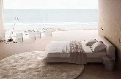
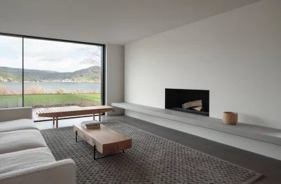
At the start, when only concrete walls were around, the man’s gaze attracted the view of the sea from the windows.
The view from the window prompted the senselessness to make bright elements in the interior. Therefore, it was decided to make the design calm.
Therefore, the sleeping area is not separated from the living room, and the TV is made on the podium, which turns both towards the sofa and towards the dining table. At the same time, so that the air in the bedroom area does not stagnate, the cabinets do not reach the ceiling.
Given the small size of the apartment, I did not want to use a lot of materials so that the apartment would not become too motley. Not because in motley and saturated interiors there is something bad, maximalism is now in vogue, but in order not to make the interior too screaming and torn into patches of stains.
I especially like the combination of soft-touch surface of kitchen and concrete facades. All materials had to be such that it was pleasant to touch them.
Honestly, I was worried that the client would trust, and later, in the finished interior, he would be upset by an overabundance of gray. Therefore, the gray kitchen, ceiling, diluted with white planes of the walls. In addition, like any composition, the interior required dominant or accents. They were blue sofa and orange wardrobe.
The apartment has a plan that all designers hate - some walls are semicircular, others are not at right angles. This gave rise to hidden niches and cabinets.
For example, the gray square behind the sofa is not only an art object, but also a built-in wardrobe for rarely used things.
One of the cabinets is behind the mirror at the entrance; only a frosted circle prompts its existence.


