Introduction
The up-and-coming neighborhood of Sai Ying Pun by the Western side of central Hong Kong is a natural extension of lower Hollywood road and Sheung Wan district whose trendy clubs, restaurants and galleries have been filling most of the spaces once occupied by local businesses. This project adds up to all the recent nice looking restaurants popping up along High Street, and in a broader view along with the new serviced apartments building, galleries and cafes is another evidence of the fast changing reality of western Hong Kong towards a leisure–oriented direction .

Concept
At the ground floor of Island Crest luxurious residential complex in Second Street ,“La Viola. bar & grill” is overlooking a well designed small square whose space characterized by green features, light brown limestone paving and wooden benches offers a breath of quality urban space in a densely built area. Designing the glass façade as a totally operable surface through two sets of French windows is a natural choice given the shape of the 120 sqm floor plan whose internal space unfold in two main rooms along the17 meters long façade. When glass doors are opened there is a strong continuity of space between the interior and the exterior. There is a sense of easy coolness when wine drinkers stand on both sides of the long Italian marble high tables inside or actually outside the room, actually in the public space. Concept itself has also been conceived based of the relationship between internal and external spaces, by connecting inside and outside when glass doors are open and by playing the card on how the interior space would look from outside.
This Italian restaurant has some “fusion” elements in the cuisine; food is served in a very sleek and modern presentation. There has never been the intention of replicating the traditional Italian restaurant. Both the client -“The Violet” group - and the architect - Alberto Puchetti form Arboit Ltd - agree to recall a classy Italian space, not replicating it but rather reinterpreting it with a modern edge.

The Restaurant.
The Asian fascination for old-style European décor finds in this place a new interpretation. Decoration inspired by interiors of a 16th century high-ceiling Venetian palazzo is in this case a digital image specifically designed for the brand image of this company by Arboit ltd. These decorative elements are printed out on wallpaper with a fresco-like type of texture. Design of decorative frames and moldings printed on wallpaper blends with the real wooden moldings applied on top.
Inspired by the surreal atmosphere of David Lynch’s movie and the final scene of Kubric’s “2001. A space odyssey” the white powerful floor light stripe all along the perimeter of the room to dramatically illuminate the artworks making the walls looking like floating in the space between dark ceiling and dark floor.
By contrast with the aristocratic artworks digitally produced on computer and printed on wallpaper some concrete textured pillars are articulated to add spatial rhythm along the walls and contribute increasing the elegant perception of verticality of the 4 meters high walls making them looking higher than what they are. The textured antique mirrors located by each corners double the perspective view of the side walls making the space looking much bigger than reality. The choice of an exclusively grey tones color palette makes the space a perfectly subtle backdrop to highlight by contrast the vivid colors of served Italian food and wines making them the main characters on this stage. A modern interpretation of the classical Louis XVI chair is matched with dark mahogany tables and the futuristic looking “Aerodrome” lounge lamp designed by Alberto Puchetti for Northern Lighting find its own place in filling empty spaces and dialoguing very well with the design of the architecture. Dark gray concrete floor and the black painted open ceiling complete the design whose concept is all about a an edgy interpretation of the venetian palazzo by juxtaposing digitally edited fine classical décor, furniture and materials with modern and minimalist looking shapes and textures. The final result is meant to be quite spectacular looking for walkers passing by 2nd street, as the darkness of the small square in between the façade and the street surround the bright vision of the interior looking like the stage of a theatre.

The Bar
Concept is still related to the restaurant – relating by contrast aristocratic and rough materials - but has a different feeling, a more metropolitan vibe.
Decorative digital artwork printed on wallpaper with fresco-like texture alternated with concrete surfaces are on the walls in the hallway to the toilet and on the service cabinet on the way to the restaurant, however the contrast between old and new is also played here matching Italian white marbles surfaces of tables and counters top with concrete surfaces and stainless steel profiles.
Mirrored shining surface of the stainless steel edges on every shelf of the bar wall and counter design dynamic horizontal lines cross the space in exciting contrast with roughness of matt concrete surfaces and floor.. Led lights illuminate the bottles and highlight these steel horizontal lines. Kitchen work is perceived though the movement of shadows behind the translucent glass on the back of the bar shelves.
The non-color palette of the architecture allows the bright colored bottles of spirit and liquor bottles lined up on the shelves to be the main character of the scene.

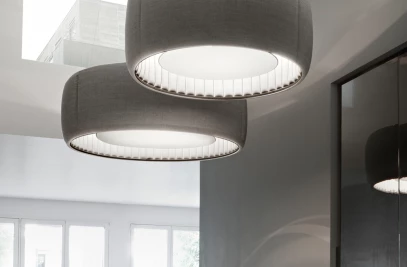
Iconic “Glas” by Diesel-Foscarini pendant light, “Aerodrome” designed by Alberto Puchetti for Northern Lighting fill up the spaces with their sculptural presence and adjust the mood of the bar with modern coolness. As for the restaurant Both Alberto Puchetti Architect and client decide to avoid the feeling of “déjà vu” of the typical bar-bistro .
Like the colorful lining fabric of some classic grey tones tailored jacket the color palette of the toilet, in contrast with gray tones of restaurant and bar is like an explosion of colors. Half of the wall surfaces are covered in a pattern of eleven different types of “Majolica “ ceramic tiles typically produced in Southern Italy white the other half is covered by cream-yellow concrete wall as a proper chromatic backdrop to the tiles.

Brand Corporate Image
This project is also the first chapter of a chain of restaurant. The conceiving of the brand image is also an important part of this project. The graphic theme decorating the architecture is also characterizing all the other expressions of brand image, from the design of the menus, stationery and business cards as well as shopping bags website and logos. As the architecture is characterize by the contrast between decoration and minimalist the graphic design has lyrical artistic motifs inspired directly form the interior decoration of 16th century Venetian palazzos combined with graphic layout and font very clean and modern. The combination of these two contrasting figurative language bring originality to the final image.


