The lay-out started from a two fold idea:
−firstly the purely functional needs: bringing a maximum of natural light into the space and keeping the floor space as open as possible; thus creating an easy, free-flowing and relaxed atmosphere.
−secondly accepting the unique character of the site in the urban landscape and incorporating it in the design.
This resulted in an open plan lay-out consisting of large connecting interior spaces; linking horizontally as well as vertically.
Different in size, height, view, orientation, level... they are unified by their material and yet varied with specific spatial qualities allowing the client to use them according to his mood, needs, season etc.
Additionally, all of these spaces have access to the surrounding garden; connecting the outdoors with the indoors; maximizing and encouraging usage of the precious and rare outdoor city-space.
There is no real path to take or follow to wander through the house, no dead-end corridors and with views of the surroundings lurking around every corner, the house relates to the city and vice versa.
At the center of the volume a vertical void connects the different levels, not only revealing the slim concrete floor and slender beams but also the outdoor patio next to the bathroom.
Without this void, this would be the darkest spot on the ground floor but by opening up the floor, this area is now light-filled and gives the visitor a rare glimpse of the lush foliage of the trees in the neighbours' garden.
Material use is functional and kept to a strict minimal.
Polished concrete flooring allows minimal construction height not altering the existing window openings and heights in the facades.
The visible casting seams add a rough, industrial note.
New steel frame sliding windows mingle with renovated iron cast windows. Both frame views of the garden and the surrounding urban landscape, blurring the boundaries between the house and the city.
Large stainless steel kitchen surfaces are easy to maintain and reflect light while wood veneered cupboards add contrast and structure.
Plenty of empty wall space is provided for the display of the owners art collection and travel memorabilia.
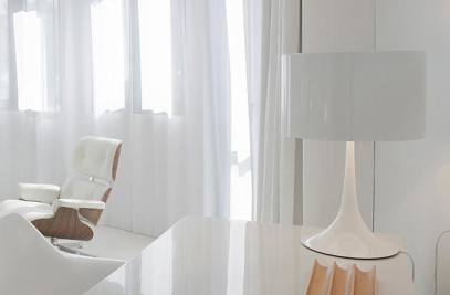
To complement -and in keeping with the architectural concept- we sourced furniture pieces that combine natural, tactile materials like wicker, marble or wood with technical, industrial details (e.g. the pieces from Poul Kjaerholm or Eames).


