Escape the bustle of city life for a moment and come aboard for a sublime dining experience.
Pennant, the new restaurant in Thonglor is founded by a group of F & B industry entrepreneurs who have gained international experience to develop the first flagship store for the Thonglor culinary scene, creating experiences customers won't soon forget.

Concept Design
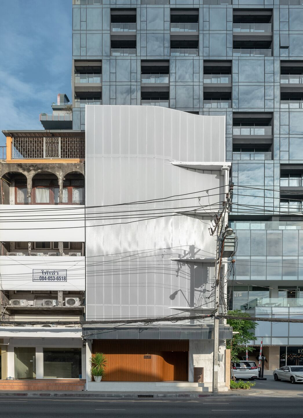
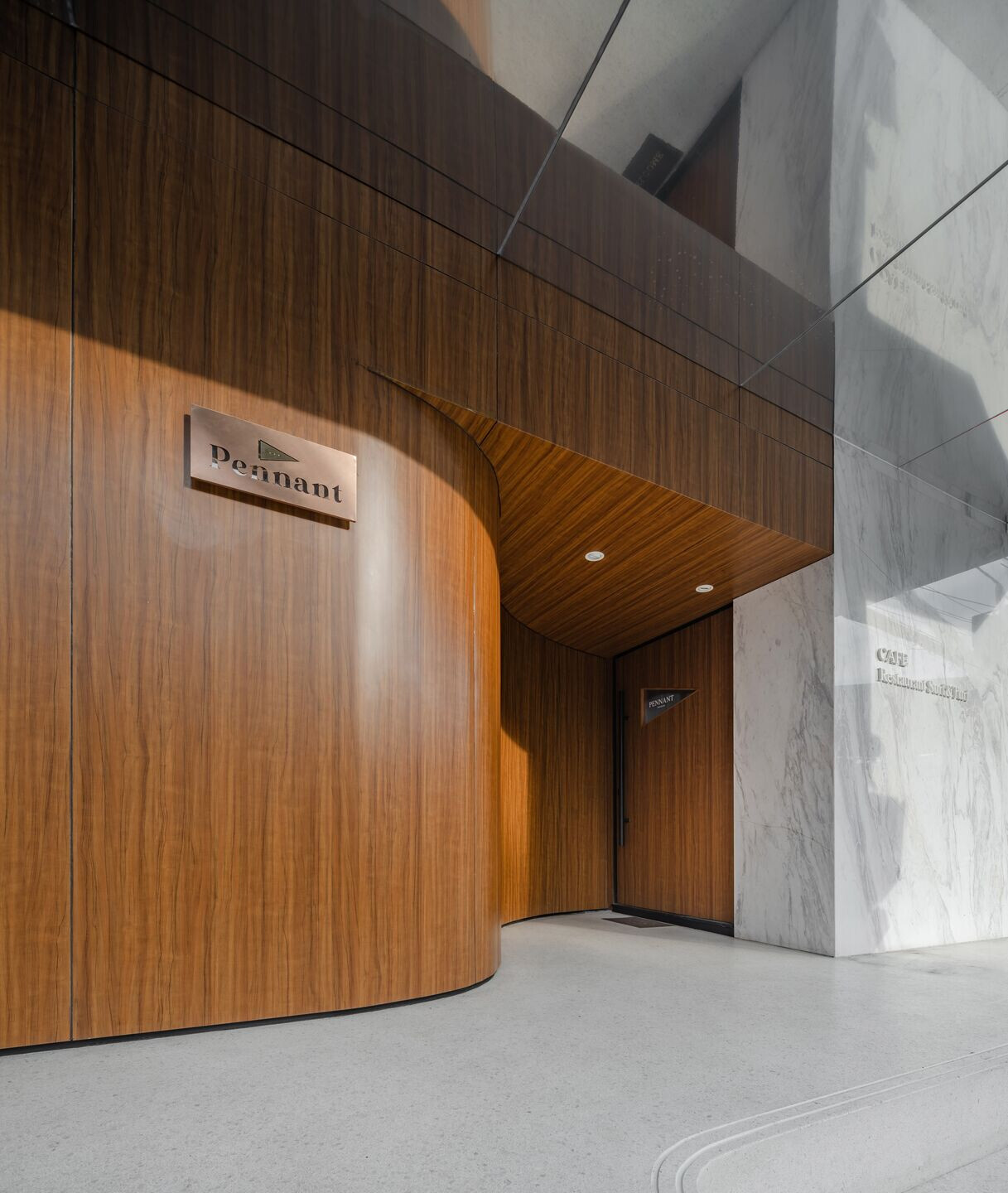
The location of the existing building which locates at the beginning of Thonglor road facing the main Sukhumvit road is where our inspiration for the curves came from as it resembles the sail that is blown by the wind. This enlightened the creation of the translucent curves that bring dynamic and welcome patrons from Sukhumvit road. The first-floor facade is designed to contrast the second floor with PAD to elevate the scene to resemble the entryway of a cruise. Varnished wood that is commonly fitted on luxury yachts is used to lead patrons to the main entrance, the PAD is made with wooden-finished aluminium cladding for outdoor use, practicality and cost control.


Once the customers step foot in the vicinity, it is as if the journey of a luxury cruise ship sailing through the night sky is being told. Upon entering, customers are swept on a voyage that takes them from a bustling city to the calm body of water under the night sky, through the fog, light sea breeze, and the ocean waves.
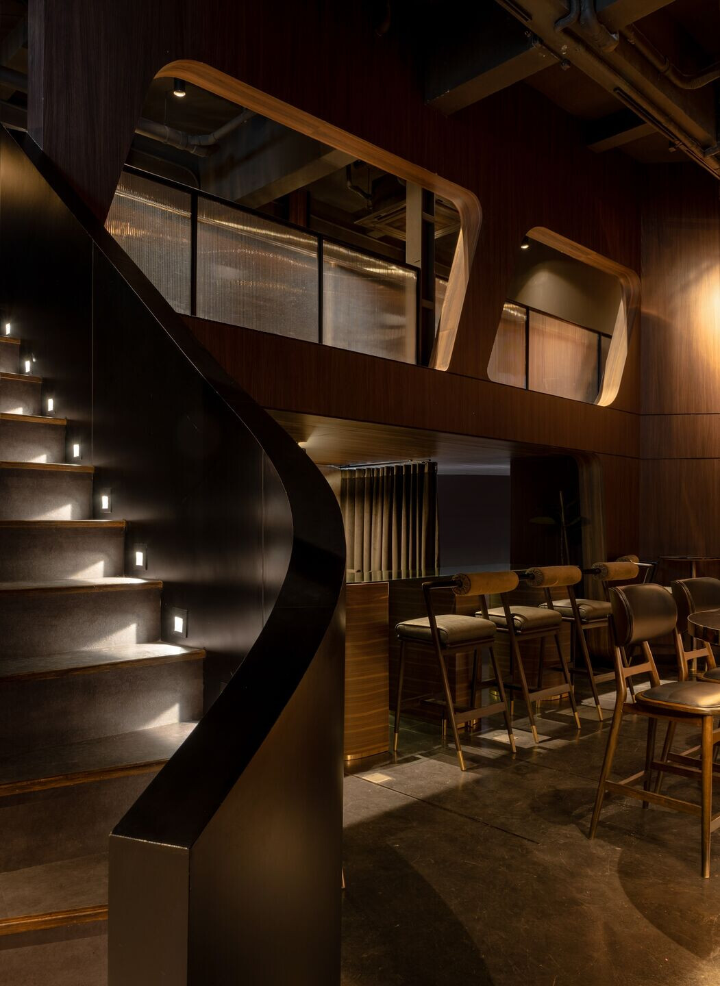
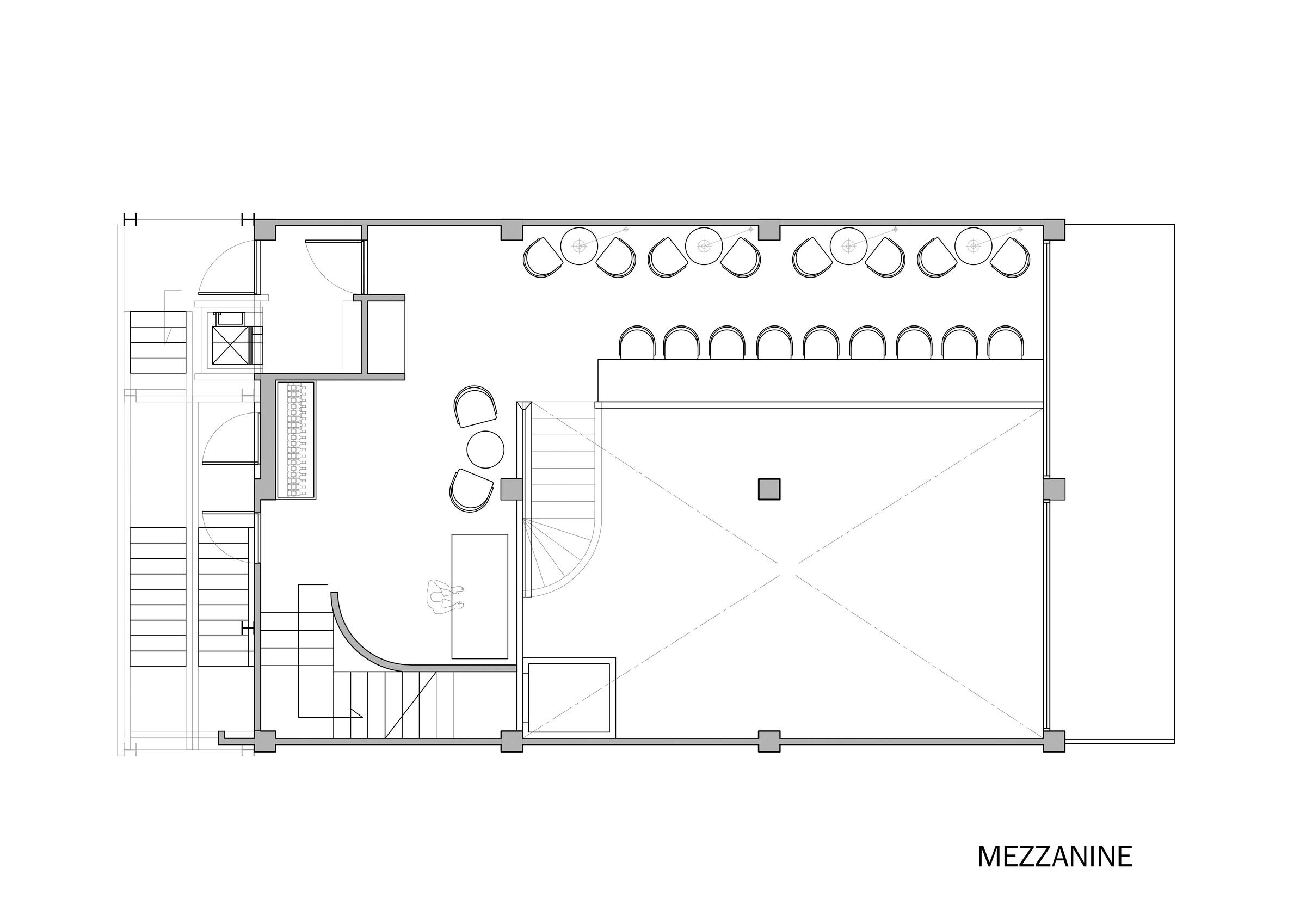
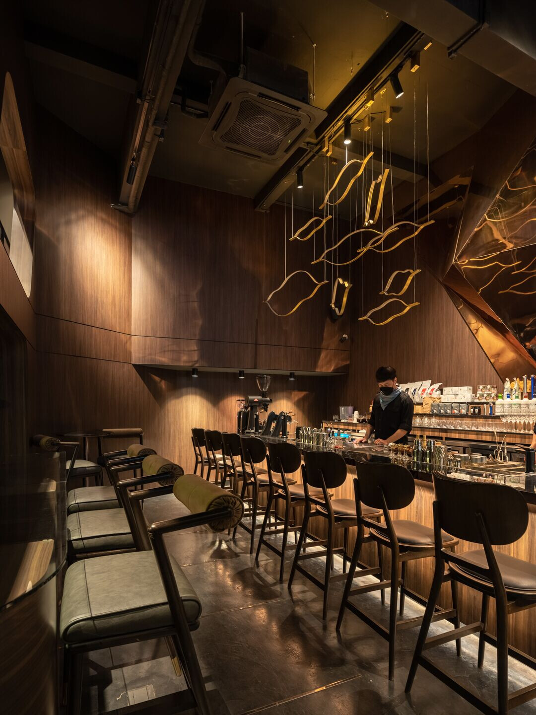
The first floor holds the new experience all-day cafe and bar where customers can enjoy coffee or cocktails throughout the day while indulging in a night atmosphere. The use of dark-toned fittings and dark walnut along the arch profile creates the sensation of being on a luxury cruise ship. The copper origami boat gleams through layers of hanging clouds as the main feature at the counter bar. A little twist on this floor is a hidden lab room that is designed to probe a secret under-the-ship lab where the distilling and tasting happens. The moon staircase, a curved staircase leading to the lab room, the mezzanine and the DJ booth, is yet another spot visitors will find hard to resist for a photo opportunity.
The second floor holds a fine dining which will be launched very soon , the 3rd and 4th will be constructed next year.
There are two parts of the low ceiling space. The first one is at the entrance. The other one is the dead end space beside the toilet.

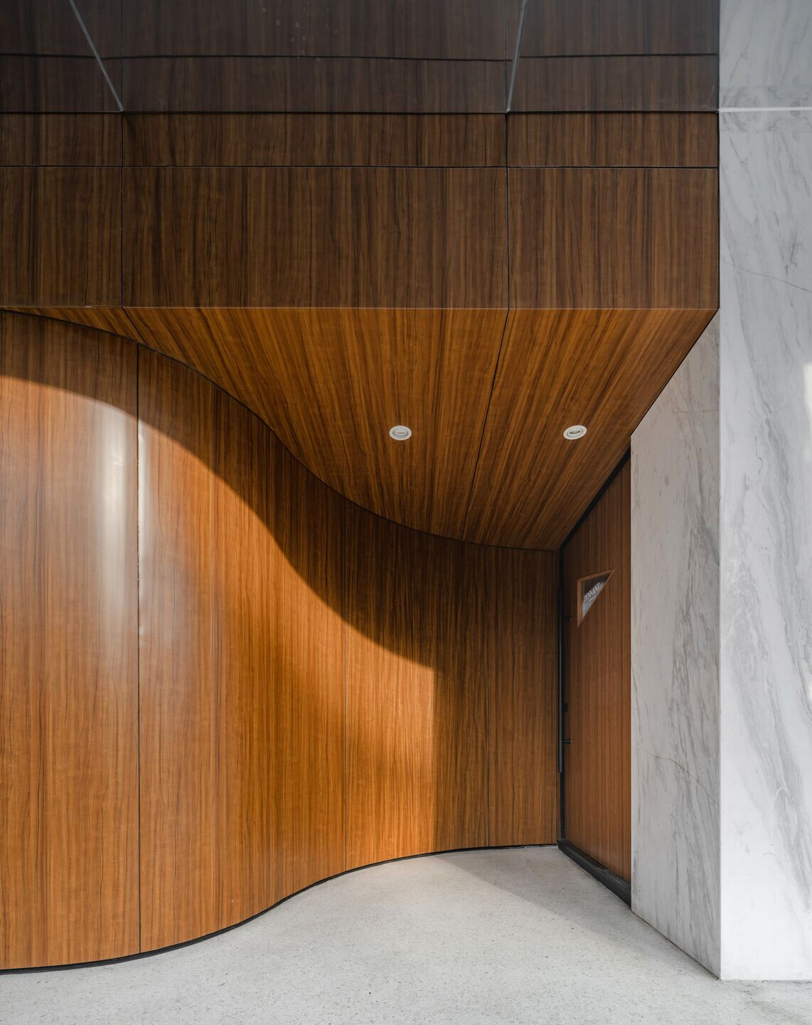
a. This area is next to the main entrance. After entering the door, you will be greeted by a small foyer with a curved wall. This is the major transition area from day to night scene, before experiencing the rest of the restaurant.
Behind the foyer, locate the 3 semi -private dining pods, divided by curtains.
This area was designed to be like the secret chambers in the cruise ship hull since we had quite a low ceiling in this space. We used timber look cladding for the wall and the ceiling , and played with the tone-on-tone elements such as curtains and furniture.
The purpose of what we did here was to create the vintage & cozy atmosphere with the ultimate ship hull experience for the guest.
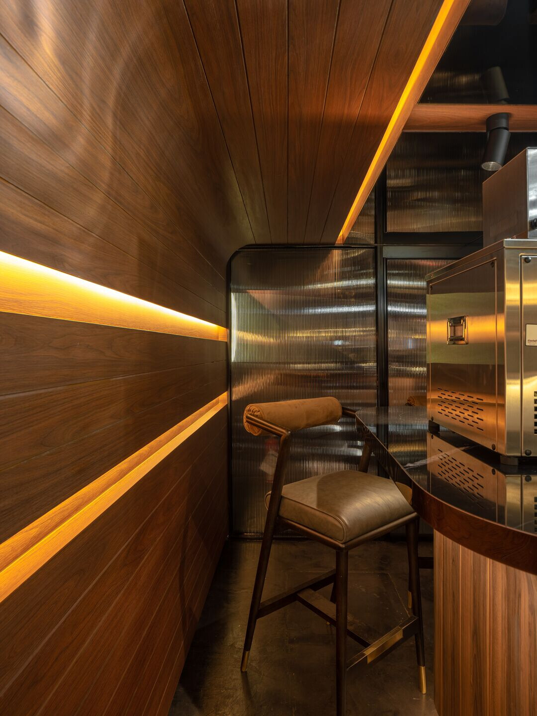
b. The area next to the stairs and the toilet is the dead end space with the low ceiling. The original story was that we received a request from the owner about wanting a tasting room and when we saw this area, we thought that this area would suit. Therefore, we discussed with the owner about turning this area into a testing room.
However, instead of going for the common testing room, we went for something a bit more intriguing. That’s where the concept of the secret lab of a mixologist came to our mind.

Even though we added a new creative touch to this area with the secret lab of mixologist concept, we knew that we still had to stick with the main direction – the cruise ship.
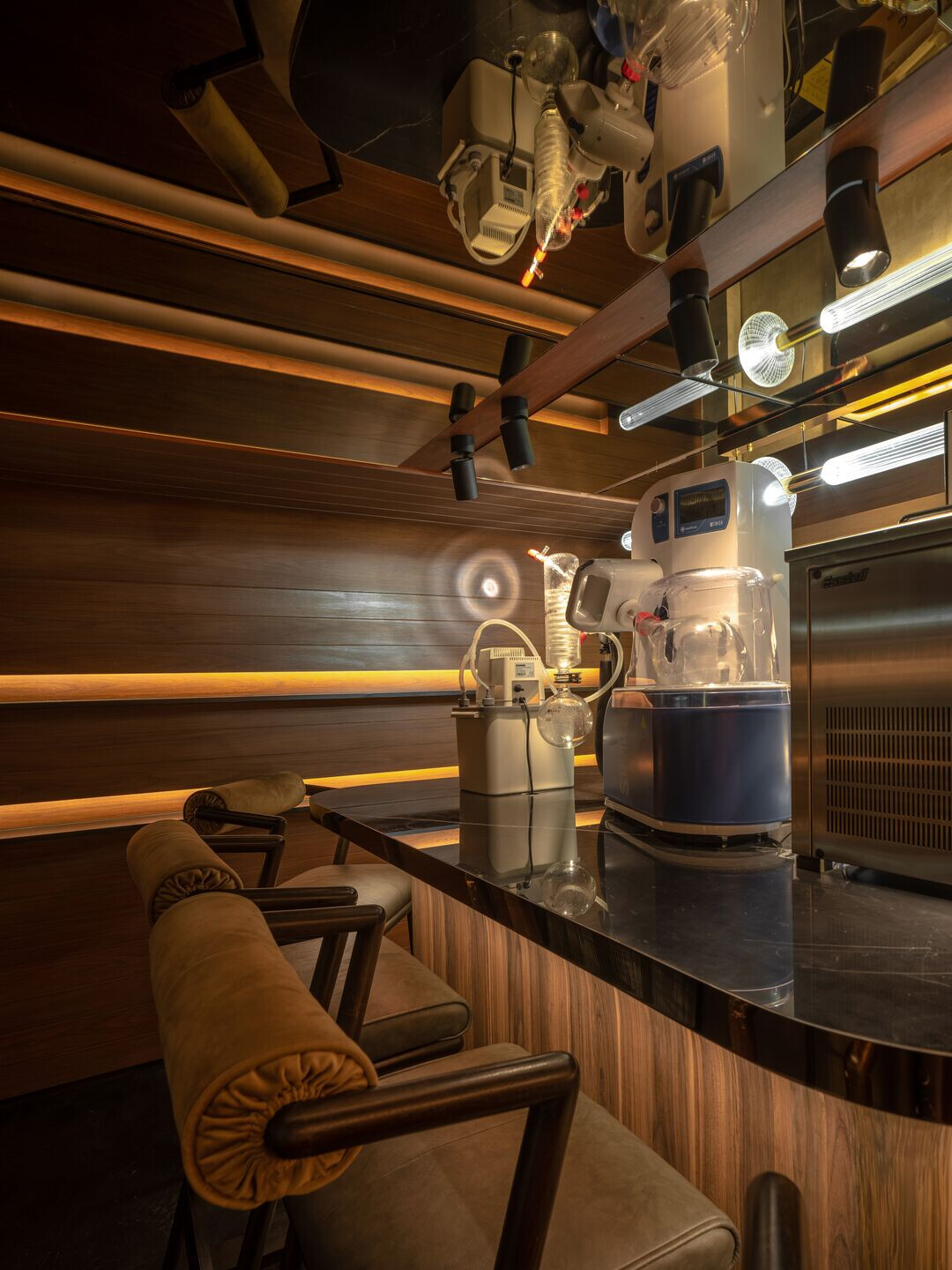
So, here, we designed our secret lab to be like a cabin. We were aware of the limited space, therefore, in this area, we used the indirect lighting technique and sci-fi style decorative lights. Also, adding the bronze mirrors on the ceiling and wall to make it feels or looks more spacious than it actually is.

The main limitation was the budget. Because we had to maintain the design intent, but it also had to fit the owner’s budget.
At first, the owner wanted us to present our original idea first because she didn’t want to kill our idea at first. So we were told to submit the ideal design plan. After we did that and showed the owner the estimated cost, we got asked to reduce the cost. This request was quite a challenging situation for us because it meant that PAD had to find a way to reduce 40% of the estimated cost. At the end, PAD found two solutions as followed :

1. Exterior Facade
We adjusted the sail part (the white portion) of the main facade by deciding to use a translucent corrugated roof instead of tensile fabric. Because it shared some similar results as we want this part to be translucent.
There was also another part on the exterior facade that we made some changes. That part was the facade at the bottom where it looked like timber. We decided to use aluminum cladding instead of using the varnished wood, the material used for ship, in order to save cost and we consider it to be quite sustainable as well.
2.Interior
For the interior, PAD retrenched some parts of the design which were the ceiling as well as the main hanging feature, and the wall.
So instead of using the paneling wood for wall, PAD had picked to use wood pattern wallpaper. Meanwhile, for all the built-in parts, we decided to use wood laminate texture to match with the wallpaper. The reasons for doing all these were because we wanted the overall look to go in the same direction and to make people feel like all these were made of natural material.
Another material that was being replaced in order to reduce cost was the reeded glass. Here, we used polycarbonate sheet instead because it still gave the same effect.
Team:
Interior and Architecture design: PAD Space Artisan
Photographer: Panoramic Studio
