Interior signage

An overview of projects, products and exclusive articles about interior signage

Product • By Phos Design GmbHWC pictograms (Man, Woman, Wheelchair User, All Gender)

WC pictograms (Man, Woman, Wheelchair User, All Gender)
Our high-quality stainless steel toilet pictograms, combined with a divider, enable clear identification of the different toilets in the sanitary area. As door signs, they enable comprehensible orientation independent of language and writing with a significant message for efficient routing. The self-adhesive pictograms are attached to doors and load-bearing surfaces as toilet signs. With a height of 2 mm, they stand out matt to ensure clear orientation and a first-class design statement. Winner of 3 international design awards, the symbols can be used individually or as a pictogram pair. PHOS Design GmbH -----------------------------------------------------------------We offer different versions of the signage/pictograms. Individ... More

Product • By George & WillyWooden Letter Board

Wooden Letter Board

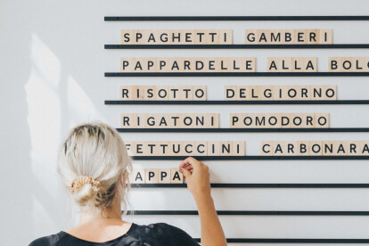
The Wooden Letter Board is a beautiful way to use display lettering for your menu, to-do list, or for announcements in your space. Each Wooden Letter Board Menu comes with a set of 400 changeable wooden alphabet and number tiles, along with a set of rails and screws for easy installation. Additional alphabet and number stickers are also included to apply to the back of spare tiles, should you need any extra to complete your letter board.  More

Project • By CCHEShowrooms

Showroom médical

The project focuses on showcasing the products of a company specialising in medical equipment, while immersing visitors in a world reflecting the medical world of the future. The project offers the visitor a path through peripheral exhibition spaces relating the patient's journey through the various medical services, focusing on one environment after another. The exhibition is organized around a central meeting space, the point of fall of the path from which all the rooms are accessible. The separation between the spaces depicting the hospital and the central space is achieved through arcades with rounded corners framing the various hospital scenes that follow one another. Finally, each space represents a specific area of the hospital, an... More

Project • By Spark ChicagoOffices

Paylocity - Schaumburg

As the developer of industry-leading human capital management software, Paylocity needed a workspace to reflect its best-in-class dedication to service. Branded elements create a continuous narrative through the space and reinforce their brand and culture. We continue to partner with Paylocity in offices across the country, creating contextual moments that blend Paylocity culture with the local geographic flavor. More

Project • By Spark ChicagoDistribution Centres

Greater Chicago Food Depository (GCFD)
The Greater Chicago Food Depository (GCFD) makes a daily impact on hunger by distributing nutritious food across Chicago and Cook County. Their new volunteer orientation space informs visitors of the incredible work employees perform each day and inspires the community to support their mission. Office branding reminds employees to cultivate and celebrate progress daily. More

Project • By Spark ChicagoOffices

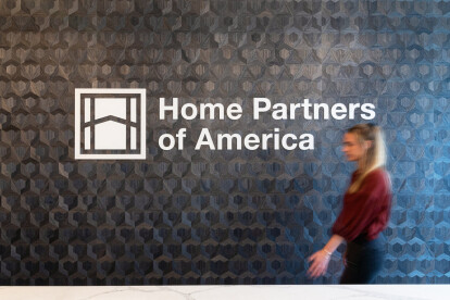
Home Partners of America

Home Partners of America (HPA) provides a path to home ownership that is more accessible than the traditional home purchasing process. Their sophisticated corporate brand is articulated through branded elements which nod to the residential real estate market. More

Project • By Spark ChicagoOffices

Ann & Robert H. Lurie Children's Hospital

Top-ranked Lurie Children’s Hospital provides superior pediatric care with a legacy of excellence. Inspired by the tactile optimism of children’s toys, a series of installations reminds employees of the patients, families and communities they serve each day. More

Project • By Spark ChicagoOffices

Objective Paradigm

Objective Paradigm (OP) connects technology industry talent with Fortune 100 companies and startups. Their new Chicago space supports the fast pace of the technology industry and the hustle required to be a successful recruiter, while infusing warmth and life. More

Project • By Spark ChicagoOffices

Morton Salt

Morton Salt’s modern headquarters breathes fresh life into a historic brand. The company’s rich history provides a wealth of inspiration to draw from, including the iconic Morton Salt Girl in her signature yellow dress. New elements work together to reflect an innovative vision of this classic brand. More

Project • By Spark ChicagoOffices

Evolent Health

Evolent Health added two floors to their Chicago headquarters and needed to carry the brand of their single existing floor to the new space. Working with leadership, bold, sophisticated branding elements were developed to express their culture and values. More

Project • By Spark ChicagoOffices

Feeding America

Feeding America offers help to those in need through a nationwide network of food banks. Their mission is simple: to feed America’s hungry and engage the country in the fight to end hunger. Branded elements in their updated office bring Feeding America’s stories to life, showcasing their brand patterns, extensive color palette, and beautiful photography. More

Project • By Spark ChicagoOffices

Komatsu

Komatsu is one of the world’s leading manufacturers and suppliers of earth-moving equipment. Branded elements spanning four floors draw inspiration from Komatsu's global reach, employee culture, physical impact on earth, and appreciation for their clients, while seamlessly integrating into the architecture. More

Project • By Spark ChicagoOffices

Equity Residential

Equity Residential acquires, develops and manages apartment complexes in the United States. Guided by their mantra, creating communities where people thrive, the branding displays throughout Equity Residential’s space celebrate the places in which employees live, work, play and serve. They illuminate their core values of sustainability, social responsibility, wellbeing, diversity and inclusion. More

Project • By Spark ChicagoOffices

CDW

CDW is a leading technology solutions provider to business, government, education and healthcare customers in the United States, the United Kingdom and Canada. Digital technology and connectivity inspire the brand treatment throughout the 8-story campus, celebrating CDW’s history, innovative technical solutions and culture. More

Project • By Spark ChicagoOffices

2625 Butterfield

Real estate investment and management company Clear Height aims to create the best value for clients by developing and acquiring properties in the most desirable locations. Custom signage was created to reflect the aesthetics and brand of their 2625 Butterfield Road property. More