What was the initial brief? What were the main considerations? How did this develop throughout the design process?
The original brief was to design a home for a young family with two young children with additional space to accommodate their elderly grandparents when required. The family were hesitating for a long time between moving out of London to suburbs where they could afford more space, or staying in the city and living a more dense but sustainable urban life. The project doubled the area of the house from 115 sqm to 230 sqm and exceeded the client’s expectations.
Can you tell me anything interesting about the client and how the project relates to their lifestyle?
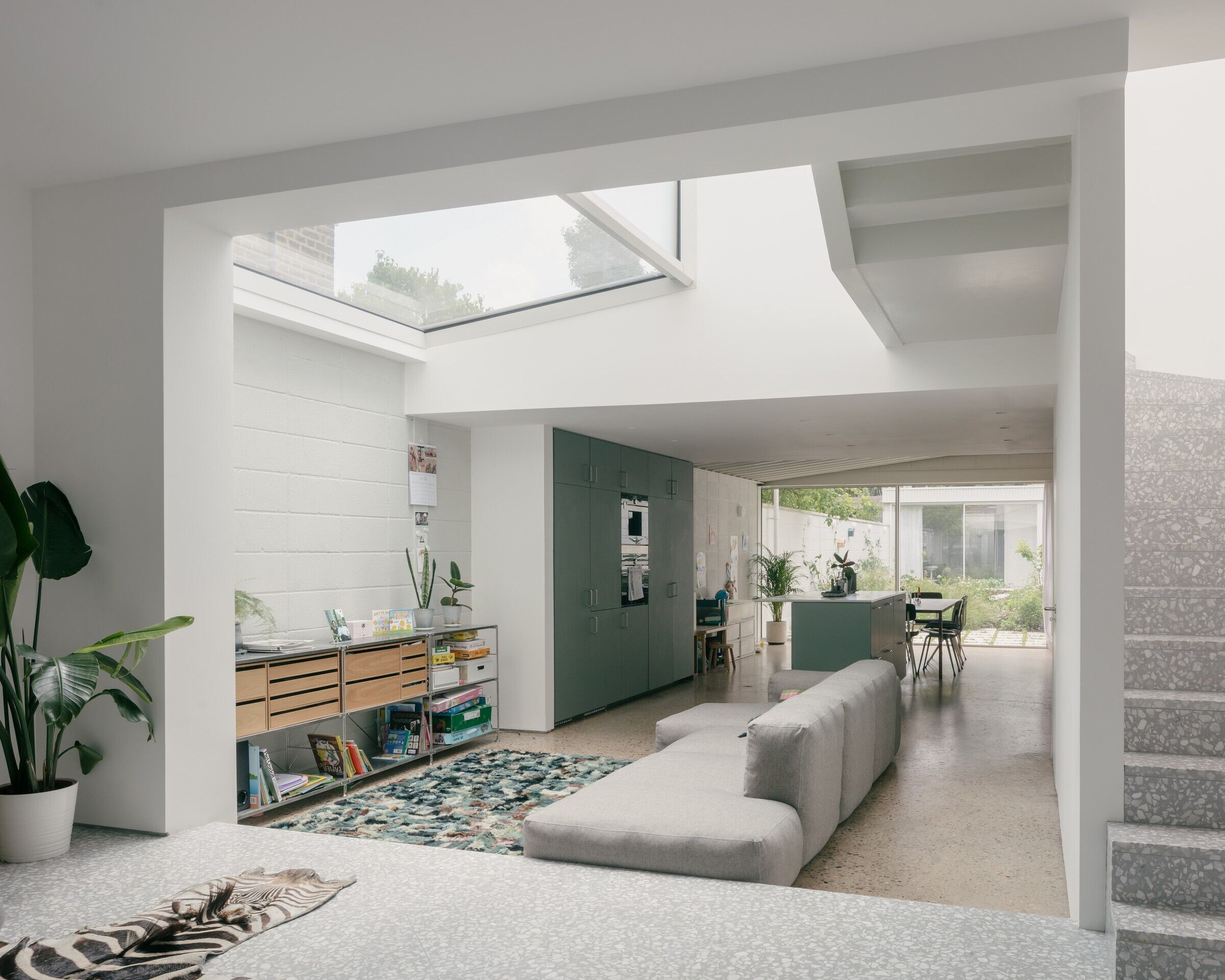
The homeowners lead busy work and social lives therefore the blissfully serene minimal interiors create the calm and comforting backdrop, while the spacious open ground floor which opens up to the terrace and garden is perfect to hold social gatherings.
Can you describe the existing home?
Where is it?
The house was a two storey three-bedroom mid-terrace period house built in approx.1890s. Together with two adjoining similar type properties the house forms a characteristic terrace which lines the Harbour Road to its south-west. The Harbour Road is a quiet very short residential street which branches off the busy Coldharbour Lane on the north-west and terminates to the Clockwork Studios (previously Fred Karno’s Fun Factory) at Southwell Road at its south-eastern end. The property is located on the intersections of well established residential areas: Camberwell to the north, Brixton to the west and Herne Hill to the south. The public transport accessibility is exceptional with the Loughborough Junction Station being only a few minutes walk away and direct 10 minutes trains to Tate Modern and the City of London.
What kind of condition was it in?
The house was vacant and deteriorating for several years and required extensive renovation to become livable. The original house was poorly insulated, had damp issues with unpleasant associated smell, and didn’t meet neither the 21st century housing standards nor the family's current and future needs: there was no family bathroom while the third bedroom was less than seven square meters.
What kinds of feelings did it evoke?
While the house is a period property and has historic value, when the architect first visited the house there was a feeling of melancholy about its dilapidated state, but at the same time excitement about the amazing potential of the project and the future transformation.
What are its main attributes/challenges?
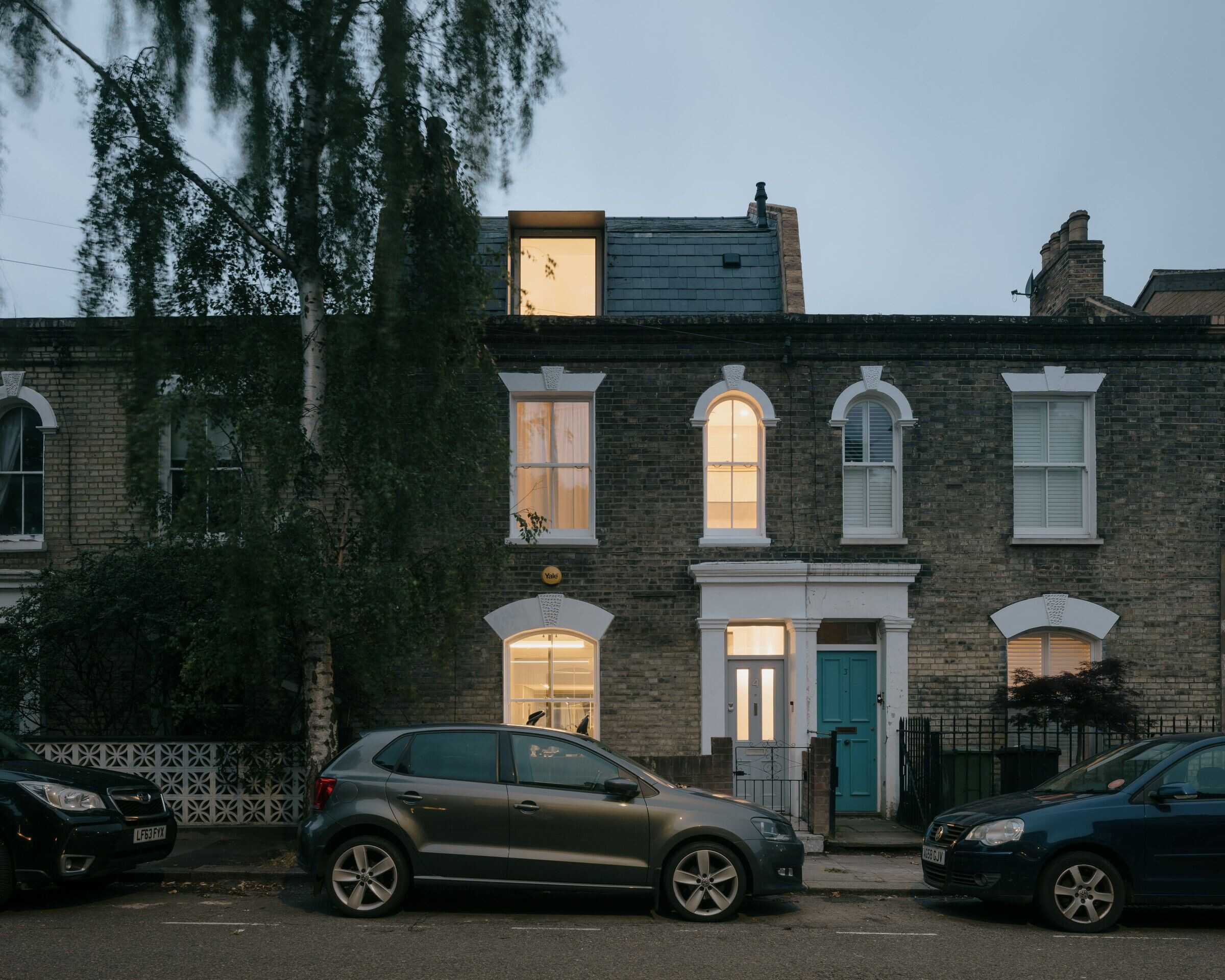
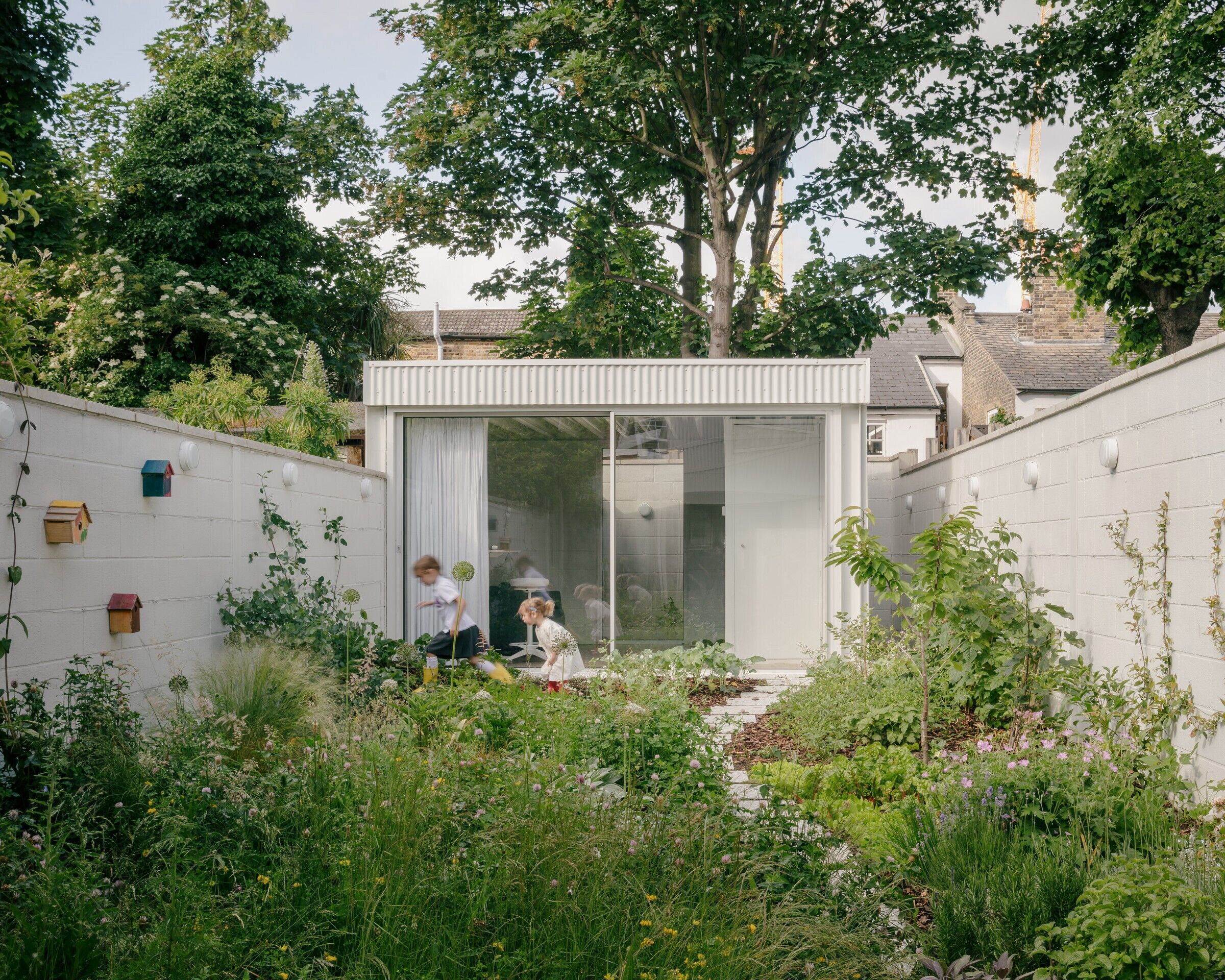
The design preserved and reinstated the main volume of the original building. The front part of the original building facing Harbour Road presents a characteristic period terrace and together with the neighbouring properties form a charming ensemble. The rooms in this main volume had reasonable areas and floor to ceiling heights. However the back of the existing house featured a stacking of smaller volumes typical to this period typology. On the ground floor the kitchen and bathroom were built on a non-insulated concrete slab-on-ground which caused rising damp up the walls. While being immediately adjacent to the garden the kitchen and the bathroom had only a single small raised window and obstructed the connection of the host house to the garden. While the old part of the house was preserved and renovated to suit the current housing standards, the new rear extension has a contemporary approach.
What kind of work was done to the street facing facade? It looks like it was mainly restoration work?
Exactly right, the historical façade and historical features have been restored.
Can you “walk me through” the renovated home? How have the spaces been arranged? How has the floor plan changed?
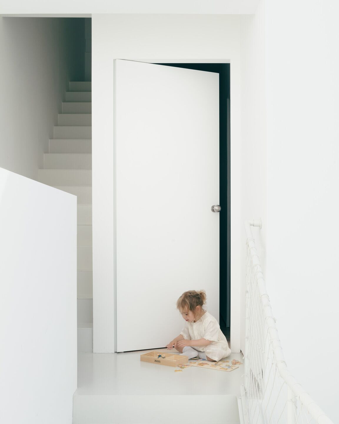
The project consists of five distinct parts which can be experienced in sequence when entering the building: 1. The original Victorian terrace facing Harbour Road; 2. A glass ‘bridge’ atrium which connects the old and the new; 3. The new contemporary extension at ground and first levels; 4. A patio garden framed by: 5. a garden room at the opposite end.
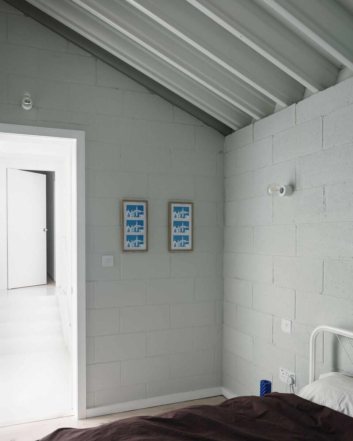
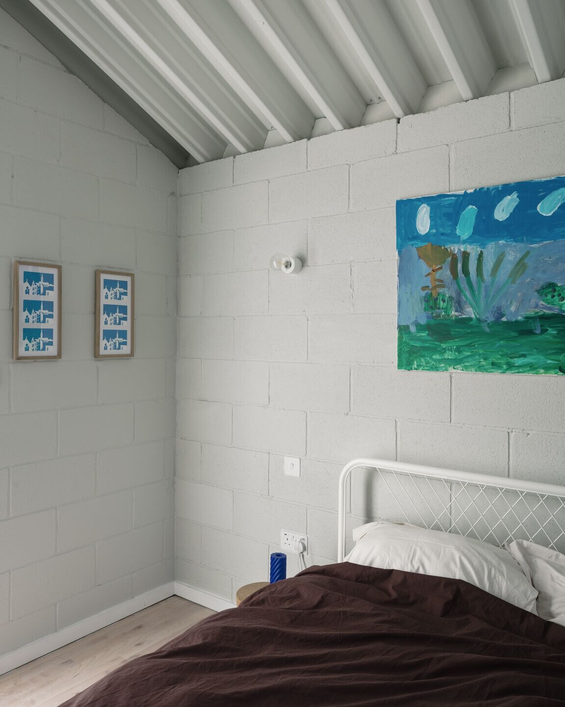
The space sequence is thought through not only horizontally but vertically as well. The ground floor is open, public and noisy, the first floor is divided into rooms for guests and children. And the last top floor is a master bedroom in the newly added mansard roof – full of light and quiet at the end of destination traffic.
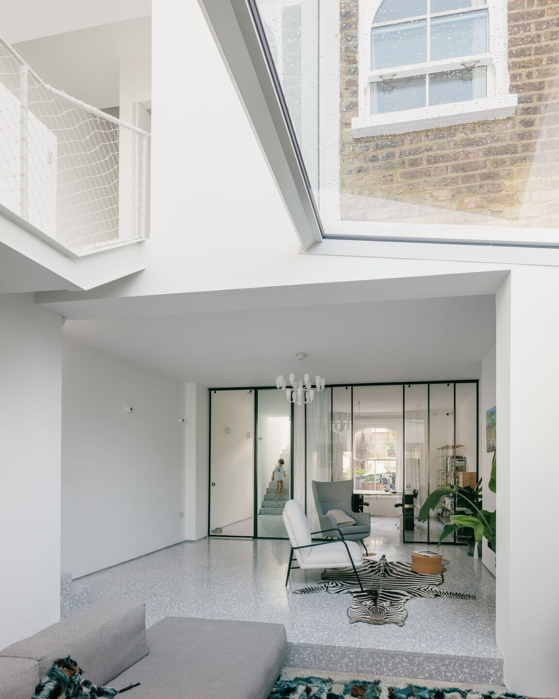
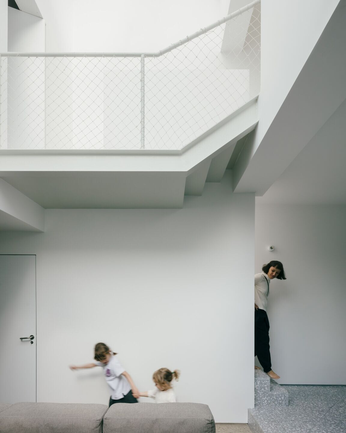
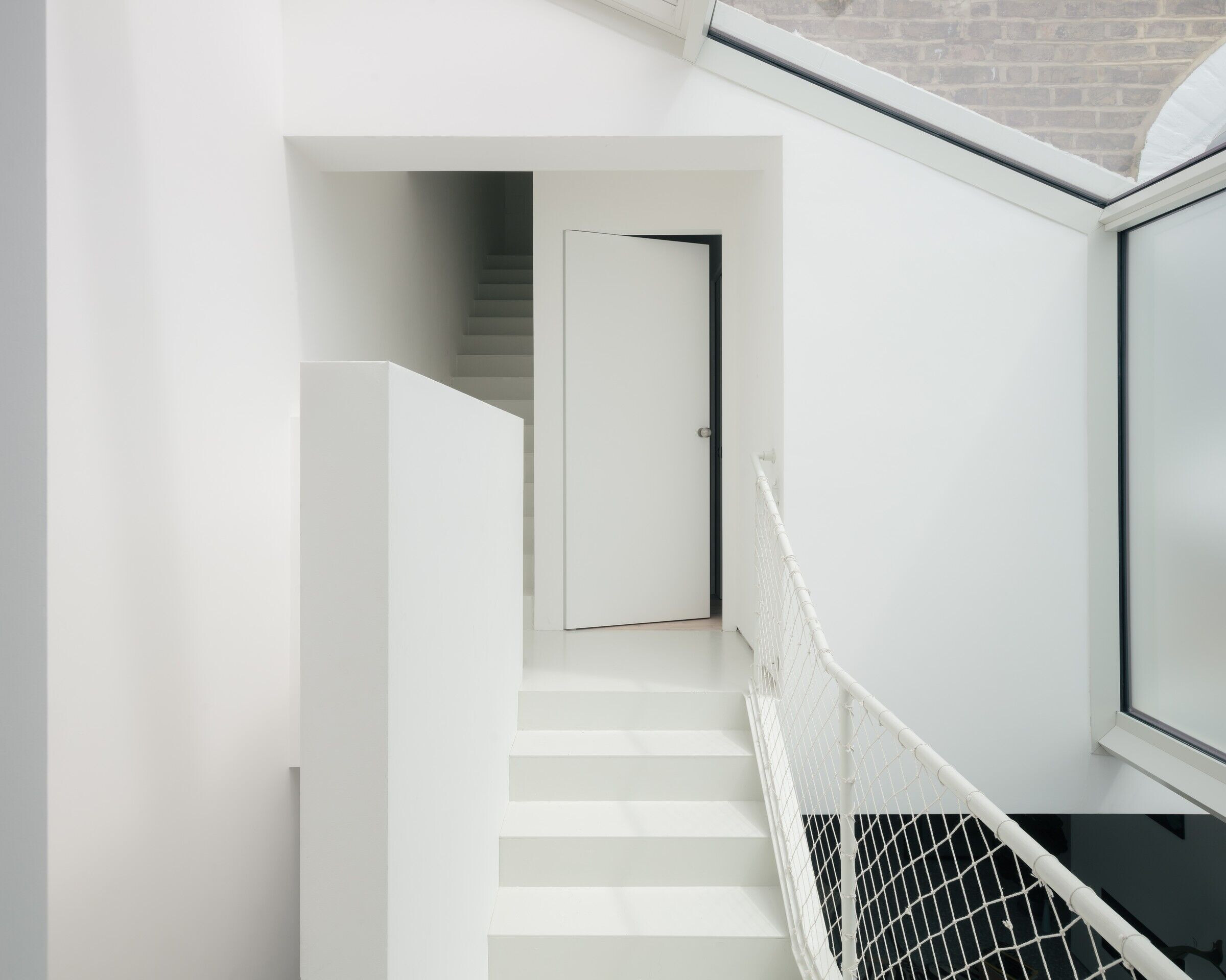
The project was conceived as a prototype for urban dense living, where the development has been thoughtfully maximized within local planning constraints. It successfully responds to the challenge of making experientially rich dwelling within the context of congested cityscape. The project unlocked the potential of a 130 years old Victorian house and made it suitable for high quality living requirements through innovative and creative interventions: a side and rear extension on the ground floor, a rear extension on the first floor, a new mansard roof, and an outbuilding. The initial area of the house has been more than doubled, and now houses several family generations. The “old” host building and the new volumes are connected by a conceptual glass “bridge”; this atrium brings daylight into the centre of the house while visually and physically connecting all floor levels. The configuration of the “bridge” embodies the “memory” of the old building. In terms of sustainability strategy, the atrium which forms the heart of the building brings daylight deep into the plan, therefore reducing the need for artificial light and contributing to warm up the house from autumn to spring through solar gains. The openable windows in the highest point of the atrium provide effective natural cross ventilation in summer eliminating the need for air-conditioning. Four photovoltaic panels on the roof generate a considerable amount of energy throughout the year.
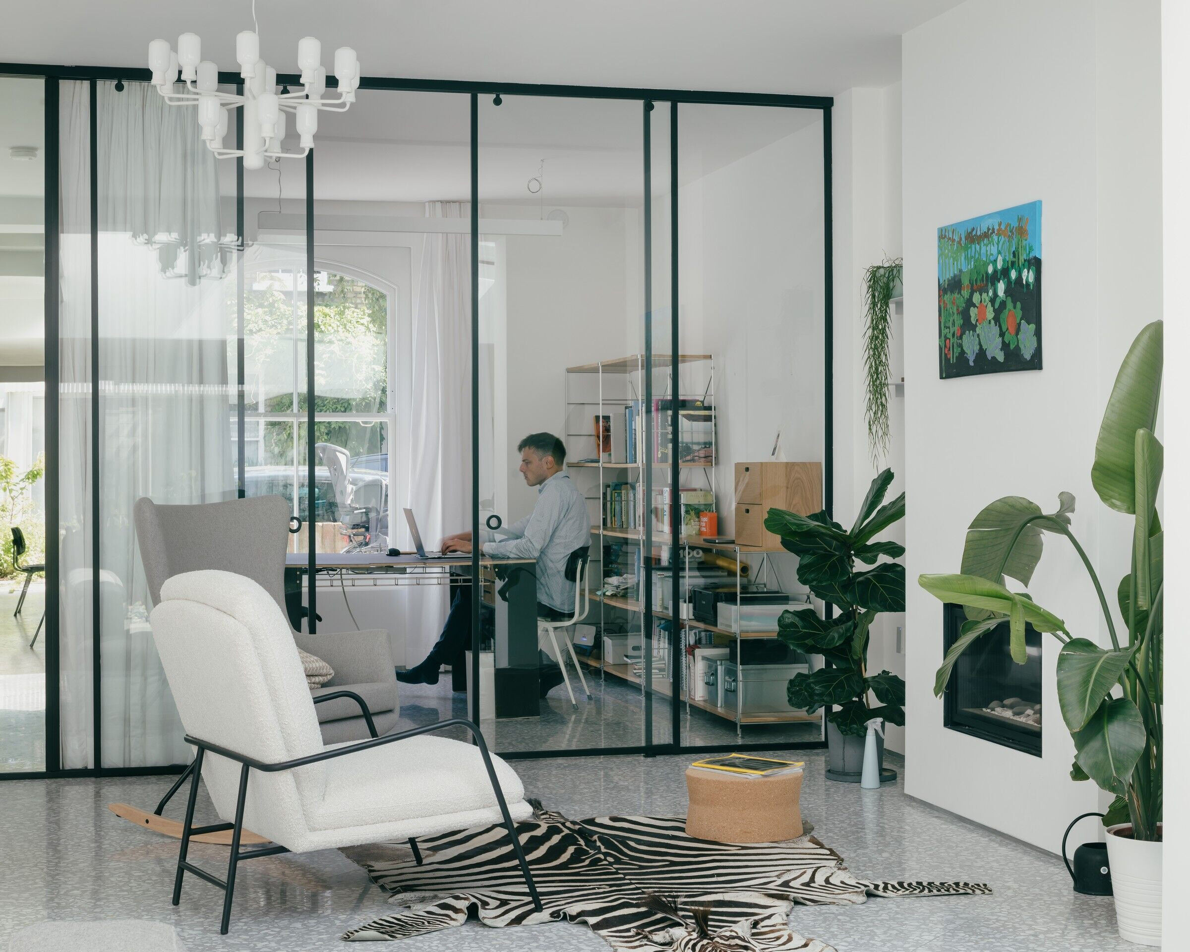
The traditional sitting room facing the street has been transformed into an office to allow for the hybrid working from home, resembling a historical set up with workshops on the ground floor and living accommodation above.
How do the new and existing elements of the home sit together?
We were striving to achieve contrasting elements which at the same complement each other and work in harmony with the urban context. The glazed “bridge” of the atrium is the lightweight architectural element that brings the old and the new together.
How does the extension relate to the context (ie. the angle of the roof seems to echo the surrounding roof structures)?
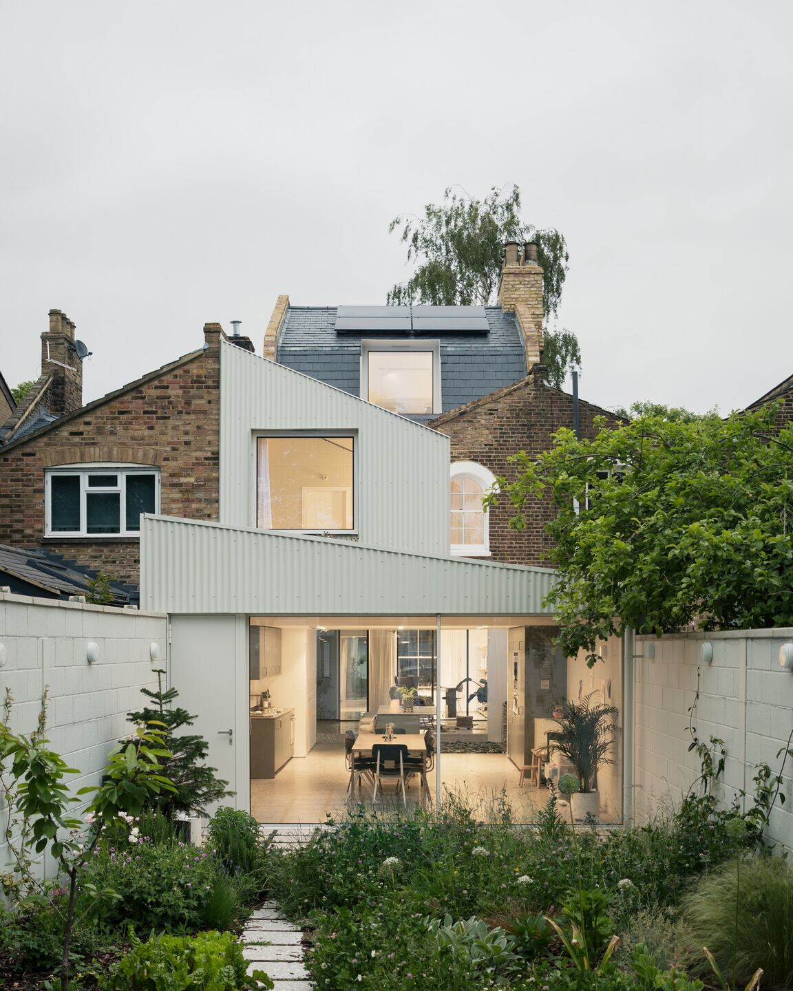
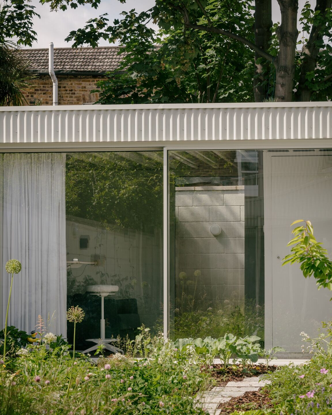
The ground floor rear extension has been extended to align with the neighbouring property extension. Initially, we envisioned lowering the rear portion of the ground floor to maximize the internal height of the space, and minimize impact on the neighboring properties, but the detailed survey of the shallow sewage pipe under the extension proved the idea impossible. We therefore raised only one side of the roof making it a mono-pitched roof. Extensive green roofs on top of the new ground floor extension and the garden room give great views from inside, but also greatly contribute to the outlook for the neighbours. Similarly, the first floor extended 1.9 meters to align with the first floor rear façade line of the neighbouring terrace. As you rightly noticed, the roof pitch of the first floor repeats the angle of the historic V-shaped parapets of the traditional London roofs. The first floor extension is set back from the opposite neighbours to minimize the bulk and impact on their views, amenity and daylight access to the windows. The new additions’ facade have been clad in off-white corrugated steel sheets matching to the aluminium colour of windows frames and doors. This enables the feeling of lightness, reflections of the sunlight, but also echoing the white elements of the Georgian urban fabric.
What are some of the key materials used here and why were they chosen? (Including the following)
What is the extension made from?
Being inspired by Belgian brutalism, the exposed blockwork with high recycled content delineate the whole perimeter of the site including the garden and the ground floor as a uniting theme and contriving an ascetic domesticity. The blockwork, steel beams, concrete floor and metal deck - most of the materials have been left true and exposed.
The grey flooring in the extension?
The grey flooring on the ground floor is polished concrete with large aggregates. Underfloor heating in the polished concrete floor allows for efficient low temperature heating.
The cinderblock (?) walls?
The blockwork from a local manufacturer Lignacite provides a large thermal mass to the building, ensuring the building stays cool in summer. It has been left exposed and painted of-white in the same RAL colour as the façade, doors, windows and other elements. In the interior the blocks were laid as stack bond, in the exterior – as a stretcher bond, creating a very subtle difference between the inside and the outside.
The linear ceiling / roof?
The roofs were built from metal decking left exposed in the interior. Metal decking is almost never used for domestic projects, but more often for industrial sheds. However, using the metal decking (in the same off-white RAL colour) allowed us to create an articulated ceiling with linear ‘vaults’ or ‘waves’ instead of the boring more traditional ‘cover it with gypsum boards’ approach. The ‘waves’ of the metal decking create an architectural theme together with the ‘waves’ of the metal façade panels and window curtains.
The use of blue cabinetry in the kitchen?
In the kitchen we decided to use colour which would be harmonious with the rest of the interior, but also complement the extensive greenery in the interior and the exterior.
The yellow tiles in bathroom?
The children bathroom is another area where we decided to play with colour. The yellow Mosa tiles are juicy and stimulating, energizing kids every time they use their bathroom.
What are some of the key furniture / lighting / fixtures used? Including:
o The chandelier light
The central light fitting in the reception by Normann Copenhagen is a contemporary take on a chandelier. It is meant to give a slight feeling of grandeur when entering the house. The elements of the chandelier is made of white marble – the same material used as aggregate in the terrazzo tiles in this ‘old’ part of the house.
o The sofas
The Mags sofa by HAY has been chosen because of its ‘soft’ features which contrast with the rest of ‘hard’ interior. It is arranged as a modular island oriented on all three sides: the reception, the sitting area, and the kitchen.
o Cork side table
The side tables are made of sustainable material – cork, and add elements of softness in the interior.
o Bath filler
To choose the bath filler we spent some time looking for something robust-looking to match the overall interior design.
o Work desk
The office desk has been designed by us for one of coworking projects we did a few years ago, and made from scratch for this project. The thin tabletop is made of birch plywood topped with Forbo burgundy linoleum in this iteration of design. The table allows two people to work at opposite ends. Four timber planks from the table legs and are painted in black colour to achieve the floating effect of the tabletop. A cable tray underneath is put under tension, to enhance the structural sturdiness of the table. The design can be downloaded on our Instagram page and made by any DIY enthusiast at home.
o Dining chairs / table
Some of the dining chairs are the original Friso Kramer’s Revolt chairs designed and manufactured in the mid-century Netherlands. The rest of the chairs are the recent HAY’s makeover of the modernist classic. The timeless design with its exposed steel elements and black back and seating fits perfectly in the interior design. The table is the last object in the linear sequence of elements: the sofa > the kitchen island > the elongated timber table. It is long enough to accommodate the frequent social events, and the natural texture of wood re-balances ‘harder’ surfaces of concrete and metal.
o Rug
The rug is also a design of our architectural studio. It has been made from leather scraps I found in one of the leather shops in Bricklane. The owner of the shop was surprised I wanted those scraps for myself, and handed the bad to me almost for free. The pieces of the leather were sown together by the Ukrainian seamstresses I work with, and the result exceeded my expectations. The rug forms a centerpiece of the sitting area, it is very soft to touch but at the same time durable. A great example how things can get upcycled for not too much money.
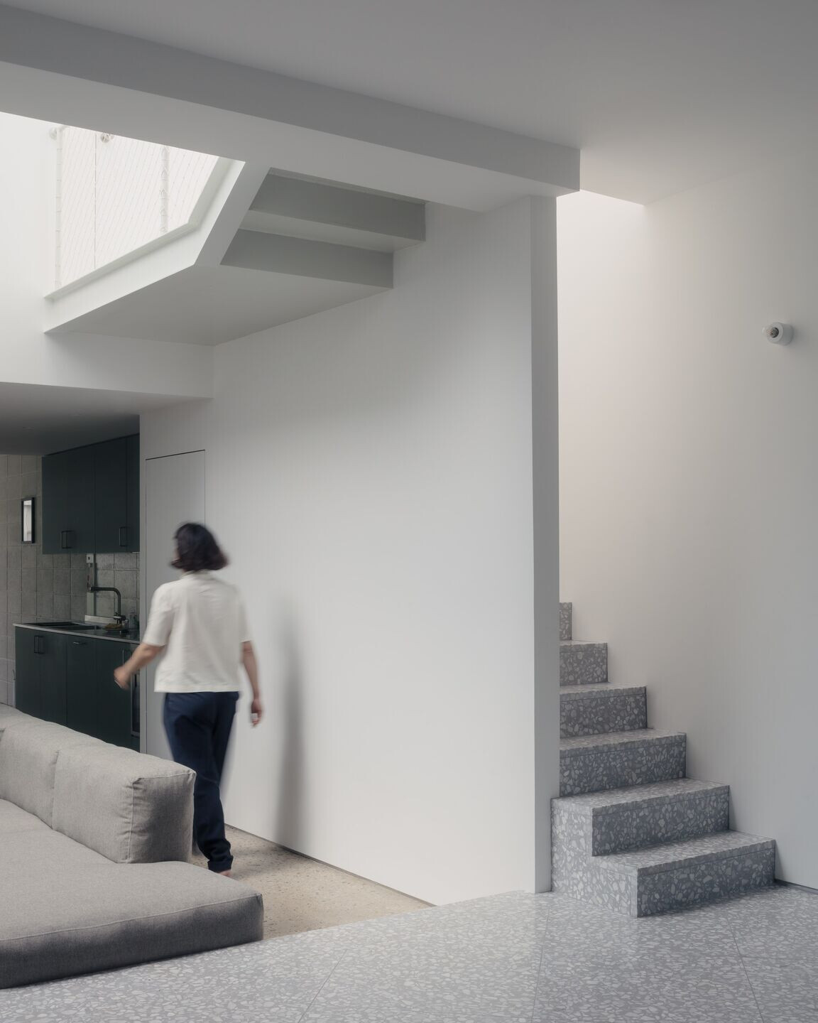
What is the thinking behind the netted balustrade?
Inspired by Japanese examples we wanted to create a lightweight infill of the steel structure, which at the same time would ensure safety. All the exposed steels have been painted in the same off-white colour.
What kind of relationship is there between the interior and exterior spaces?
We were striving to achieve a seamless connection between the inside and the outside. The dining floor and the terrace are leveled so when the rear slider is open the outside and the inside merge together. The profiles of the sliders are very thin and minimal visually dissolving the barriers between the internal spaces and the garden. The garden room is conceived as another room of the ground floor which also completely opens up to the garden. The materials palette, the light fixtures and the colours palette which were used in the exterior are the same as in the interior, enhancing the feeling that both form part of one whole.
Can you tell me more about the landscaping – the transformation is impressive!!!
Thank you! The garden has been conceived as a patio between rooms of the house enclosed in blockwork walls. The side walls have been treated as vertical extension of the horizontal surface of the garden, and are used for growing climbers such as jasmine, grapes, honeysuckle, raspberries, beans, peas, and even a climbing fig. The bird’s houses and bug hotels are also mounted on the walls. The planting in the garden is a combination of productive and decorative landscapes where each contribute to the success of the other. The biodiverse turf with multiple wildflowers species attract pollinators which in turn pollinate vegetables and fruits. For example, broccoli, spinach, carrots and beetroot plants are intermixed with anemones and echinaceas busting the myth that growing food cannot be beautiful. The herbs and spices area are planted opposite the kitchen and includes rosemary, sage, lavender, mint, chives, parsely etc.
Most of the surface of the garden has been left unpaved to allow for natural rainwater runoff. The terrace is permeable, made of the same terrazzo pavers as the hallway, office and the reception. The permeable joints of the terrace have been planted with aromatic thyme, which emanates amazing scents every time someone walks on the terrace.
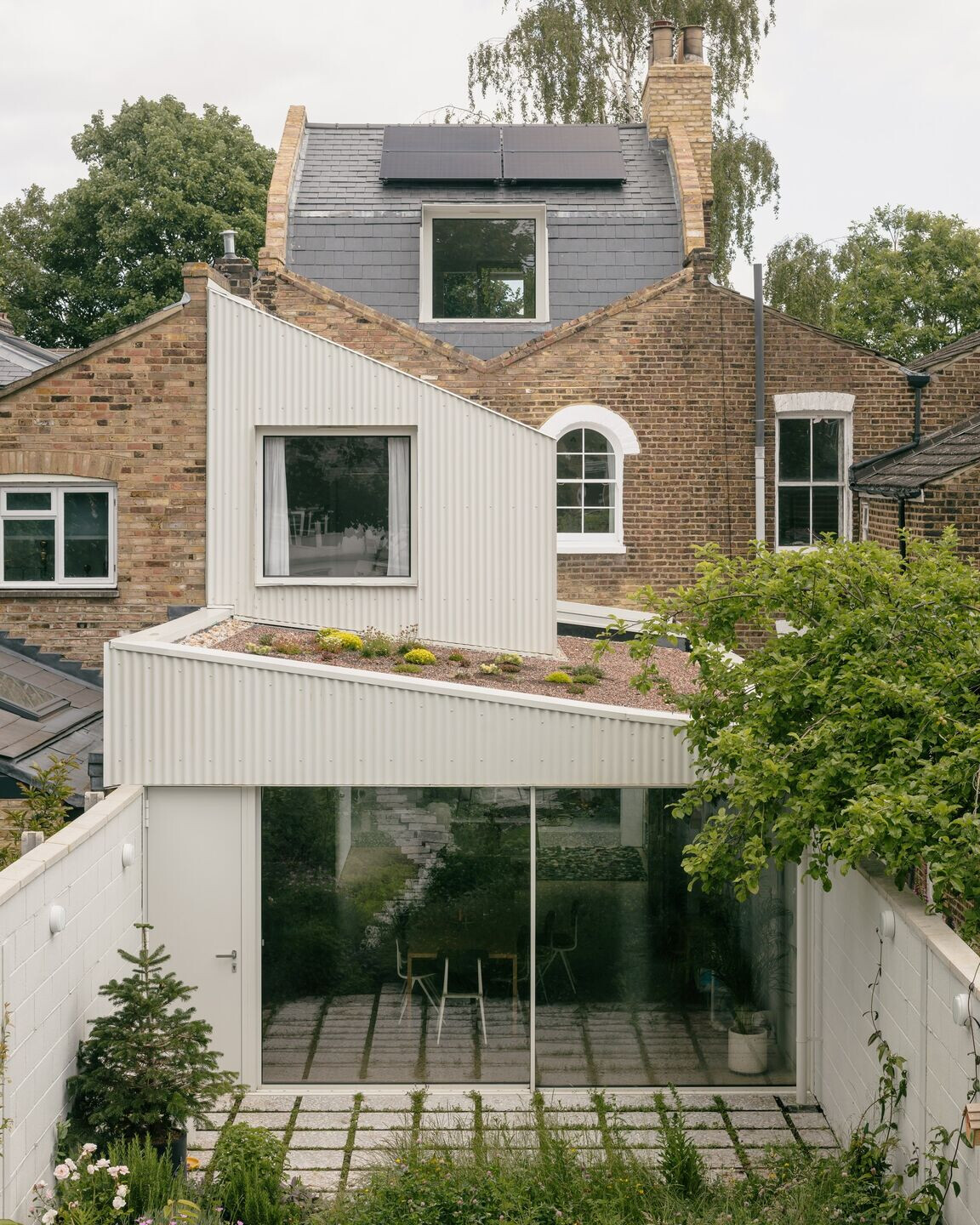

I also love the green roof – can you tell me what is planted here? What function does it serve?
The extensive green roofs on give great views from inside, contribute to the outlook for the neighbours, but also reduce the urban heat island effect, the rainwater runoff, and encourage biodiversity. The roof of the ground floor extension has been planted with various sedums, while the less accessible roof of the garden room roof has been planted with drought-proof festuca glaucas which don’t need much looking after, but also look great. These blue grasses also echo the grasses from the mid portion of the garden.
What were the key challenges for this project and how did you address them?
The planning stage was quite lengthy, and it took approximately nine months before we filed in the full planning application as we went through two pre-application submissions with the council. The initial design looked quite different from what was finally submitted; the council was reluctant to accept any other than a traditional mansard loft extension. Luckily we found a design compromise, and complemented the mansard roof with contemporary interpretation of dormer windows.
What is your favourite aspect of the project / what did you find most rewarding about the project?
The most rewarding part of the project is to see the result of our hard work, to see the pictures before and after. It has been a long challenging journey and we put all our soul into the project, but the transformation is astonishing.
What was the budget for the build? (If not confidential) Was it difficult to keep to the budget (or was it exceeded?) What measures/considerations did you have to take to keep to the budget? Where did you save on the budget? What was the most costly part of the build? Why was it worth spending the money here?
The budget of the build was £350K including fees. The Covid has impact on construction materials prices and availability. To keep to the budget we had to modify certain details and sometimes compromise on the design choices without affecting the overall quality of the project.
What is the reaction of the client to the finished home?
We were simply amazed with the beautiful and spacious home we achieved as a result. Our small children love playing in the garden and look after the vegetables we grow, they now got so much extra space to run around.

Team:
Architect: Pashenko Works
Structural Engineer: Blue Engineering
Approved Inspector: Wilkinson Construction Consultants
Photography: Stijn Bollaert
