The location
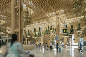
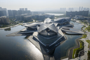
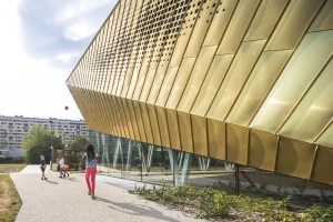
Inaugurated in November 2023, Merlata Bloom Milano constitutes the urban connection link between two of the most important urban regeneration projects in Milan, Mind and Uptown, with the declared aim of re-establishing the transformation of the north-west quadrant of the city of Milan in a sustainable way . The area was purchased in 2019. The building was built in record time, during the years of the pandemic, immediately aiming for Breeam sustainability certification, an evaluation protocol that implies an integrated design policy, the sustainable choice of materials , the creation of efficient systems.
The building was designed by CallisonRTKL (CRTKL), while the municipal and executive project was carried out by Rossetti Engineering, a company that is part of the ImmobiliarEuropea group. Merlata Bloom Milano will have as its catchment area the first residents of the new district - around 7 thousand (2,500 families) - in addition to the historic Gallaratese-Rho district, reaching around 3.6 million possible visitors.
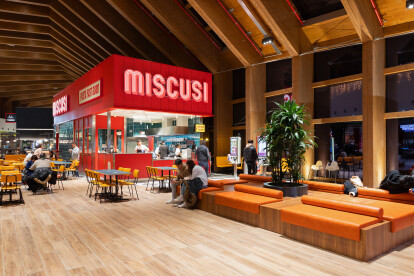
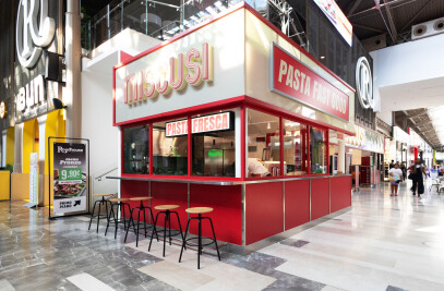
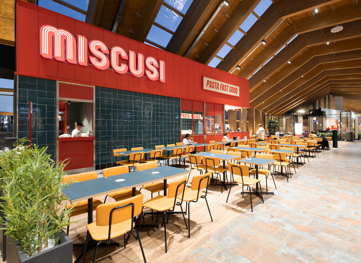
The real estate unit designed for the MiScusi client consists of a freestand kiosk overlooking the centre's food court.
The project
As highlighted in the keymap, the kiosk is positioned in the center of the area that acts as a bridge between the two blocks of the centre. The positioning of this "corridor" is suspended over a road connection of the real estate area, suggesting some aesthetic and functional choices of the project, which in some ways refer to an outdoor environment. Since it is a strategic and almost obligatory passage for the passage of user flows between the two blocks of the center, Avamposti wanted to create a declination of the format that would suggest a rest station. The aesthetic universe of the visual imagery that we saw in the paintings of the American painter and graphic artist Edward Hopper was translated architecturally into some choices of palette and materiality, without betraying the characterizing elements of the format. The resulting perception recalls the familiarity and imagery of a "stop" in a place of rest, which breaks the fatigue of a long journey.
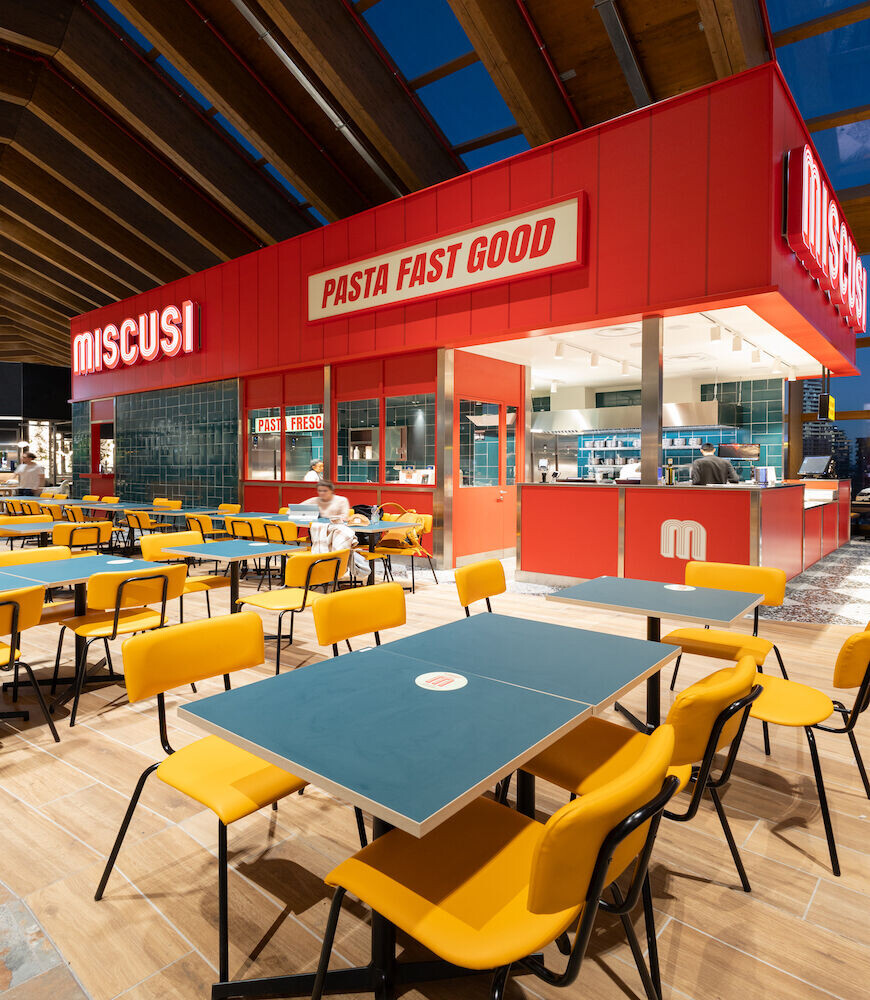
Also in this case the design took place in a synergistic way with respect to the requests and needs of the customer, taking into account the indications and requests for stylistic alignment and conservation of volumes expressed by the ownership of the shopping center.
All food & beverage set-up projects, inserted in shopping centers and food courts, require a delicate feasibility verification process that fulfills the wishes and enhances the characterizing aspects of the format, respecting the indications and technical requirements of the shopping center.
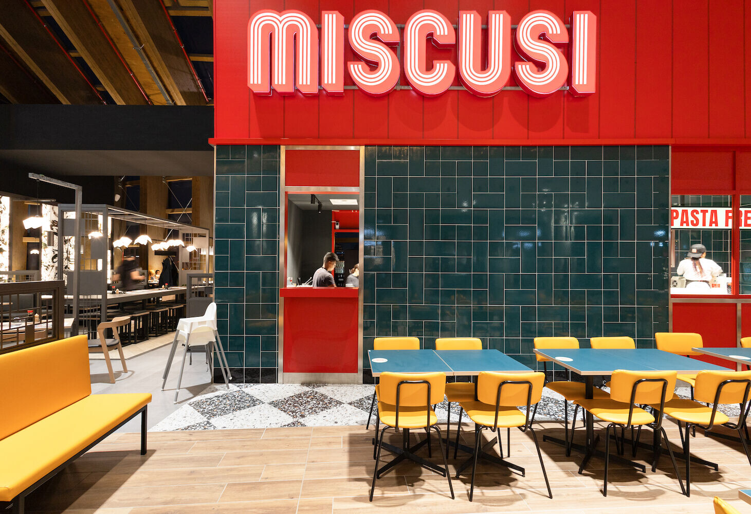
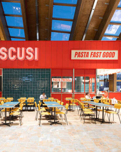
The irregularity and curved tracing of the surface on which it was possible to lay the floor characterizing the format contributed to defining the Miscusi kiosk as a passing satellite. The seats, placed on one side on the windowed side of the "bridge", on the other towards the food court, seem to almost explode compared to the monolithic volume of the kiosk, as happens with the outdoor tables of a café in the square.
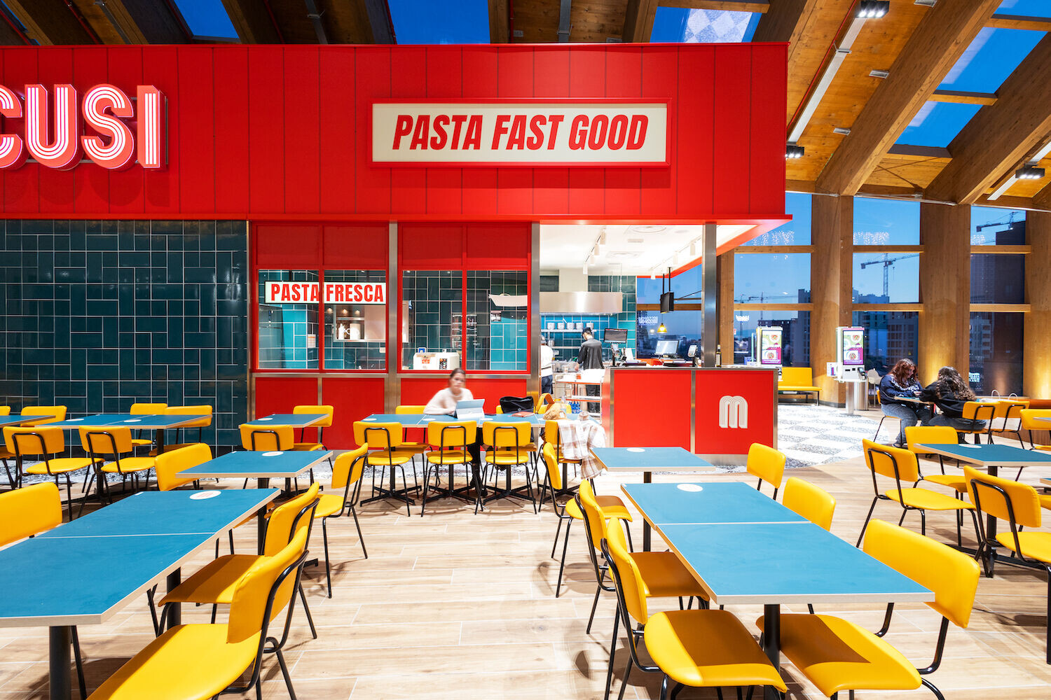
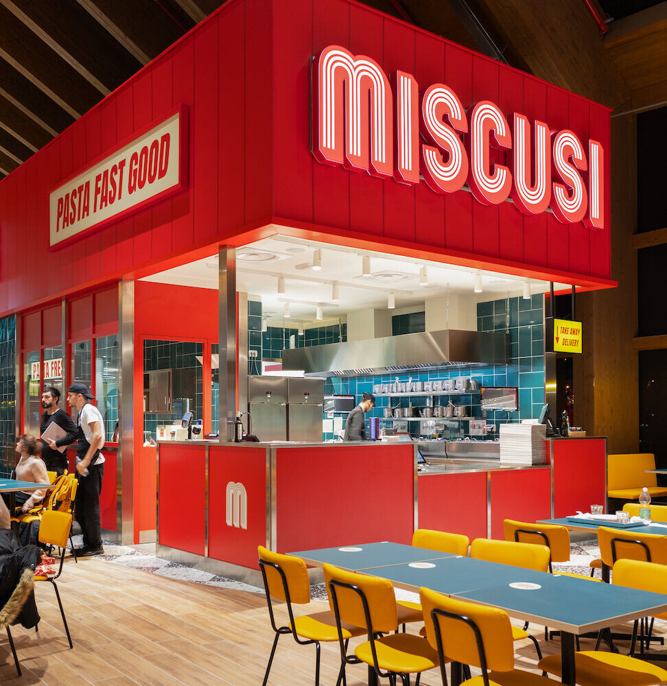
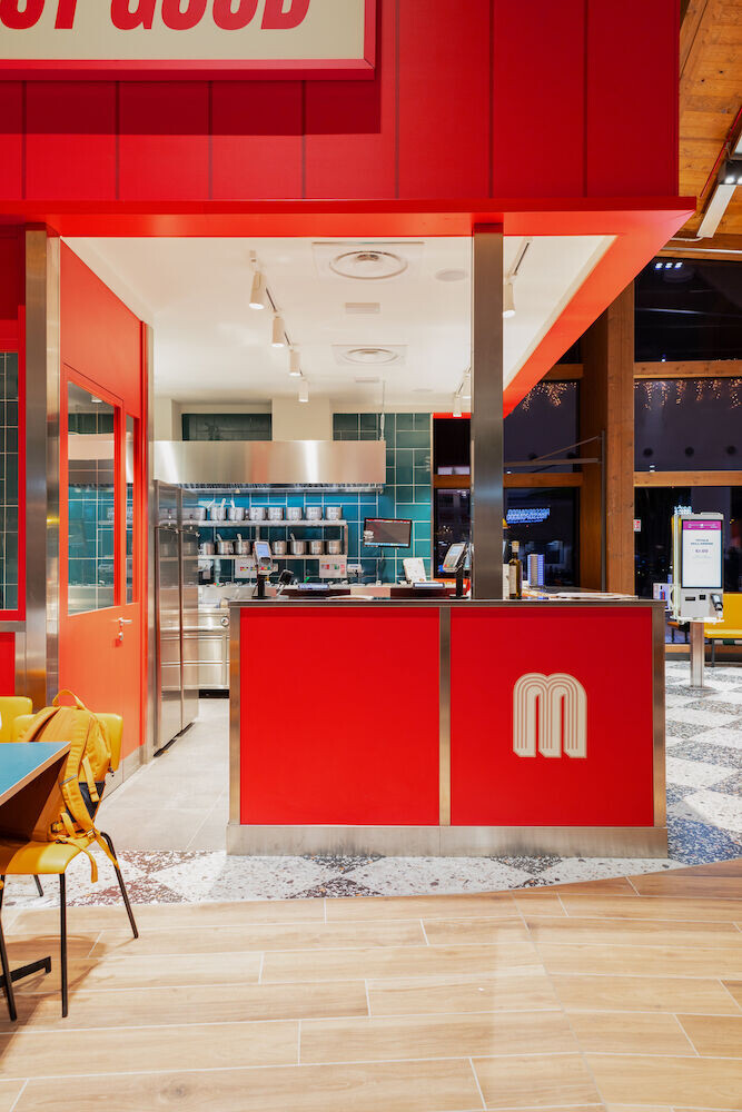
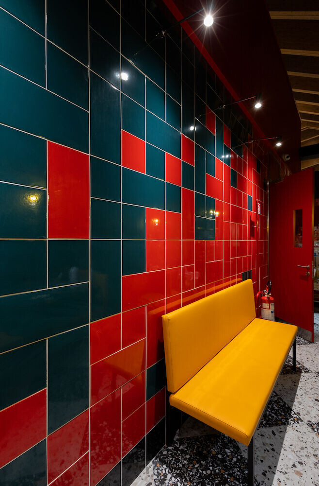
The kiosk stands out from the surrounding units above all thanks to the choice to highlight its height. The shiny green tile entirely covers three sides of the pasta factory-kitchen-cash-service block, acting as a background and contrasting material compared to the red and cream of the brand's three illuminated signs. The installation of the green tile mixes its square and rectangular versions, changing rotation with each module, creating a rule that results in a dynamic, apparently random effect. The visual play is definitively achieved in the completely closed side of the kiosk, the one overlooking the windows: here an incursion of the red gradient takes place which ennobles the wall with the two technical accesses for the staff.
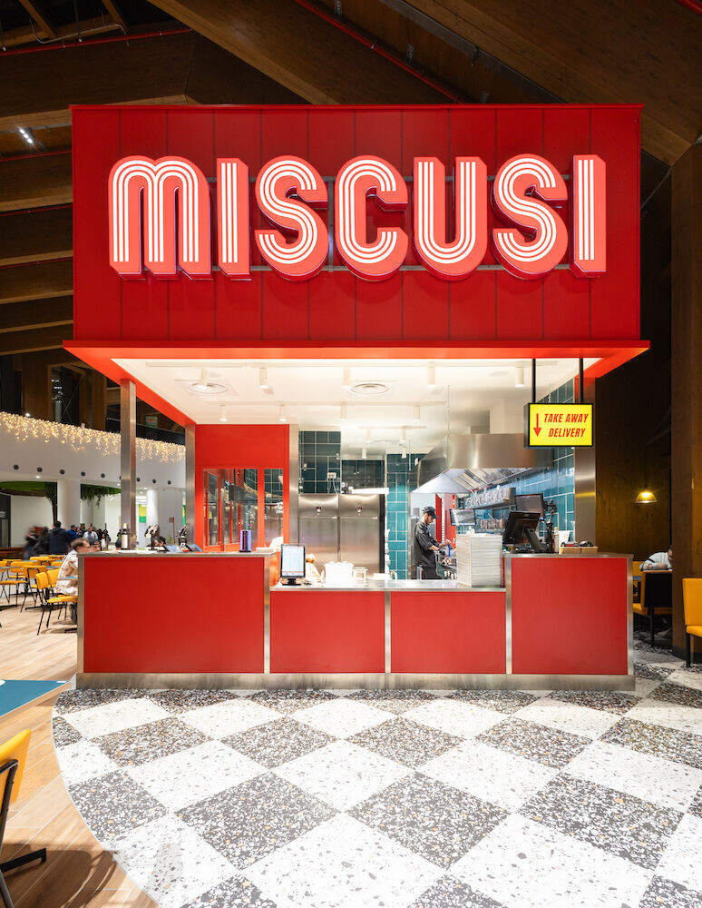
From the cross-section it emerges that the height was created by adding a sort of elevation compared to the kiosk.
Compared to other projects, here the main block compacts and incorporates all the technical areas of the pasta factory and kitchen in approximately 45m2, positioning the order, payment and customer service counter in the most exposed corner of the unit. Despite the small size, the window overlooking the bronze drawing production, a characterizing element and reason for the qualitative uniqueness of the brand, has been preserved.
The corner of the central block overlooking the food court is visually delimited by the contrast with the green tile cladding we mentioned. This area overlooks the pasta factory area and is interrupted by a small corridor which allows access to the service and cash register area. In continuity with other rooms of the format, the load-bearing structure of this corner was created with an iron core, partly glazed and partly covered in red Formica-like material.
The kitchen
From this detail of the plan emerges the effort to preserve all the operational elements that we have already seen in other projects, albeit revised to fit into the small size. The flows of the operators, studied together with the customer, move from the production area to the kitchen and plating niche, insisting on the corner cashier and customer service counter.
The wall intended for cooking and seasoning pasta is entirely covered with green tiles with the same installation pattern as the external walls. In contrast, all the kitchen elements are in highly polished stainless steel, including the fridge units, which, being visible from the room, become furnishings in their own right and contribute to the storytelling of craftsmanship and authenticity of the format's preparations.
From this section emerges the detail of the division of operations conceived already in a preliminary architectural phase. The distribution of the "L" block represented here clearly defines the customer approach flow, from the order and payment phase to the collection of the tray. Mirrored, this configuration determines the orientation of the flows and the operational times of the staff who, in a few minutes, will be able to accept and process the order, cook and season the dishes, delivering the product plated on 40x30 trays, already neatly set up on the service counter and/or in the overhead shelf on the right, intended for the collection of take away orders by customers or delivery riders. A waiting area is also reserved for the latter which does not hinder customer sessions.
The front of the food pass is made with the same red formica and steel-like finishes that we also find in the service counter and in the cash register corner. Here the shiny metal element, which served as a frame for the red panels, also becomes the supporting column of the open section of the cash desk and the open compartment serving the room.
Seating area
The real estate unit is delimited by the tile laid on the ground, with a stoneware grit effect, which reproduces the ancient cement compounds characterized by the presence of stone chips and marble granules, now commonly referred to as Venetian terrace. To add interest to the installation, a checkerboard effect was created, contrasting light and dark tiles.
The seats irregularly surround the entire central block.
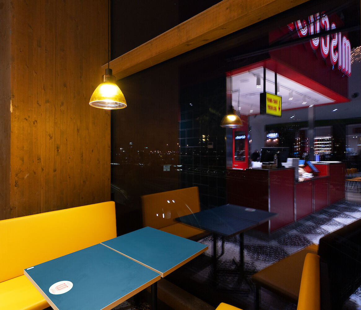
Following the curved line of the glass wall of the shopping centre, panoramic lounges were created, placing the polenta yellow padded benches with contrasting black iron structure characterizing the format against the load-bearing wooden structural partitions of the centre. Two, three or four tables have been positioned between the benches, based on the depth allowed by the niche, surmounted by suspended chandeliers with warm light and orange glass lampshades, which suggest an almost homely environment. The chandeliers on these seats are independent furnishing objects, with a dark iron structure with a suspended arm: the result is an interesting hybrid between a ceiling chandelier and a floor lamp, which integrates in a creative and functional way with the particular needs of the center .
The remaining seats surround the central block, positioning polenta yellow upholstered tables and chairs in an irregular and modular way, naturally going beyond the curve outlined by the laid floor and occupying part of the passage corridor of the center which serves as a food court.


