Sageun-dong, where the building is located, is a neighborhood where students from neighboring universities live. (Because of the lack of dormitories) For the lease project for the students, the landlord decided to break down the single - family house that had lived for decades and to build a multi - unit house with a fully-furnished studio apartmenton the spot. It was the first time for a full-scale rental business, and Sageun-dongserved as a dormitory for a nearby university, so the owner was a kind of latecomer. Naturally, we needed devices that could win in competition with the surrounding other studio apartments, and in addition to that, we felt a sense of responsibility as a long-time inhabitant of the neighborhood, who wanted to provide a better residential environment for students.
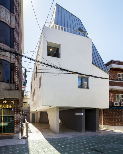
The land area was small and shape was lozenge, first job was to find the maximum possible volume to create a proper environment. We traced the maximum volume along the slant line for solar access and the shape of the land, and ultimately found a diamond-shape slanted mass.It was not a common pattern, but it was not to be treated.
The focus of the building plan was on diversity. One of the reasons for the poor living conditions of university students is that they are not given the opportunity to choose the space. The size and shape of units are the same, and it is easy to extract the maximum amount from the limited land, so diversity is neglected in many ways. Even so, we still believe that the right to choose space is important. To do this, we first manipulated the windows of the units. The windows in two units with identical floor plan but on different floors were positioned differently.
The position and open direction of the balcony also change from unit to unit depending on theof sight and level on the road. The smaller the room, the greater the impact of change. The layout of the built-in furniture varies greatly from room to room along the window and balcony. We want tenant to look aroundthe unique units in these building and raise their taste of space and reclaim our right to home.
As part of that process, within individual units, we tried to divide the area.It is uncomfortable to live in a small space because there is no space compartment. Different kind of spaces, however small, need to be present in a house; spaces such as a balcony, multipurpose room, bathtub, a living room loosely separated from the kitchen, built-in cabinets or closet that fit the space, etc.If you can find a dirty dishes in your sink on the bed, daily life is likely to be miserable. In the small studio apartment, we want to lighten the sun and need fresh air, but the gaze on my door and window is always annoying. So we desperately need minimal distinction between balconies, bathrooms, kitchens and beds.
The shape of each unit, which was shaped by the influence of the staircase, was an opportunity to answer their own situation. In Room 201 and Room 301, we took the squatting area into the kitchen and separated the living room and the kitchen loosely. The first impression is wide and looks good, but we cannot solve the miserable life in small room. We set built-in furnitureto approach both sides for most units. As a result, at least the bed is hidden in the front door and kitchen. The landlord wanted to put a bathtub in the bathroom, it was a suggestion to match the attitude of an architect who wanted to preserve the traditional quarters of the house. Finely arranged balconies in relation to the surroundings are our gifts to young students. We hope to have a little breathing through this transition space.
The landlord is living together in this building.While the owner usually uses the top floor, but this case landlord lives on the fourth floor. This makes it possible to utilize a four-story veranda.
The two slopes along the slant lines for solar access meet at one corner at respective angles. In order to minimize the contamination of the slopes, we decided to use zinc standing seam finishing for the slopes and worked with the joints based on the corner where the two slopes meet. In this way, we were able to finish the corner with the standing seam alone without using additional flashing. As shown in the elevation, the finishing resultingly accentuated the slanted mass. The design process of this building is not an "invention" but is a kind of "discovery" in that its most significant design element was automatically calculated based on the Building Act prescribing slant line for solar access. Our task was to reveal the virtuality that is spread around the site through the language of architecture, and what was needed here was archaeological diligence rather than inspiration.
The finishing material used for the slopes was a product called Azengar from VMZinc. It is a matte light grey product. It is not our way to finish a strong formative change with a strong material change. The finishing for the slopes was chosen among natural materials that would clash the least with the white stucco finish on the vertical face of the building. Due to cost problems, we were unsure until the last moment whether we could proceed with our plan. Fortunately, thanks to the determination of our client who trusted the initial design more than the architect himself, we were able to realize the design. As the building looked like a 3-year-old building when it was just completed, we hope that it will look like a 3-year-old building even after 30 years.
