This modestly sized apartment, owned by a senior doctor, is located in one of the newly built towers in central Tel Aviv. Meticulous planning, a well-balanced use of colors and materials, and planning of clever storage solutions transformed this property into a pampering space with the bonus of a breathtaking view at sunset.
In recent years, Tel Aviv has become a bustling building site. New cranes are popping up daily indicating the start of exciting new building projects. An apartment in one of these recently completed buildings, which doubles as a green lung in the heart of the busy city, is owned by a senior doctor who moved to the city after years of living in a spacious private property in the countryside.

The move from the village to the lively city, and the downsizing of living space to an 80 sqm apartment, required the designer duo Tsipi Yavets-Chen and Paz Chasdai to come up with creative storage solutions that would support practical and comfortable living.
"The client was clear about his design vision from the start: an elegant apartment with a sophisticated and youthful touch, like a pair of comfortable jeans paired with a designer shirt, creating a fresh and immaculate property with an urban vibe”, recalls Yavets-Chen. “Thanks to the correct use of natural materials, we created a raw canvas that was used as the backdrop for more sophisticated design elements”, she adds.


“We stripped the apartment back to its shell with the intention of creating a multi-functional open space”, says Chasdai who adds: "we used the surrounding view as our focal point and planned the interior with the curved building structure in mind, creating the perfect panoramic picture”.
According to both designers, the green view can be experienced from the entrance to the property, along with glimpses of the sea peeking between the buildings.
“The design focused on the flow of the breeze, light, and view, and as such, all internal walls were taken down with the exception of one wide pillar in the living room and the cube-shaped safety room in the middle of the space. Those two massive elements became the keystone of our design. By exposing the original walls of the safety room, we uncovered perfectly smooth concrete that was previously concealed by plaster. In addition, we raised the height of the apartment by disassembling the suspended ceiling.
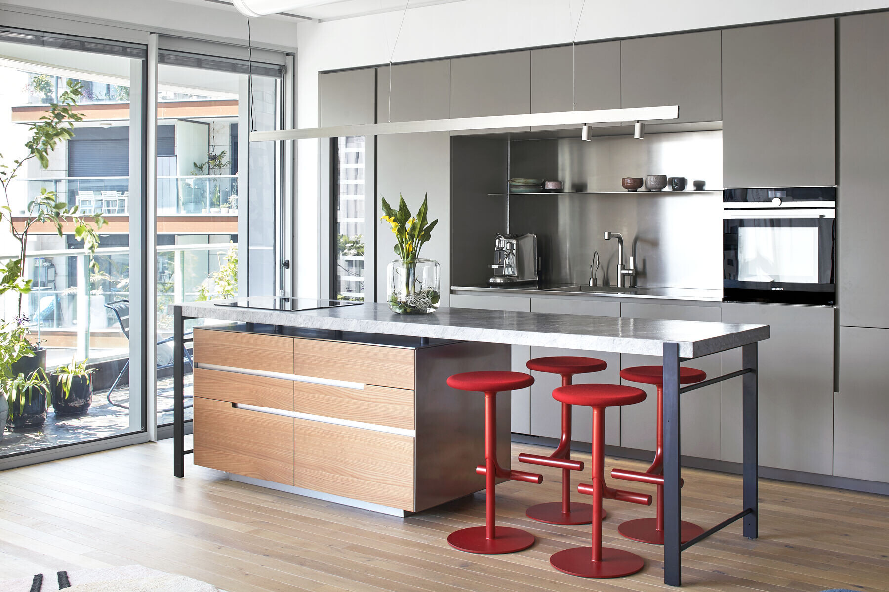
The kitchen, which is located in the heart of the open space, was fitted with tall cabinets. A working niche in brushed stainless steel reflects the view is located in the center of the space. Storage cupboards and a niche for a wide integral fridge were designed to the right, and a luxurious wine fridge was fitted to the left.
An island was designed in parallel to the kitchen cabinets. The island, which seems to be floating on a wood and stainless-steel cube, thanks to the support of two thin iron legs, is made of a velvet-textured matt-gray stone worktop. This island can be used as a kitchen worktop as well as a comfortable workstation in the heart of the apartment.
The designers chose wine colored bar stools that can be lowered as needed when entertaining. A long light strip was fitted along the air conditioning ducts above the island as a final touch that draws the eye to the surrounding view.
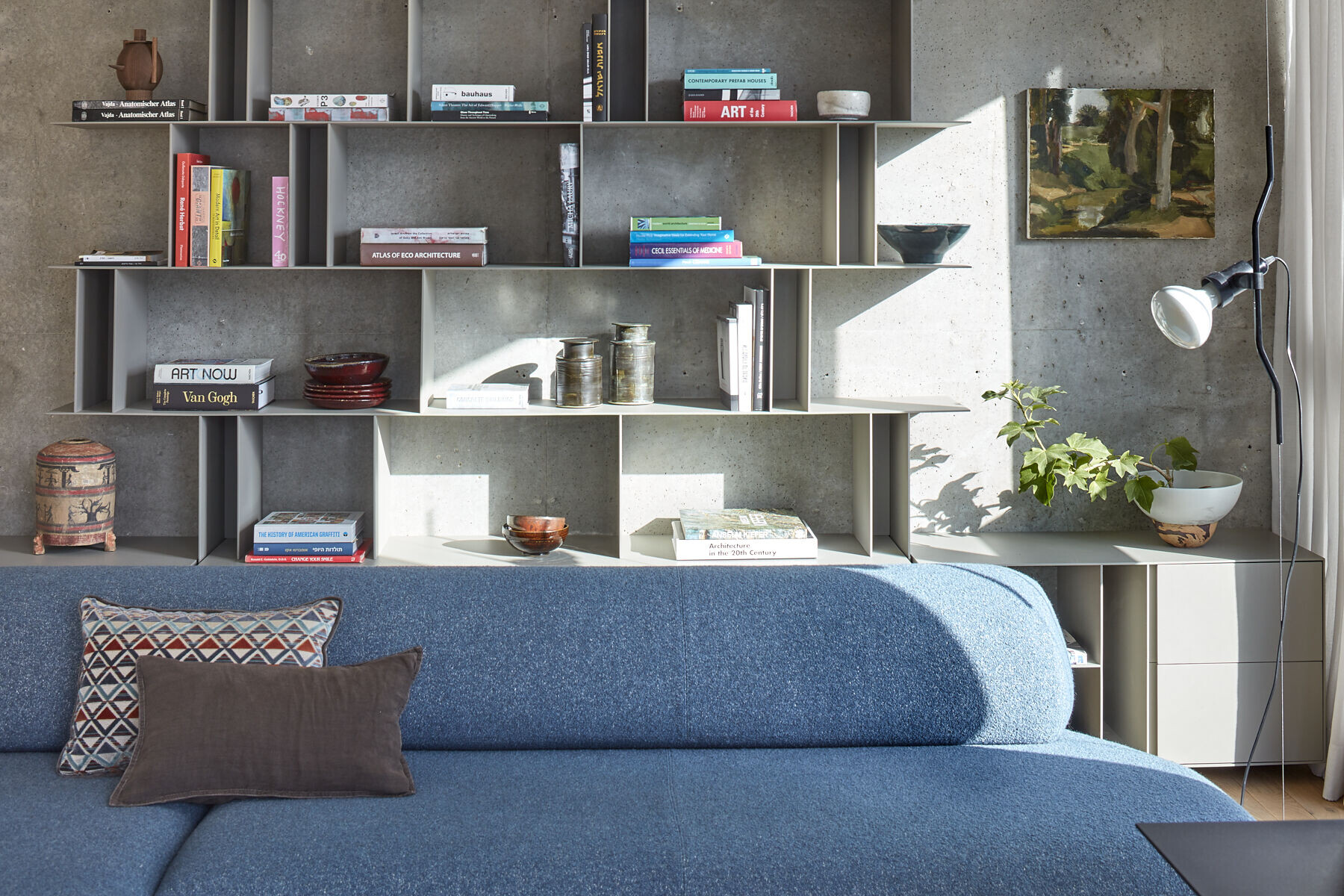
A long-curved steel blue sofa was positioned against the concrete safety room wall, facing the urban Tel Aviv view. A classic forest-green 70s’ armchair and footrest were positioned across from it. Round iron and concrete coffee tables stand between the two seating areas and two floor-to-ceiling lamps were fitted next to the sofa.
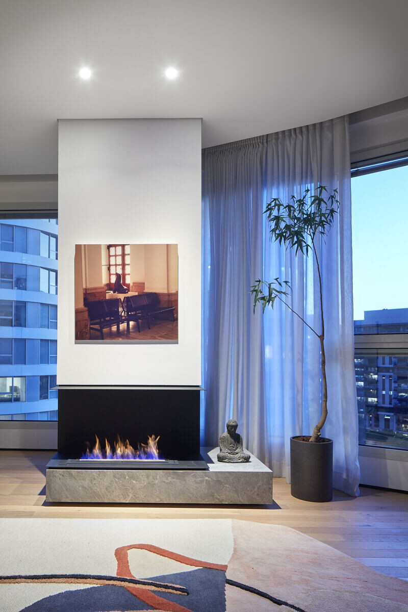
A black iron fireplace surrounds the remaining structural pillar in the center of the open space, along with a stone bench that creates a balance between the elements. An art piece by the local artist, Ruti Agassi, decorates the wall above the fireplace and creates depth and continuity from the curved windows.
“When we stripped the plaster off the safety room walls, we exposed a beautiful smooth concrete structure, thanks to which we managed to free up a few additional centimeters of space”, recalls Yavets-Chen. “A hand-made thin aluminum library was planned around the exposed cube wall. The lower part of the unit is dedicated to storage and the top part displays floating aluminum shelves that continue around the safety room, blend into the bedroom door frame, and continue into the bedroom itself”, adds the designer.
The safety room was designed as a cozy space with a wooden-legged divan bed and an adjustable burgundy wall lamp. A spacious cupboard with matt glass doors was fitted in the room, with open storage created to its right. A wall-mounted folding desk and wall-mounted tv clear the space from any objects.

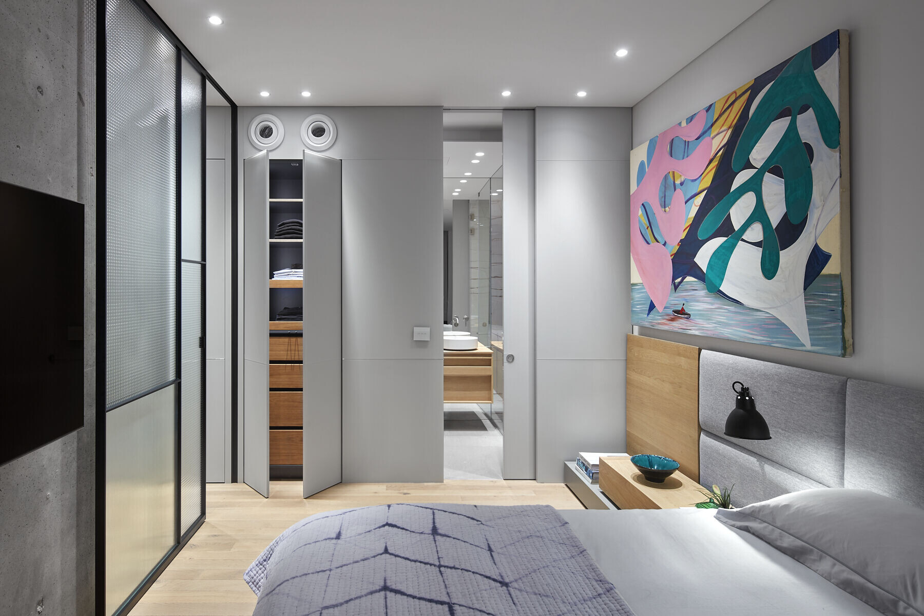
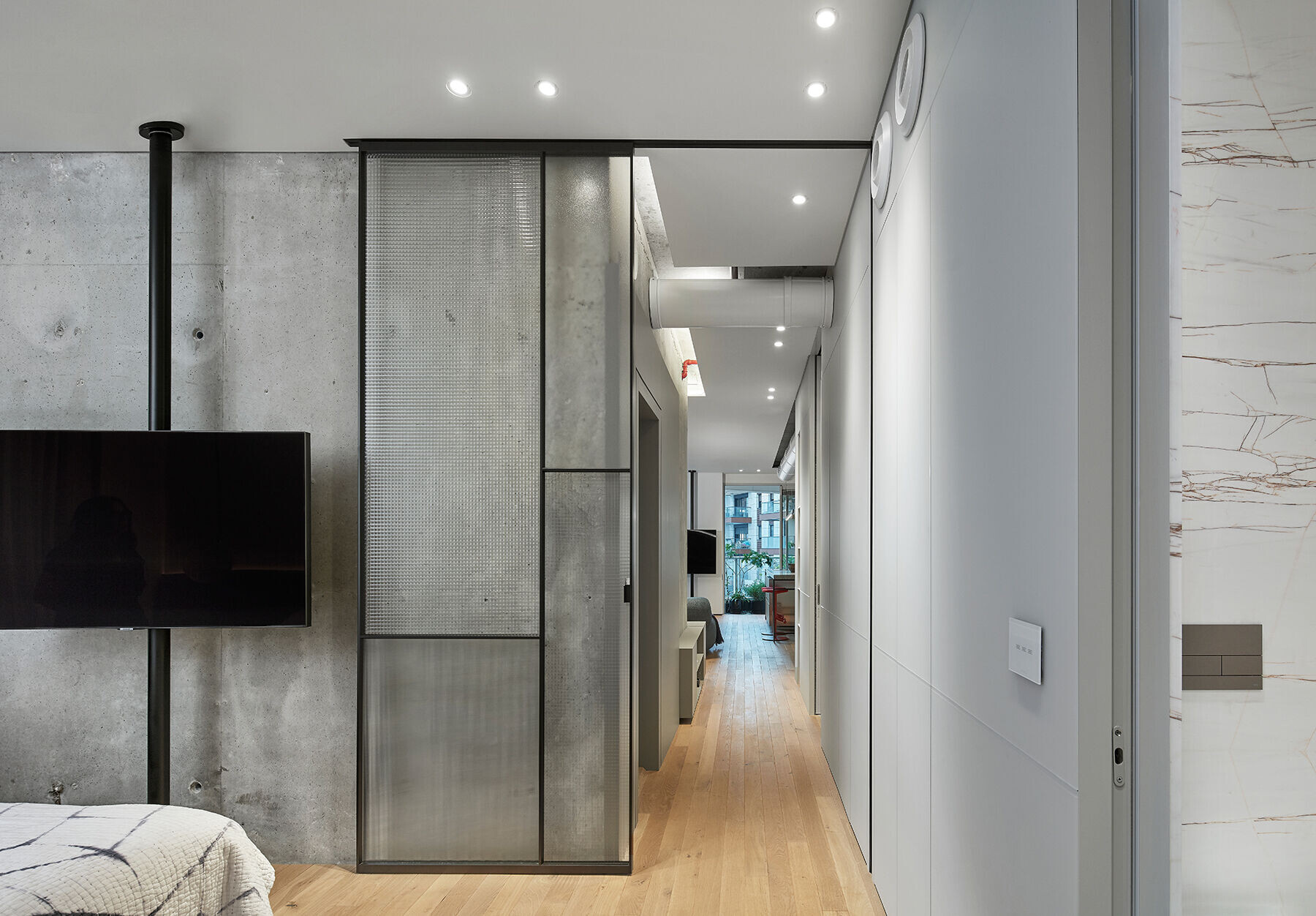
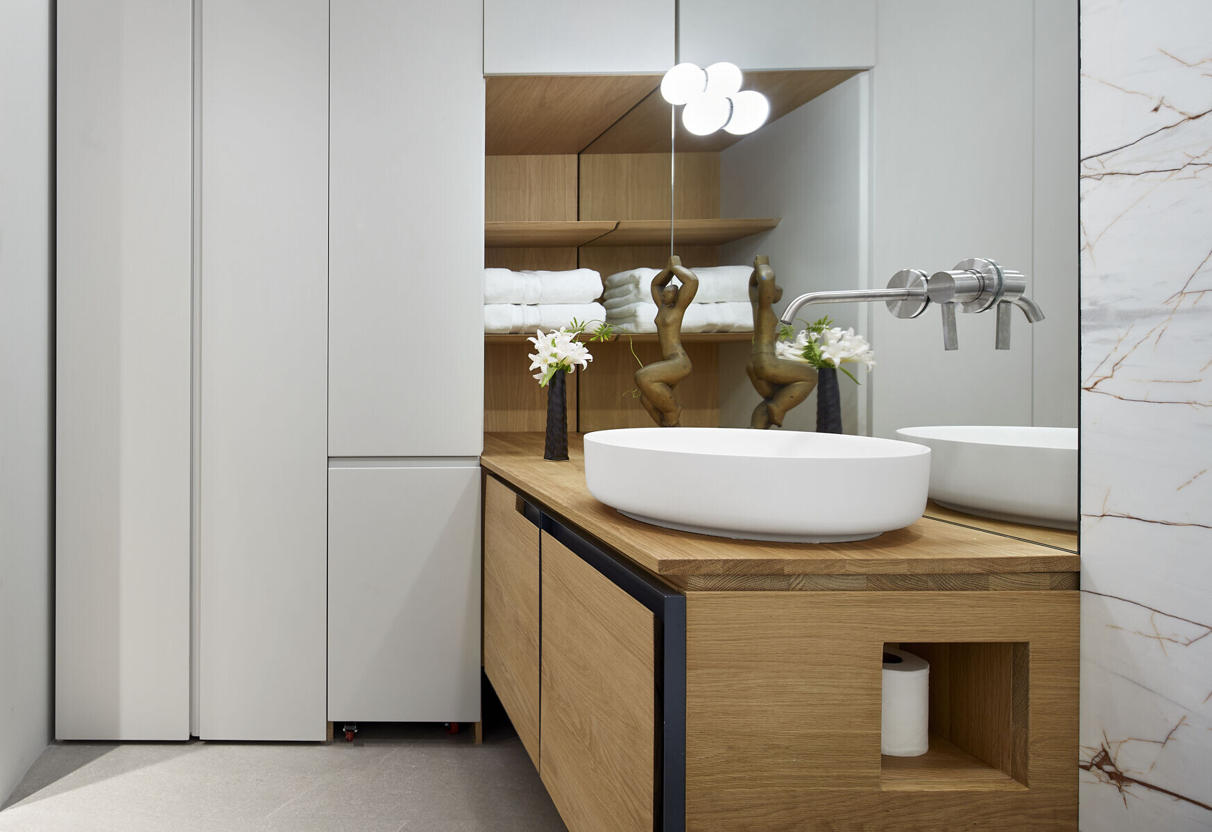
“In the absence of walls, we created a continuous visual axis that runs along the length of the apartment - a double-sided carpentry unit that starts in the bedroom and ends as an exposed air conditioning duct above the kitchen island”, explains Yavets-chen “Within the unit, we incorporated a significant amount of storage space dedicated to various needs. The storage axis includes functions such asspace-saving sliding doors that lead to the bathroom, an air conditioning system, plumbing, a media cupboard, and a smart home system. The electricity cupboard is located in the corner of the axis by the entrance door and is made of spaced panels allowing for ventilation. The panels are lined with a breathable fabric to conceal the content.
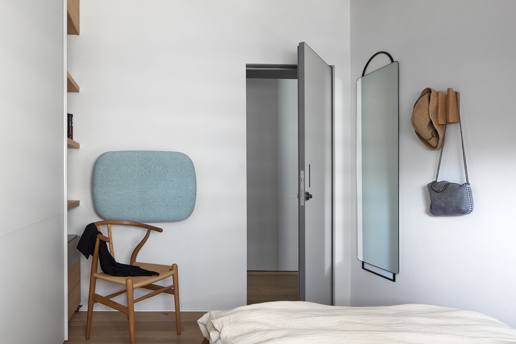
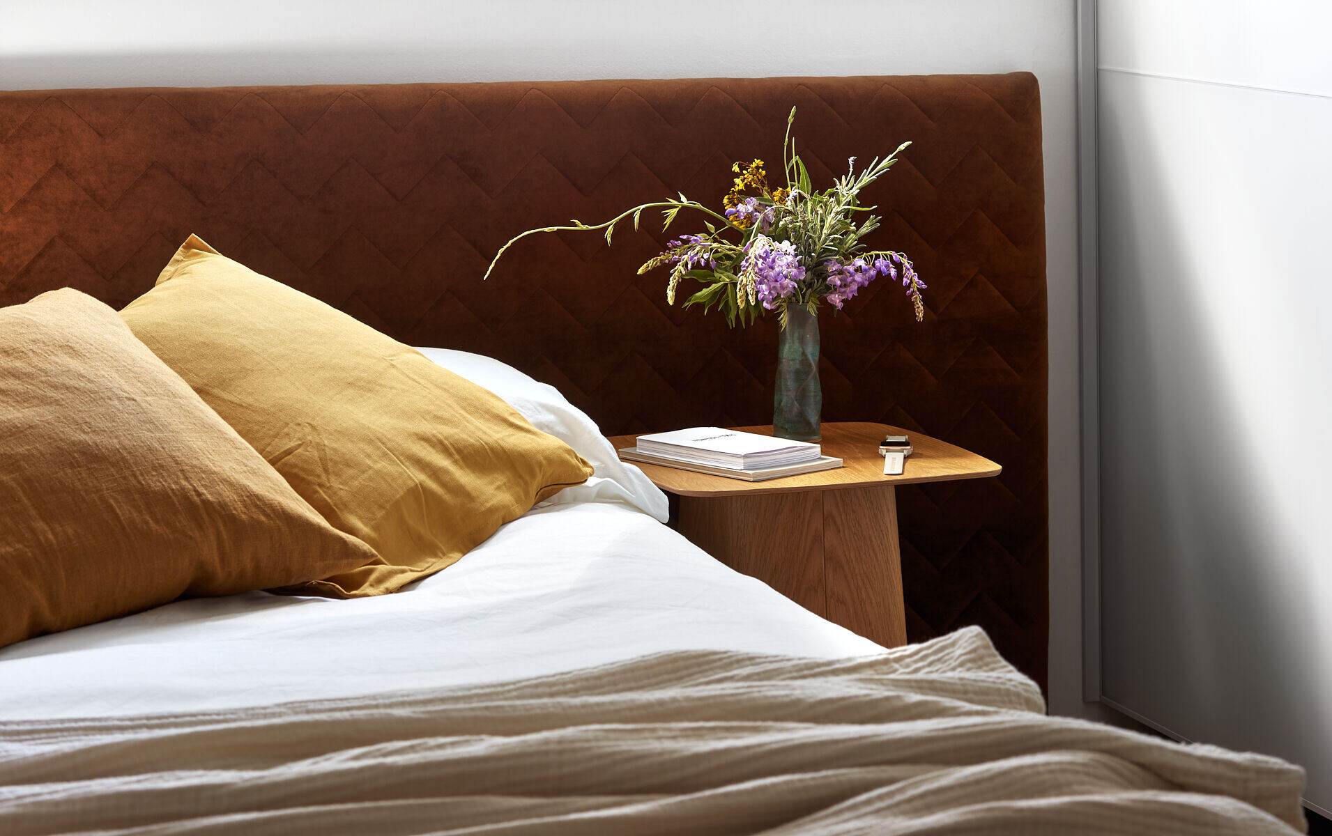
The bedroom is located at the end of the corridor and partitioned by a custom-made sliding door in a variety of textures, allowing the view and natural daylight to fill up the space. The sliding door also divides the left wing from the exposed concrete wall to the right, and between them artworkby the Israeli artist Shai Azoulay is displayed.
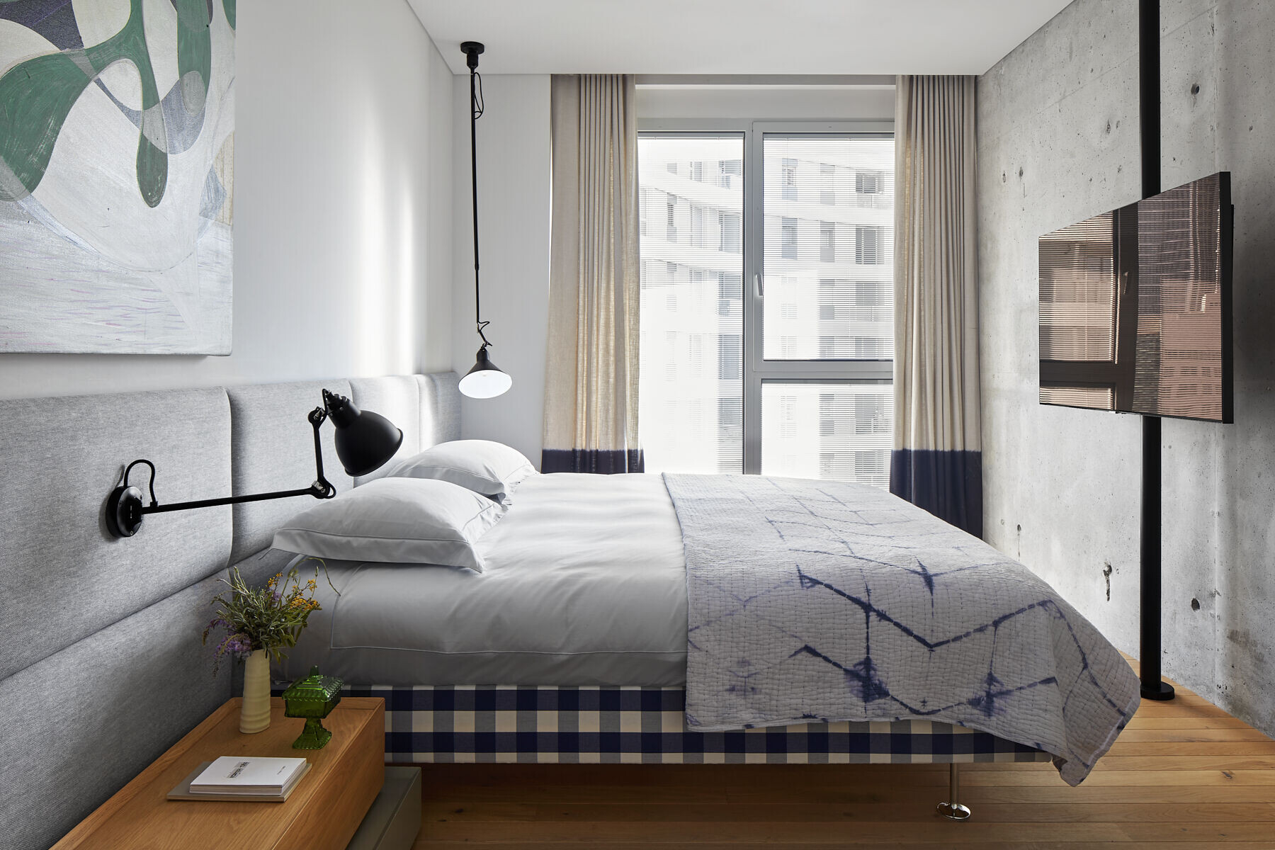
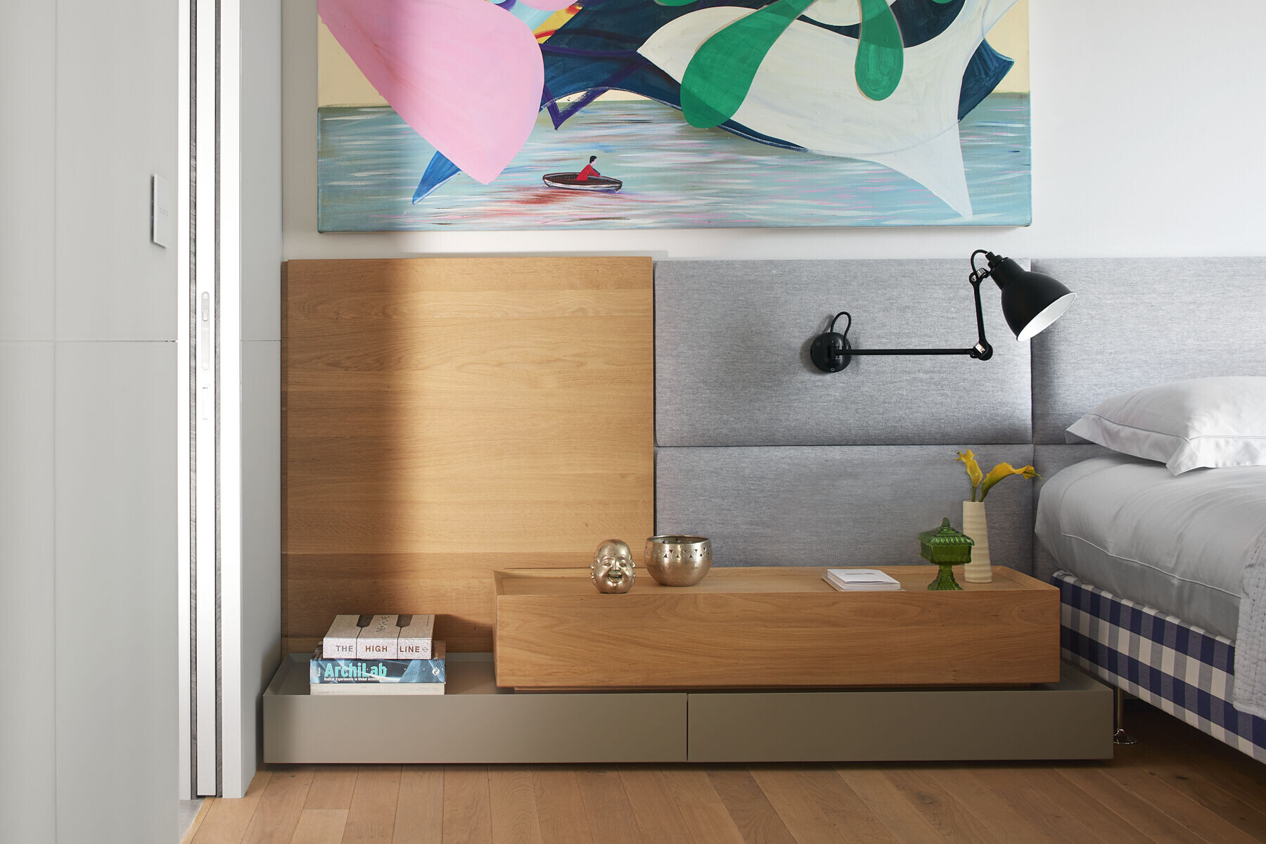
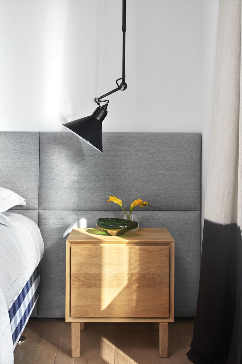
An iconic bed was positioned in the center of the bedroom, for which the designers created a fabric and wood headboard that runs along the wall. Stacked wooden cubes were designed to the left of the bed, under an art piece, and to the right, a wooden bedside table. A couple of light fixtures extend from the wall and the headboard. The TV is fitted onto a free-standing floor-to-ceiling TV mount. The concrete wall, along with the glass door create an interesting play of materials - raw versus refined.
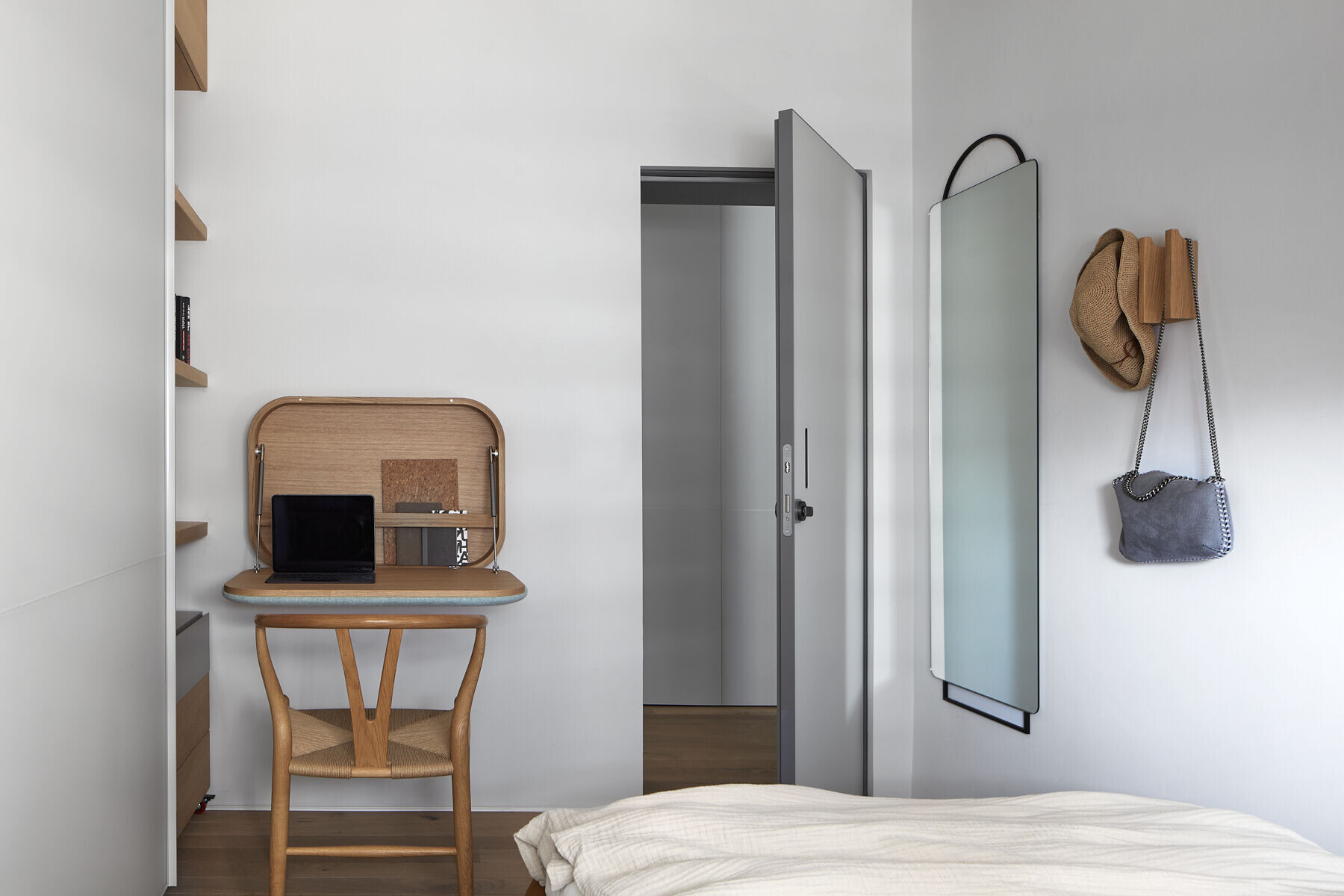
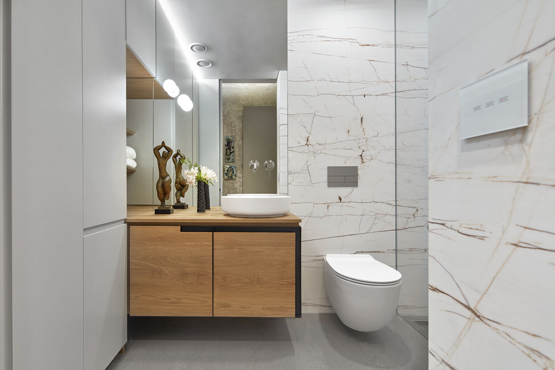
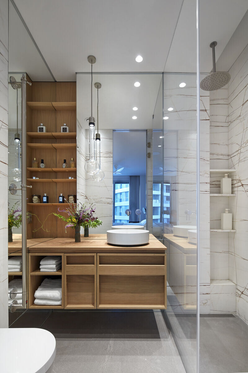
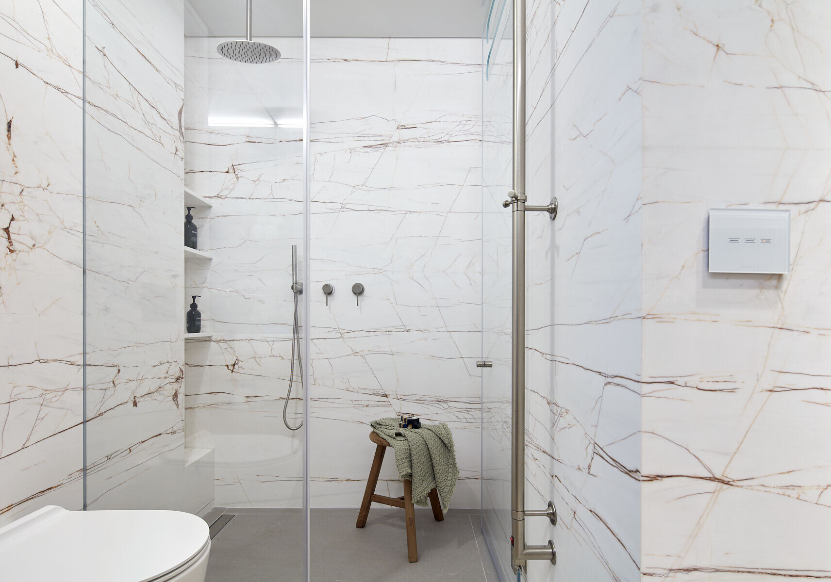
The bathrooms are located further along, as customary in contemporary new buildings, and as such, they lack any natural daylight. “We needed to lighten up the space and give it depth, and as such, multiple mirrors were fitted in the space to reflect the light”, explains Chasdai. “The Corten veined natural stone tiles compliment the mirrors and seem like a delicate piece of art in the space. We embedded stone niches in the wet areas for elegant storage and the light fixtures blend with the overall ambiance”, she adds.
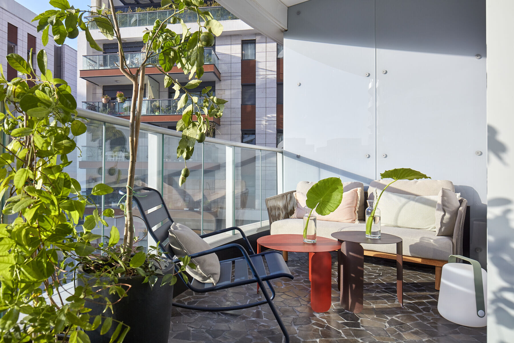
The view can be seen from all corners of the property. “We created the feel of a garden on the balcony, which is small but delightful: the original decking was replaced with a natural stone mosaic, and lemon, jasmine, and herbs were planted around it, framing the view of this lively city”, summarize the designers.
Team:
Planning and design: Interior designers Tsipi Yavets-Chen and Paz Chasdai
Photography: Shay Gil
Contractor: B-melacha
Material Used:
1. Library, covers: Bulla Studio
2. Axis: Nielsen
3. Media and smart home infrastructure: T.S.E Audio
4. Sanitary: Hezi Bank
5. Sofa, rug, chairs: TOLLMAN’S
6. Kitchen, togo, tables: HABITAT
7. Bed: Hästens
