Archello Awards 2026 · Enter your projects before 30 September 2026

Comercial architecture

An overview of projects, products and exclusive articles about comercial architecture

Project • By Studio di Giácomo • Restaurants

Carbone Pizza

In the heart of Florianópolis, CARBONE Pizza & Pasta was created in what used to be the garage of an iconic historic mansion from the 1940s, located on the land that also houses Berlin by Cité. While the main mansion vibrates with the city's artistic and cultural movement, CARBONE occupies the back of the land as a true Italian refuge — a welcoming space where tradition is celebrated in every detail. Rafael Ribeiro Rafael Ribeiro Rafael Ribeiro CARBONE's architectural design deeply respected the soul of the property, rescuing its history and highlighting the beauty of what already existed there. We peeled back the walls and revealed the charm of the original solid bricks, which were exposed in several... More

Project • By Estúdio Modullus • Exhibition Centres

Spazio Rooftop

Designed by Estúdio Modullus, the Spazio Rooftop project embodies contemporary elegance through a striking and welcoming architectural proposal. With a bold volumetry and clean lines, the building emphasizes transparency and connection with its surroundings through large glass façades, bringing lightness and visual integration. Caption Caption Caption The use of materials such as exposed concrete, earthy-textured finishes, and natural elements like vertical landscaping creates a balance between modernity and nature. Caption Caption Caption The rooftop — the project’s namesake — offers a unique experience with a privileged view and an ideal atmosphere for social gatherings and e... More

Project • By CAAM • Restaurants

Sōko Restaurant

Located in Querétaro, Mexico, Sōko is a Japanese teppanyaki restaurant that reinterprets the industrial character of its barrel-vaulted warehouse through a refined, minimalist language. The name—derived from the Japanese word sōko, meaning “warehouse”—honors the building’s origins. Designed by CAAM, Sōko uses brick, concrete, and metal as defining materials, preserving the existing structure while introducing precise interventions that balance tradition and modernity. Zaickz Moz Zaickz Moz Entry is through a landscaped garden, where brick walls buffer the dining area from the street. Reflections of trees on water surfaces soften the transition, setting a contemplative tone that continues indo... More

Project • By Paly Architects • Shops

Li-LA-LO Kolonaki

THE CAVE Abstractly, a cave adorned with precious stones; the rigid structures of the cave's interior soften, taking on an organic essence. The once solid rock floor gradually transitions into soil, then sand, and finally earth. Panayiotis Voumvakis THE DOME The dome, a longstanding architectural element dating back to ancient times, still holds prominence today. Above, the cave's ceiling is illuminated by a radiant dome. Panayiotis Voumvakis THE SPIRAL An ancient Greek symbol representing the essence of Hellenism, the spiral signifies a powerful and luminous force within the dome. Panayiotis Voumvakis THE COLOR Reflecting the hues of the rock, the color palette shifts towards earthy tones like sand, gold, silver, or t... More

Project • By NUQUE arquitetura • Offices

CO.W Coworking

The Co.w. Coworking project was meticulously designed to represent a truly innovative unit, aimed at fostering collaboration, stimulating creativity, and enhancing the productivity of independent professionals, startups, and growing businesses. Every detail was carefully considered to elevate the concept of coworking to a premium level. Maurício Moreno Maurício Moreno Maurício Moreno Maurício Moreno Maurício Moreno Maurício Moreno Maurício Moreno The finishes were chosen with the intention of providing refined sophistication, with curved lines and a carefully selected color palette to reflect the brand's distinctive identity. The clean aesthetic, combined w... More

Project • By NUQUE arquitetura • Offices

Printi

Agility, personality and excellence. These are some of the many words that define Gráfica PRINTI. Through technology and constant innovation, PRINTI has become one of the most recognized digital graphics on the market, and such growth has required the creation of a dynamic and functional office that meets its standards. Sara de Santis Sara de Santis Sara de Santis Sara de Santis At the beginning of 2018, PRINTI approached LP+A to create an office that expressed its identity in a creative and impactful way. Therefore, we seek to understand not only the PRINTI brand, but to delve into its day-to-day life and its mode of operation. Its innovative way of working led to the creation of several open and collaborative s... More

Project • By NUQUE arquitetura • Offices

Kerry

In this project, we present spaces that reflect the company's identity and values. By eliminating the excessive compartmentalization of rooms from the previous work structure, the project introduces integrated spaces with a great sense of spaciousness, fluid circulation, and dynamism. Renato Navarro Renato Navarro Renato Navarro Renato Navarro Renato Navarro Inspired by the colors and textures of food, we present vibrant environments with abundant natural lighting and elements of biophilia to provide comfort and quality to the work environment. Renato Navarro Renato Navarro Renato Navarro Renato Navarro Renato Navarro With various possibilities and typologies of workstations, we increase o... More

Project • By NUQUE arquitetura • Offices

Repense

REPENSE is a communication agency in tune with the present and with a focus on the future. The agency clearly expresses its desire to be an eternal STARTUP and never stop rethinking and reinventing itself. The founding partner of REPENSE, Otávio Dias, approached us to design a space that would reflect this startup spirit while also conveying an image of maturity. Guilherme Pucci We worked in a process of great co-creation with the client: exchanging many references and ideas until we arrived at the concept of the LOOK and FEEL that would reflect the soul of the agency. To achieve this, we worked with neutral colors: white, black, and gray, and timeless materials: wood, concrete, and brick, giving shape to this youthful and rela... More

Project • By NUQUE arquitetura • Offices

Scor

The client approached us to rethink the layout of their office. As a global leader in insurance solutions, the company's core values are sophistication, security, and innovation, which needed to be reflected in the spaces. Maurício Moreno Maurício Moreno Maurício Moreno Maurício Moreno Maurício Moreno Maurício Moreno Maurício Moreno Based on a thorough analysis of the existing spaces, we addressed the need to adapt workstations to the company's evolving requirements. With this in mind, we developed new layouts for the work areas, as well as a welcoming reception area - designed for both clients and employees - that is multifunctional, providing spaces for s... More

Project • By NUQUE arquitetura • Offices

Grant Thornton

With a drive for growth and innovation, Grant Thornton aimed to revamp its traditional open workspace and embrace a new hybrid way of working. The new space is multifaceted, allowing for various forms of individual or collaborative work, with a welcoming atmosphere for employees. The previously standardized open layout became obsolete for the company as they transitioned to a hybrid working system. Renato Navarro Renato Navarro Renato Navarro Renato Navarro The new space offers a versatile environment, providing all the necessary infrastructure to work in different ways, from formal meetings to informal gatherings and individual tasks. The collaborative and informal spirit is applied with refinement, giving the office a... More

Project • By BLOCO Arquitetos • Shops

Dessine Vansati

We defined an interior wall painting division line at 210cm from, from which we created two main areas for the exhibition of the brands products. The “floor” area serves as a backdrop for the work area and display of flooring and decorative lighting pieces. It has natural wood floors and black paint on the walls to emphasize the decorative pieces. Julia Totoli Julia Totoli Julia Totoli Julia Totoli Julia Totoli The “ceiling” area is composed of white surfaces and is dedicated to the display of different recessed or superimposed lighting pieces on ceilings and walls. The store has a direct connection to the garden of the residential block at the back of the property. Julia Totoli Juli... More

Project • By BLOCO Arquitetos • Shopping Centres

Mané Market
Located in Brasília, between the Mané Garrincha National Stadium and the Nilson Nelson Gymnasium, on the Monumental Axis, the Mané Market project reuses the roof structure of an existing building. The market is a 6 year long temporary installation that will exist until the definitive installation of the future Sports Complex of Brasília at that location, whose construction is scheduled to begin in 2026. Until then, the objective is to take advantage of the existing infrastructure on the site and transform it into a market focused on gastronomy. The existing building was used during the 2007 Pan American Games. However, after that event, its space had been empty and unused for several years. Joana França... More

Project • By Dionne Arquitectos • Restaurants

Brasa Negra

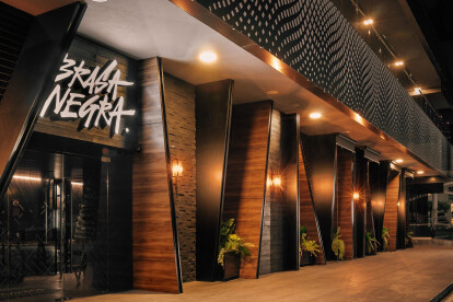
Brasa Negra is a restaurant, with an exploratory and casual personality, the project is developed on the premise of being a space for sharing, establishing a new experience in the city.   Alejandro Mirsha The goal was to generate an eclectic space with a unique character, recovering different architectural representations to create a restaurant that contains diverse micro-environments. Each one with singularities, but revolving around fire, embers and roasts, thus reflecting an expressive diversity of materials, textures and atmospheres.  Alejandro Mirsha The experience of the place was conceived to incite the user to explore the menu and in the same way, the space, each micro-environment generates the user's curiosity... More

Project • By Haal • Shops

Mariano Store

Mariano is a lean and basic menswear brand with a timeless approach and has a hybrid operation, with online and physical presence. Caption The goal of the physical store is to become a point of contact between customer and product, while communicating the brand values through the store design. Construction had to be very fast paced, therefore very simple construction techniques were used, communicating the brand simplicity through a palette of whites reinforced with different textures and soft lighting. Caption In order to frame and highlight the products, we detached the store volume from the mall alignment, and designed a see-through fabric panel in the facade that provides privacy to the inside while instigating customers.... More

Project • By Taller de Arquitectura • Supermarkets

Lavinia

In a very small space, and with very few economic resources, the decision was made to use artificial lighting as a design resource, achieving a cozy, pleasant environment that is conducive to storing high-altitude wines. More