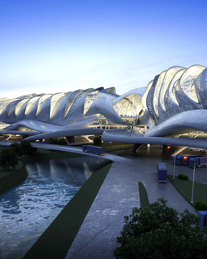
Our border crossing proposal was an opportunity to make the intangible tangible. The increasingly abstract experience of crossing a border has too a large part disappeared as lines of delineation change more and more quickly and the crossing is often removed from ground or place with modern air and rail travel. The proposal was created to link both sides of the crossing with a single light weight structure. Large ramps lead busses and cars onto a covered parking area. Here passengers in busses disembark to enter the building and cross the border on foot. Cars will travel under the pedestrian bridge as they are separated from coach traffic and directed towards the edge of the large plinth the building sits on. Once inside- visitors have a number of places to eat, read, shop and rest before crossing the border. The border becomes a weigh station a point to rest Once making it through the physical immigration a central bridge links all levels opening up the skin of the building allowing visitors a view out of the river that forms the physical boundary and of the all the vehicles and people at different levels crossing the border.
The experience is meant to be one of ease where the spatial progression is from an open space up into a semi-enclosed carpark and then into the building then into an open crossing. So the difference between outside and in have a sort of rhythm of experience. The main hall is not fully closed itself. It is a light structure as steel space frame forms a series of portals with a light aluminium skin. The portals form clere-story windows to allow the space to be flooded with natural daylight from the north while it is shaded from the intense sun. They also allow cross-ventilation through the building and actively ventilate the exhaust heat which first cools the smaller offices and retails spaces around the periphery of the border hall.
Further environmental aspects of the design are the use of photovoltaic panels on the skin of the building and ground source cooling system, along with the use of light-weight materials which allow ease of construction and dismantling and the useful end of the building’s life. The form has something of a dragon and something of beetle, equal parts futuristic and pre-historic. Rather than the result of a particular style or direction it was the outcome of a response to the need for large column-free space and a necessity for daylight and cooling. The typology of a 19th century factory provided the first inspiration as a building type which was open in plan but allowed for a great deal of light. The design process took the typology of the factory and replicated it using a script but altered the form to be more organic and undulating. Taken to the extreme the light scoops multiplied and where shaped further to orient themselves towards the north light but also to channel or scoop in prevailing winds.
The logic of trusses came from the idea of the bridge as a physical crossing of the river. The concept of the bridge was extended and became metaphor for the space. A bridge structure would extend the length of the entire border crossing facility creating an open envelope for all the facilities. Offices, facilities, shops would all be housed as separate stand-alone volumes with their own ventilation systems which would exhaust cool air into the hall where people would move through quickly.
