Our brief for this small winery, set on 100 acres on the west side of Paso Robles, was to design a working winery and hospitality space that would embody the ethos of its owner/winemaker. The vineyard and wines are named after the site’s original owners - who had dedicated their lives to being great farmers, humanitarians and stewards of the land. The new owner wanted to honor and carry on that legacy of stewardship. In our design approach, we took our cue from our client, a self-professed minimalist, and his belief that a fanciful winery and expensive gadgetry do nothing to make a wine – or a place – better.
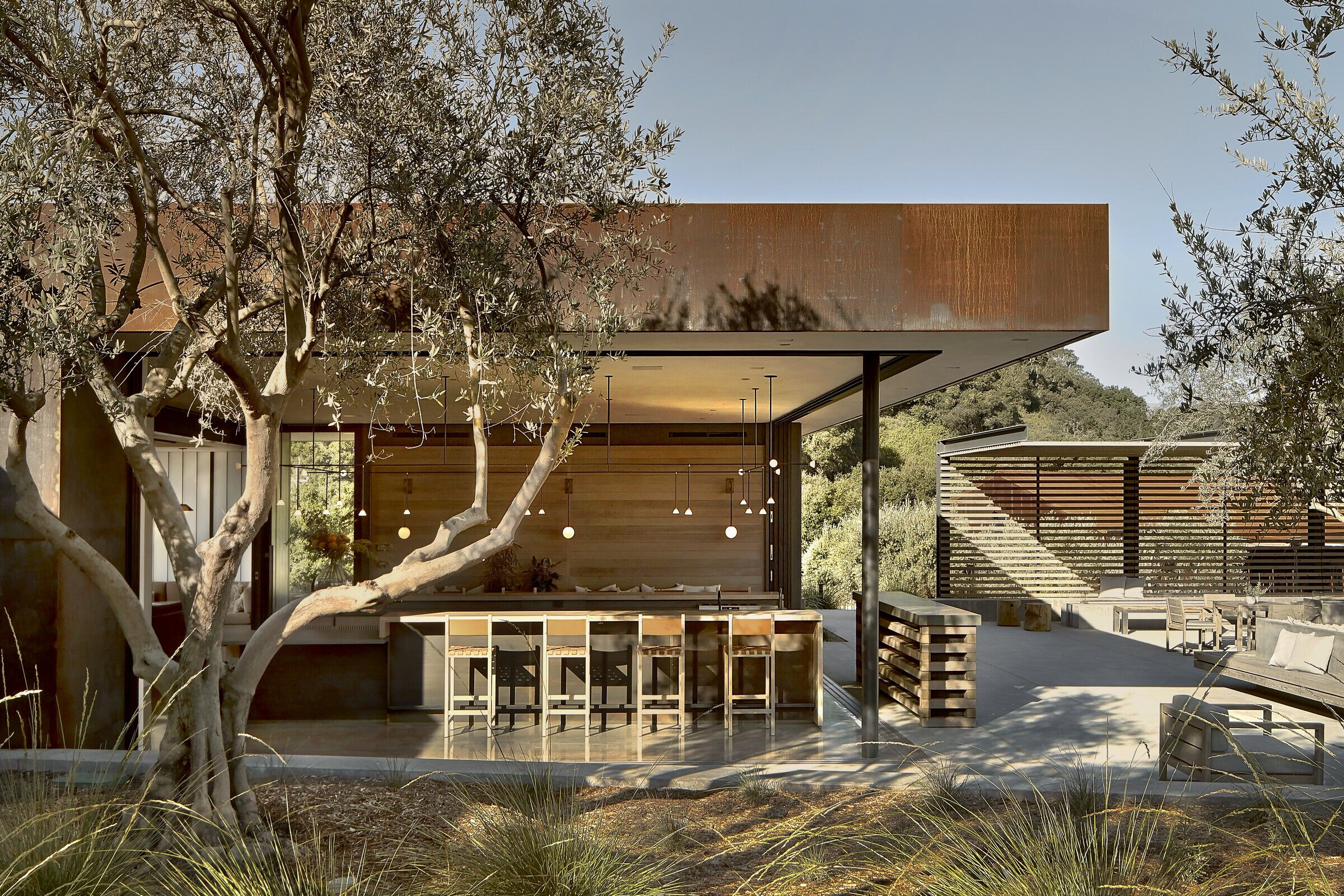
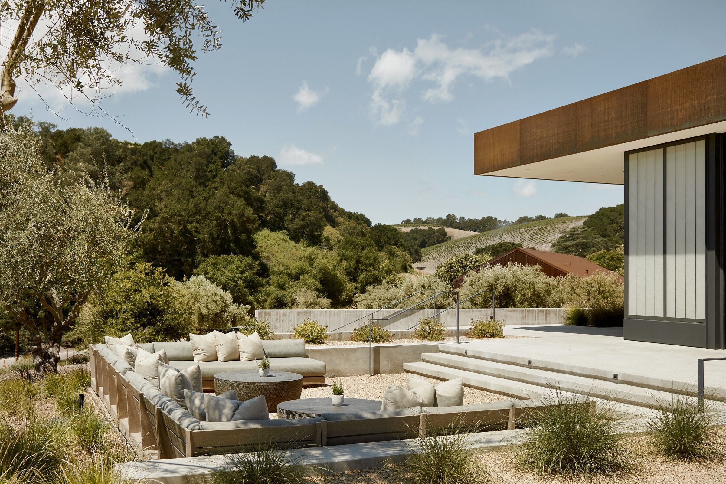
Our goal was to design a space that provides a casual, welcoming atmosphere for visitors, while reflecting our client’s minimalist philosophy. He first approached us with the goal of creating a place in the vineyard to gather. Essentially, he asked for a terrace and trellis, so that’s where we started. Inspired by the visible fractures in the chalky limestone soil of Paso Robles, we began to study the patterns created by the fractures in the soil. These patterns, in turn, became the basis for the laying out the walls, which run in direct relation to the land and views. Set at an angle to the vineyard, the long lines of the walls are oriented toward the views of downtown Paso Robles.
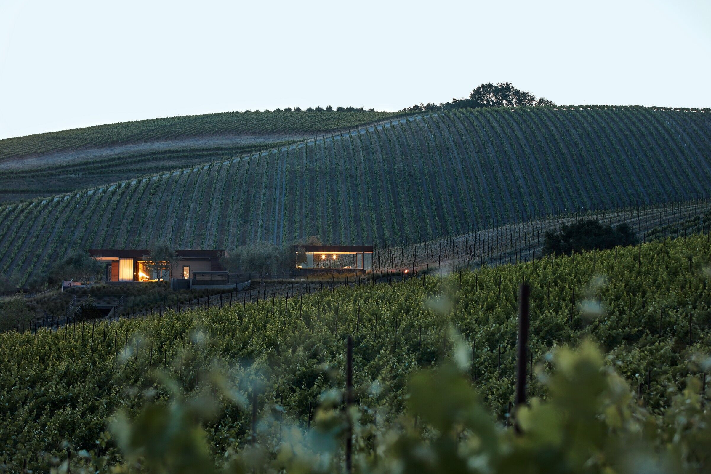
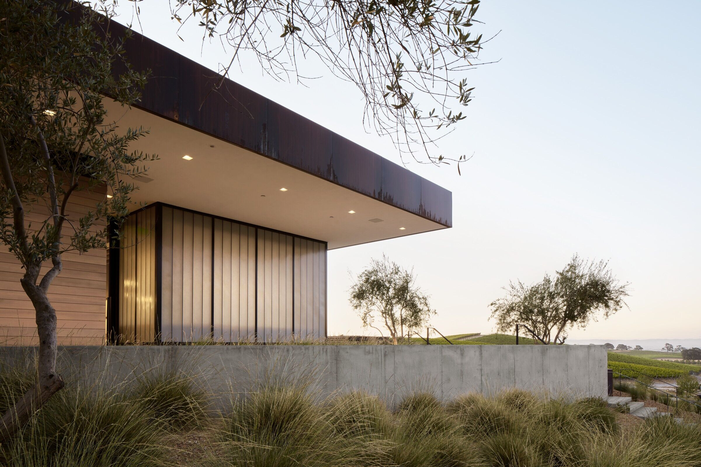
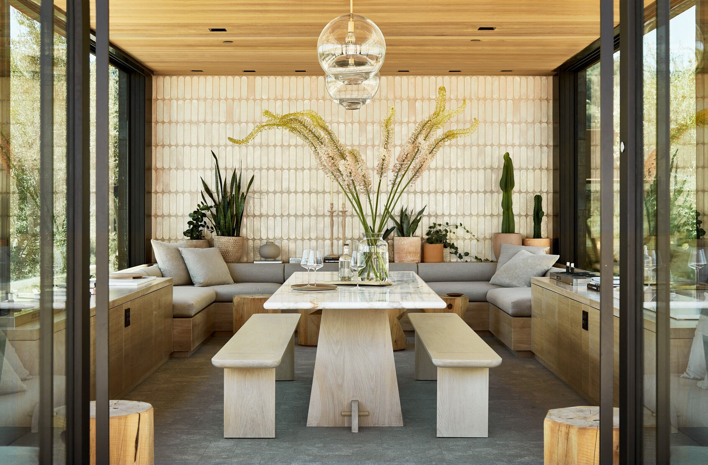
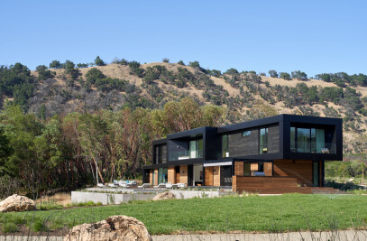
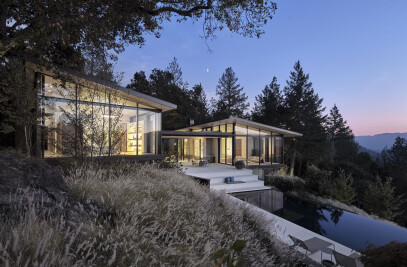
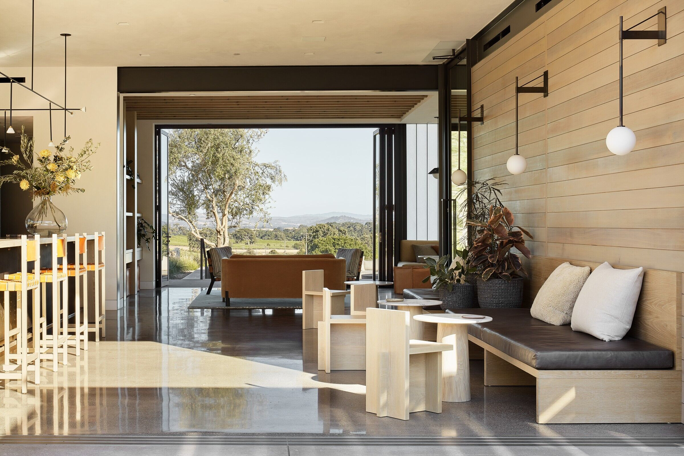
The hospitality experience is arranged to create a variety of indoor and outdoor spaces to gather to enjoy the wine, the land and the company. Elevated to enhance views but designed with flat roofs so as not to compete with the rolling hills, the simple concrete structures -- open on three sides -- are straightforward and unassuming, lifted above the vineyards without dominating them. The buildings are comfortable and residential in scale - essentially an extension of our clients’ home, located a just short distance up the hill. The hospitality space totals 5,874 square feet – 2,104 of interior conditioned space surrounded by 3,770 square feet of terraces. The secondary terrace faces directly toward downtown Paso Robles, but the main terrace is all about the land. The vineyards come down the hillside toward this terrace, essentially immersing visitors in the vineyard. From a distance, the small structures seem like islands floating in a sea of vineyards.
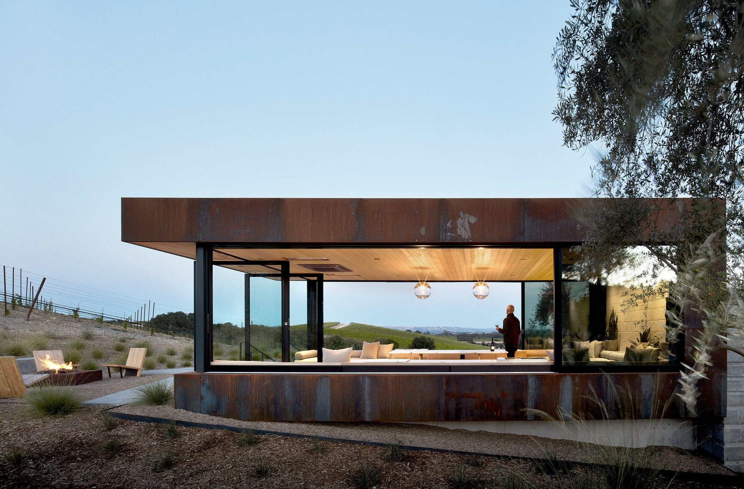
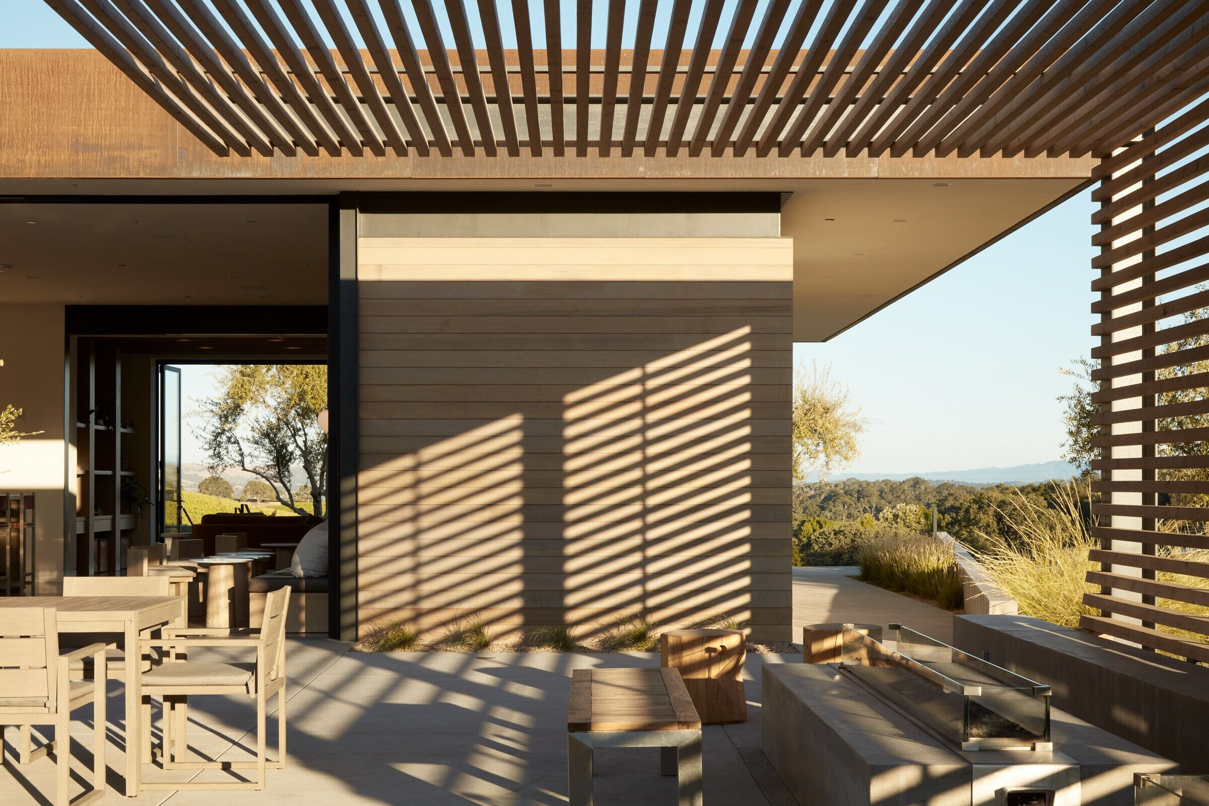
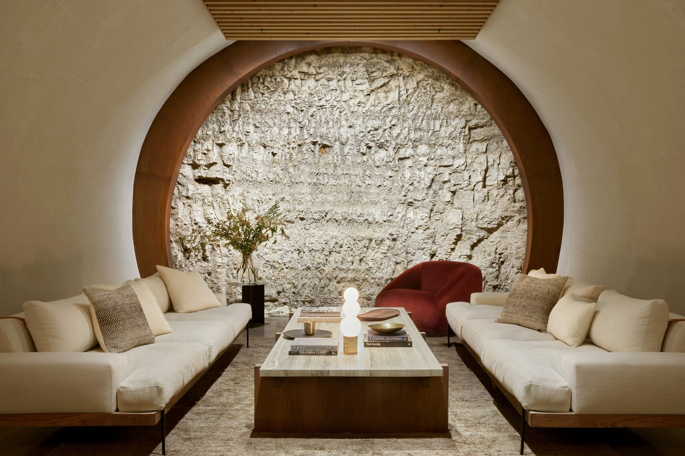
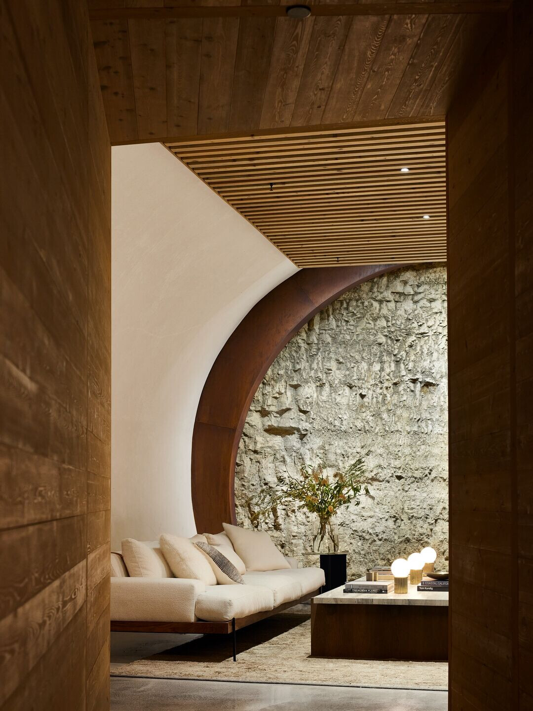
The site’s elevation presented a challenge. We needed to bring visitors up from the main approach to the terrace on the upper level without endless stairs or ramps, so we broke the procession into a series of terraces from the bottom to the top. Each terrace provides a different vantage point from which to experience the site. The material palette is limited – we used no more than what we needed: cedar, stained in a natural finish, board-formed concrete, natural steel that will rust over time, like the stakes set at the end of each vine row. Making good use of the limestone extracted to create the caves, we crushed it and spread it throughout the landscape.

Team:
Architect: Signum Architecture
Interior design: Katie Martinez Design
Construction: RP Construction
Photography: Adam Rouse
Material Used:
1. Doors/Windows: Fleetwood 4070
2. Exterior Steel Color: Benjamin Moore Nightfall 1596
3. Kalwall: VertiKal 2 ¾” Wall System
4. Concrete Color: Davis Outback 677
5. Exterior cladding: Corten plate
6. Fire pit: Paloform Caldera
7. Plank siding: Nusku Thermacor siding
