Busy life and increasingly frugal lunches are the issues on which to bet, according to the new format “Al Volo - take away”. A light, genuine and healthy meal is the goal that the local cuisine aims to achieve. Every day the dishes following the seasonal ingredients and focus on the calories and the needs of vegetarians and intolerant. The logo and the naming, specially created and designed for the brand, perfectly enclose the philosophy behind the venue. Genuine and fast products, ready for a light meal and always attentive to nutritional values. To eat "Al Volo".
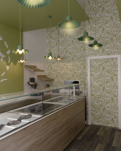
The compact space of the sales area, about 25 square meters, has been exploited to the best to include a large exhibition space, a working area with a link to the kitchen, and a snack area reserved for the customers. The high ceiling and the distinctly elongated plan suggested the study of two "floating" surfaces on the ceiling of different heights and entirely lacquered in green. The sage green color is a fundamental and recurring element in several elements, referring to the key concepts of the brand: healthy cooking, well-being and genuineness.
The artistic and decorative component, studied in every detail, plays an important role. Wallpaper with a "green" texture is placed to close the environment, creating a visual and functional separation filter with the area behind the kitchen. The suspensions, in pressed natural cardboard, with different colors and shapes, simulate a cascade of branches and leaves that create movement and lightness.
Colorful graphics and minimal decorations are used to complete, in harmony with the context, the side walls. The main objective is always to create tailor-made interventions, never predictable environments, tailor-made for the final user, and able to communicate to those who live them an unrepeatable narration.
