The project consists of an office tower with a commercial complex in the base, located at the intersection of Apoquindo Av, Santiago’s main axis, and Vespucio Av, the capital’s circular beltway. Despite its urban importance this place is poorly laid out as a cloverleaf intersection surrounded by several buildings of varying height and quality. The site has immediate access to a Metro station, which has the highest daily traffic flow in the entire subway network. The roughly square site is opened on three fronts. Given its location, the tower faces Apoquindo Av coming east from a mile away, as an iconic mark at it’s vanishing point.
The regulations allowed a tower of 21 floors; a buildable area of 18,738 m2, with square shaped plants averaging 1,000 m2 each, and a core containing a battery of eight elevators and two enclosed double stairwells; plus 4,000 m2 of built area in a two storey commercial complex, and 18.000m2 in five underground floors for 600 parking lots. The volume of the building is quite constrained by the maximization of the built area within these regulations.
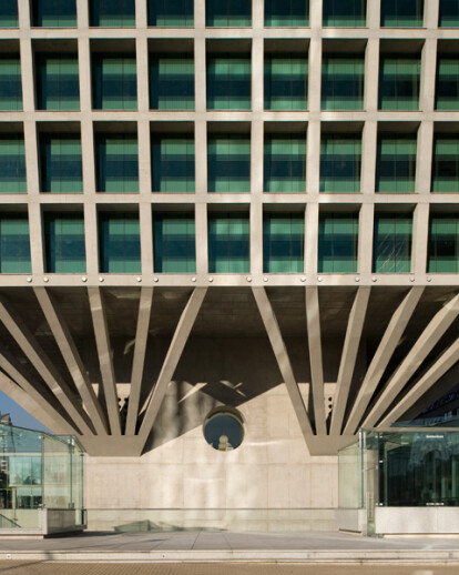
Given the high pedestrian density of the area, our first decision was to clear the ground level as much as possible, freeing up the site as an extension of the public space. This was made possible by hiding underground a major part of the program’s commercial area and withdrawing the rest of the complex’s structure to the borders at the back of the property, so as to allow an interior corner square. Furthermore, it was possible to structure the tower in such a way that only the shaft core rests on the ground, as it is capable to resist by itself all vertical loads as well as shear stress and flexion at the base, considering the proportion between the height of the building and the width of this base, and that, because it is centered in the square floor plans, torsion of the structure under seismic stress is avoided. Moreover, in this solution, matching tower and underground columns is unnecessary, so, an optimum result of 27m2 per car was achieved on parking floors. Floor plan surface gradually increases from floors 4 up to 21 to attain the total built area. This section allows to: - Reduce the shaded area produced by the bottom floor suspended over the ground; - Reduce the angle of diagonal bracing supporting the series of floors; - Column-free floor plans with increasing sellable area at upper floors, which price rise as well; - And finally, to define the outline of a memorable landmark facing the axis of Apoquindo Av.
Continuous floor to ceiling windows are shaded by columns and a perimeter eave at all floors, standing upright 90cm. behind the edge of the slabs, thus leaving the supporting structure expressed at the outside of the tower. Glazing setback plus screen printing and differentiated reflectivity according to lighting and thermal requirements for each different area of the facades together resulted in a reduction in energy consumption of up to 25% in comparison to nearby buildings of the same category. Building costs turned out to be inferior than the initial estimates related to towers of similar characteristics. This is important because we believe that economy in design purifies the rhetoric of architecture; after all, the efficient use of available resources is an infallible condition for achieving beauty.
Towers are seen from below. Their perception varies as one approaches them. In this building, its trapezoidal shape with the distorted structural grid of its facades counteracts the fugue of lines in perspective, rendering an orthogonal volume as one gets closer while still framing the object completely, and as one looks up shifting the visual angle with respect to the vertical direction given by the sense of gravity, an equivocal sensory adjustment is produced. This balance plays with the relativity of the perception of volume and weight, making conscious the quest of stability as a decisive matter of architecture.
