During the past decade, Sangdo has undergone rapid redevelopment, with approximately ten-thousand housing units being constructed. Housing supply soared, but parts of Sangdo that were not subject to the redevelopment quickly became vacant. Consequently, streets with vacant buildings deteriorated, and the floating population plummeted. Small buildings and lots on these streets were not profitable. In order to overcome this situation and increase the value of an old residential building on the site, the building was renovated into a self-employed press company for a comic author to write, exhibit and promote her work in one building.

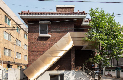
This renovation project altered usage of the building from residential to commercial, which incurred various architectural interventions such as relocating entrance and staircase, modifying interior and exterior materials, and adjusting room scales. ‘Face-Lift Sangdo’ refers to the overall design changes made in the existing building, to reevaluate the potentials of a commercial building in this specific residential area.

From the first to the fourth floor, there are a bookstore, exhibition space, studio and a communal kitchen, respectively. Different phases of press including planning, showcase, publication, and promotion, are vertically connected in the building. The small garden on the first floor and the rooftop space on the fourth floor allow the activities inside the building to expand when in need. Even though each floor area was small, about thirty-three square meters, the removal of the existing partitions and walls allowed sufficient allocation for each program. Steel columns and beams are commonly used to meet the seismic design standards in Korea, but they could significantly reduce the ceiling height and the usable floor area. Instead, reinforced concrete walls were used to satisfy structural requirements and to maximize the interior space.

The staircase was internalized to connect the programs vertically and to mediate the spaces on different levels by continuing the same floor materials throughout. The new facade of the building that emerged from the internal transformation becomes a storefront that exposes the movement of the users on different programs and levels.

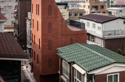
The existing building did not have a ‘front’ face; it did not have a proper facade. As is often the case for multi-family residential, the main entrance of the building was a thin glass door at the landing of the exterior staircase. Because it was so close to the road, the circulatory conflict between the entrance and the movements on the street was inevitable. The entrance was relocated to the north, and the staircase was internalized to alleviate this unpleasant collision. Thus, the small garden to the south-east was separated from the old entrance, becoming an accessible outdoor area on the first floor. The narrow, double-height new entrance on the front façade dictates the overall impression of the building.

Along with the repeating geometry of the staircase openings, it brings a sense of order to the overall composition of the façade. The decorative red bricks of the 80s and 90s are now covered by two contrasting materials: aluminum cladding and stone tiles. The smooth aluminum cladding on the bottom seems to hold up the rough and heavy-looking stones above it, creating an intriguing dialogue between the two materials.


Material Used:
Facade cladding: White Stone Tile / BrickMarket
Flooring: Polished Concrete with Aggregate Exposed / On-Site
Doors: Wood Plywood / On-Site
Windows: Aluminum System Window / Alluco
Interior lighting: Linear LED / Dayoon Lighting


