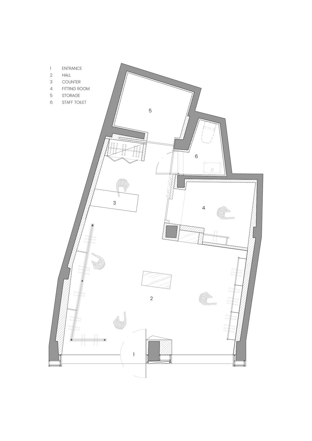
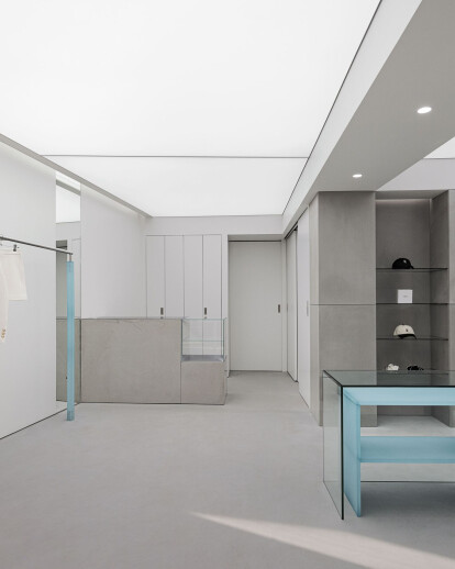
With a vision of pursuing a style that is fashionable and trendy, inspired by various places to lead the fast-changing trend, Lookcast opened its store in Seongsu, where consumers can quickly read the latest trends in Korea, to meet the needs of consumers seeking diverse experiences beyond shopping.
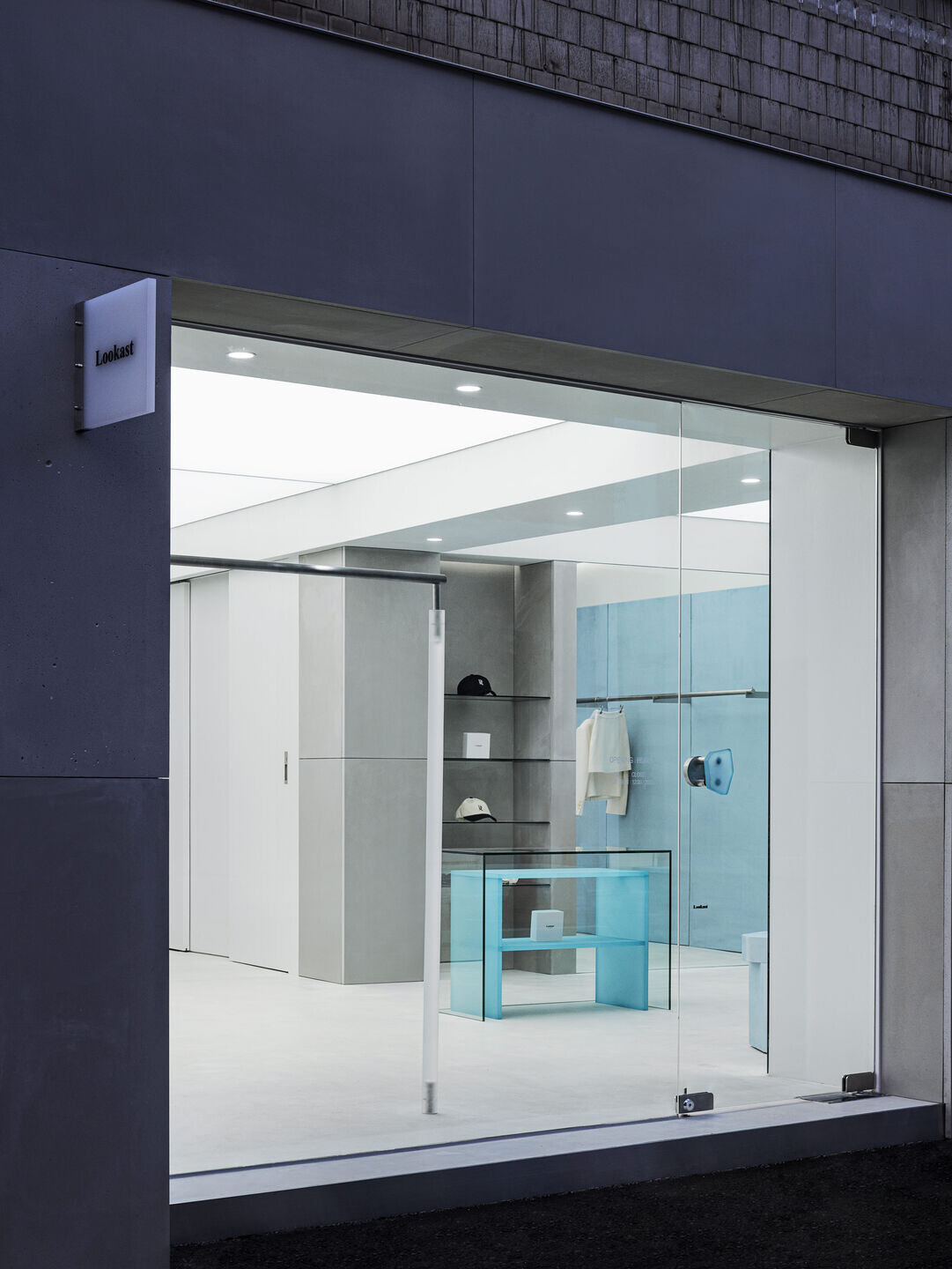
We wanted to create a space that fits the classic and sophisticated mood of Lookcast.
The keyword "LIGHT" was derived to meet the needs of the client's "space where clothes stand out well" and "clean space." This keyword is expressed in two ways in space.
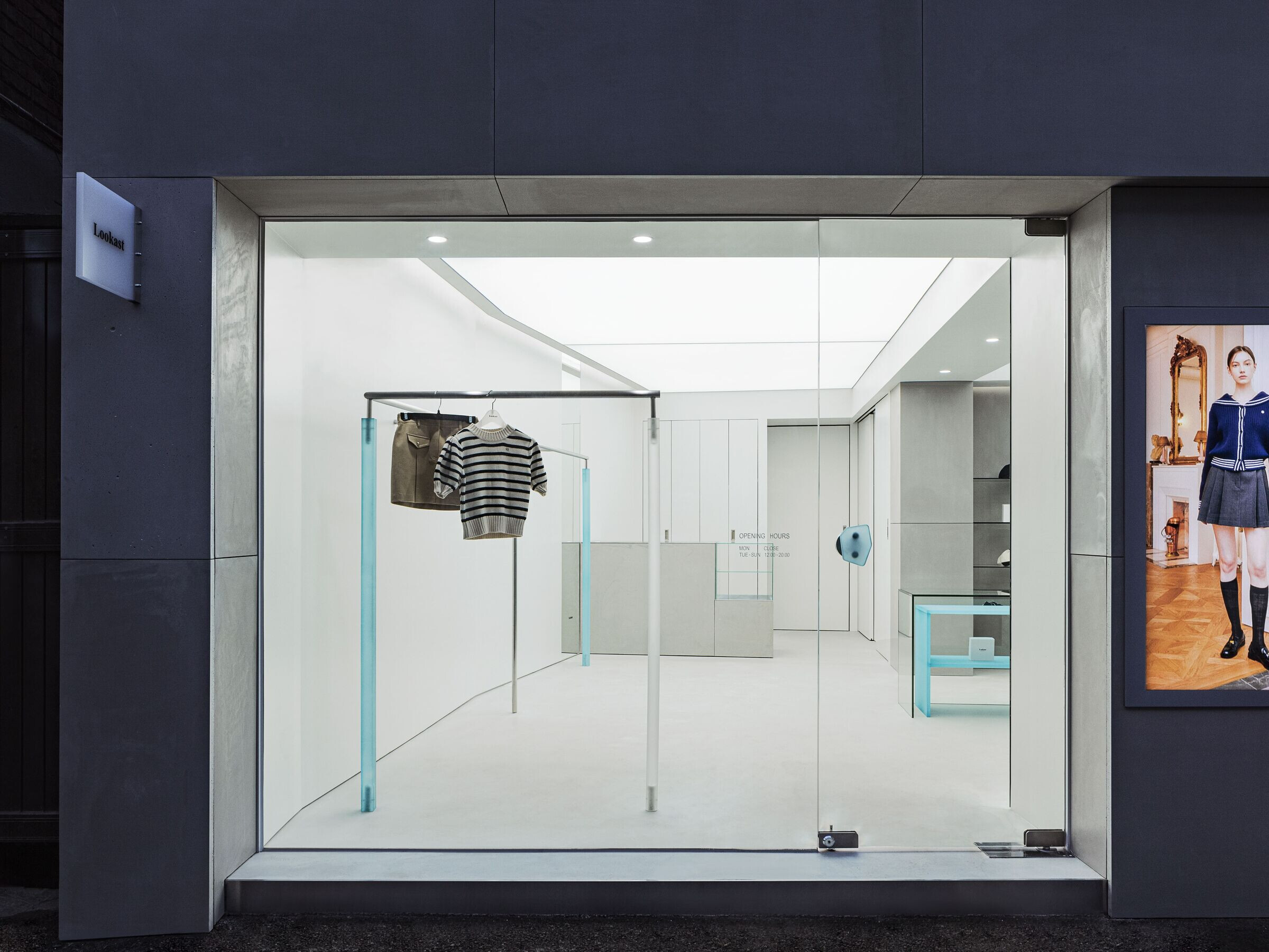
The first was to actively embrace the site. This building, which has been in place for more than 30 years, has a great personality called diagonal. Here, we focused on accepting the diagonal line by actively utilizing the point where there is no right angle. Design using diagonal lines has had the effect of reducing dead space. And through three types of mirrors, a small area of space was felt wide.
In addition, through three types of mirrors, a sense of expansion was given to a small area of space to feel various eyes.
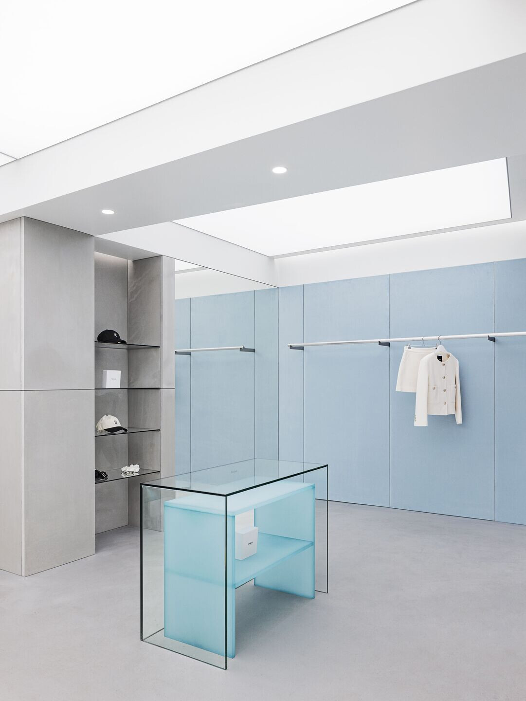
Second, the color was restrained. Clean White- Refreshing Blue- Gray, I organized it in three colors. First, the overall space was composed of white tones with walls and barrisol lights. Next, with a gray-ton concrete panel, the outer façade and the inner shelf were placed in parallel to give a sense of internal and external connection, and the weight was set at the overall tone.
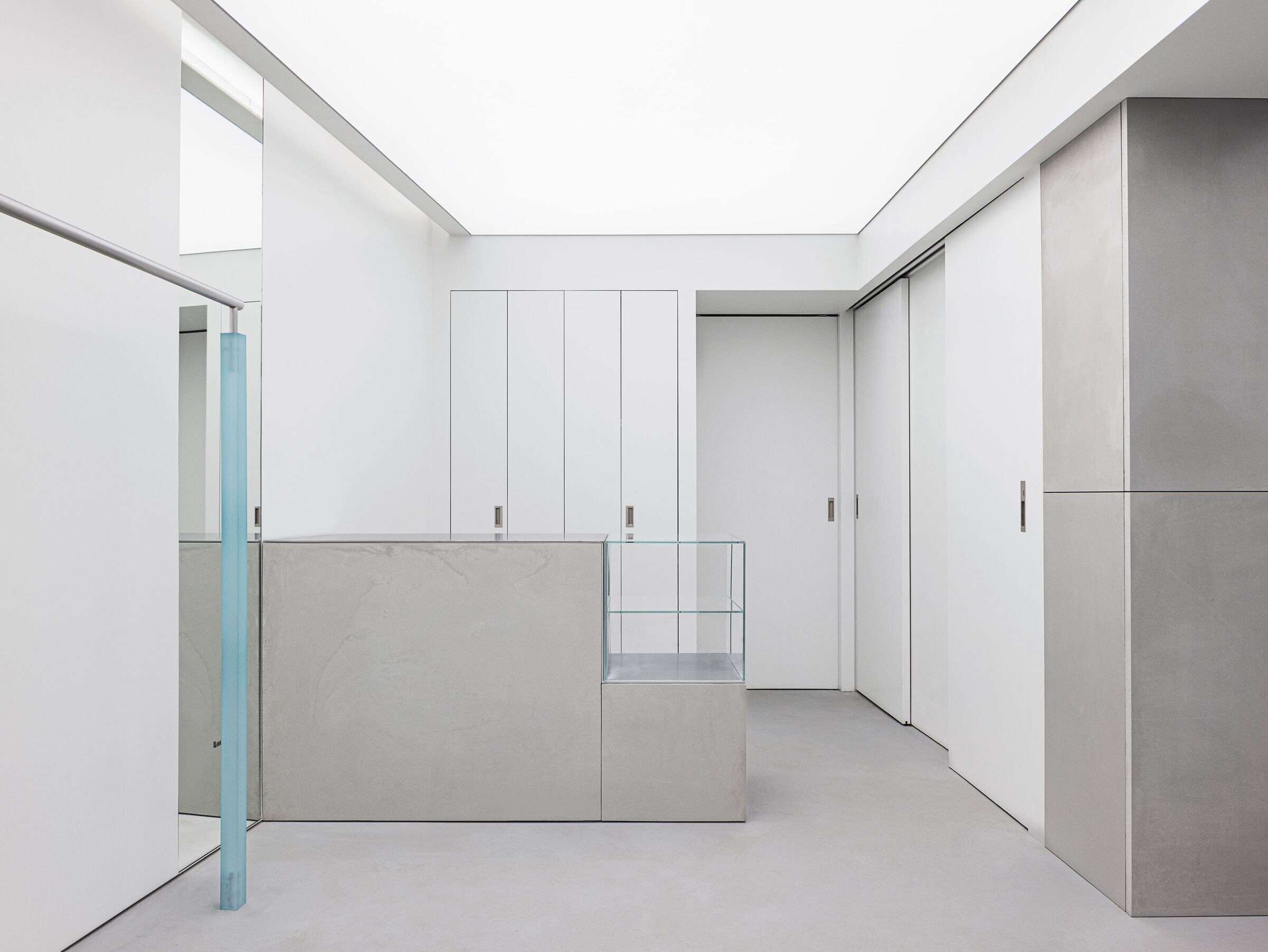
Finally, the blue designated as a point color has the effect of leading the overall cool mood and harmonizes with the color of the brand. It contains wit in the space while using various materials such as suede wall panels, acrylic hanger legs, carpets, and art paint objects as points.

