A pharmacy moves to a new location, and this enables the upgrade of an existing commercial premise—a former warehouse for the storage of Ham—that had remained unused for years. This move, in the vicinity of the original establishment, became an opportunity for the owner to consider new ideas. These ideas went beyond the need to consolidate his clientele and attract new patrons, and included innovative ways of reconsidering the relationship between the client and the pharmaceutical dispatch, as well as offering new services. Pharmacists have ceased being mere medicine dispensers and their services have tended to take on a more personal approach. They now deal with their clients on a more individualized basis. Commercial formulas have been replaced by specialized health assistance. Additionally, the range of supplementary products on offer in a pharmacy is constantly on the rise, which makes the client take on a more active role in the buying process. There is a tendency to depart from the traditionally static pharmacist-counter-client relationship, and to introduce selling and marketing strategies that are more dynamic. This creates a fluid relationship between the product, the space and the way the pharmacist and the client interact.
In this way, within the new pharmacy and with personalized attention as the main premise, flexible areas have been defined. These can be configured as spaces that provide one-on-one services, not only by the pharmacist, but also by other health specialists such as dieticians, dermatologists or physiotherapists, all of whom can offer advice and provide regular support within the space of this new pharmaceutical premise. Another aspect that has changed in pharmacies is the storefront. The traditional static display of products has ceased to make sense. What needs to be shown now is the pharmacy itself; the space has become the product. Hence, a glass facade that reveals both the interior space and the structure of the building itself is defined, starkly exposing it all just as it is. There is nothing to hide, everything can be seen and is shown in an organized and specialized manner. The articles on sale are not only displayed according to defined categories, but also following a color code, a composition that is reiterated in their labeling, classification and the order they are placed in. The color arrangement of the products defines the pharmacy’s logo.
Within the space, the counters are individualized to provide privacy and personalized attention, while the flows and transits within the store are organized with the help of movable showcases and gondolas. The central customer service area, the true heart of the pharmacy, is accentuated by a dynamic, slatted wood ceiling. The shifting slats give the impression of a space that is constantly changing, underlining the idea that this central area is capable of holding all sorts of activities, somewhat like the stalls of an arena-type theatre. In this case, the spectator moves and the main characters are the actors that buy and sell.
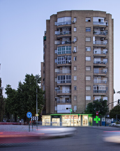
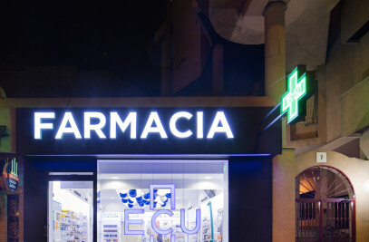
Wood is also the material chosen to frame the showcases, which along with the wood on ceiling, makes the space cozier and welcoming, in carful balance with the cold nature of the other materials used, which are very basic and have an industrialized feel. White is used as the background color in order for the products to stand out. The commercial premise has a large façade that faces a roundabout on the outskirts of the city. The new façade strives to capture the attention of the drivers that pass by. In order to achieve this, its finishing is extended to the undersides of the zigzagging cantilever of the balconies above the premise. The edge of the cantilever is lined with green LED lights that highlight the geometry of the building. This zigzagging line is about 12 meters long and it enhances the visibility of the business —subconsciously, it also recalls the traditional green cross of the pharmacy.
