Location - Kyiv
Type - Commercial
Area - 165 sq.m
Year - 2021
Photo - Yevhenii Avramenko ABOUT
ABOUT
This dental clinic project is performed in the old center of Kiev. The building is completely renovated, it has no historical value. All floors and the frame of the structure are made of metal. The ground floor has a 165 m2 premise plus technical basement and staff quarters. On the ground floor, there are two dentist's offices, an operating unit with preoperative and postoperative rooms, two restrooms, a meeting room and a reception area. A significant advantage of the clinic is a detached closed courtyard, which has also been improved by our studio.
 RECONSTRUCTION
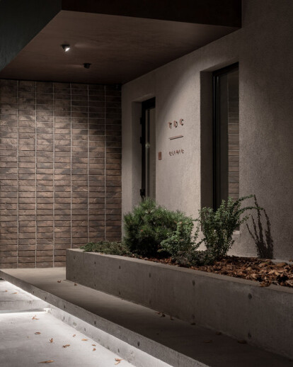
We completely demolished all the walls on the ground floor and designed offices in accordance with the relevant regularities and technologies. In the courtyard, we dismantled an extension and created an entrance group by designing a flower bed, an access to the clinic and a porch. The adjacent garage, located opposite the clinic windows, has been decorated with atmospheric wood. A combination of materials such as concrete, brick and wood was used throughout the entire entrance group.  DESIGN
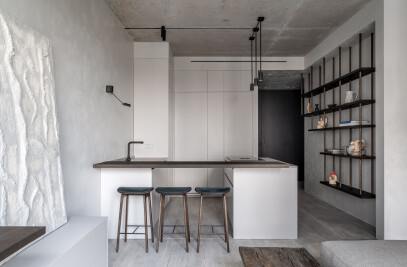
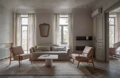
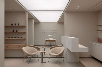
The interior leitmotif was the idea of creating non-hospital atmosphere, so we used warm materials and colors. Since the indoor lighting is scarce, we expanded all the window slopes inward. This has become the architectural feature of the project. We wanted to create the atmosphere of a dental spa-salon, therefore, we used only natural materials such as marble, American oak veneer, and lime plaster on the walls.
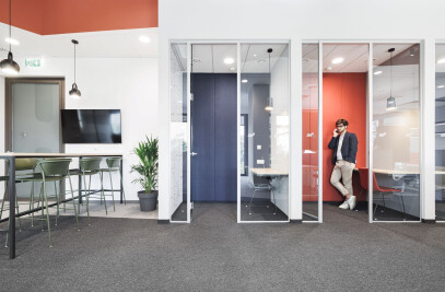
 Due to a large number of doors, we decided to make them hidden to prevent from the space distortion.
Non-standard design solutions did not prevent the introduction of all modern technologies in the clinic: autonomous ventilation, gas systems, a microscope. LIGHTING
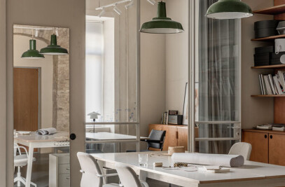
A lot of attention was dedicated to lighting, we used warm, soft light and spotlights to feature and deepen the textures. The offices have specifically designed standalone lighting used prior to treatment with the purpose of creating a relaxing atmosphere.  FURNITURE
Furniture in the offices and the waiting area is custom made. The restroom sinks were made of porcelain stoneware. COURTYARD
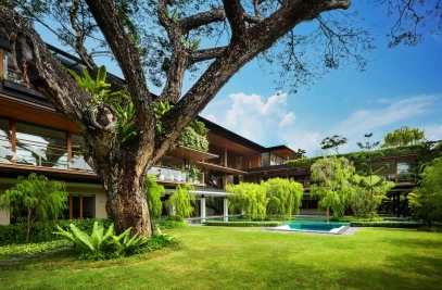
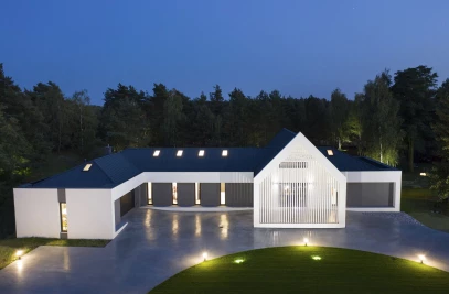
We paid great attention to the courtyard and entrance area design as well as the lighting of the latter. The path to the clinic goes through the sliding gates, which we sheathed with old wood, and, in cooperation with the gardener, planted a flower bed creating a minimalistic landscape. The facade is covered with gray facade plaster.
The signs are developed in collaboration with the designer and are made of natural sheet copper – three signs plus indoor navigation. Сopper elements are used throughout the place in our project.  FLOOR
FLOOR
The floors of the offices are covered with Tarket linoleum by «NOTE design studio». The common area floor is paved with Full grass porcelain stoneware surfaces. HIGHLIGHTS
With a thought of making this project as minimalistic as possible, with a limited number of details, we hid all storage places behind hidden facades as much as possible. One of the most challenging tasks in this project was to visually elevate the ceilings, which decreased significantly due to the duct ventilation. To make the client feel comfortable, we used design techniques visually elevating the room.
 Throughout the project development, we had to constantly face the space readjustments and to adapt the solutions to the emerging changes. Nevertheless, all the assigned tasks were completed in full.
