What was the brief?
Concept “Gray”
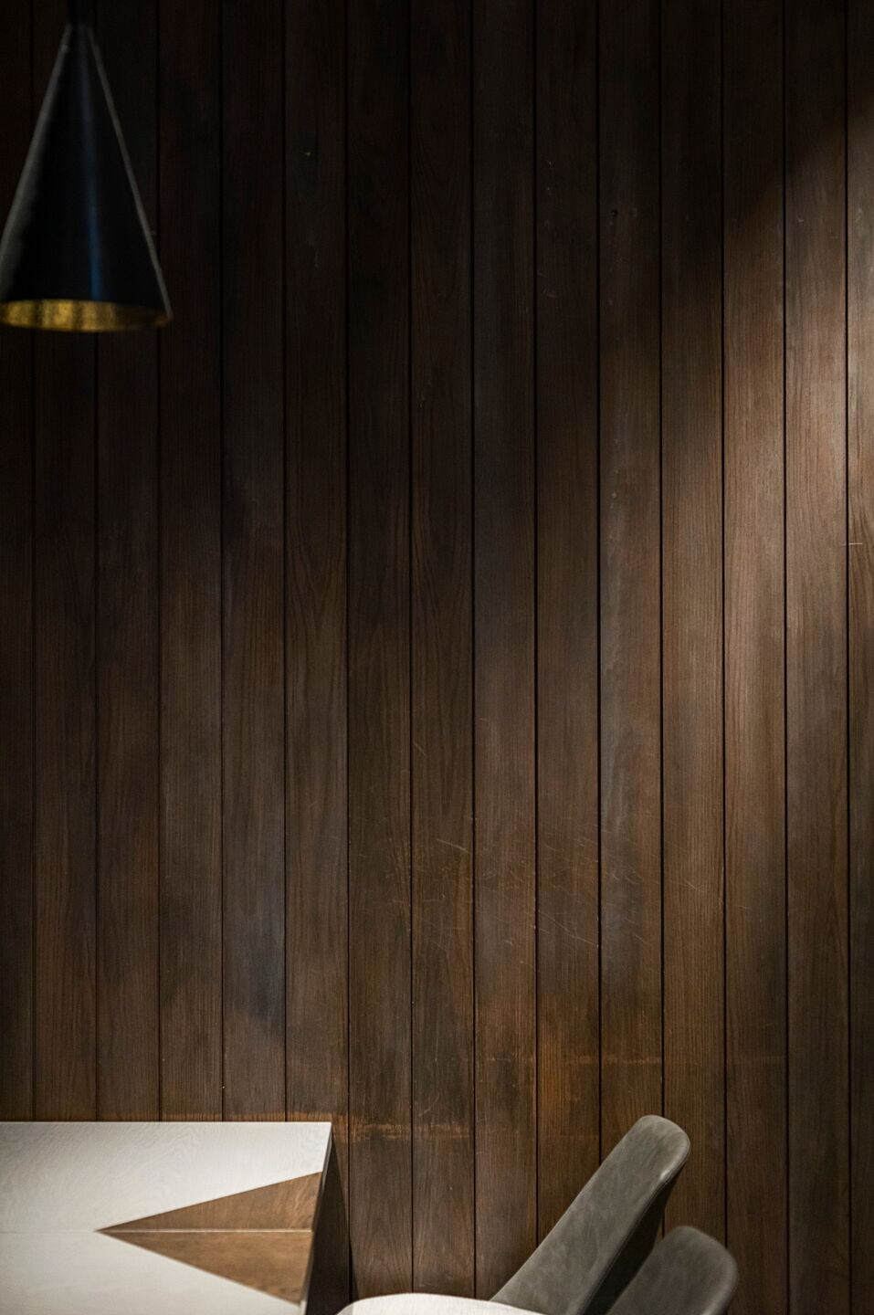
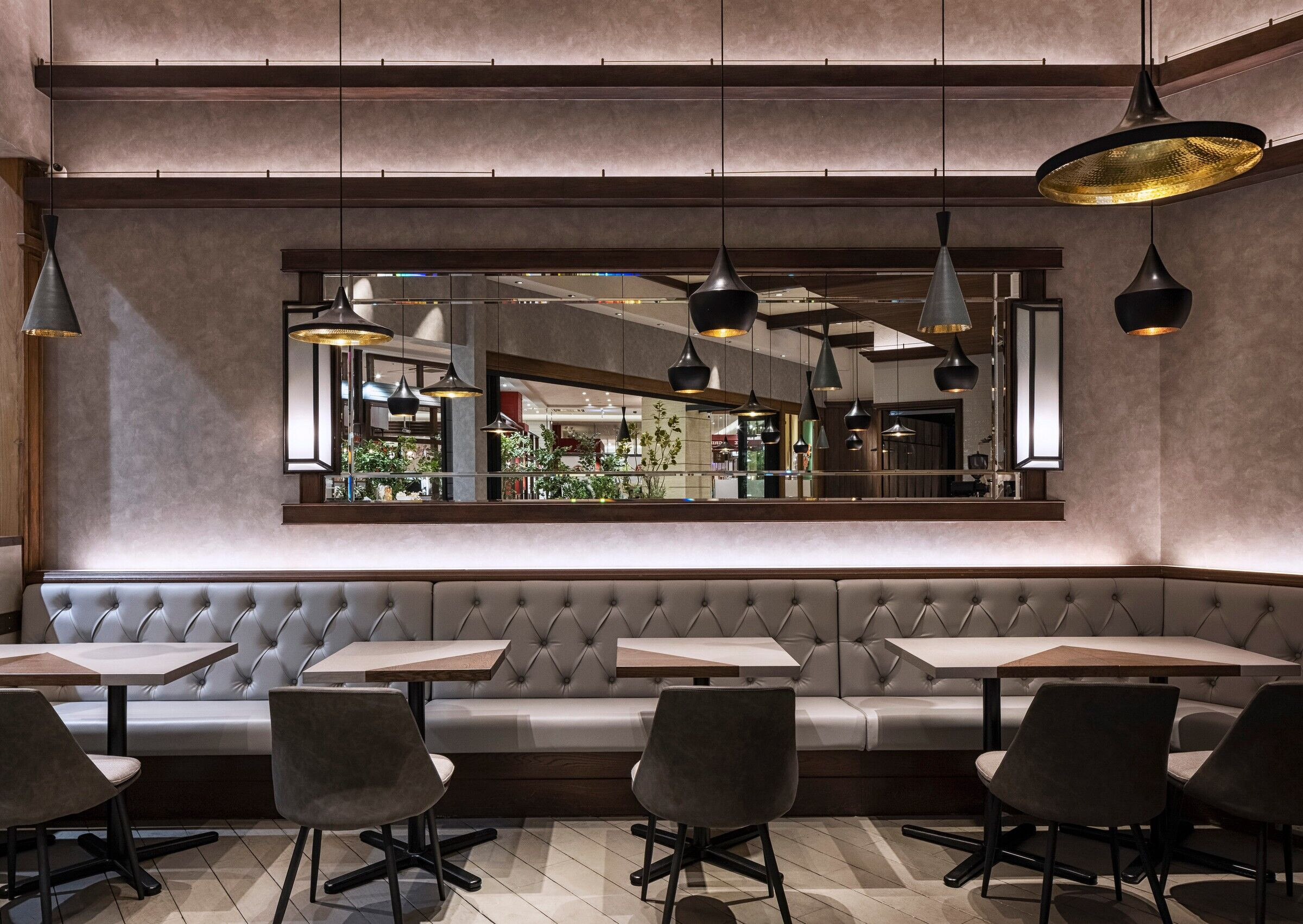
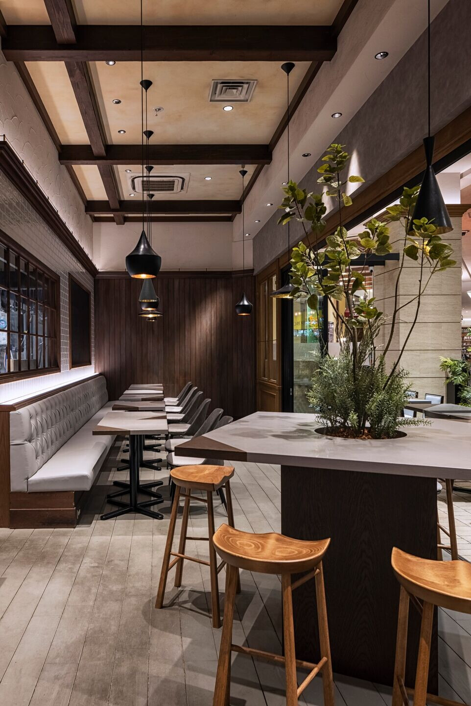
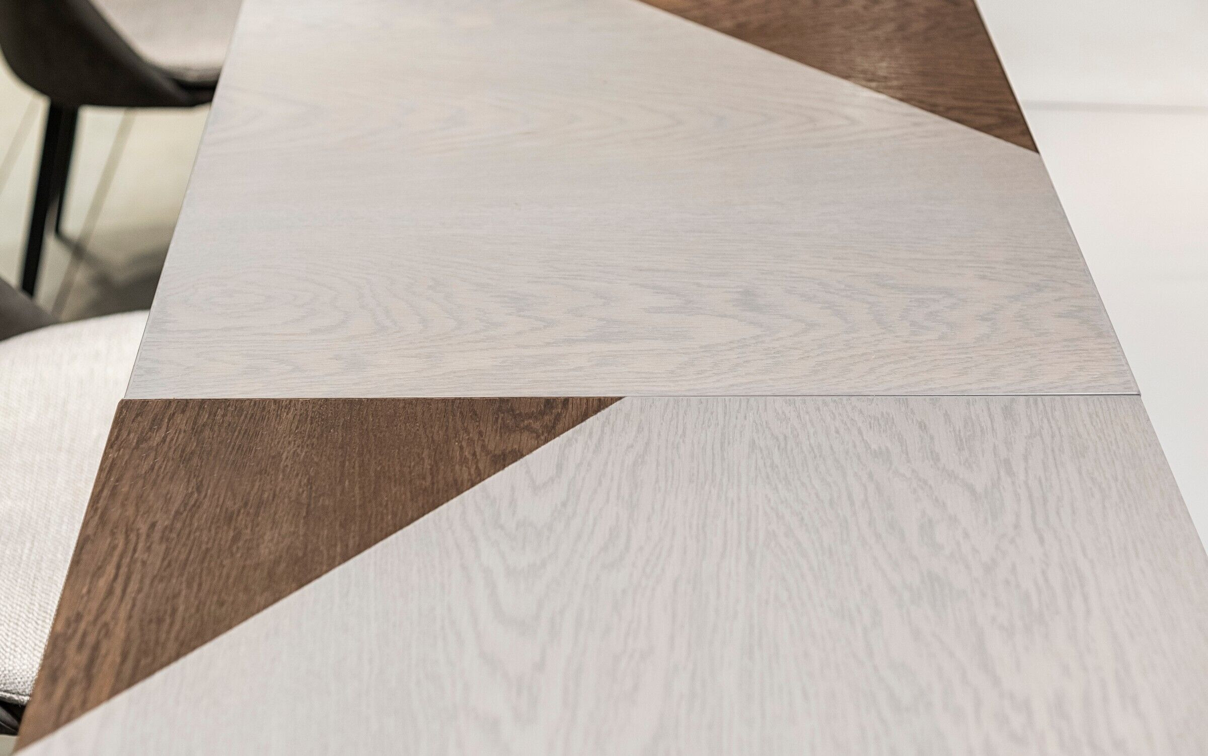
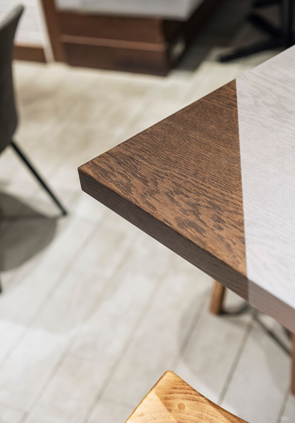
The client aimed for a cohesive "grey tone" theme in their space, prompting an exploration of the color grey. Originating from "grey" in British English and "gray" in American English, the term historically suggests a shiny silver quality in Germanic languages. In Japanese color terminology, distinctions between "haiiro" (slightly yellowish grey) and "nezumiiro" (bluish grey) reflect subtle differences, attributed to residual hues from burning wood. To embody Japan's grey, the design incorporated reddish wood tones as a base, harmonizing with existing colors and integrating new materials. For the "TRIANGLE" theme, desk wood grains were artfully segmented into triangles for accentuation. The goal is to evoke a sense of Japanese grey throughout the space, blending tradition with modern design elements effectively.
What were the key challenges?
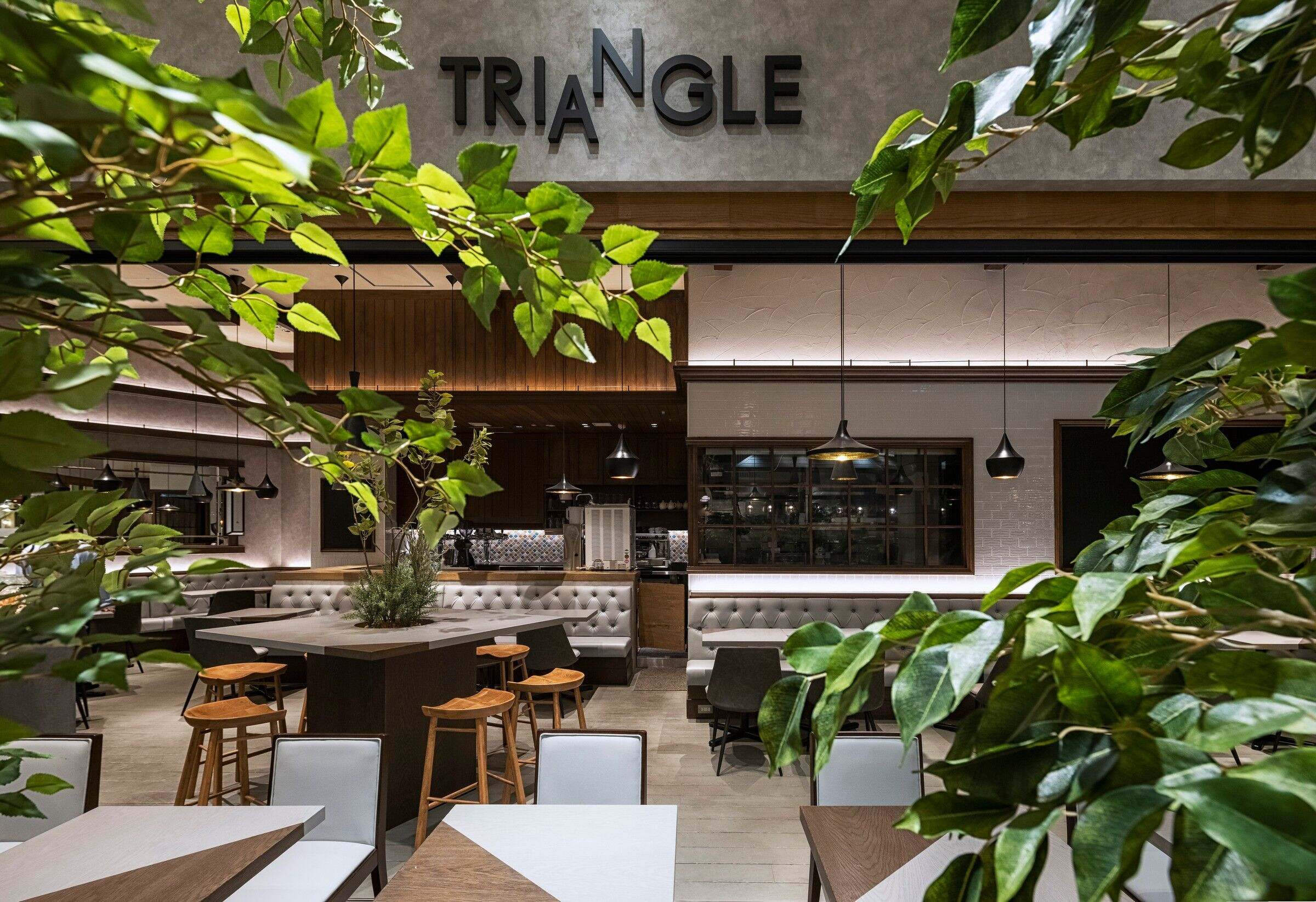
Since it was a renovation of an existing store, I aimed to make the most of the materials already in use while ensuring that the overall image changed significantly.
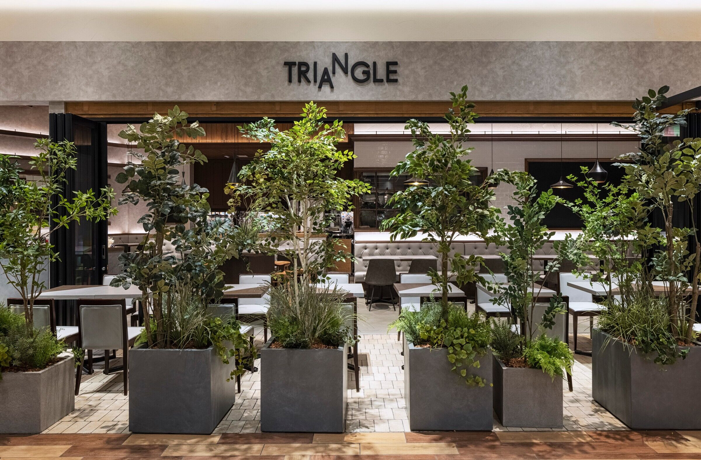
What materials did you choose and why?
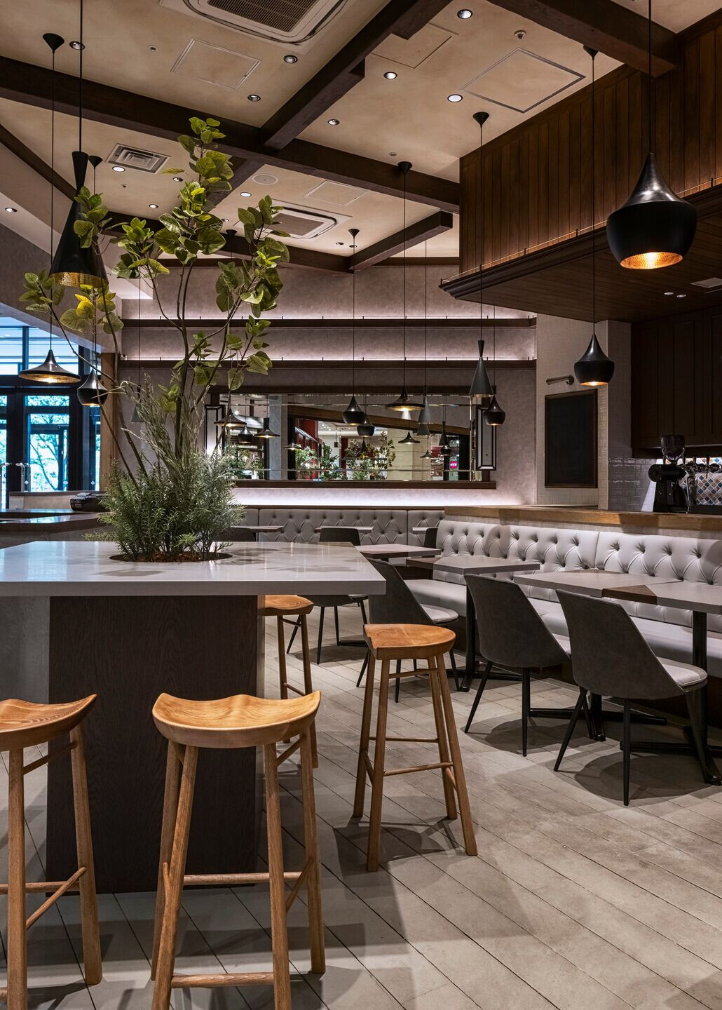
By sanding and repainting the existing solid wood flooring, I was able to preserve its history while infusing the space with a fresh new image.
Team:
Design: KAMITOPEN
Client: EVER BREW Co.,LTD.
Other participants: Hakore corporation
Photo credits: Keisuke Miyamoto
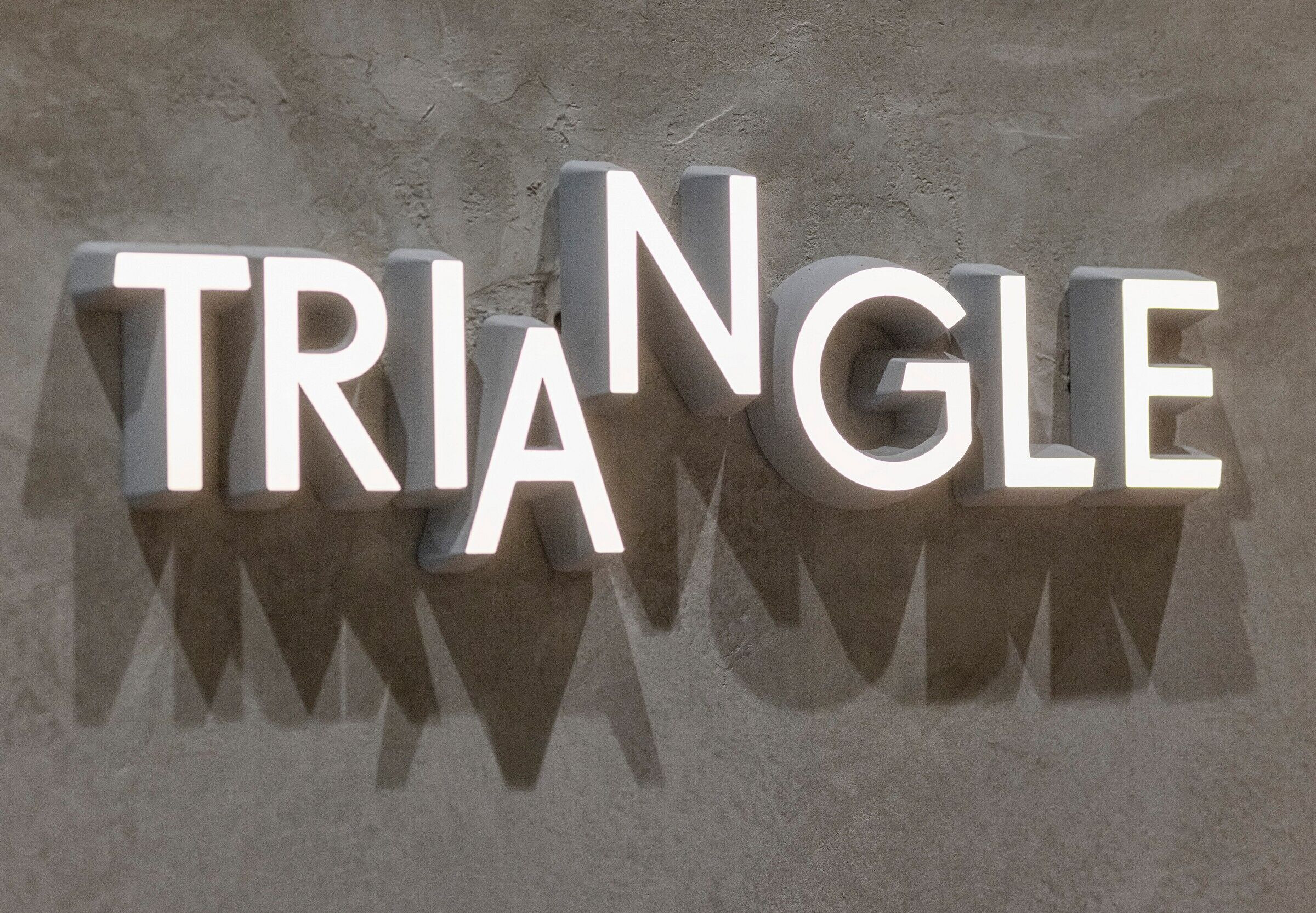
Material Used:
1. Facade cladding: WRA8041, TOLI (Above existing vertical walls, PB 12.5mm overcladding / cross lining)
2. Flooring: Flooring staining (gray) after buffing existing flooring
3. Interior lighting: ModuleX/ TOYO KITCHIN/ E&M / Kurako
4. Interior furniture: AZUMAYA corporation/ sangetsu/ KINOSHITA/ cyber
