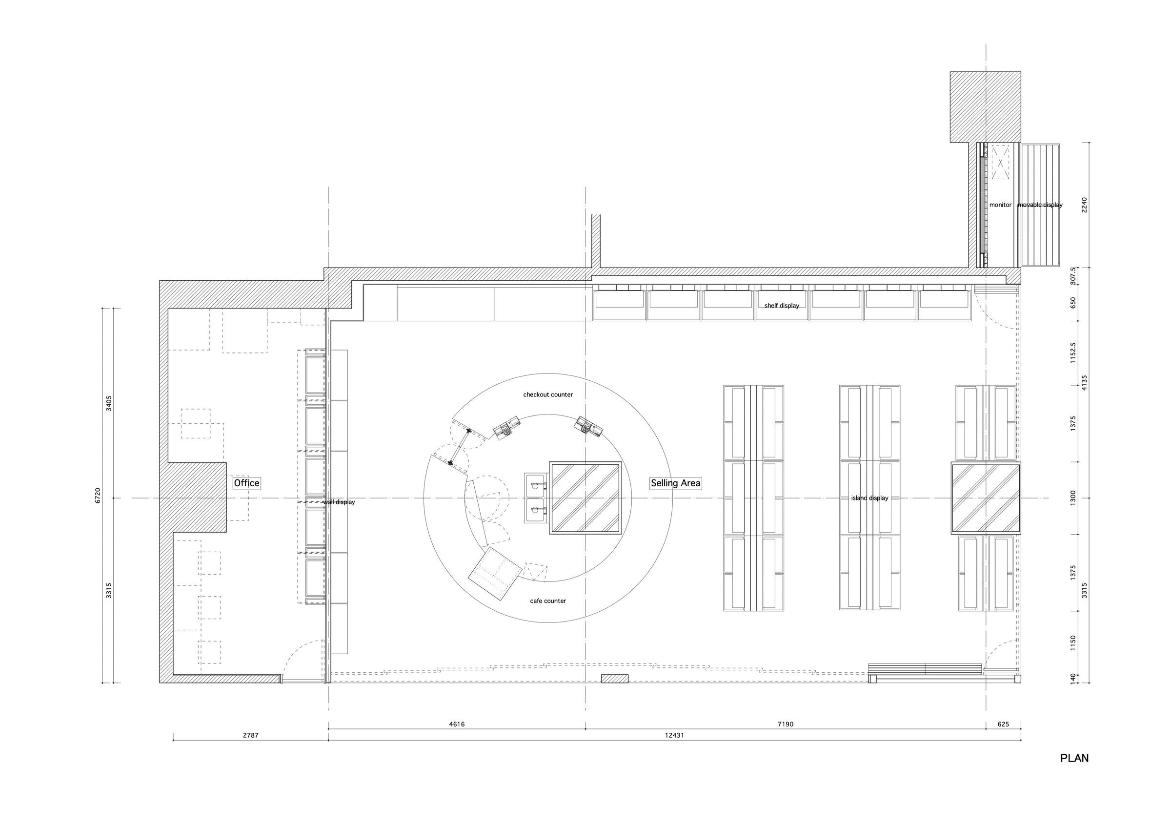
This is a renovation project of the Wakayama Kishukan, a place where local specialties from Wakayama Prefecture are sold to the people in the Tokyo Metropolitan area to promote Wakayama. For the redesigning of the store, an eating area has been added.
The store is located in the basement of a local landmark building in front of Yurakucho Station.

The lower level of this facility is lined with stores selling local specialties from all over Japan. Every storefront is decorated with a variety of designs and signages to attract the attention of visitors. In addition, because stores of this type procure wide-ranging products directly from different producers, product types and package designs are not standardized and, as a result, all storefronts are inundated with a large amount of visual information.

With this background, we aimed to provide a sense of unity for a wide variety of products and add elements to attract passersby into the store. The following are three specific ways to achieve this:

1: Local material and Tactility
A particularly important design requirement was the use of Kishu wood, a product of the abundant forests of Wakayama Prefecture. Kishu wood has a better color and texture and is more consistent in quality than woods from other regions. We were conscious of conveying the beauty of the material itself by simply arranging and stacking them as if they were cut from the mountains and lined up in a sawmill. In today's age of excessive visual dominance with the development of media and the Internet, the rich scent of Kishu cypress will stimulate the sense of smell of people passing in front of the store and draw them into the store.

2: Color: Luster and Noticeability
The products sold in the store are the pride of Wakayama Prefecture and their shape, color, and luster of each package vary. In order to create a uniform impression of these products collectively and in an attractive manner on customers, we used orange as a background color to provide the sense of unity. The thick concrete pillars in the store are also wrapped in orange-painted mesh to create an eye-catching facade.

3: Symbol and Circulation
The storefront widely opens out towards the corridor and creates an unobstructed line of sight, providing visitors a panoramic view of the store and inviting them to come inside. A circular counter that serves as a cash register and an eating area is placed around a pillar in the center of the store. This layout encourages visitors to circulate between different sections in an otherwise monotonous retail space with rows of product shelves. It is the symbol of the store that attracts visitors.

We hope this store will become a place where visitors can touch and smell the agricultural products and processed goods given by the nature of Wakayama Prefecture and experience the real richness detached from digitalization.
(Hirofumi Nakagawa + Ryo Yamamoto)