This project is a renovation of a 1994 2 bedroom brick veneer apartment on the banks of the Maribyrnong River in Footscray. The project is modest but tries to pack a punch through the use of light materials and a pop of colour. The apartment already had beautiful natural light and an excellent view to the river and Footscray Park, however it had seen better days and was in need of a refresh. We were tasked with giving the home a new lease and improve the functionality of the key areas while working within the existing bones.
What was the brief?
The brief was to open up a ground floor living area, reconfigure a very small bathroom on the first floor, and provide a general refresh throughout. The goal was to provide a light, bright renovation which was also robust, functional and cost-effective for a couple with a new baby on the way.
The kitchen was opened up and much needed extra storage incorporated. The bathroom in particular was a difficult space; wedged under a stair to a third floor, it was cramped and not utilised in the most efficient way. The brief also called for reconfiguring this area to make the most of a difficult space.
What were some of the design elements?
The client worked in fashion and design and had some beautiful timber workbenches she wanted to incorporate into the house. The original thought was to see if we could repurpose them into the kitchen or living room joinery, however the sizing of the slabs of timber proved things difficult. Instead, they were repurposed as surface mounted sliding doors to the first floor bathroom and toilet areas, making them a feature on the stair landing.
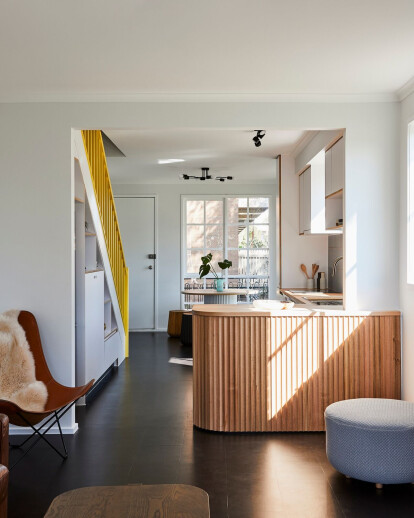
We opened up the U shaped kitchen in favour of an L configuration to give the illusion of more space and provide more accessible cabinetry space. We tucked in additional joinery under the stair and extended the original kitchen out.
In the bathroom, due to plumbing constraints, we kept the shower in its original location, but moved the basing to a previously underutilised nook. Although small, the client didn’t shy away from colour which was great as this gave the bathroom visual impact with the choice of tiles and blue basin.
A bright pop of colour in form of a yellow balustrade adds character to a muted palette. To soften the space, we incorporated a curved timber bench. The fluted timber board cladding this bench added texture to the space while keeping the materials natural. The graph tile in the splash back is muted but on close inspection also adds subtle texture to the space. Dark cork colours contrast with the light joinery.
What were the key challenges?
Working with existing structures can always prove a challenge. The location of the existing services, structures, and plumbing can really dictate what can and can’t be done with a modest budget. The bathroom went through a couple of redesigns after construction started as once the floor was opened, we discovered that waste outlets couldn’t be relocated due to how they fit with the existing structure. These issues were worked out on site with the builder.
Key products used:
Kitchen bench: Porta ‘Contour’ timber lining boards,
Benchtops: Solid timber
Tiles: Classic Ceramic 'Graph' and ‘Pittorica’
Cabinetry: Maxiply Koskisen film-faced plywood
Paint: Dulux
Basin: Concrete Nation
Barn doors: client's own repurposed timber desktops
Who was the builder?
Carland Constructions
https://www.carlandconstructions.com
