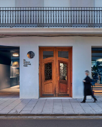
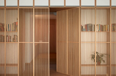
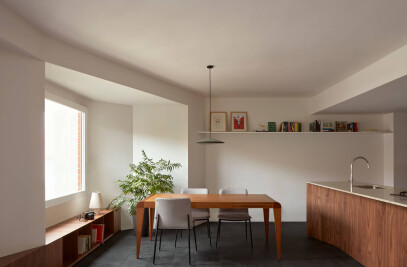
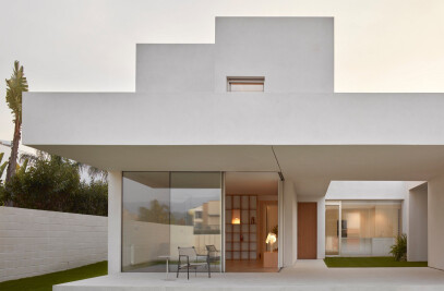
The project was born with the premise of reinterpreting the space for personal care through exercise. A gym concept understood more as an attention and exhaustive control of the body as a whole than as a merely sporty exercise.
Therefore, the space must allow to develop a type of training not only based on the physical, but also accompanied by a mental and sensory development, which will allow the body to achieve the desired balance.
Based on this starting concept, the place to start working offers apparently contradictory and restrictive conditions, with a very marked structure, a hard and symmetrical geometry and a depth emphasized by the proportion of the room to a background without lighting.
The structure that invades the central part of the space appears as an aggressive conditioner since its rigidity initially limits any type of more fluid approach.
On the other hand, the intended use of the space requires high privacy from its users, who must be able to train with an individual and exclusive perception, in an atmosphere of tranquility, silence and concentration.
With these starting premises, geometry becomes the main tool of the project. A square in the center of the space, rotated 45 degrees on the dividing axes manages to free the structure, leaving it included in the spaces intended for service uses and excluded from the circulation space.
This change of direction allows a constant geometric dialogue throughout the space that hides some spaces from each other, guaranteeing the required privacy, while constantly suggesting the following sequence to discover. The space of movement, therefore, becomes the true architect of the intended and finally achieved objectives.
A single color gamut runs through the entire project, silencing the view and allowing the user to be guided only through the succession of planes that define each area of use. Compression and decompression indicate where to stop to access the different spaces.
The central square, the origin square of the project strategy, is the place where public uses come together and works as an interchange in constant activity.
Materially, the carpet on which the circulation space runs helps to change the user's perception from access, working as a first step in the disconnection process that he must experience. As you move through space, everyday life is getting further and further and the body and mind are preparing for their moment Along with the succession of monochrome materials that dress the space, a studied set of reflections allow the perception of natural light to be expanded from the different points of the project.
Simplicity, light, geometry and materiality work in solidarity to prevent anyone else from altering the body's concentration.
Team:
Nacho juan, clara cantó, jose Iborra, ana riera, marta ordoñez, andres herrero y maria Mateo.
Material Used:
1. Carpet - Rols
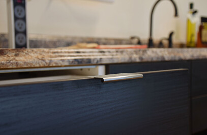
2. Walls– blue lacquered wood
3. Furniture – blue lacquered wood
