Very exciting and experimental approaches to shop design can be observed at opticians as of late. Glasses and sunglasses are fashion accessories today. All opticians carry a big line of designer brands, and through individual, imaginative shop design increasingly are creating a unique selling proposition.
If you enter Hofstede Optiek in the Dutch city of The Hague, you ask yourself, has the interior perhaps been taken from some fantasy film. The shop on Hoogstraat recently was completely refurbished. Nowotny Architecten from Delft were commissioned to design an interior that was to be completely different from others. The all pervasive organic forms catch the eye. Architect Alexander Nowotny was predestined for the job of developing an unprecedented design by his “fresh approach”. According to Hofstede, since about 1997 the optician sector has undergone a metamorphosis to a retail trade that employs flair and atmosphere to sell. Alexander Nowotny says this is also a response to internet commerce: over-the-counter businesses must be able to do more today than sell products; that is to say, they must also take the haste out of buying and offer a good experience and entertainment. Going out to shop is no longer a vital necessity, but a leisure activity.
The new Hofstede salesroom had to be both entertaining and seductive, had to stimulate all the senses without being loud and vulgar. The concept had to embody the opposite of monotonous, overfilled shop windows and endless display racks inside. Hofstede shows frames without exception in display cases, also in the shop window. The products are presented as unique items, because the customers themselves, of course, would like to be unique and buy something unique. Most of the frames are locked away and taken out for the personal consultation with the customer. Self-service only applies to sunglasses. The customer should be served and be given the feeling that he or she is a “star”. The shop serves as a stage.
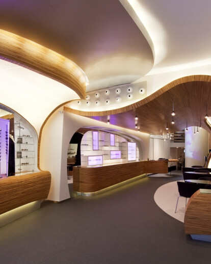
The interior is designed all of a piece. It is a harmonious composition, a walk-in sculpture. The organically shaped interior exerts an attraction upon entering it and transports the customer gently through the room, as it were. Pleasant feelings and associations with the warmth and security of the interior of a body should be generated. All load-bearing walls and the ceilings are covered with facing elements. Upon every movement in the shop, the effect of this fascinating composition of curved, slanted, rising and falling lines changes as the perspective changes. The impact is enhanced by the use of mirrors which visually enlarge the room and seemingly eliminate its boundaries, the walls and ceilings.
Walk-in sculpture The walkway meanders through the store past the display cases, its course corresponding to the lines of the floor, ceiling and lighting design. The customer should move through the shop intuitively. The display cases are simultaneously integrated into the wall and also the mirrors. Some of the showcase presentations even move.
The dominant element of shop design is the combination of white-plastered surfaces and strongly grained zebrano wood surfaces. In addition, steel, chrome, glass and perspex were used. The floor is made of white and black ground natural stone, with an admixture of a silver metallic effect, and looks medium-grey.
In the entrance area the white plaster has been combined with steel surfaces. Here the open sunglasses display is positioned, designed to encourage impulse buying. The mid-shop area is lower and more ‘intimate’. The consultation desks are located here. This area features protective wooden ceiling and wall panelling and a wall-mounted oval consisting of dark-violet ‘glamour velvet’. Violet leather, violet and naturally warm LED lighting plus relaxing lounge music enhance the effect. The rear part of the shop reveals a second, open-sided floor. Images are projected onto the stair construction. Each consulting desk is equipped with a small flat screen on a pedestal to provide digital assistance in advisory talks.
The facade of the shop, white marble prior to renovation, was replaced by a front made of glossy black granite. The ‘Hofstede’ lettering was milled out and highlighted with LED light. The entrance was repositioned so that it is now symmetrical to better comport with the classic facade and the in-shop walkway. The shop window design with its combination of matt and clear glass, and the perspex cubes behind this, create a visually exciting and tempting view into the shop, whose strong design is emphasised by its lighting architecture.The lighting uses mostly LEDs. This includes the lighting of the display cases: colour-changing LEDs have been incorporated into their rear panels and shelf floors. Much indirect lighting is employed, becoming a part of the architecture. The 250 LED strips highlighting the floor, ceiling and wall architecture were developed specifically for this shop project.
About half of the interior finish of Hofstede Optiek in The Hague was produced individually and locally, all in all a refined concept including much custom construction instead of confection.
