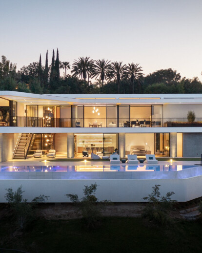
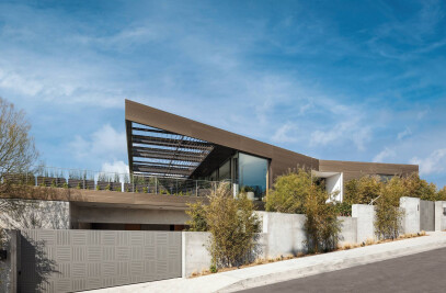
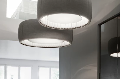
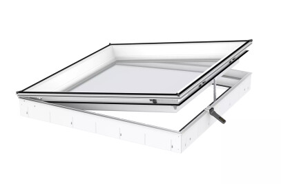
Tucked into a steep hillside lot in Bel Air, the 14,000 SF House on Siena Way tested our firmly grounded modernist principles.
With three full designs produced due to changing stakeholders and client interests since 2013, the main goals of the project never changed, namely: to resolve the site’s challenges in an elegant way, deliver sufficient square footage despite onerous building height limitations, and provide both an intimate family setting and expansive entertainment abilities for the future residents.
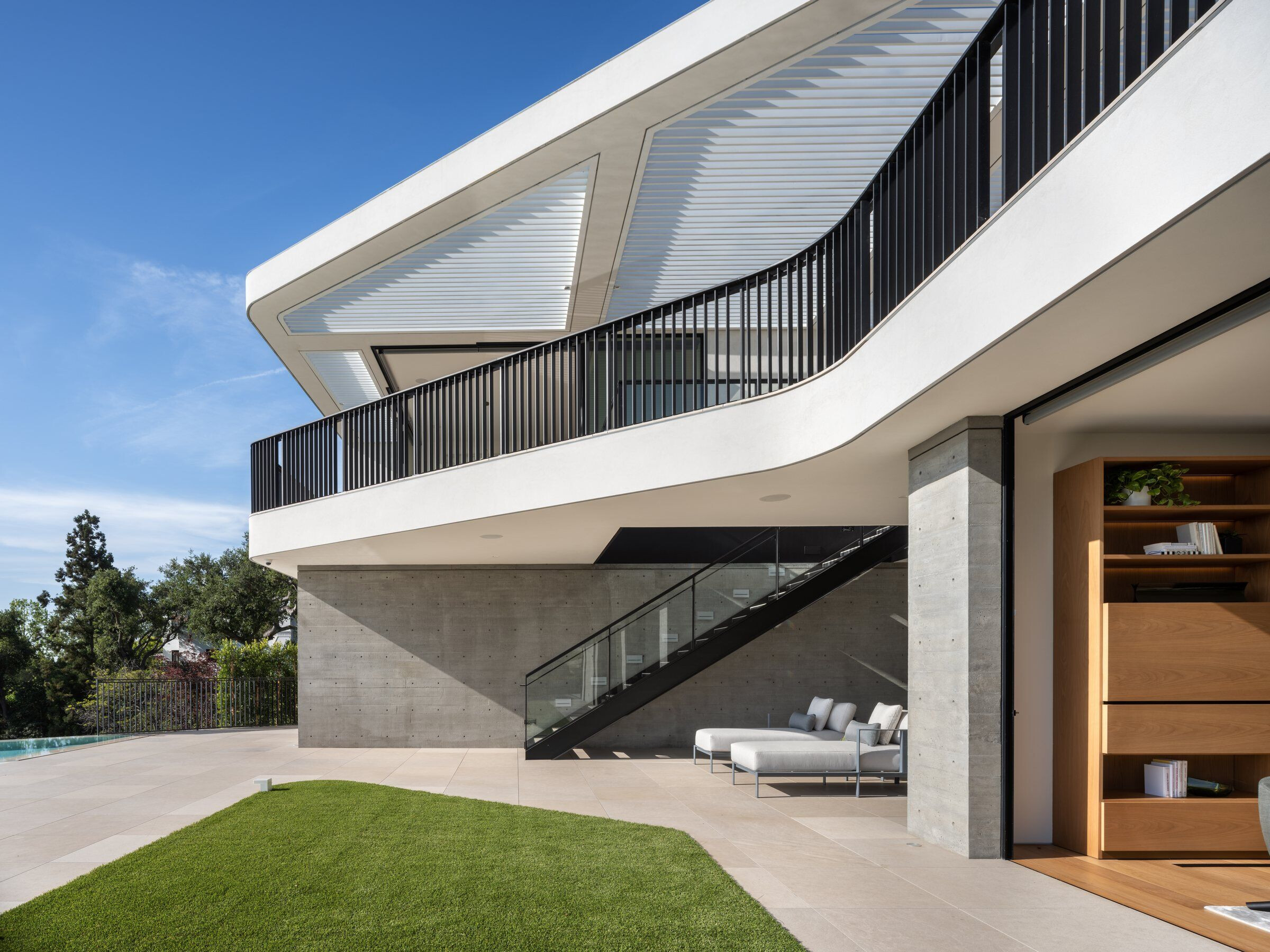
The project, located in Bel Air, presented many challenges including the site’s steepness, narrow street frontage, neighbor-imposed building height restrictions, and difficult vehicular access. By following the natural contours of the site, we maximized the plan, pulled the building down into the site, and stepped the massing to follow the topography. The result is a non-definable curvilinear form, still abstracted in architectural geometry, but with a more fluid and organic shape.
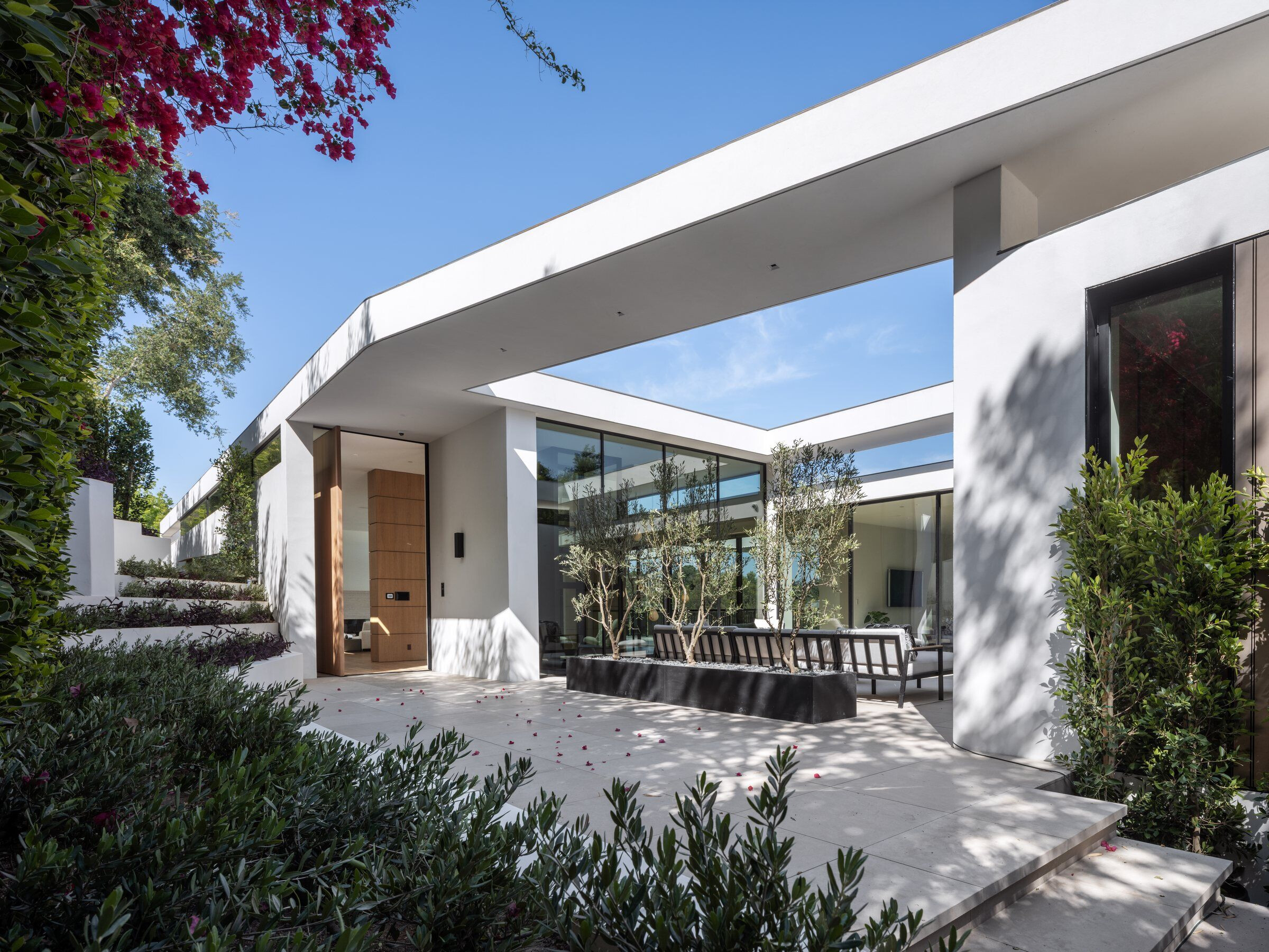
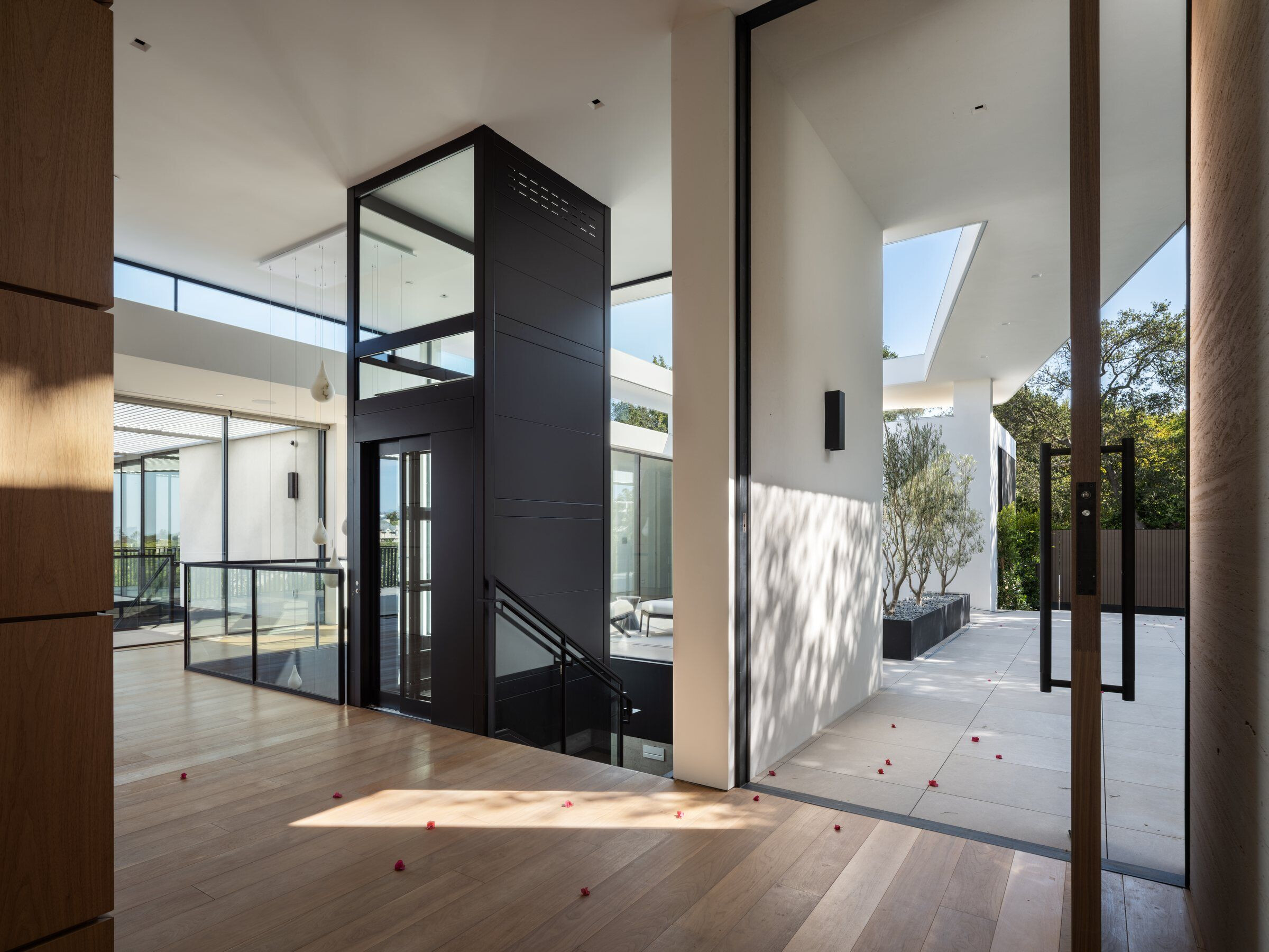
A specific one story above grade neighborhood height restriction meant we had to dig deep into the site to unearth the needed additional square footage required for the development to be feasible financially.The challenge, then, was in bringing daylight down to the lower levels. Two large light wells, one with a monumental stair and glass elevator and one that acts as a sunken court with a sculptural olive tree create the required daylight and ventilation making the lower levels pleasing.
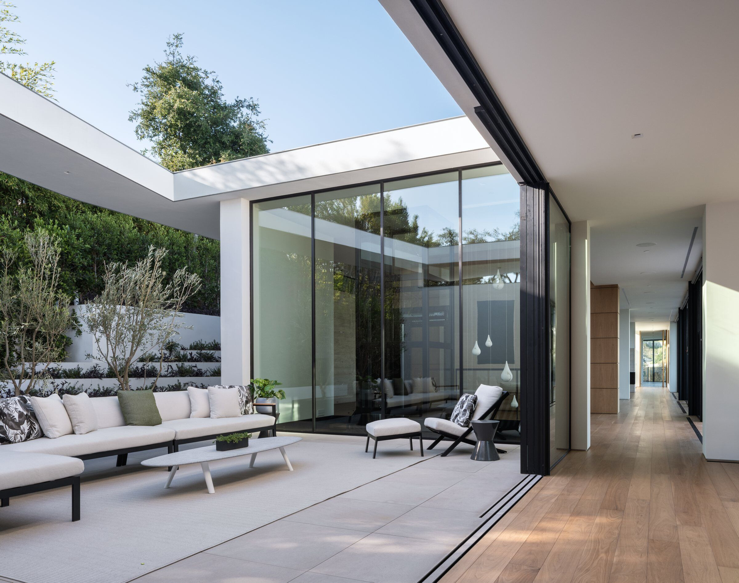
The courtyard not only provides daylighting but brings nature to some of the most frequently used areas of the house, allowing the frequented areas of the upper level to experience the tree’s crown and the lower level to experience the olive’s trunk.
Appearing relatively modest from the street, the home is secretly expansive. Always working to avoid producing a home that feels cold and vast, our aim in designing any residence is to enable future inhabitants to feel comfortable in all circumstances: whether they are hosting a large fundraising party or enjoying an intimate family dinner. Reversed from the traditional approach, the entry-level consists mostly of ‘public’ spaces while the lower level contains most of the ‘private’ spaces.
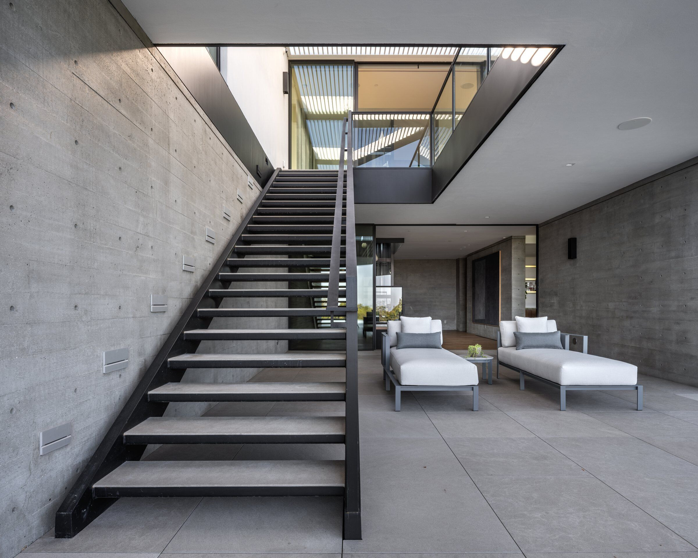
In order to resolve the complex geometries on the exterior of the house, we revisited stucco as a facade solution, despite its historical overuse. Requiring very few joint lines, the stucco looks almost monolithic, pairing well with the bronze-painted aluminum slats found on the exterior.
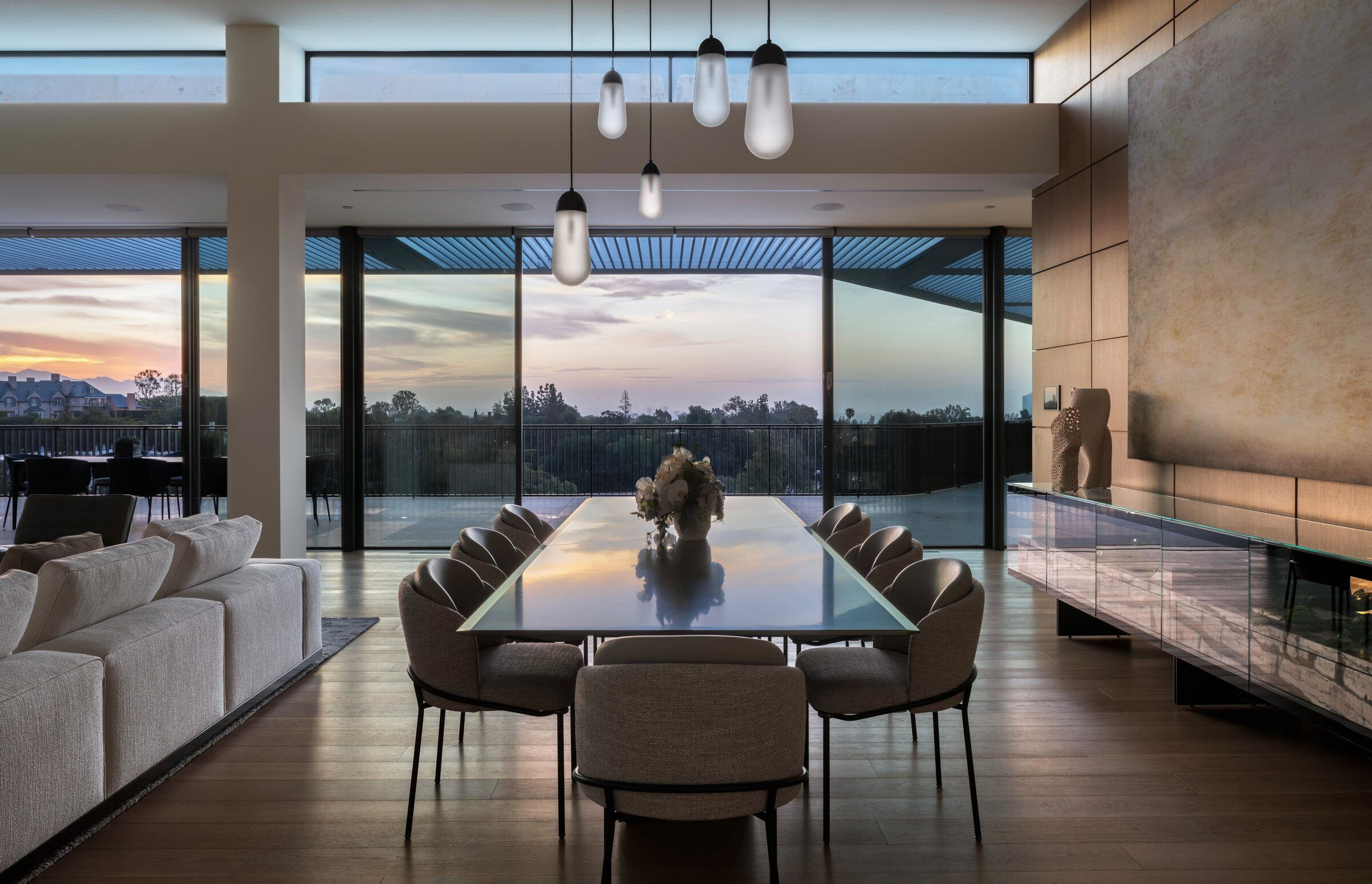
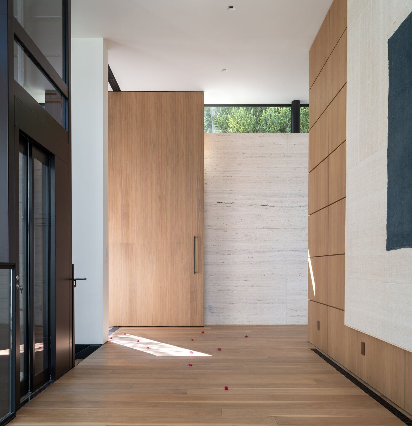
Uniting the interior is a restrained palette and consistent finishes: walls are white, while floors and wall paneling are walnut. The stone throughout is light beige, a color that is repeated in the travertine entry wall. Large amounts of glass with black anodized aluminum frames allow ample light and ventilation into the home.
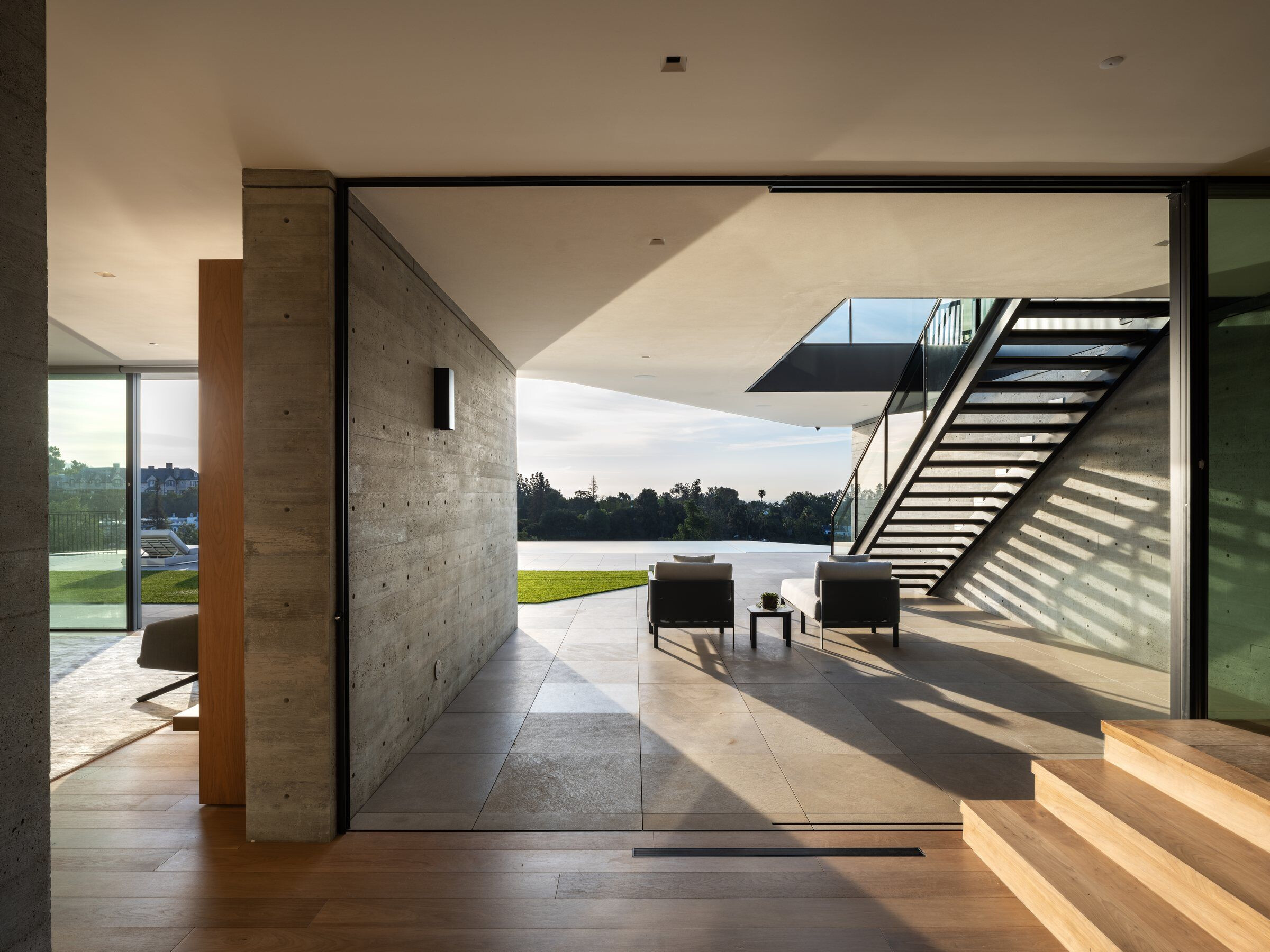
Despite having a more dynamic and fluid geometry than our typical work (the plan is multi-axial: relationships or 'lanes' are turned, rather than straight), the house is still set up on a strict 20-foot grid - a theme we find ourselves returning to consistently in residential architecture.
Team:
Plus Development Group, Builder’s Team
Grover Hollingsworth & Assoc.
Lighting Design Alliance
John Labib + Associates
FORMA Engineering, Inc.
South Coast Engineering Group
Ecocentrix
Aquatecture Pools, Inc.
Ferrari Forge
Material Used:
1. Flooring: Walnut, Blonde Black Walnut Flooring, Madera
2. Skylights: Skylight window, Skylight, Velux
3. Bar grating: Bar grating, McNichols
4. Ceiling: USG Drywall Suspension System, USG Ceiling Solutions
