What is it to be MAIS (plus) FITNESS? Understanding the charisma behind one existing brand is to comprehend that what defines it is the people. It is the will to belong to this “tribe” that makes the people to join and want to belong to this fitness community. From this concept comes the motto for this new gym in Torres Vedras, a middle size city in the West region of Portugal. Our main challenge was the creation of a spatial image identity for this and future MAIS FITNESS gyms.
A tribe communicates by symbols and colors, and it was this language that we proposed to identify in order to affirm the identity of the MAIS FITNESS brand.
The new gym was to be settle in an existing building, so much of the formal exercise was to accept the characteristics of the existing and when possible adapt and reformulate it, so as to make the most of the spatial qualities in behalf of what we intended to transform this gym into.
At the programmatic level, the task was simple. The charisma of MAIS FITNESS is associated with people’s positive energy, and the sharing of this energy in group classes with the maximum number of athletes. Thus, a XXL studio was mandatory - the bigger the better! The definition of the positioning of this space in the layout, as well as the existing access stairs to its interior, were the predominant factors in the program distribution. Placing the reception desk as a nuclear point of the circulation dynamics inside the gym was one of the requirements. Hence, its centrality, allow establishing relations with the lounge area, the studios, the office and service area, and even with the changing rooms.
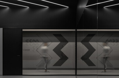
For the creation of the brand spatial identity, we sought to explore concepts associated with its universe: elegance and energy, black and yellow, - and +. By exploring these elements in different intensities in spaces environments, chromatic compositions and graphic patterns, we intend to transmit an exclusive, coherent, contemporaneous and unique identity, inseparable from what MAIS FITNESS represents. The positioning of the brand dictated the remaining options.
We avoided conveying a Low Cost design connotation, but rather a democratic premium. The environments of the spaces, as well as the choice of materials reflects this, elegance and good taste, with a touch of irreverence in the details. We believe that less is more, so we sought to take advantage of a sensible and just pallet of materials, in order to convey unity but also differentiation between the different uses of the gym.


