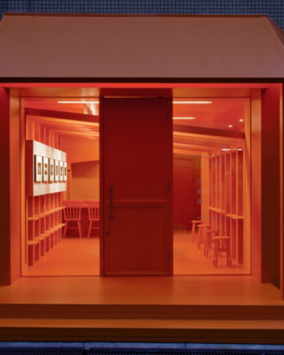
It is located in the area locals live in, which is far away from the busy commercial centre.I designed the shop with the concept of "not to blend in the surrounding", following my client's wish to reflect the meaning of "Sorayumebako" to the actual design.
"Sorayume" is a Japanese word meaning "a fabricated dream", that is, a dream for telling people as if you actually dreamed it. Having this concept in mind, I designed space where visitors can feel as if they stepped into another world, like a dream. The key colour of orange interprets the time between day and night,summer and winter, and yin and yang.It reveals that this is a place for visitors to change their mind fromthe yang "daily life" to the yin "private life".
I only selected one colour in order to enhance visitor's awareness through the shop, from within and without. For letting visitors associate "bako" (the variant form of "hako") meaning "a box" in English, I lined a series of portal frames from the entrance. I also installed tables, bookshelves, exhibition panels and projector panels in this unique structure, in order to make use of space for many different occasions
