


Microsoft HQ Bucharest is paying homage to a historic and symbolic site for the technology and science development in Romania. It takes cues both from the neighboring Polytechnic University and from the rich industrial heritage of the area. Microsoft HQ building is aiming for Well Gold Certification. The Polytechnic University itself was built in the 60's in the middle of the then industrial platform as it was meant to train specialists for the growing industries. Nowadays, the same site became an emerging hub for tech companies.
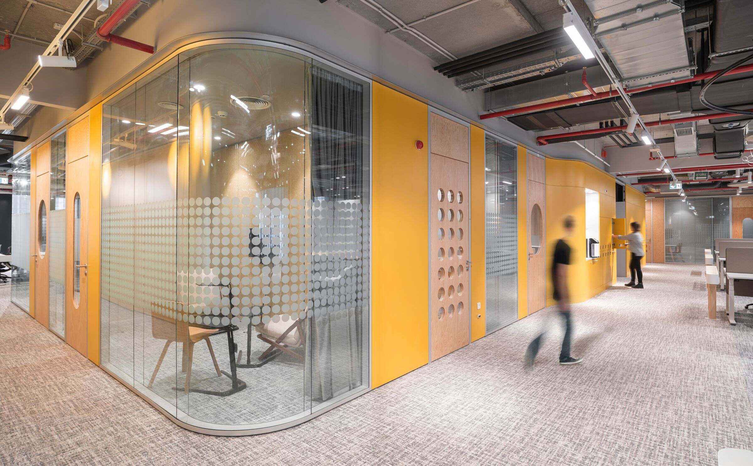
The proportion of the building (long and narrow) required avoiding sharp corners and calls instead for sinuous shapes and rounded corners in order to be pleasant to walk through. The curved glass walls are a symbol of a technological victory but also a reminder of the streamlined architecture of the 30's, the period when modern Romania was founded.
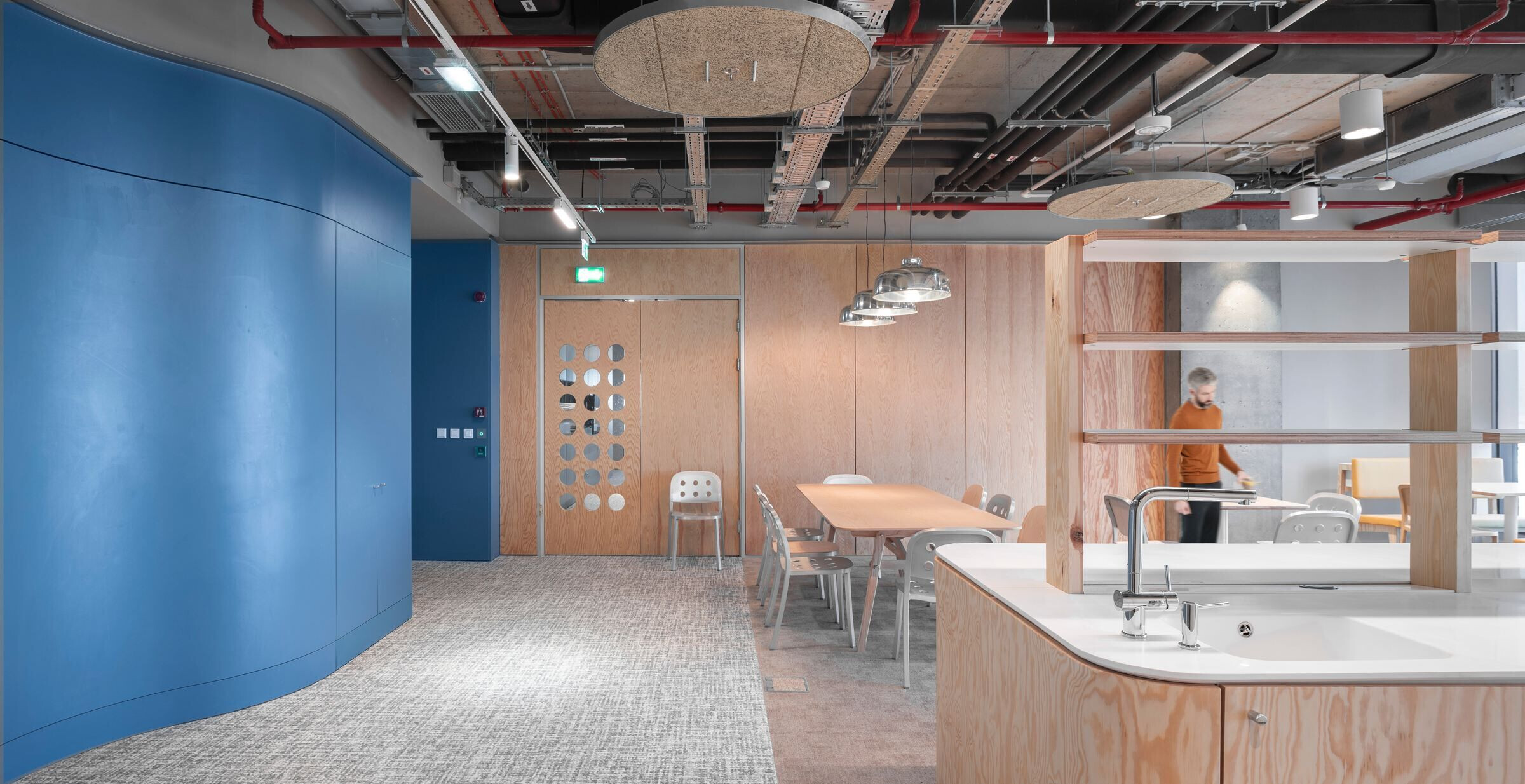
Across the street from Microsoft's HQ is the historic building of the Army garment factory, further on is an airplane turbines factory, then the "Electrotechnica" (founded in 1915, a subsidiary of AEG) all culminating with the iconic UFO shaped Polytechnic’s auditorium, a local landmark. All these inspiration converged to a family of shapes expressing both fascination for modernity and a reverence to the past.
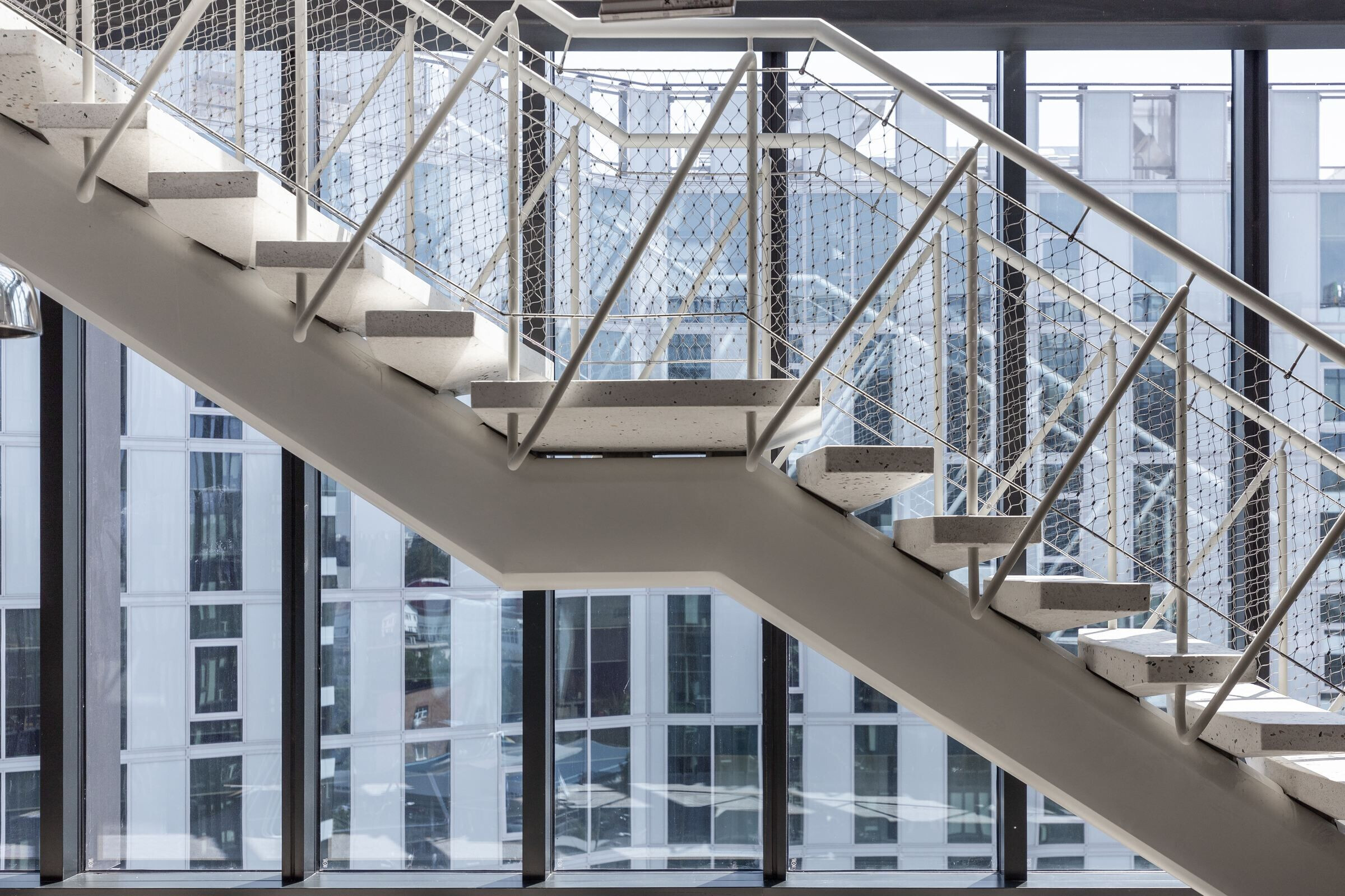
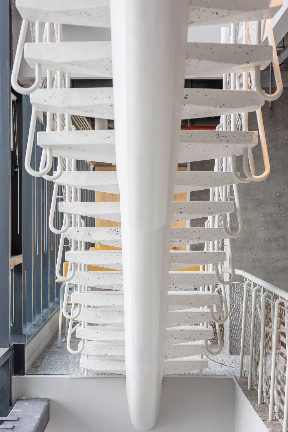
The staircase uniting the 10 floors is a metaphor for the thread and fabric, related to the historic and prestigious garment factory across the street. The punched holes pattern is a common international modernist symbol of the "age of the machine". With all these references to an industrial past and a tech future, the place is warm and pleasant through the use of natural materials and pastel colors, natural veneers (pine, ash, oak), natural wool felt for acoustics, wood fiber ceiling treatments, cork acoustic walls. Each of the 10 floors has different finishing and colors: Aluminum, copper, bricks, wood, corrugated steel.
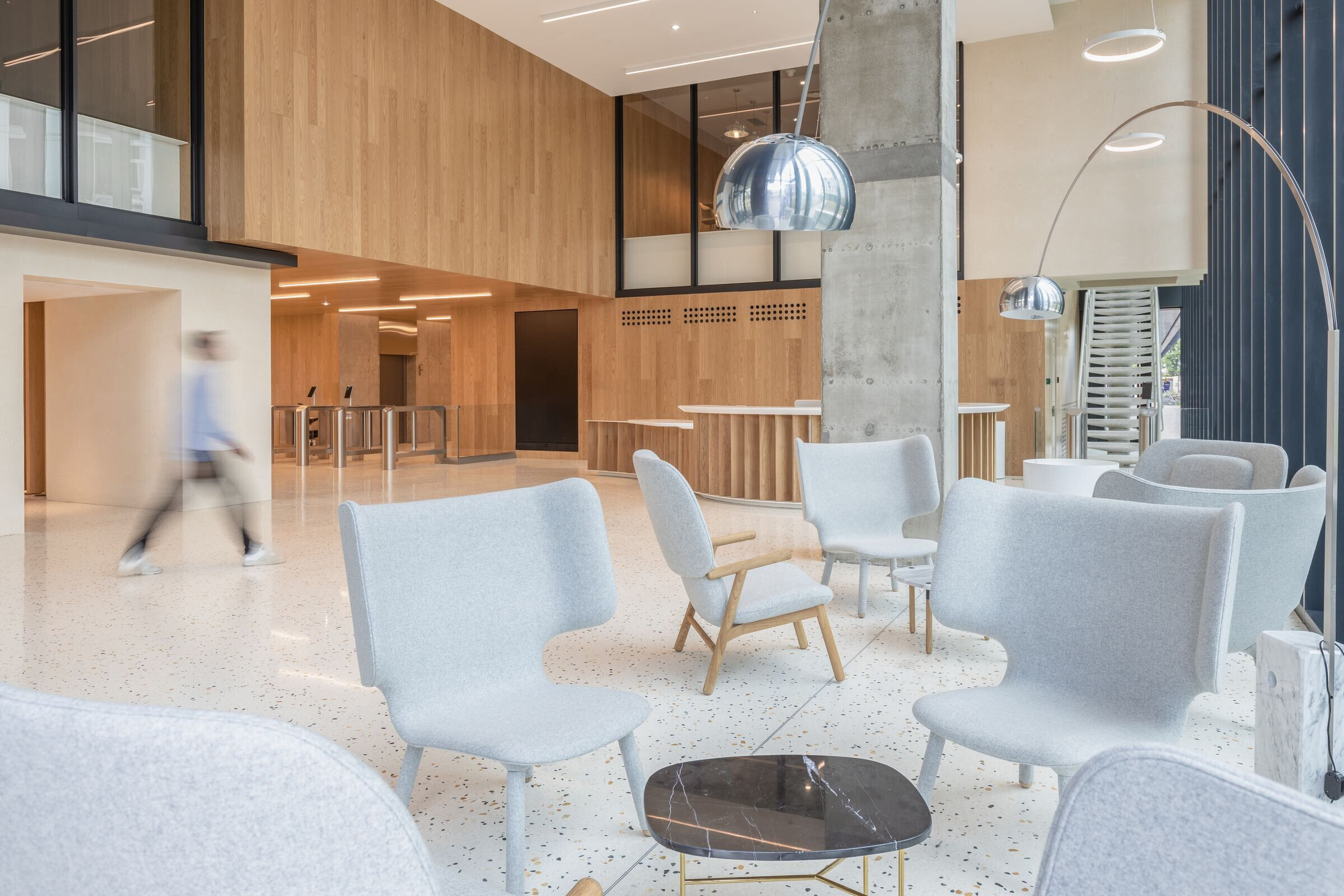
Our aim was not to glorify the disappeared industries, but to pay respect to the history of the place and to uphold its positive effects. Hence, the design is bringing forth elements of industrial heritage, families of shapes, materials and textures reminding the local history while capturing the essence of modernity through simple, geometric lines, streamlined, clean finishes and built-in technology. Of course, without the proper key, these analogies stay hermetic. We tried to find a bridge between fascination for modernity, industrialization and the eternal human need for pleasant, intimate spaces.
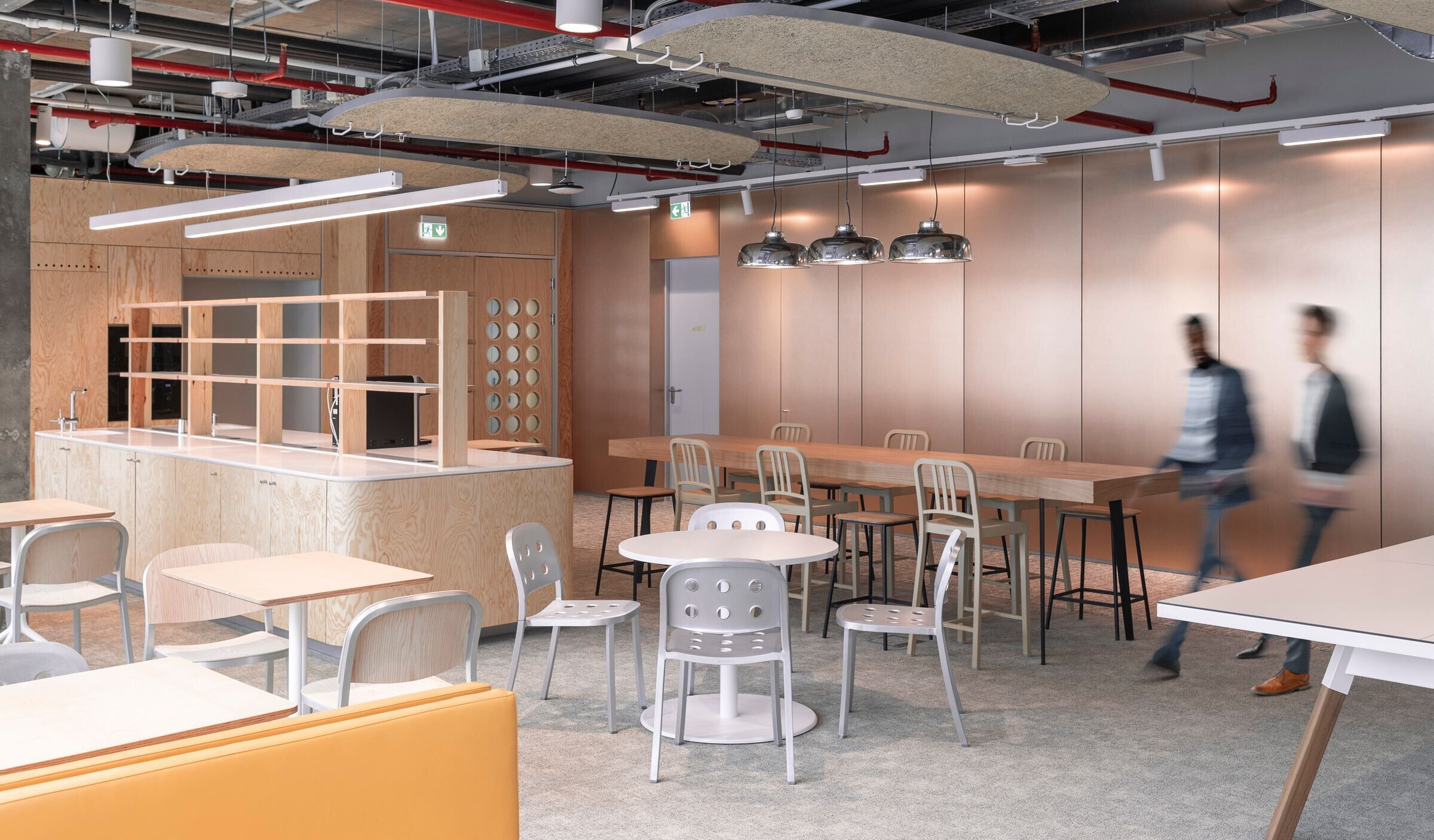
Extreme attention was given to light. In most offices, light is even and dull based on the false assumption that a working space needs to be powerfully and evenly lit. Even the official norms reflect this outdated model. While this was true 50 years ago on a production line, it cannot be falser in a space where everybody works on screens and each glare is a nuisance. After visiting many offices where employees keep lights off, we devised a plan with directional lights aimed to behind the screens, peripheral spotlights for a pleasant atmosphere and dedicated, dramatic light for architectural features.

What was the brief?
Follow the Microsoft Design Manual which contains the global guidelines while being strongly local in ourt approach
What were the key challenges?
Understanding deeply Microsoft's way of working in order to deliver a tailor made solution for its needs
What materials did you choose and why?
As much as possible natural materials: Plywood, massive wood, natural veneer, natural wool felt for acoustic elements and terrazzo beacuse we beive in the warmth of the natural materials and in their role in the wellbeing of the inhabitants of a building. We also used copper and corrugated steel and brick as they remind of the industrial heritage of the area
Material Used:
1. Flooring: Shaw carpet, Terazzo
2. Doors: solid wood
3. Interior lighting: Greentek spotlights, linears and pendants
4. Interior furniture: playwood, custom designed and produced. Steelcase desks and chairs


