



THE OBJECTS IN THE FENCE
In the premises that housed a jewelry store, three young doctors open a new pharmacy. The structural features of the building and other constraints severely limit changes to the plan. The container is therefore well defined and becomes a constraint - opportunity. The project therefore focuses on the enclosure, the objects it contains, the axes of visual and spatial relationship between inside and outside.
Interior care aims to define a pharmacy that deviates from the common perception of this type of activity. A refined, linear and welcoming space was defined that would provide a neutral but not cold container, ready to welcome the complexity that would be generated by the products on display. The display system constituted the enclosure, the perimeter of the container, of the box. Some precious “objects” become the fulcrum of the two sales areas: the counters and the source. Pure volumes made as monoliths covered with stoneware slabs that become the center of the drug sales area and the area dedicated to cosmetics, respectively.
A new element for a pharmacy is the source, an iconic monolith, accompanied by a ceiling spout, which at the same time becomes a functional element of purification, sanitation and an iconic object uniquely characterizing the activity. The source in the cosmetics area is the beginning of an experience, of an approach to cosmetics. Path that begins precisely with washing your hands.
The simplification of the container led to the monochromatic choice of the coverings, from the painting of the walls, to the furnishings, to the color of the flooring embellished with a textile texture up to the system of display shelves. In counterpoint there are the stoneware objects with a marked materiality and the light of the reflecting gold-colored windows. The elegant combination of a few elements and colors is also enhanced by the different textures of the various parts: the smooth reflection of the glass, the roughness of the "bush-hammered" stoneware, the light grain of the plaster on the walls and ceiling .
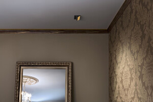
The lighting follows the general direction, technically centered and calibrated for the correct display of the products without becoming dazzling and excessive. Designed as if it were a home environment, targeted, soft without ever trivializing the environments with diffused and generic lighting.
The result is an environment that welcomes, does not dazzle and does not impose itself. Which puts the objects on display and the living comfort of those who work there and customers in the foreground. The rigor of volumes, lines and alignments to pursue simplicity by subtraction without losing the refinement and warmth of the welcome.
Material used:
1. General contractor: Edil Sama srl
2. Flooring: HPL laminate, “Fly me to the moon”, Barry Alloc - Woodco -
3. Glass doors: Gold glass doors, customized products, Edil vetro srl
4. Windows: Customized products, local artisan
5. Interior furniture: Custom furniture, Pianeta legno Ebanisti srl
6. Coatings with tiles: Stoneware tiles, Sensi-brown lithos, Casamood Florim
7. Faucets: Ceiling washbasin mixer, ID210 rose gold, IB Rubinetti
8. Supplier : Pirrera Ceramiche, Favara (AG)
9. Interior lighting:
Track lights, Optus, Linea light Group
Recessed spotlights, light shadows, Flos
Outdoor projectors, Fenestra, Flos


