The project is a co-working space located in Shenzhen, which was design by X+LIVING. The goal was to create a space which can accommodate multiple companies and give full play to the employees' individuality, and let "co-working" no longer be just a synonym for "low-cost".
The chief designer, Li Xiang, integrated artistic aesthetics and interesting visual effects into the four-storey space, and differentiated the tone and style of each floor based on functions.
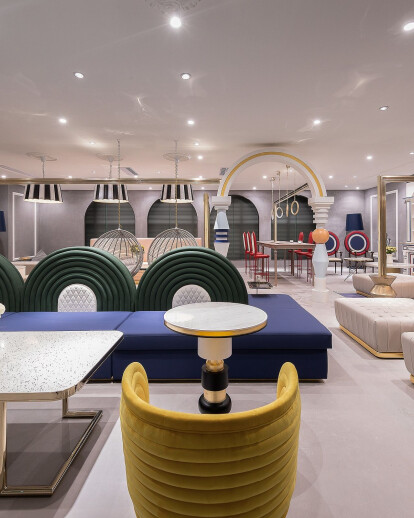
1F serves as the lobby and reception area, with two entrances. The main area of the lobby on the south side functions as the main entrance, from which people can reach the workspace, while the north area features an entrance leading to the dining space and a large striking installation resembling a hot-air balloon.
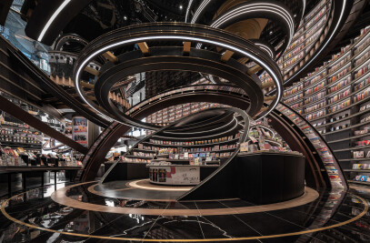
An atrium runs through the overall space. Besides, the window panes were embedded into the interior wall, making it appear to be the facade. When the escalator rises and passes through each floor, people can enjoy varying visual experience.
2F functions as the dining space. X+LIVING laid emphasis on design of the end area of the corridor. Colorful background walls, combined with interesting dining-related furniture and installations, add visual appeal to the space and allows interaction among people, space and articles.
3F is a small workspace, targeted at young groups. The space around the two escalators is used as public reception area, which is connected with the shared conference room and resting area, and separated from the office that requires privacy and quietness. Such clear spatial layout makes the visual point more focused, and facilitates future operation and management.
As reaching 3F by taking escalator from the lobby, people will be firstly welcomed by the words "Work Hard" on a show window, and then see the public reception area with grotesque artworks when turning around. X+LIVING utilized elements of gym equipment in the space to convey the idea of keeping balance between health and work. The champagne gold horizontal bars and rings are very eye-catching, enriching the spatial experience. Chairs were designed with diversified forms and shapes for the sake of serving different needs, including social interaction, leisure, learning and staying alone.
X+LIVING designed several rugs in the public reception area, which not only echo the paintings on the walls but also make the space more comfortable and visually attractive. The open bar area and relaxing ball pool are on the side of the reception area. It is interesting that two paintings can be seen from the bar area. The head part of Vincent Van Gogh's self-portrait and hands of Mona Lisa indicate the washrooms for males and females.
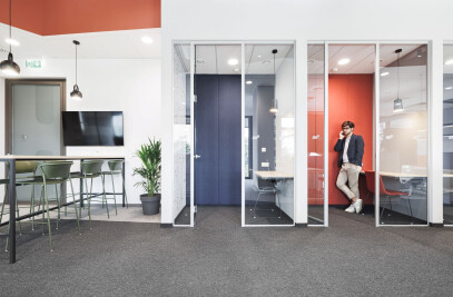
Passing through the reception area, people will come to the shared conference room and the telephone-booth-shaped resting rooms. The conference room is characterized by minimalist design, with the projector box as the highlight. The resting rooms were decorated with a warm tone, equipped with soft seat and wall cushion.
4F is a large workspace for mature and elite groups. It has the same layout as 3F. The space near the escalators also functions as a public reception area, with the large office area surrounding it, so that employees of each company can reach their working area very conveniently. The overall space on this floor was endowed with a sedate and mature atmosphere by use of wood veneers and grayish-brown concrete coating in a large area. The furniture was designed in a minimalist style.
Besides, elements of exercise equipment can be found in the space as well, reminding people to pay attention to physical health after work.
Material Used :
Customized furniture: XiangCASA
