Located in Aldeia da Serra, customers hired architect Beto Magalhães to review the initial design of this house that was already underway. After making a new study of the terrain, the professional privileged the view to the forest taking into account a considerable existing slope. With more than 900m² of built area,
When architect Beto Magalhães was hired to design the residence in a condominium in Aldeia da Serra, on the outskirts of São Paulo, he had to adjust his design to the foundation works of a project that had been commissioned from another professional and were already completed. The clients were not fully satisfied with the paths the work was taking and, advised by the construction company - which had already participated in other Magalhães projects -, decided to give a different direction to the project of their future home.
Examining the existing solution, Magalhães identified - among the situations that he considered to be inappropriate - that the party did not take advantage, for example, of the interesting landscape, as well as did not make a correct reading of the topography of the terrain, which has a considerable slope. For this reason, his proposal took the consolidated foundations as a starting point, but redirected the party, especially in the sense of favoring the view of the existing forest in the vicinity of the lot that is located practically on the edge of the condominium.
According to the architect, the volume envisaged in the previous project used a wall without openings on one side, which - also due to the number of floors envisaged - made it similar to the blind gable of a small building. The new project accommodated the program on the same four floors - the lower two are embedded in the land's plateaus, in order to take advantage of the slope of the lot - but created wider openings on the sides and on the back of the house for future residents to enjoy the nearby landscape and the horizon.
The plan of the main part of the program (where are the intimate environments, living / dining areas and kitchen) consists of two overlapping rectangles, however slightly misaligned. Access to these spaces is independent: on the right, you reach the service area / gourmet kitchen; on the left, you enter the living / dining rooms. On the first lower floor (garage / living and terrace), the same regular geometry remains, but with the larger rectangle (garage) perpendicular to the smaller one. The pool completes this level.
When designing the living room with double height in the first basement, the author says that his intention was to visually integrate the ground floor and the lower floor, in order to avoid the section and excessive isolation between the levels. On the ground floor, a walkway connects the dining room to the uncovered terrace at the back.
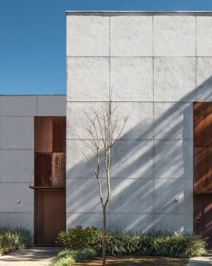
For the finishing of the higher floors (the box, as Magalhães calls them), the architect specified mineral aggregate covering, paginating it, predominantly, in the form of squares - on the main facade, the doors in corten steel, topped by irregular inserts of the same material. On the lower floors, a larger amount of material similar to the exposed brick was used - this, while seeming to embrace the upper box, suggests that the upper volume is supported only on the lower levels.
Material Used :
1. Ornare (planned furniture)
2. Wall Lamps (lamps and fixtures)
3. Palimanan (coatings)
4. Viking (kitchen equipment)
5. Aluminorton (frames)
6. Coppermax
7. Casa Franceza (facade cladding)
8. MGA Mármores (stones, marbles and granites)
9. Castelatto (floors)
10. Indusparquet (floors)
11. Portobello (floors)
12. Vallvé (metals)
