Archello Awards · Vote for your favorite projects, products and firms!
Archello Awards 2024 · Vote today for your favorite projects, products and firms!
Archello Awards 2024
Vote for your favorite projects, products and firms!

Japanese aesthetics

An overview of projects, products and exclusive articles about japanese aesthetics

Project • By Eme CarranzaBars

NIÑO GORDO

ASIAN GRILL Niño Gordo welcomes you to his playful and interactive world. A trip through Japan, Thailand, Vietnam, China, Korea and Taiwan. An Asian grill that reflects the migratory mixtures and the presence of oriental cuisine in our city. The diversity is evidenced in its layout with different types of sitting, matching with a kitsch look at the iconic elements that represents these cultures and which we all carry in the collective imagination. Its identity is made up of a wide graphic universe, materialized in coatings, crockery and merchandising. Niño Gordo is fun, it´s fire, with an Asian touch Federico Kulekdjia Team: Architects: Eme Carranza Photographer: Federico Kulekdjian Federico Kulekdjia Mat... More

NewsNews • 30 Mar 2023

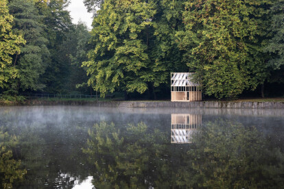
Grau Architects craft a minimal wooden pavilion that pays homage to Japanese tea houses in Czechia

Set amidst lush riparian trees on a piece of land overlooking the Hrabinka lake in Czechia, the tea house pavilion is an intervention in public spaces designed as a part of the Mood for Wood International Workshop, crafted by Slovakian architecture firm Grau Architects. Matej Hakár The 9-square metre pavilion comprising a simple material palette of birch plywood and geotextiles reflects the architecture of traditional Japanese tea houses with a hint of contemporary elements. Matej Hakár Grau Architects The pavilion features a minimal, open construction that sits in harmony with the surrounding environment, immersing one in views, sounds and movements of nature. Matej Hakár Grau... More
We wanted to achieve the maximum presence of nature in the bathroom area
The main square of the hotel
We wanted to make some areas of the hotel more monumental
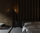
Mutis hotel room is a combination of Asian and minimalist direction which includes expressive textures and custom details
The bedroom and bathroom area is separated by a glass partition

Project • By 279 concept studioHotels

The Mutis hotel with Japanese aesthetics

The concept hotel "Mutis" located in Indonesia. This project represents our search for combinations of different stylistic directions. We experimented a lot with geometric shapes, materials and furniture. Caption Caption Project concept creation took about 2 months.One of the ideas of this project was to give people the opportunity to feel like a part of nature through location, natural materials, colors, art objects and interaction of plants with interior and architecture.We used artistic plaster in the interior, polished concrete on the floor, custom metal and wood panels on the walls. Caption Caption More

NewsNews • 26 Mar 2021

Yuomori Onsen and Spa fuses minimalist Japanese aesthetics with local materials

In the middle of Bangkok City, Sixseven Studio (67s) has completed a new urban retreat that offers authentic Japanese onsen and Thai massage. The building comprises two parts: an old apartment building and new building, separating the function of onsen and spa treatment facilities. W Workspace The bridging of old and new is inspired by Kintsugi, a Japanese art of repairing broken pottery. The result is a modern Japanese minimalist aesthetic fused with local materials. W Workspace The key challenge of the project is the narrow nature of the plot. In the heart of Bangkok CBD, the site is surrounded by tall dense buildings on all sides.  67s found a design solution with the insertion of various courtyards that allow for natura... More

NewsNews • 11 Mar 2021

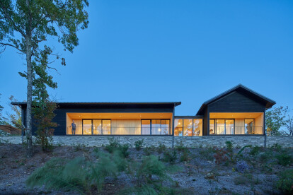
Tennessee mountain house inspired by Japanese form and aesthetics

Looking out to the Great Smoky Mountains of Tennessee, the Short Mountain House by Sanders Pace Architecture is divided into three distinct pavilions. This strategy allows space to be efficiently compartmentalized to meet the needs of the owner or expanded into adjacent pavilion areas when extra space is required for guests. Keith Isaacs Photo The pavilions are oriented in a way that defines a unique series of negative/exterior spaces around the house and allows for clear sightlines into the surrounding landscape. Connectors designed as bridges span the space between the pavilions, linking them together. Keith Isaacs Photo Though the simple gable roofs are in keeping with the region’s vernacular, the roof pitches are based... More

Project • By KURZ architectsSports Centres

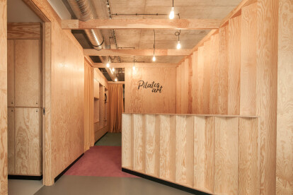
Gym studio Pilates Art

Pilates Art, located in Prague-Klánovice, is a specialized gym studio focused on the Pilates method. It is a place where you can train on a perfectly thought-out and elegant Pilates machines. To the owners it was imporant to create more than just a gym filled with people. As such during the design process we aimed at creating a space fostering quality of the exercise and at the same time supporting a cultural environment in which both body and the soul would feel good. The studio is divided into several basic zones, which form a compact and functional unit together. The very center of the studio is a relaxation and community zone designed for the opportunity to share impressions with others over coffee or tea, or just to feel the rev... More

Project • By Nakamoto ForestryPrivate Houses

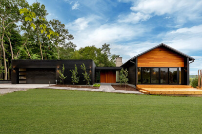
Avon House

This project was a single-family new construction build in Avon, Minnesota, featuring Suyaki unbrushed yakisugi (shou sugi ban) exterior charred siding. It was designed as a hobby project by Colin Koop of architectural juggernaut SOM as a family home for his parents. Design parameters   https://nakamotoforestry.com/portfolio/avon-house-avon-mn-suyaki/   Product: Suyaki 1×6 select grade shiplapPrefinish: BlackApplication: Residential – ExteriorSF: 6280SFDesigner: Colin KoopBuilder: Schoenberg ConstructionDate: September 2017Location: Avon, MN More

Project • By MASAKI SUZUKI ARCHITECTSApartments

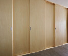
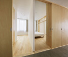
House with Sliding Doors

1. Sliding doors and hinged doors      Sliding doors have long been used in Japanese architecture. Japanese architecture has a veranda space, and Japanese people have lived by using sliding doors such as shutters and Shoji screens to control the way they connect with nature and people. Isn't it possible to utilize the device that controls the connection with the external environment even in the dwelling unit of an apartment house? With that in mind, this renovation plan was considered.      Generally, the corridors inside the dwelling units of apartments are dark and closed. It is no exaggeration to say that this is fate, because limited natural lighting is naturally assigned to the living room, and the corri... More

Project • By EA Research and Design Office / Takeru ShojiPrivate Houses

ta house

Located atop the sand dune hills of Futaba-cho in the Chuo ward of Niigata city, the area has a notable history. 170 years prior, the area was an erosion control forest meant to bind the sand and prevent it from blowing into the city. After a large fire in Niigata, the city underwent a large scale urban development project in the 1960s and 70s, where this erosion control forest gave way to the construction of educational and residential buildings.   Presently, the formerly large residential units of the area are being divided into smaller segments, leading to a densely packed residential area. The site on which “ta house” is built, is also part of this history.   The site is in a flagpole shape, (a flagpole site has a narrow entry path lead... More

Project • By EA Research and Design Office / Takeru ShojiPrivate Houses

sakuramori house

Located in the heavy snowfall region of Yokote city, Akita prefecture, the site originally comprised of a large residence, a storehouse and a large Japanese garden. Our design direction was to demolish the original house and storehouse, and rebuild atop the site, a more compact house for the couple. It was very important for the clients to preserve onsite large Japanese garden, as they had nurtured it for many years, and since the site receives such heavy snowfall, they also sought a more comfortable relationship with this environment and its hardships.   With this brief, we proposed a building where all the daily living activities and spaces are arranged on the first floor and the second floor is a low ceiling loft. Thus, in essence creati... More

Project • By EA Research and Design Office / Takeru ShojiPrivate Houses

on house

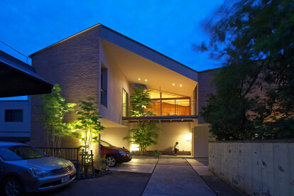
The site is located in an old and quiet neighborhood of Sakata city, Yamagata prefecture, near the national highway that runs through the Tohoku region. On house is designed for a family of four whose design brief detailed the need for a house that can cater to the individuality of each member of the family. The clients wanted a house where each member of the family can have their own space but they can feel the presence of others around them.   With this brief in mind, we scattered 3 towers on the large 330 square meter site and connected them using a deep eave band at the mid-level of the towers. When the residents travel in between the towers, they will invariably cross spaces, like the doma (cement floor) corridor or the terrace, under... More

Project • By EA Research and Design Office / Takeru ShojiPrivate Houses

shiro house

The site is located in the dense residential area of Narayama, Akita city, facing a row of a thousand cherry trees lining the bank of the Taihei River. The house is designed for a couple and their child on a small land of 92.5 msq, located at the fork of a road.   What was required from the design: A house with the ability to open out to its the surroundings, despite the harsh Akita snow, and enjoy the view of the cherry blossom trees lining the Taihei River from the comfort of the house. Since the site is located in a dense residential district, the narrow road fronting the site sees heavy traffic. We felt that a conventional construction approach would seem oppressive to this surrounding, and thus the two walls facing the road are incline... More

Project • By EA Research and Design Office / Takeru ShojiPrivate Houses

M house

Located in the mountain basin of Uonuma, Japan; the city does a complete turnaround from warm humid summers to snow covered winters. Here the temperature can reach up to 30 degree celcius in summers with over 80% humidity, while in winter the city might receive snowfall reaching up to 3 meters in height. Thus, a house built in this region needs to not only face the adversities of the land but also create an environment where the residents can thrive within their surroundings.   The conventional design approach to counter this snow is to elevate the living spaces, use mechanical means to melt rooftop snow using ground water and have thick walls with additional insulation. But all these measures create an isolation between the inside a... More

Project • By lamatildeRestaurants

Japs! cucina giapponese – Carlo Alberto

Opposites rule: light and darkness create an ideal separation, so the same space can serve the two souls in Japs! – fast and slow. This was a 360° project that went from interior decor to branding, connecting every aspect: for example, the decorative motif in the logo became a graphic and architectural element, in a relationship of perfect symmetry between image and architecture. Now each Japs! restaurant offers a different Japanese specialty, effectively connoting the chain’s different venues and sparking clients’ curiosity.Japs! – Carlo Alberto was the first restaurant to introduce Turin to traditional izakaya, the Japanese after-work venue par excellence. In this, designing the new counter – a western in... More

Project • By lamatildeRestaurants
Japs! cucina giapponese – De Gasperi

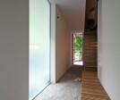
Opposites rule: light and darkness create an ideal separation, so the same space can serve the two souls in Japs! – fast and slow. This was a 360° project that went from interior decor to branding, connecting every aspect: for example, the decorative motif in the logo became a graphic and architectural element, in a relationship of perfect symmetry between image and architecture. Now each Japs! restaurant offers a different Japanese specialty, effectively connoting the chain’s different venues and sparking clients’ curiosity.Japs! – De Gasperi makes the separation between opposites extremely sharp with all light elements aligned on the same side. Furthermore, making the counter light stone, framed in iron, m... More