At times, all that is required for a unique living experience and powerful living space is to adopt a design approach that is different from the standard. The owners of this property in central Israel did just that. They hired designer Nitzan Horowitz, who designed a home focusing on natural materials and a monotone color scheme, which give the property its unique character.
In a quiet and pastoral neighborhood in a central town, stands one of the most unique homes recently built in Israel. The owners, a couple in their 40s’ and their three teenage children, purchased this duplex property and contracted the services of the well-known interior designer Nitzan Horowitz, to lead the renovation project.
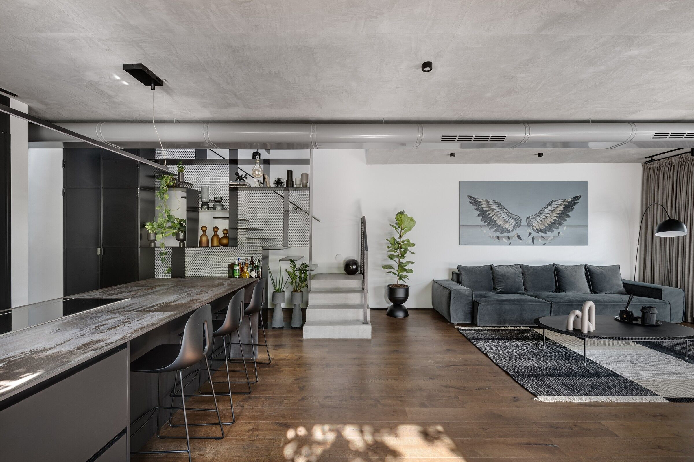
"The process was exceptionally fascinating for a couple of reasons: Firstly, the plot is not big and yet we managed to create large open and well-lit spaces”, explains Horowitz. “Secondly, the owners' focus from day one was on materials. They insisted on combining natural and natural-looking only and so we managed to create a home that is a blend of a clean and modern design with industrial motifs”. Thus, he created a new design language that flows between modern and industrial, raw and clean, throughout the house.
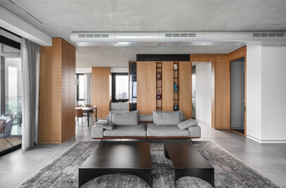
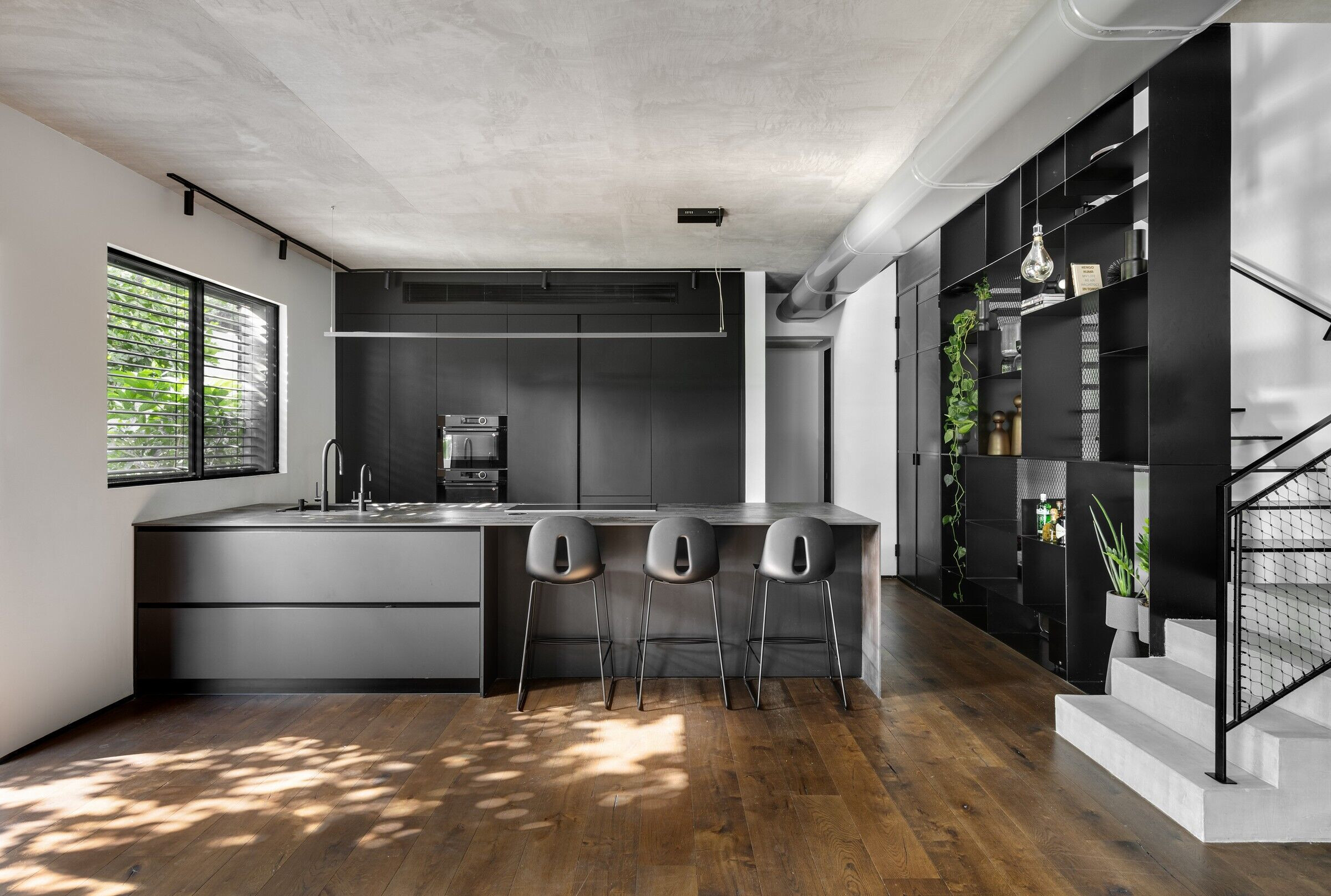
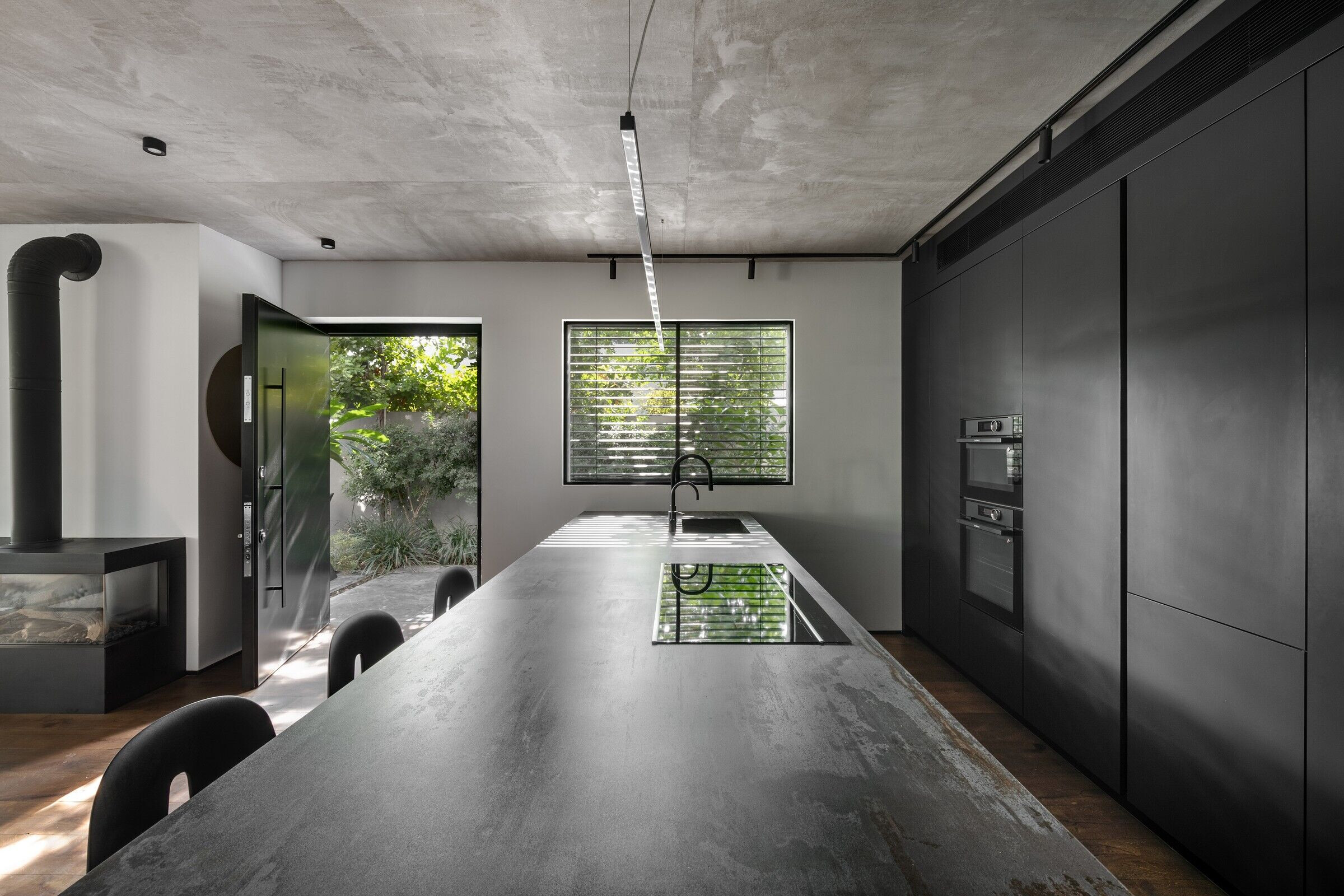
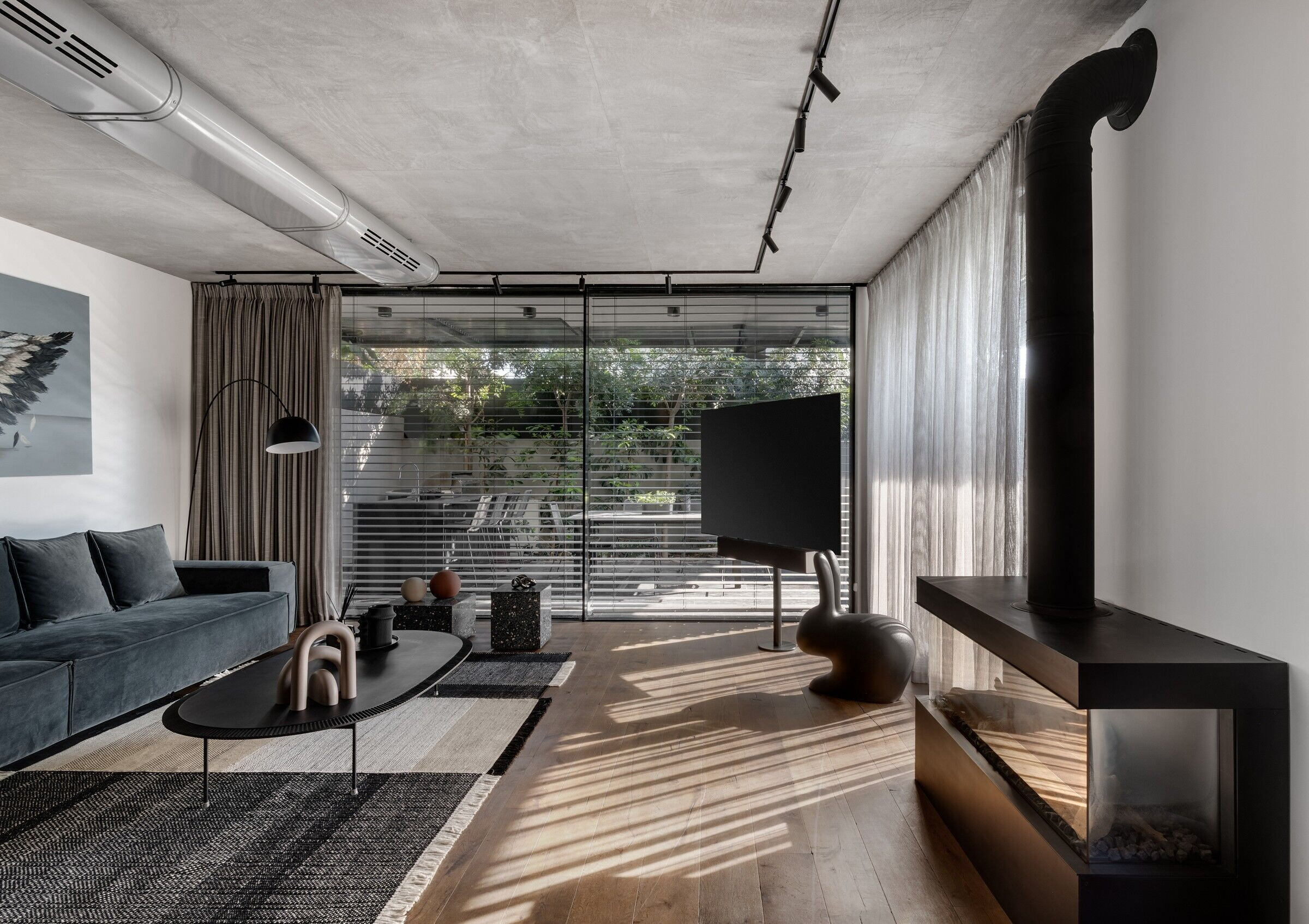
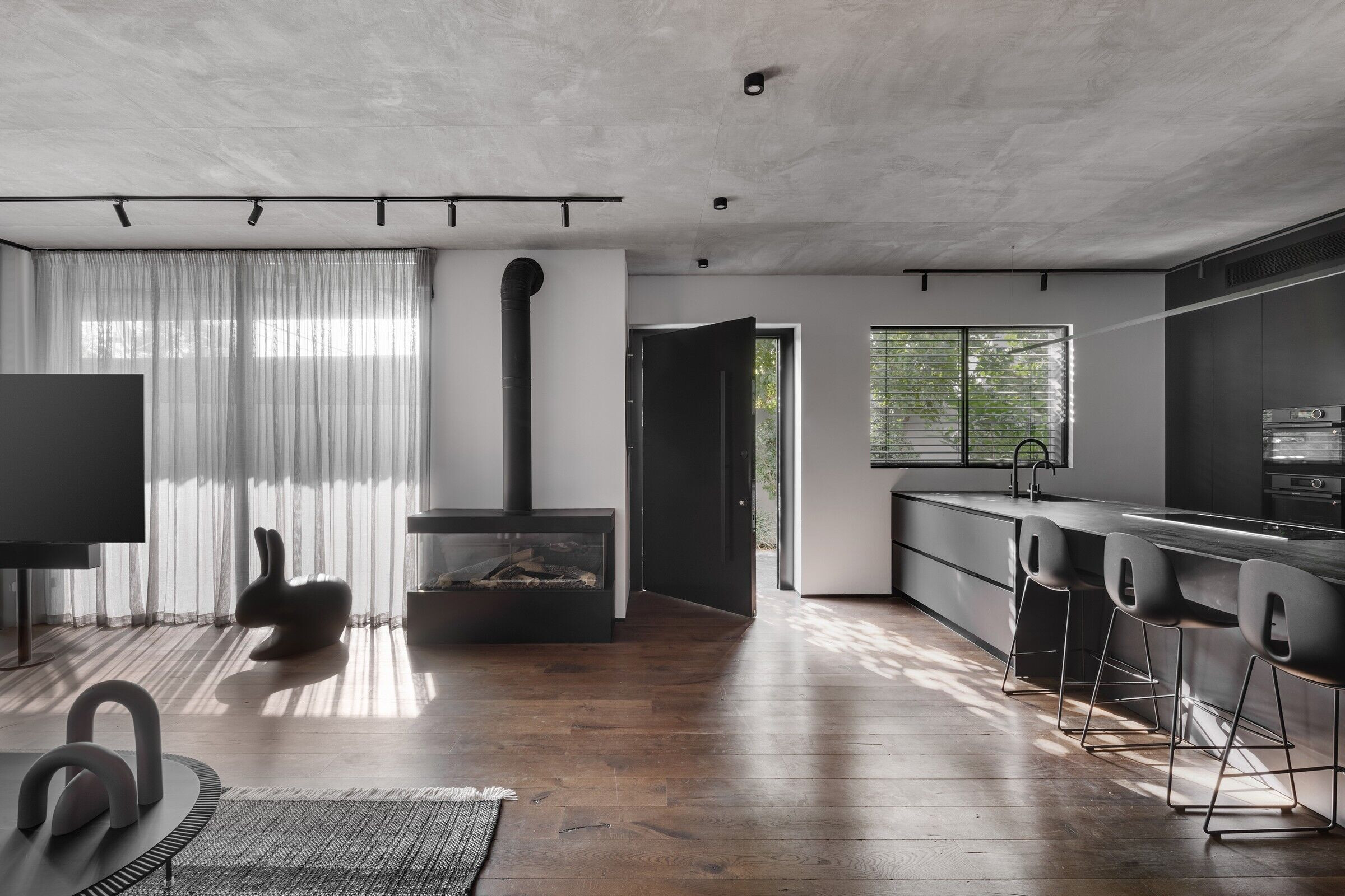
And indeed, the amalgamation of two different design styles is evident throughout the property, for example where the concrete ceiling meets the kitchen’s matt black smooth nano facades and the distressed oak blends wonderfully with the white walls - these two opposite themes come together creating an elegant, sophisticated, and harmonious setting.
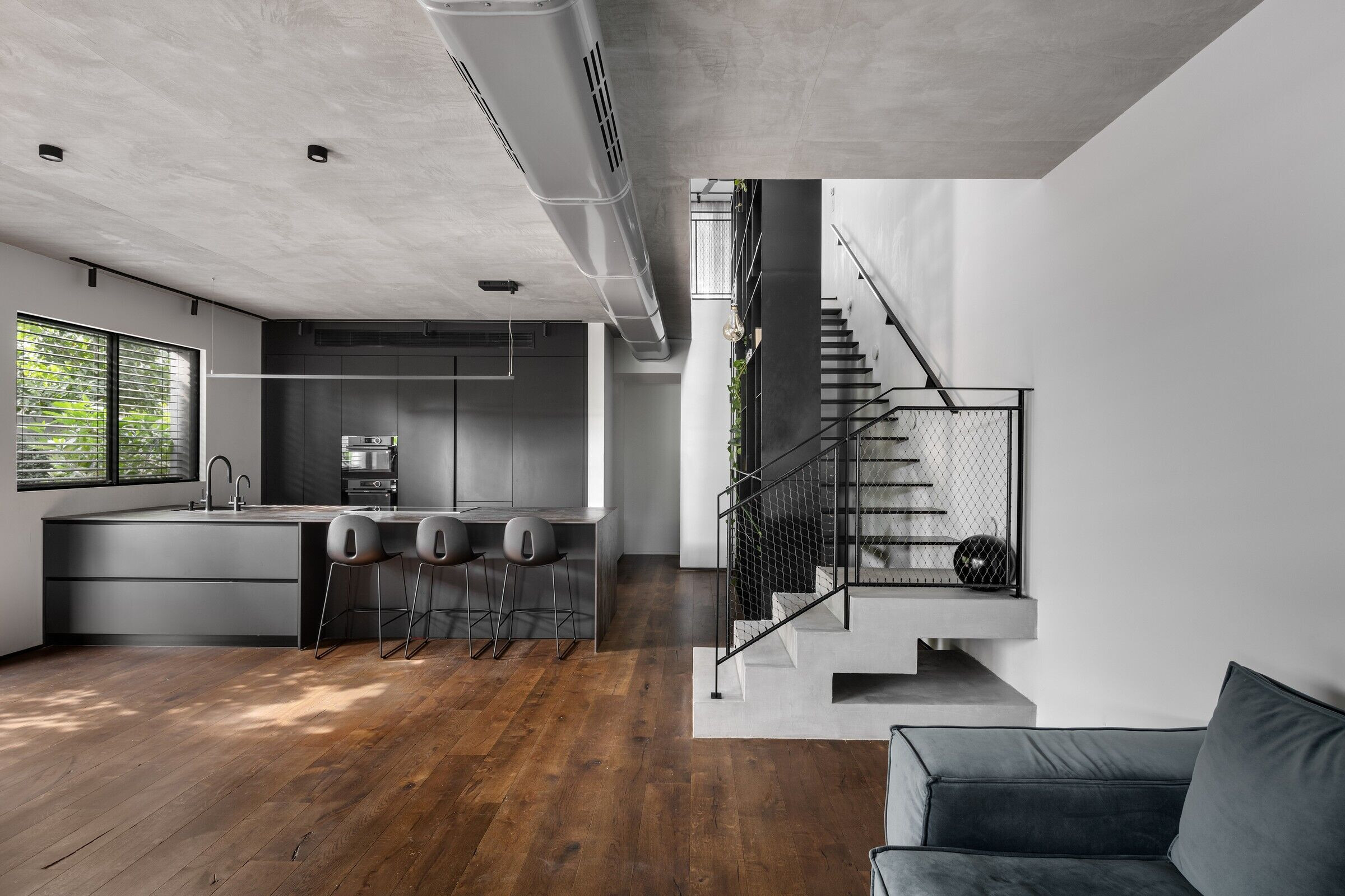
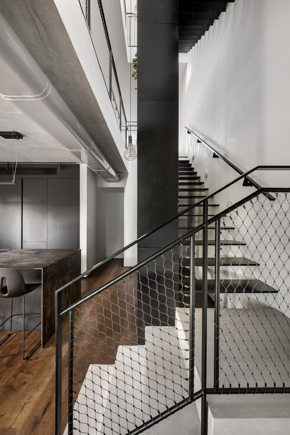
As with all duplex properties, the shared wall with the neighbors next door is devoid of windows and openings. With that in mind, the designer masterfully planned the staircase in that space alongside a monumental library that extends upwards through all the levels creating the property's core. “This area is undoubtedly the focal point of the property” he declares. “This can be experienced differently from every corner or level. It was given much consideration throughout the planning process, and the final result gives the sense that the rest of the property was created around it”.

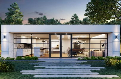
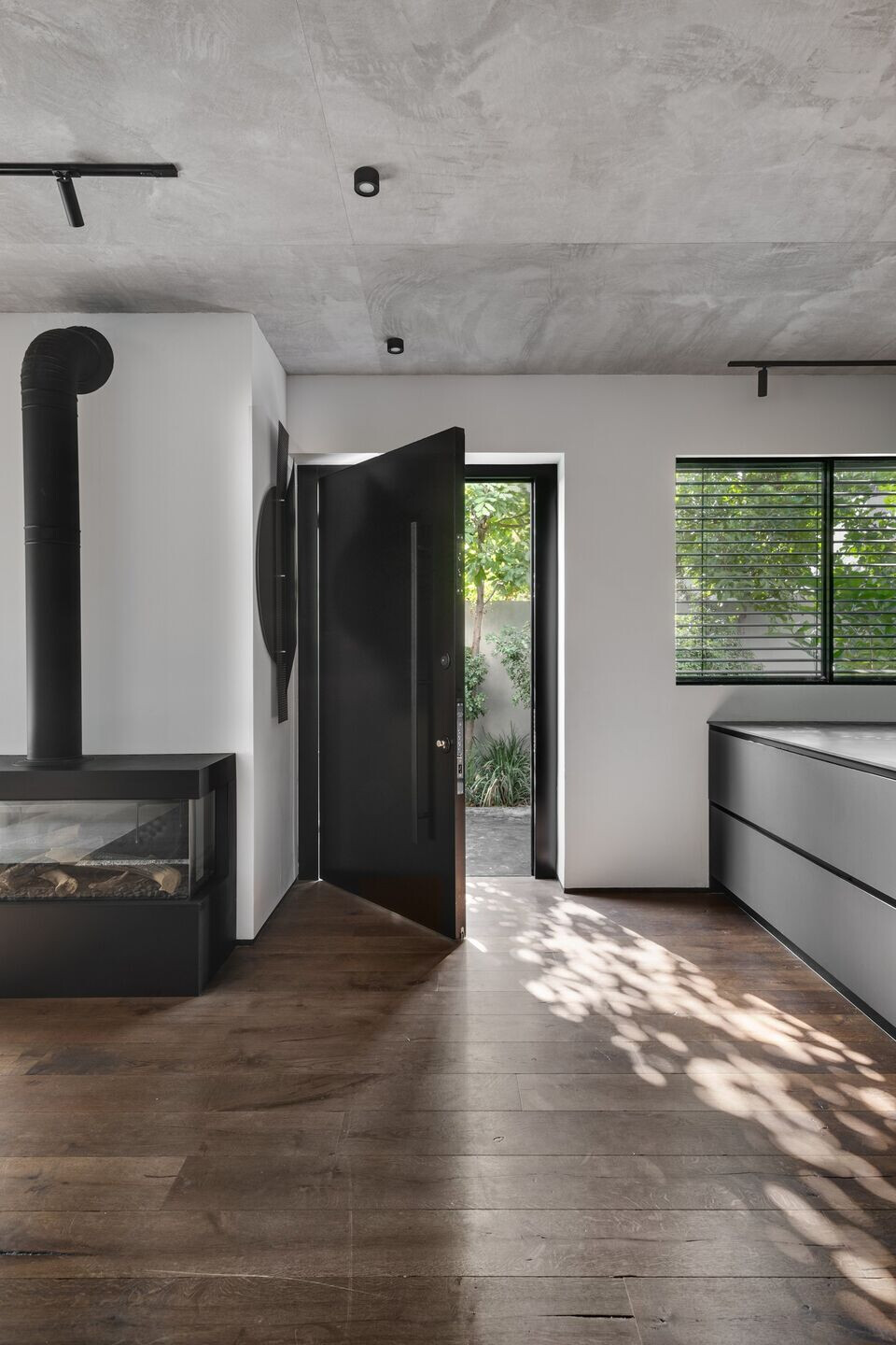
The owners requested the designer not to plan an entrance hall. “There is something very nonchalant in the planning, and there are no surprises - what you see is what you get”, says Horowitz. “The first level can be seen from the entrance, with the focal point being the staircase and library. This is a holistic experience whether one is going up or down. The ground floor includes the kitchen that is located by the entrance, a living room that overlooks the garden, and guest toilets. We decided against a conventional formal dining corner since the family frequently entertains outdoors”. According to Horowitz, the owners understood the property’s space challenges and opted for comfort and spaciousness as a result. A large 4.5-meter island was fitted in the kitchen, which can seat 6 diners and that is where the family enjoys their meals. “All kitchen appliances are concealed, giving an immaculately clean feel”, adds the designer.
The living room is located further down and serves as a strategic corner. Along with the architect, Horowitz planned curtain walls that open the space up to a well-manicured garden: “This is a very pleasant and inviting space”, he explains. “Industrial design can often be perceived as cold and alienating but thanks to the monotone color scheme and absence of over-the-top textures - we created a very cozy and containing space”. The exposed air conditioning pipes, impressive fireplace, and the combination between wood and concrete give the space a clean and immaculate feel. “The lack of niches and partitions emphasizes the elements in the space - the interior feels less architectural, and the division of the functions is more obvious”, he adds.
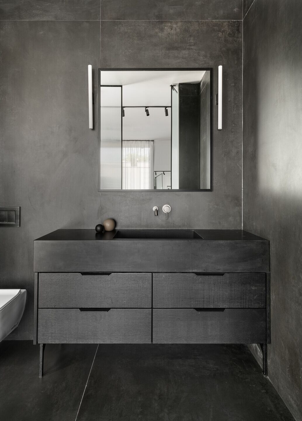
Thin iron-like granite porcelain tiles were used in the guest toilets. Here too, Horowitz chose to combine raw elements with clean and refined ones, such as a marble cube sink, unusual taps, and art pieces created by a friend of the owners.
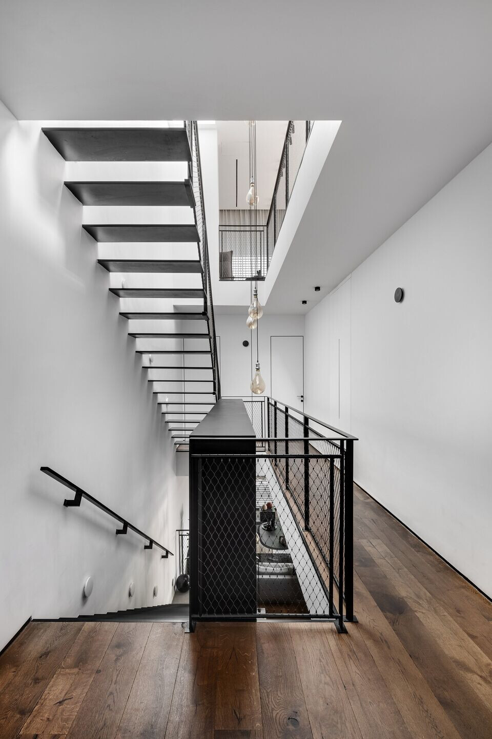
The 4.5-meter-tall, monumental iron library runs through the stairwell and contains various systems such as electric mains, comms panels, etc. The staircase is adjacent to the library but entirely disconnected from it. “The treads are made of metal and underwent a special paint treatment on site. The handrail was designed as a graphite gray stainless-steel net, which is practical and meets building regulations whilst still allowing for an open and airy feel in the space”, says Horowitz. “The stairs and the library are two elements that are visible from all the levels creating a sense of infinite space. Whilst most standard staircases are visible on one level only, here, no matter what room one exits, they still get the full experience”, he adds.
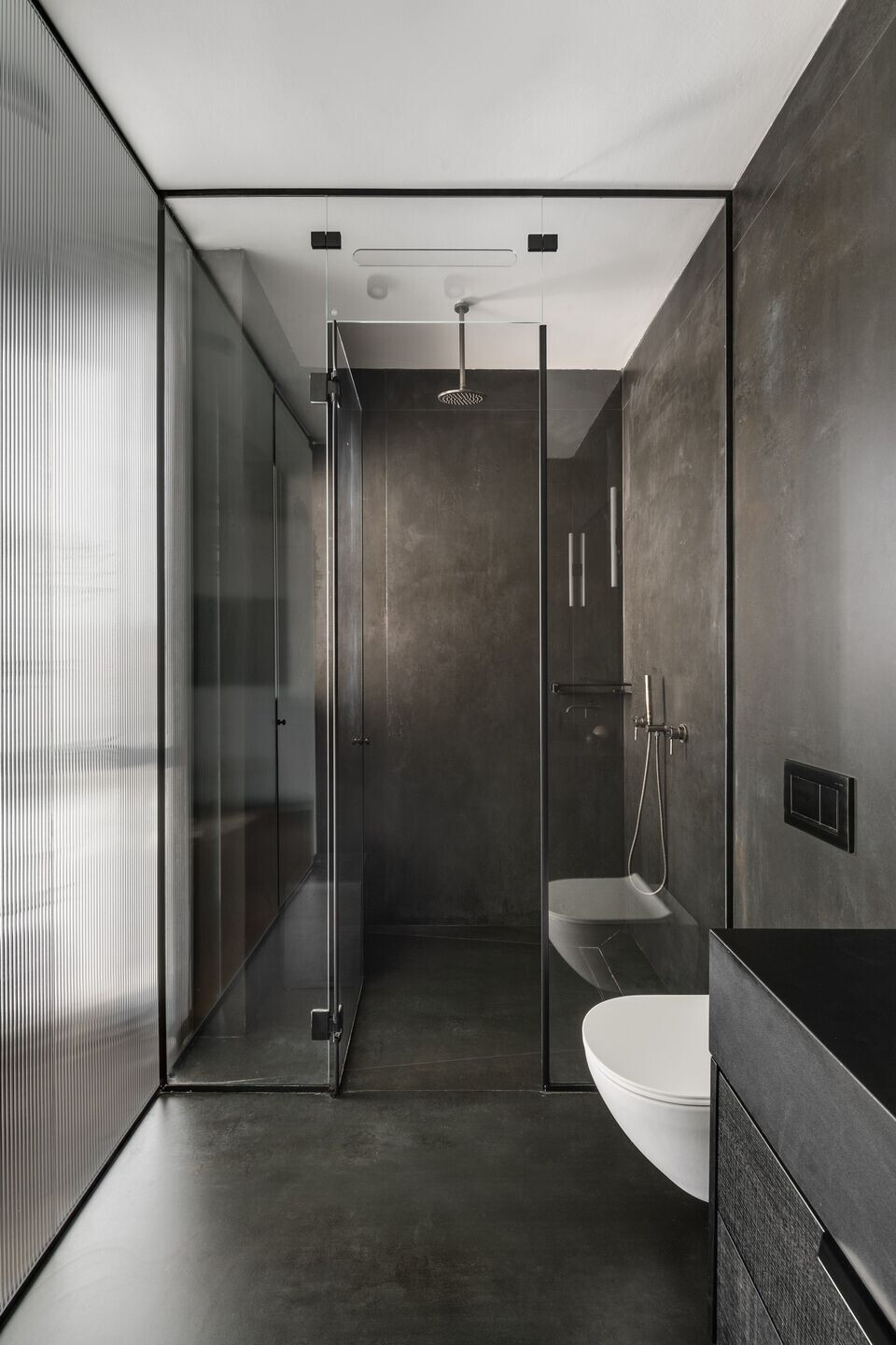
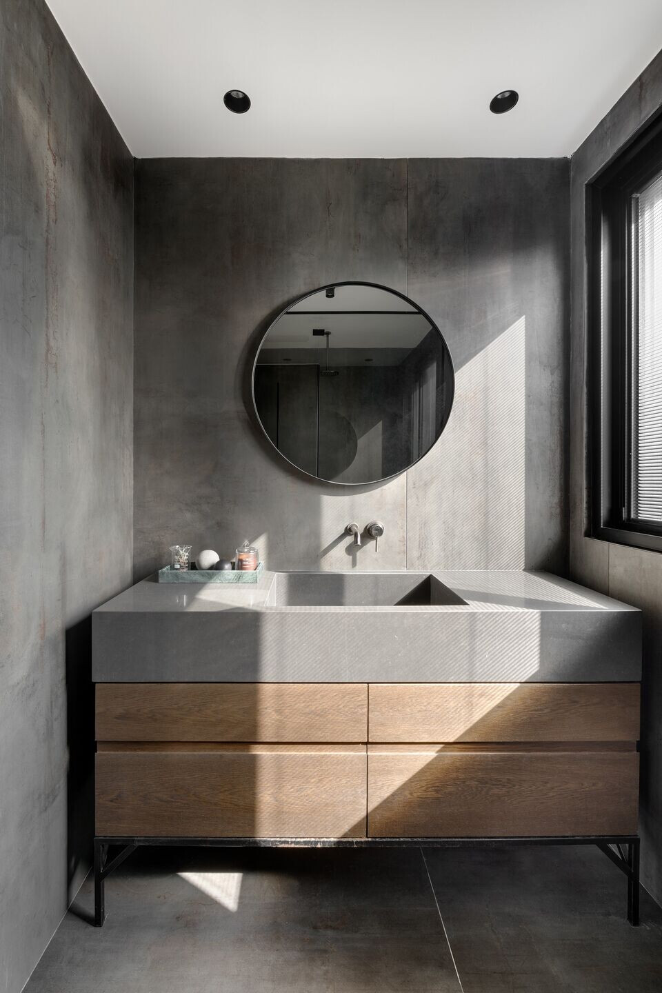
The master bedroom, utility room, and two additional children's bedrooms are located on the first level, as well as a family corner followed by a balcony. “We created a family area that brings the family together, an intimate living room unique to them”, explains Horowitz. The ceilings on this level were lowered only in the bathrooms and corridors, allowing the bedrooms to enjoy a three-meter headspace. Similarly to other levels, this one has been designed to maximize the space as much as possible: There are no corners or spaces that don't have a function. We managed to create private and intimate corners for each family member individually, whereas the family corner is a space that can be shared by all”.
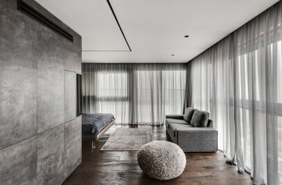
The son and daughter share a bathroom and each of them was designed a monochrome suite: “The son’s bedroom was designed in 50 shades of black, and the daughter’s room in 50 shades of white”, says Horowitz with a smile. “Although the son's bedroom was designed in a similar theme to that of the ground floor and the master bedroom, he did specify his desire for a softer overall look and feel. This was achieved with the use of art pieces, an area rug, and furniture that combines wood and iron”.
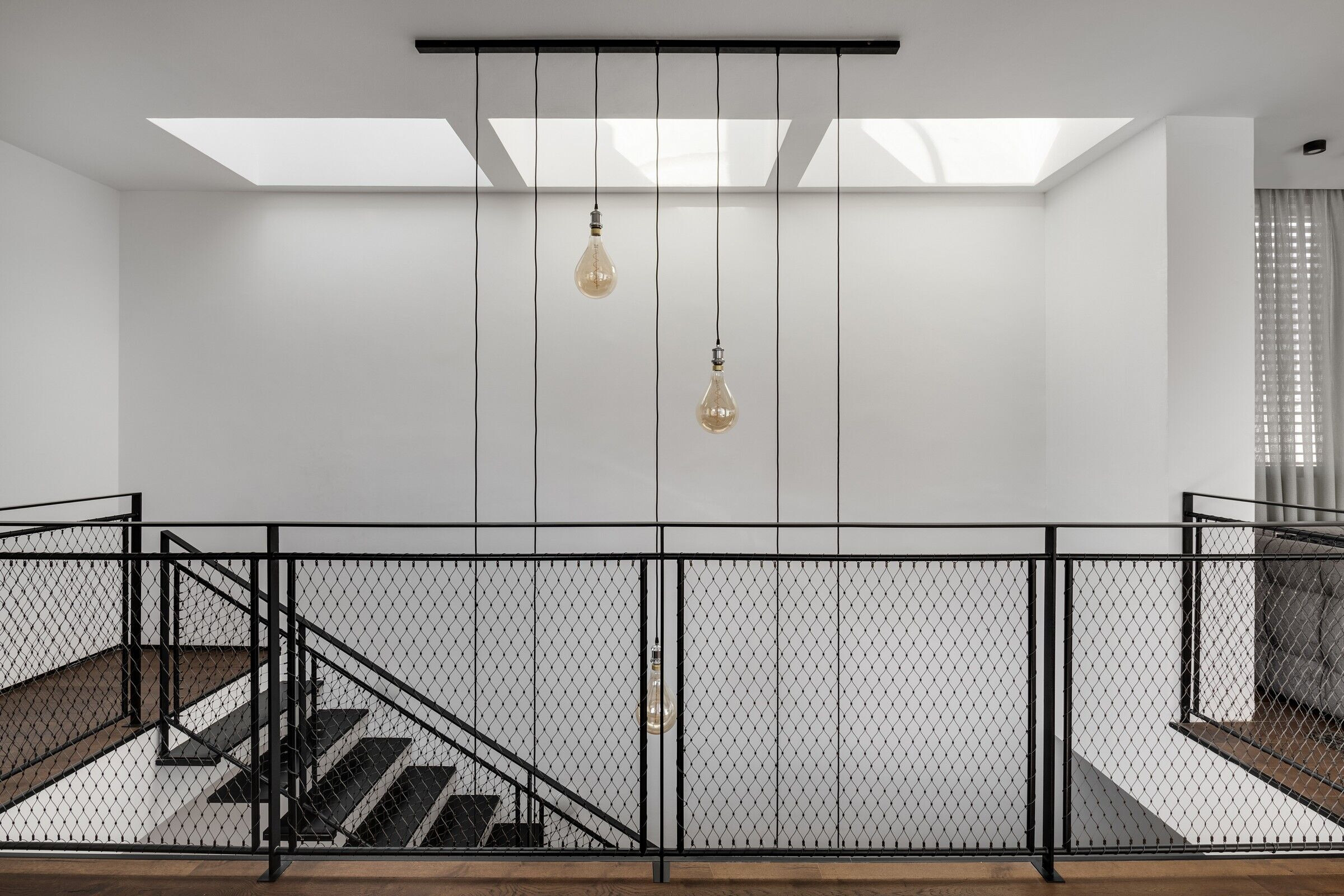
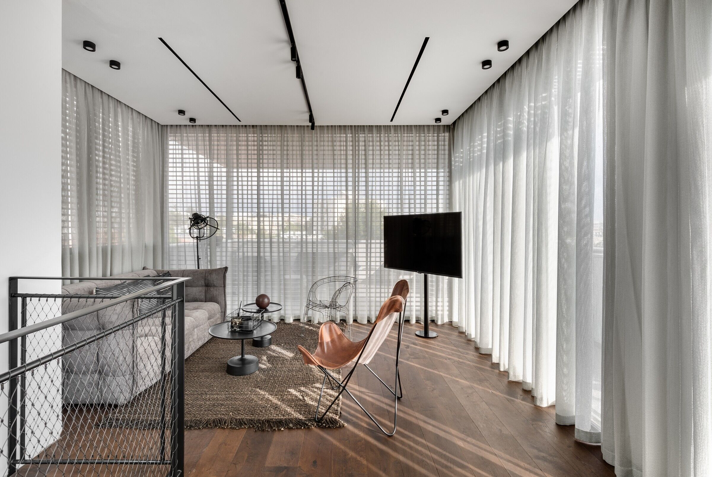
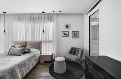
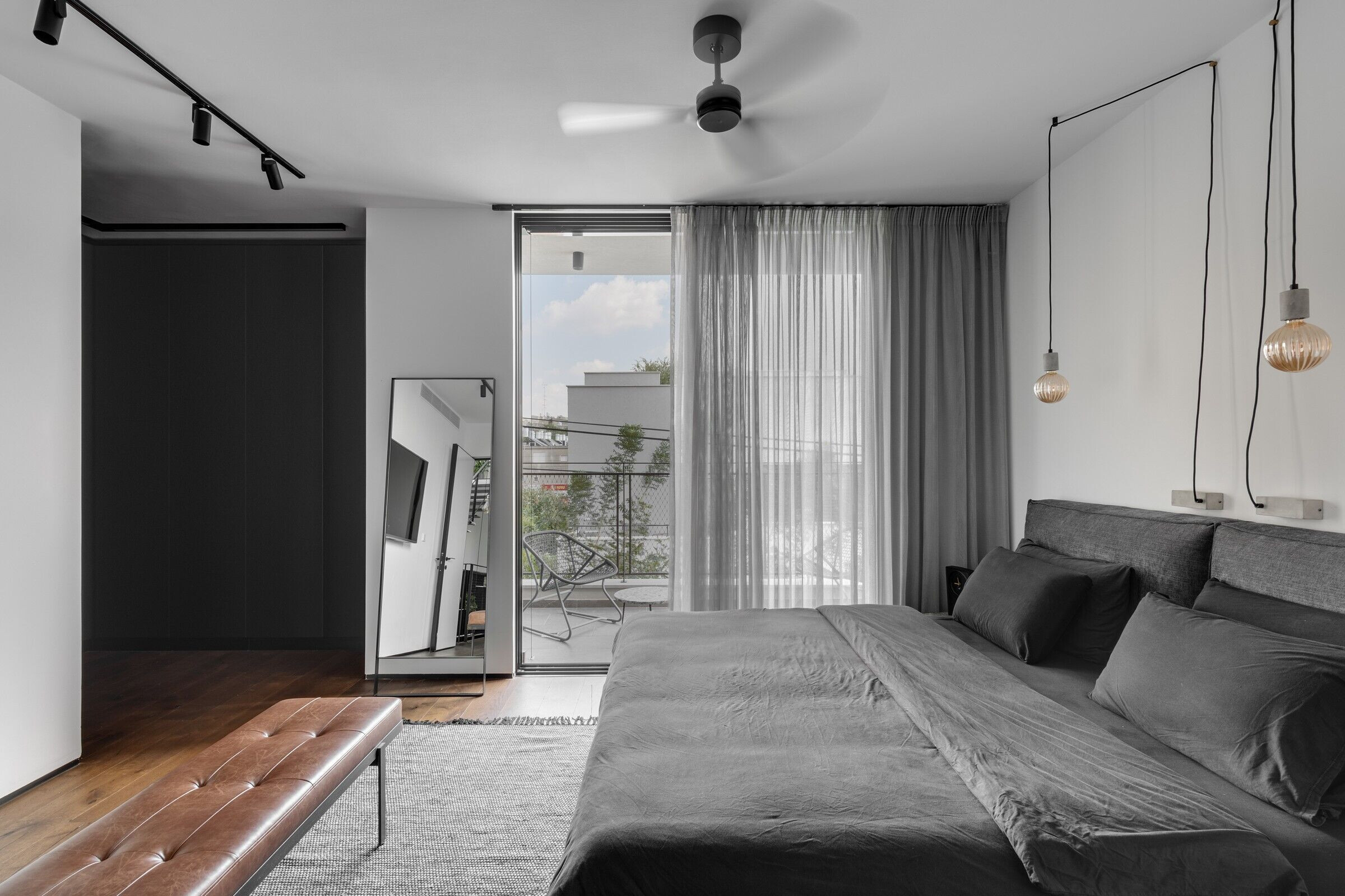
The 35 sqm master bedroom includes a private balcony and was designed in colors and materials similar to those running throughout the property. Horowitz planned a spacious suite that includes a bedroom, ensuite bathroom, and a walk-in wardrobe. “I remained true to the materials and color schemes in order to continue the property’s story from beginning to end”, he explains. “The walk-in wardrobe is reminiscent of the kitchen and the bed resembles the living room sofa. Maintaining the material and color scheme consistency has created a well-balanced and calming space. The plants and artwork add another layer that contributes to the overall desired outcome”.
The walk-in wardrobe opens up to the bedroom, and a glass partitioning was fitted between the bedroom and the bathroom to cater for good levels of natural daylight, whilst maintaining privacy. “Here too, I incorporated shades of black such as the black veneer bathroom cabinet fitted with iron legs”, the designer says. “The walls, taps, and shower profile are also black. We used very few materials in order to create a clean and consistent look”.
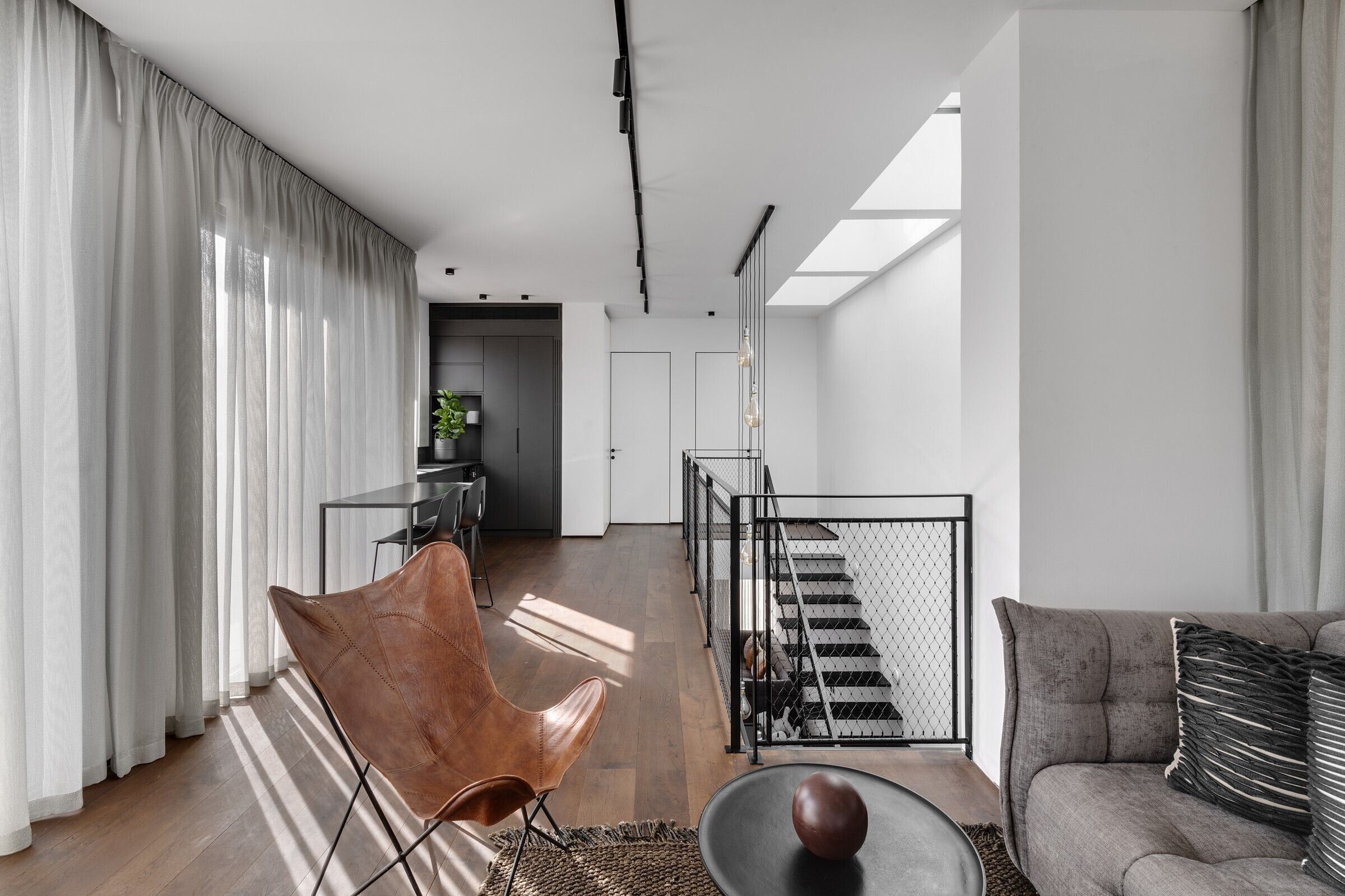

The loft, a 50 sqm space, was dedicated to the eldest son and includes an entertaining area, a kitchenette, a suite, and a balcony that can also be used for entertaining. “This level combines all the elements of a home, within a relatively contained space”, summarizes the designer “The iron, stainless steel, shades of gray, and touches of camel that appear throughout the house - are evident here too. The kitchen very closely resembles the main family kitchen, and the curtains are the same color as fabrics and textiles on other levels. There are many layers in this space too, but no overuse of textures”.

Team:
Planning and interior design: Nitzan Horowitz
Photography: Oded Smadar
Material Used:
1. Kitchen: Modulnova Kitchens
2. Appliances: De Dietrich
3. Sanitation: Hezi Bank
4. Doors: Aperto
5. Lighting: cley or
6. Textile: Orit Traub
7. Glass: Moshe Vitreum
8. Furniture: Tollman's Dot
9. Fireplace: Ortal


