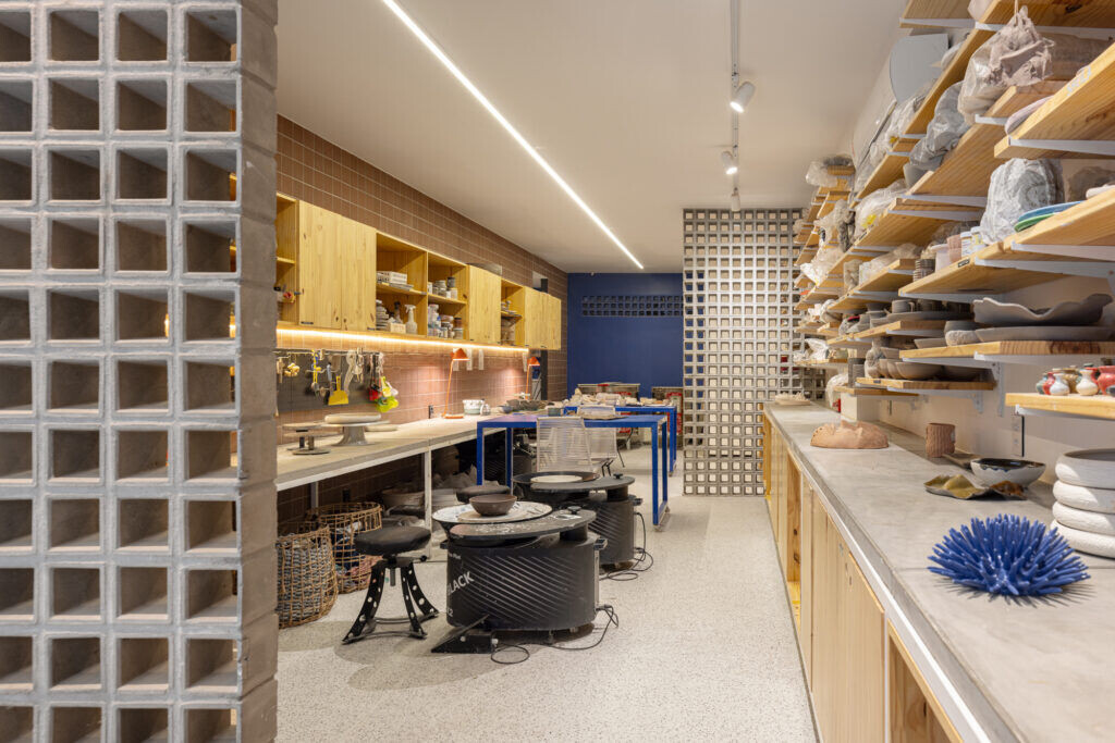
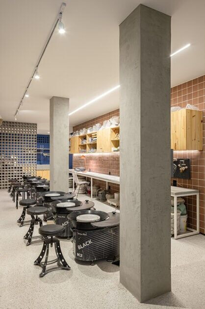
Fluidesa Ceramics was born in a commercial store in the basement of the Sudoeste neighborhood, in Brasília, in the middle of the pandemic. The project was designed to facilitate manual work, easy access to tools and the most efficient arrangement of the machines necessary for the operation of the space, which was born with the idea of being a ceramics studio and coworking space.
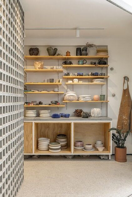
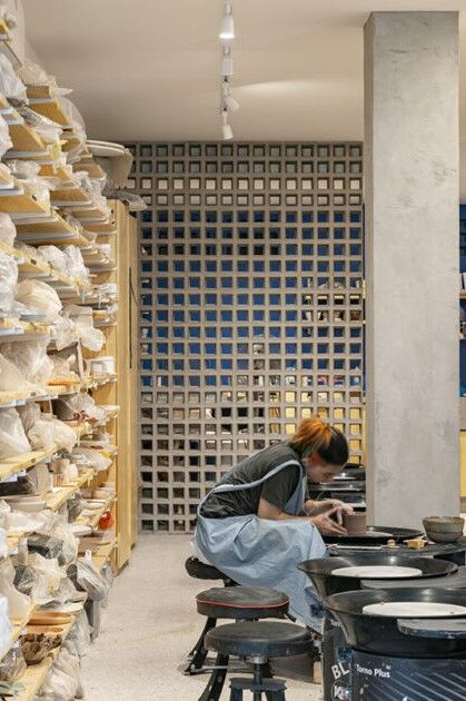
The encouragement to pause, the focus on manuality and the reverence for artistic creation meant that the demand for classes increased rapidly and the need to expand the space was inevitable. The store next door was incorporated, maintaining the characteristics of the initial project and complementing the needs that arose during the occupation of the first space.
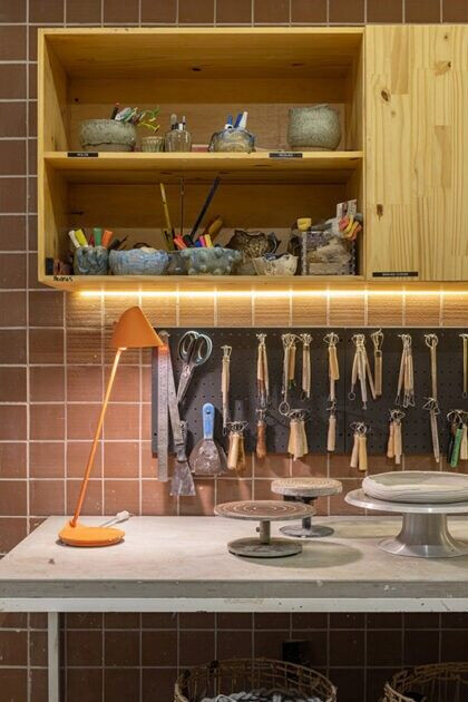

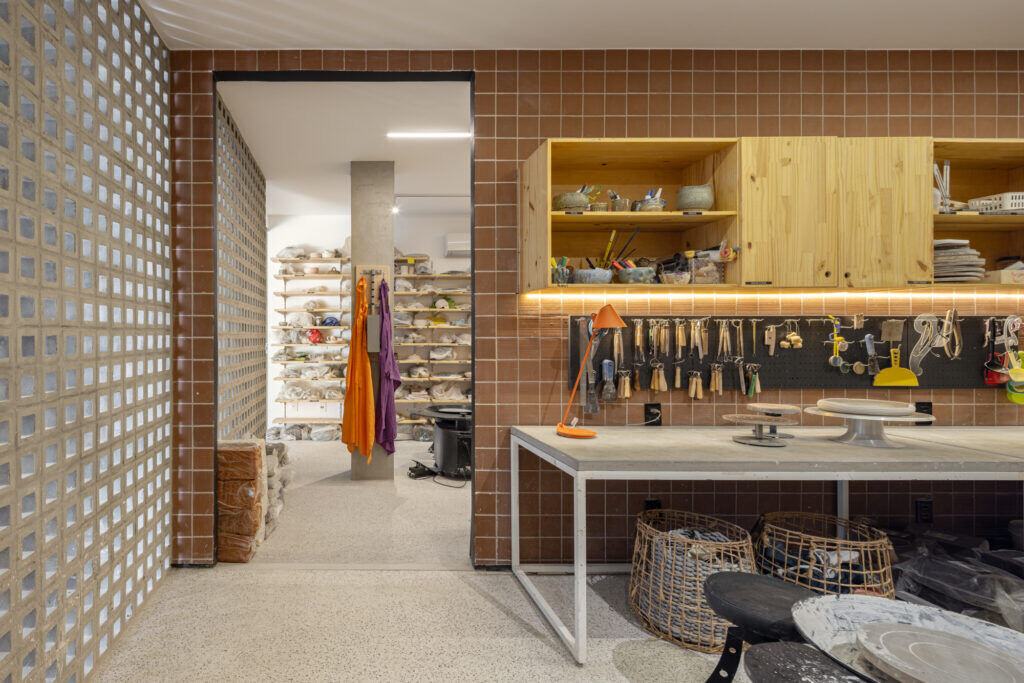
The wall that divides the two commercial rooms is covered with terracotta ceramic, a color that refers to the essence of the raw material used in the studio: clay. Pine wood and granitine flooring complement the “raw” atmosphere proposed for the space: natural materials that serve as the basis for receiving the pieces that are created there.
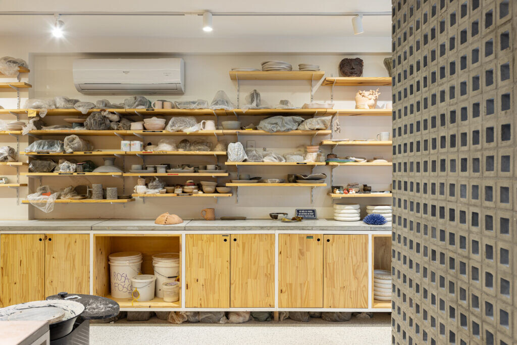
The environment presented a particular demand: the need for a space with many shelves to accommodate the pieces at different stages of production. The solution was to create modular displays that hold ceramics of different sizes and organize the space in an organic way, while facilitating routine processes and decorating the studio.
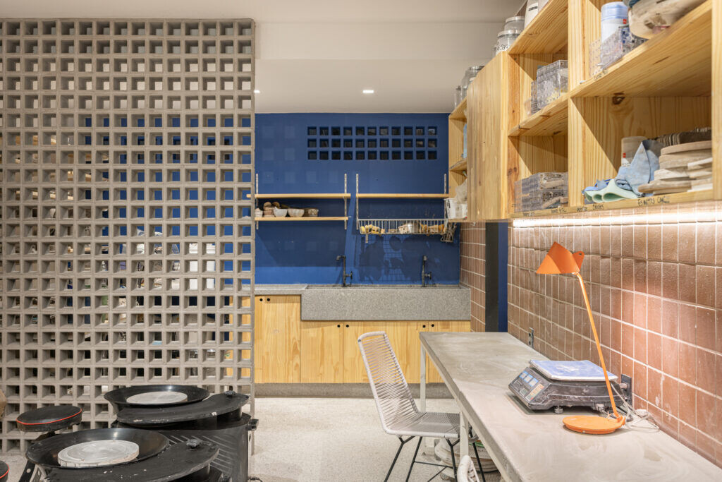
Fluidesa has the uniqueness of being a commercial, emotional and creative space. The studio was created by ceramist Mariana Franco who discovered herself in the clay craft and wanted to include more people in the process, from her masters to people who had never had contact with this type of activity.
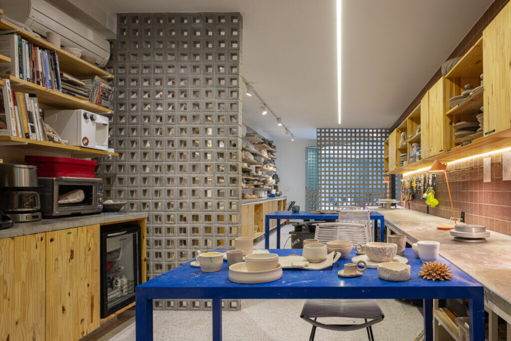
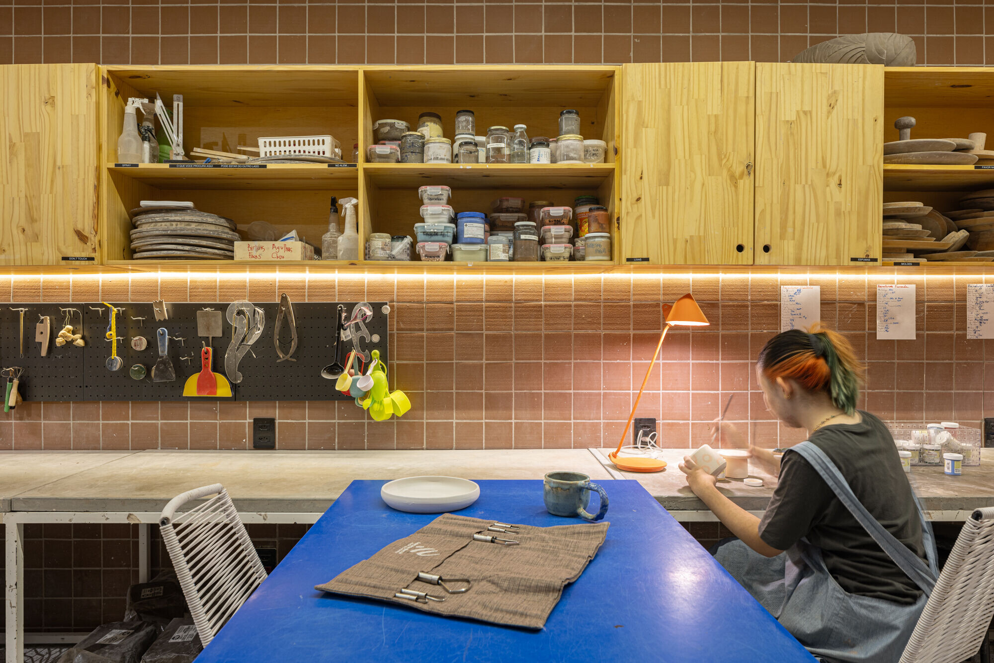
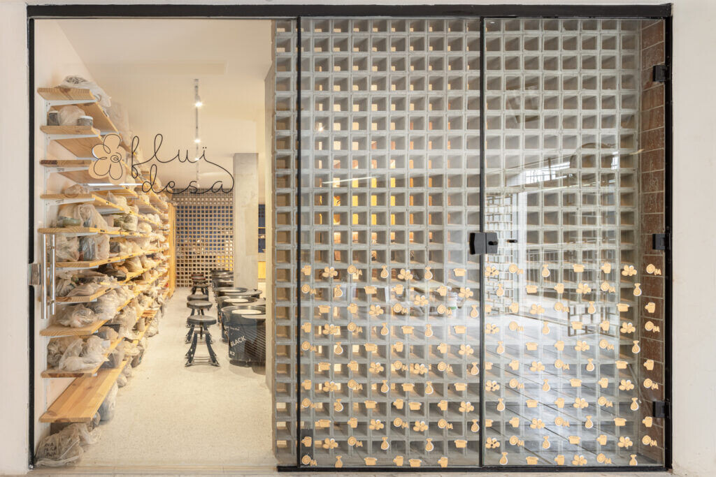
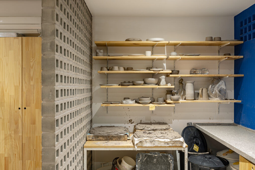
The store's entrance serves as a showcase for the pieces produced in the studio. The concrete cobogó was chosen to bring a little more privacy to the space during ceramics classes, but offering the necessary permeability to instigate whoever passes by – it is an invitation to dive into the creative universe of the place.
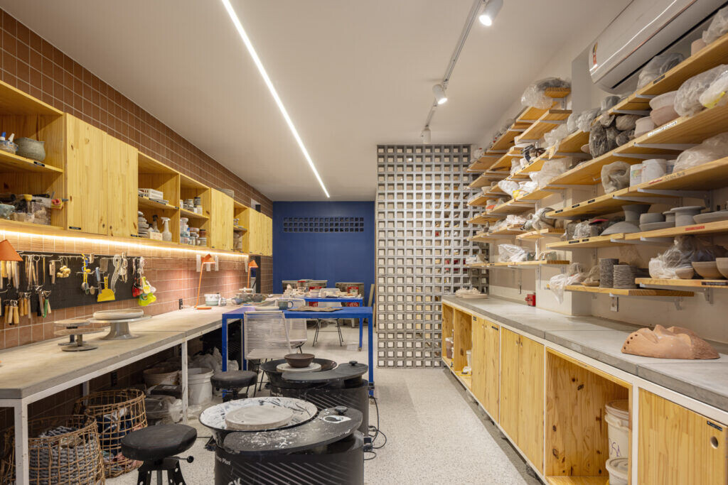
In the background, the blue wall, an element of the visual identity that contrasts with the earthy tones, reveals a search for the unexpected. The tone is also present in the studio's stationery and visual communication items and is a kind of surprise element, a color that complements the base palette and brings the right dose of humor and elegance to the space.
