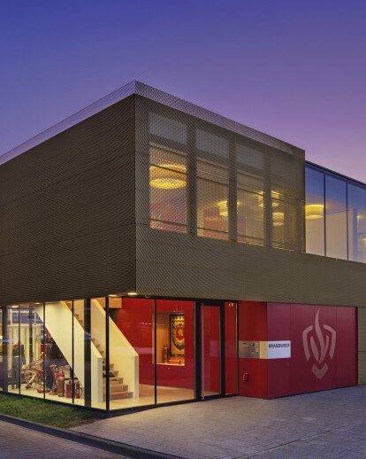
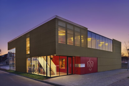
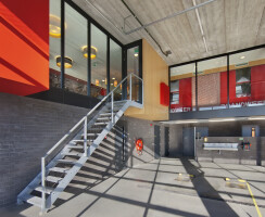
A cubic volume, gold and red. Gold and red were chosen as the main colors to symbolize fire and fire fighting. The two storey cubical building features an open skin with gold colored stretched metal on black paneling. Red panels on the inside and outside. This specific use of materials and colors determines the character of the building in its surroundings with mainly brick housing and expresses the professionalism of the fire brigade. The floor plans are very compact and functionally designed allowing a high level of efficiency in order to reach a fire or calamity within 8 minutes from the fire station.
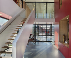
A bold outside and a soft inside. This is expressed in the design and choice of materials for the façade and the interior. On the outside the metal skin symbolizes the toughness of the fire fighters. On the inside the use of wood and colors creates a soft interior.
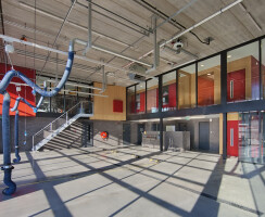
Lay-out. The building has a garage for 3 fire trucks on the ground floor with changing rooms, workshops and storages. The upper floor with cafeteria, office space and instruction room can be transformed into larger or smaller spaces for festivities and instructions for different group sizes. Art and transparancy. The interior was integrally designed in coherence with the architecture. Art was used to make the volunteers feel at home in the new building. To remember the old fire station a wall size, 7 meter long, picture of the garage doors was put on one of the sliding doors. A collage with highlights of the history of the fire brigade was designed on one of the walls of the cafeteria. Niches were designed to accommodate objects and trophies. Transparency is essential to experience the building. This has a positive influence on the teamwork. The garage is fully glazed, showing the fire trucks with their equipment to the public, expressing the presence of the fire brigade in the community, active and vigilant.
