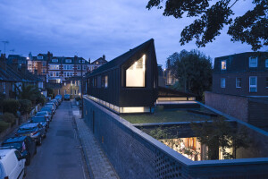
Australian architectural studio Austin Maynard Architects recently completed a new two-story house in South Yarra, an inner-city suburb in Melbourne. Designed for a family of four (and their dog), the house encapsulates the client’s vision for a “wellness-enhancing home that is architectural and inspirational.” The home is called Lang 靚 which in Mandarin and Cantonese means “pretty”. Built on a small plot, an orderly layout maximizes space and offers a balance of indoor–outdoor living.
The clients were especially keen to live in a house without hallways and corridors. They placed an emphasis on having a pragmatic and energy efficient space coupled with a unique and creative home. Suggestions included: curved elements, the play between light and shadow, contrasting textures, and the creation of a void between the upper and lower levels. “Upstairs, where the need for bedrooms meant ‘cells’ could not be avoided, the doors are floor-to-ceiling in height — this creates the feeling of having no corridors,” says Austin Maynard Architects.
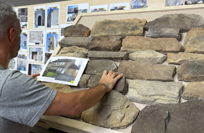
Austin Maynard designed a home whose “tough” exterior contrasts with its “soft” interior. “Lang’s external structure is deliberately austere and resilient, befitting its location on a residential street just off a busy main thoroughfare,” says the studio. The facade is clad in a hard-wearing pebble-colored Equitone fiber cement panel system arranged in a striking chevron pattern and rectangular pattern. Its 3D effect captures the interplay between light and shadow. The owners told Austin Maynard that people “frequently stop to take photos and touch the walls.”
The house is massed on its western side and steps down to the east in order to protect the neighboring property’s light and garden. “Analyzing and assessing existing conditions generated much of the form — the intelligent reaction was to concentrate the height and mass against the adjoining bulk on the boundary,” says Austin Maynard.
The site slopes gently from its northern (rear) end to the southern (street-facing) front. The studio uses this level change to demarcate the living space and kitchen with a 45-centimeter-high “seat”. At the rear, the first story extends out by an extra 50 cm to provide passive solar shade for the ground-floor lounge. Large windows and openings on three sides help to maximize space and a void was created along the fourth wall.
A garage is designed with large openings at either end. Concrete sleepers (as opposed to a concrete slab) create a pleasing flow, extending the courtyard from the rear through to the street.
The home’s interior includes a soft palette of wood, textiles, ceramic, and greenery. This natural palette is contrasted with polished concrete flooring and a perforated metal balustrade. A sculptural tree trunk-like structure that rises from the ground floor to the first floor contains bathrooms on both levels. The open-plan ground floor features subtle design nuances, including a small internal garden and gentle curves. Two areas of the ground floor can be curtained off when required: one is a reading/study corner and the other is a guest accommodation space with a foldaway bed and storage. “Another highly considered detail is the steel support column, brought inside to avoid disrupting the fluted glass window at the front of the house,” says Austin Maynard. “Appearing more ladder than column by design, it serves as an open shelf.”
Lang’s sustainability measures include:
A 7 kW rooftop photovoltaic system (with electric car charging provision).
A polished ground-floor concrete slab acts as a thermal mass (to radiate warmth in cooler months) and includes an electric heat pump hydronic heating system.
North-facing windows with eaves or rotating louvers prevent direct sunlight reaching the glass during warmer months.
Cross-ventilation passively cools the house with ground-floor windows opening onto the outdoors and first-floor windows venting the house vertically through the void.
Sustainably-sourced timber.
A water tank buried in the front garden harvests water from the roof and is used for flushing toilets and irrigation.
A ventilated facade system.
A small green roof adjoining the bathroom and southern first-floor bedroom provides additional insulation.
Total site area: 230 square meters (2,476 square feet)
Total floor area: 254 square meters (2,734 1square feet)
Ground floor area: 138 square meters (1,485 square feet)
First floor area: 116 square meters (1,249 square feet)


