Edifício A’mar

Applied products
View all applied products

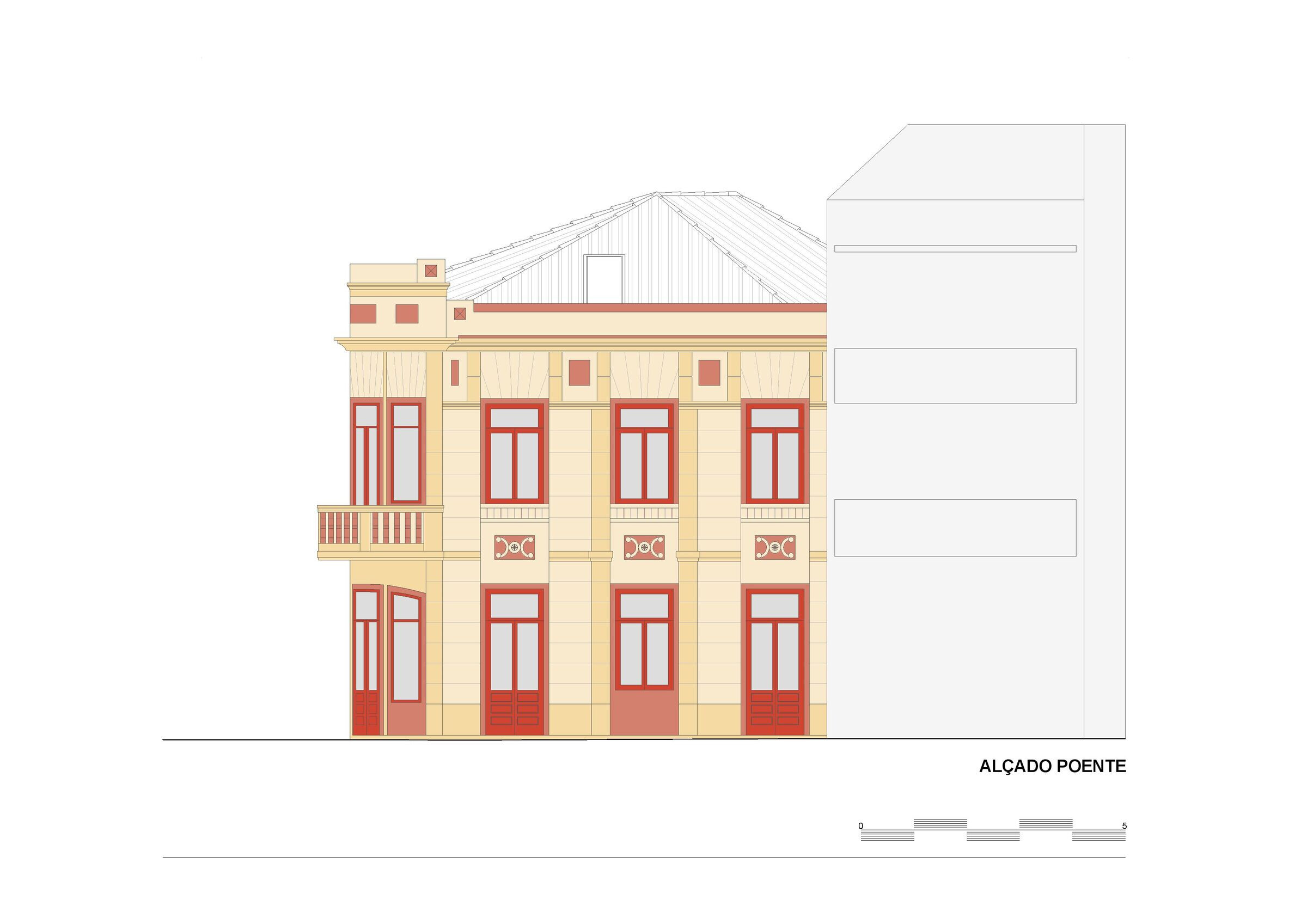
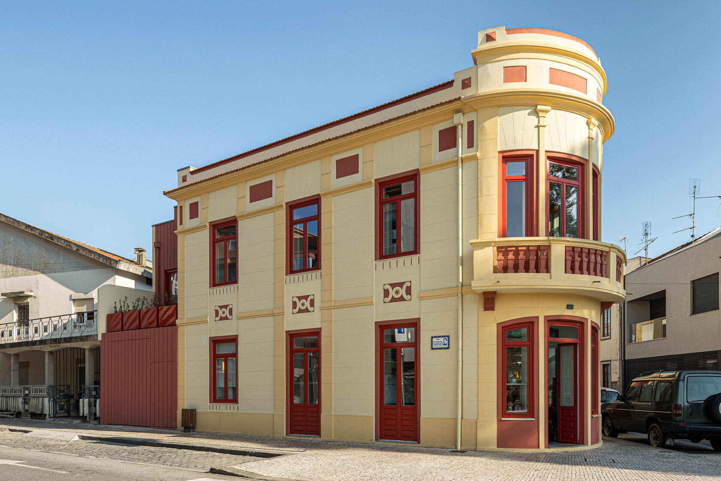
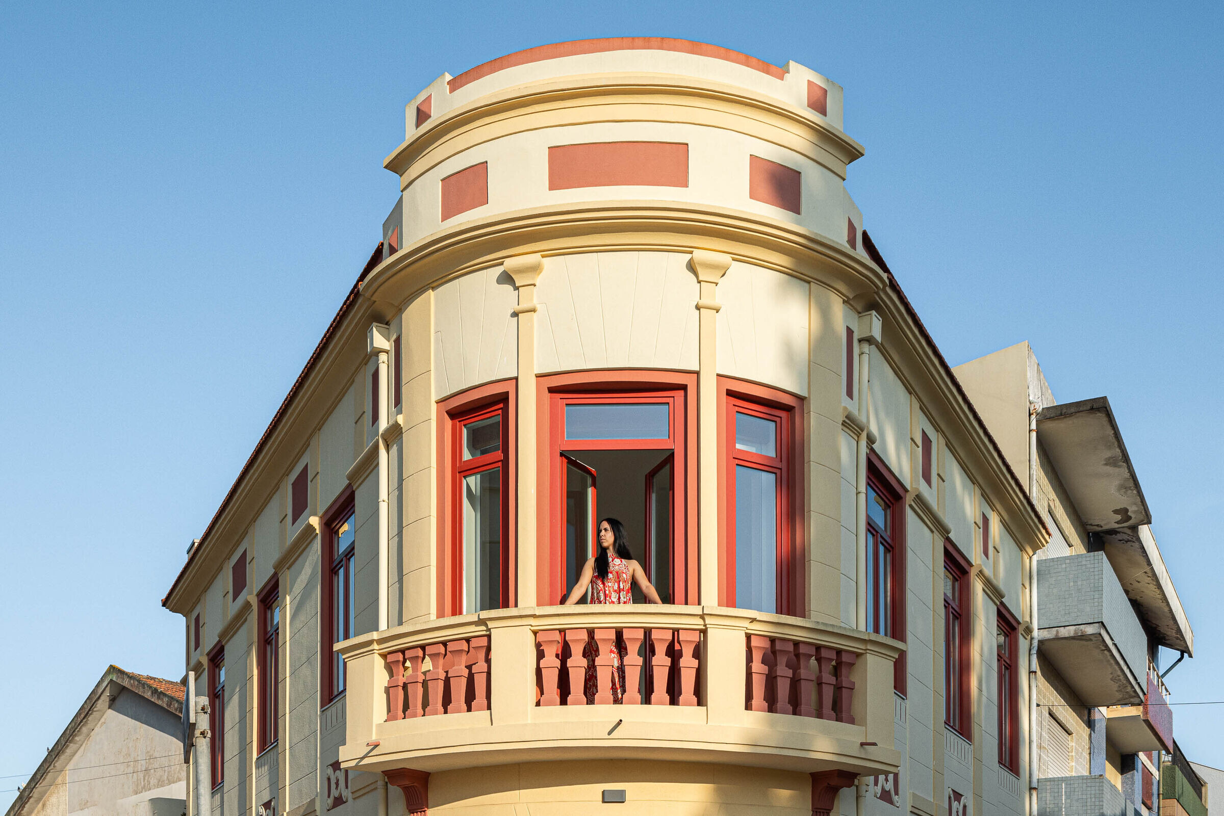
The property under consideration, a historically significant building in Póvoa de Varzim, not only carried the weight of its classification restrictions but also held a special place in the hearts of local residents, serving as a collective memory of the city. Our research unveiled a fascinating backstory - the previous owner was a well-traveled individual who poured their worldly experiences into the conceptualization of this edifice, resulting in a uniquely eclectic and neo-Renaissance architectural masterpiece. We like to describe this as a form of "reactive" architecture.

This architectural endeavor aimed to create a subtle interplay between preservation and innovation, not as a critique of the pre-existing structure but as a celebration of the two distinct eras of the building's construction.
photo_credit Ivo Tavares Studio
Ivo Tavares Studio
photo_credit Ivo Tavares Studio
Ivo Tavares Studio

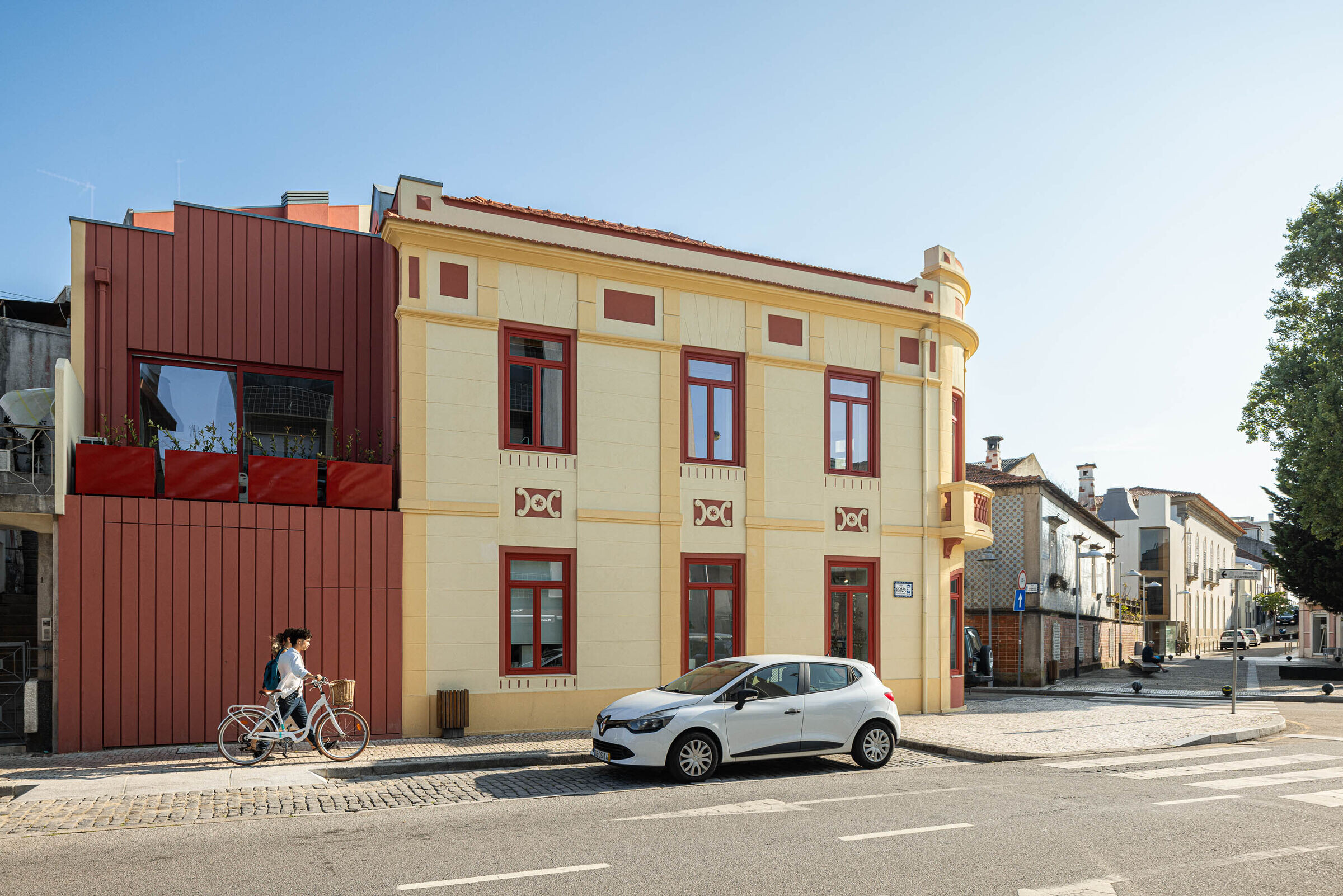
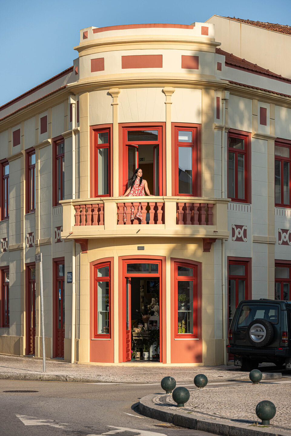
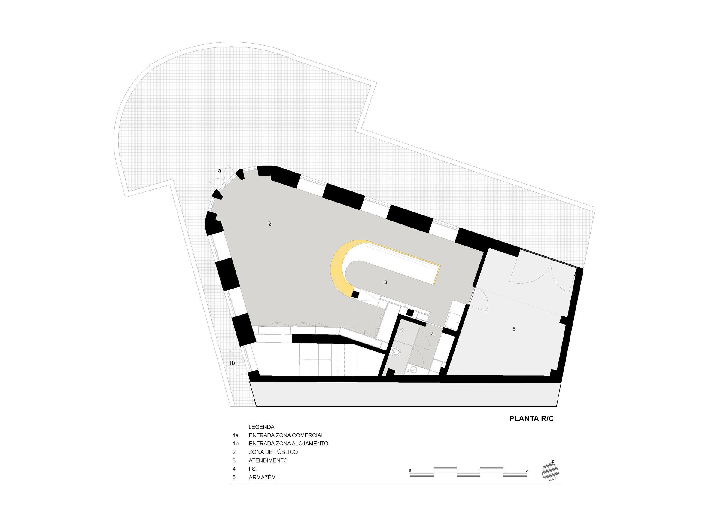
The intervention can be defined by its meticulous preservation of the property's façade, paying utmost respect to its formal and aesthetic integrity. Every ornamental and chromatic detail was carefully safeguarded. In addition, a discrete expansion was introduced to accommodate the new program for the building, comprising commercial space on the ground floor and local lodging on the first floor and in the attic. The expansion was conceived to embrace the less prominent color of the original building (red) while introducing a contrasting vertical rhythm to the existing horizontal lines, creating a clear visual distinction between the two construction periods. Given the dual purposes of the space, separate entrances were paramount. The main entrance to the commercial area is gracefully positioned at the corner axis, while access to the lodging is thoughtfully arranged along the quieter side street. Furthermore, for the convenience of the commercial space, vehicular access is discreetly incorporated into the expansion's façade for hassle-free loading and unloading.
photo_credit Ivo Tavares Studio
Ivo Tavares Studio
photo_credit Ivo Tavares Studio
Ivo Tavares Studio

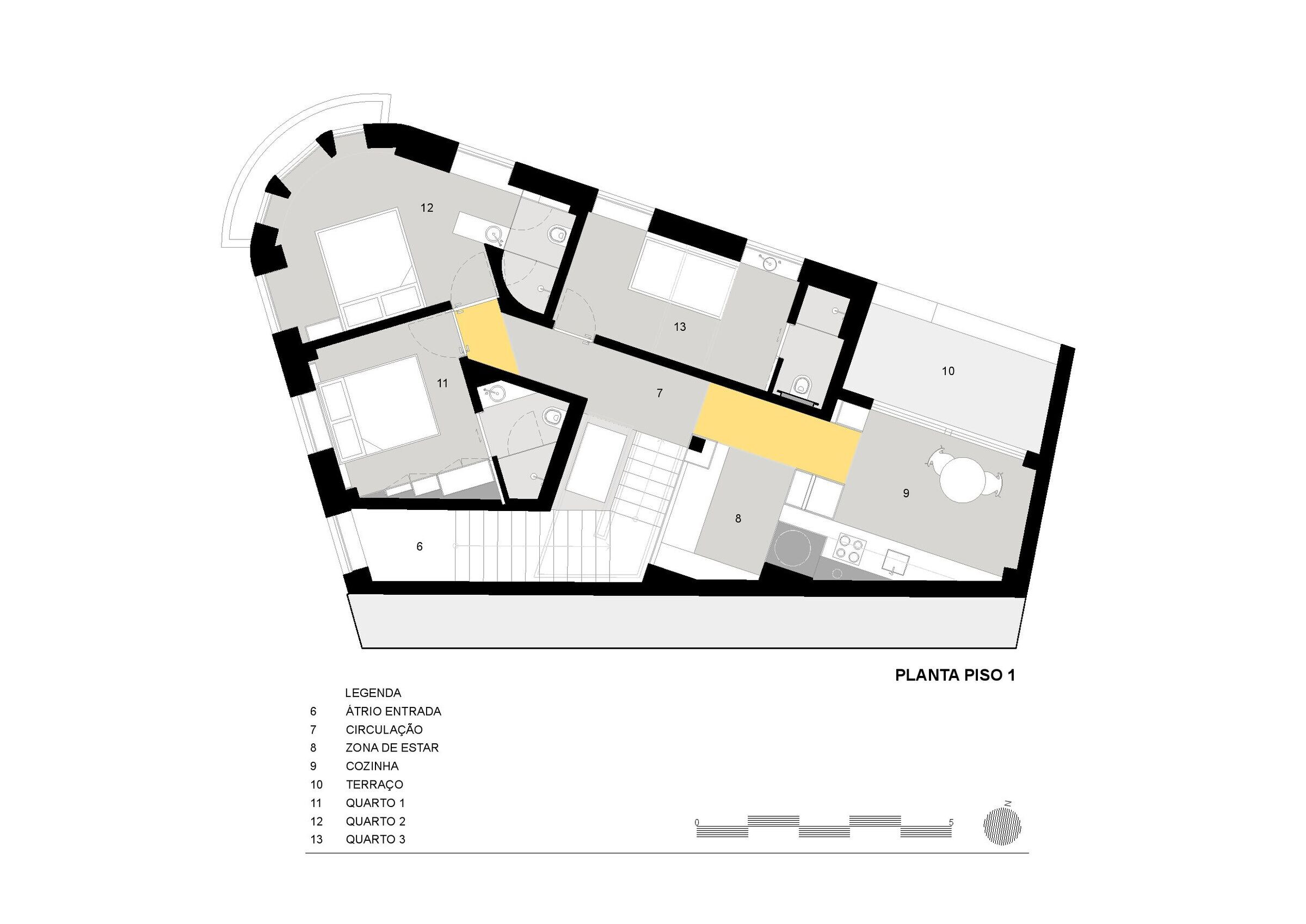
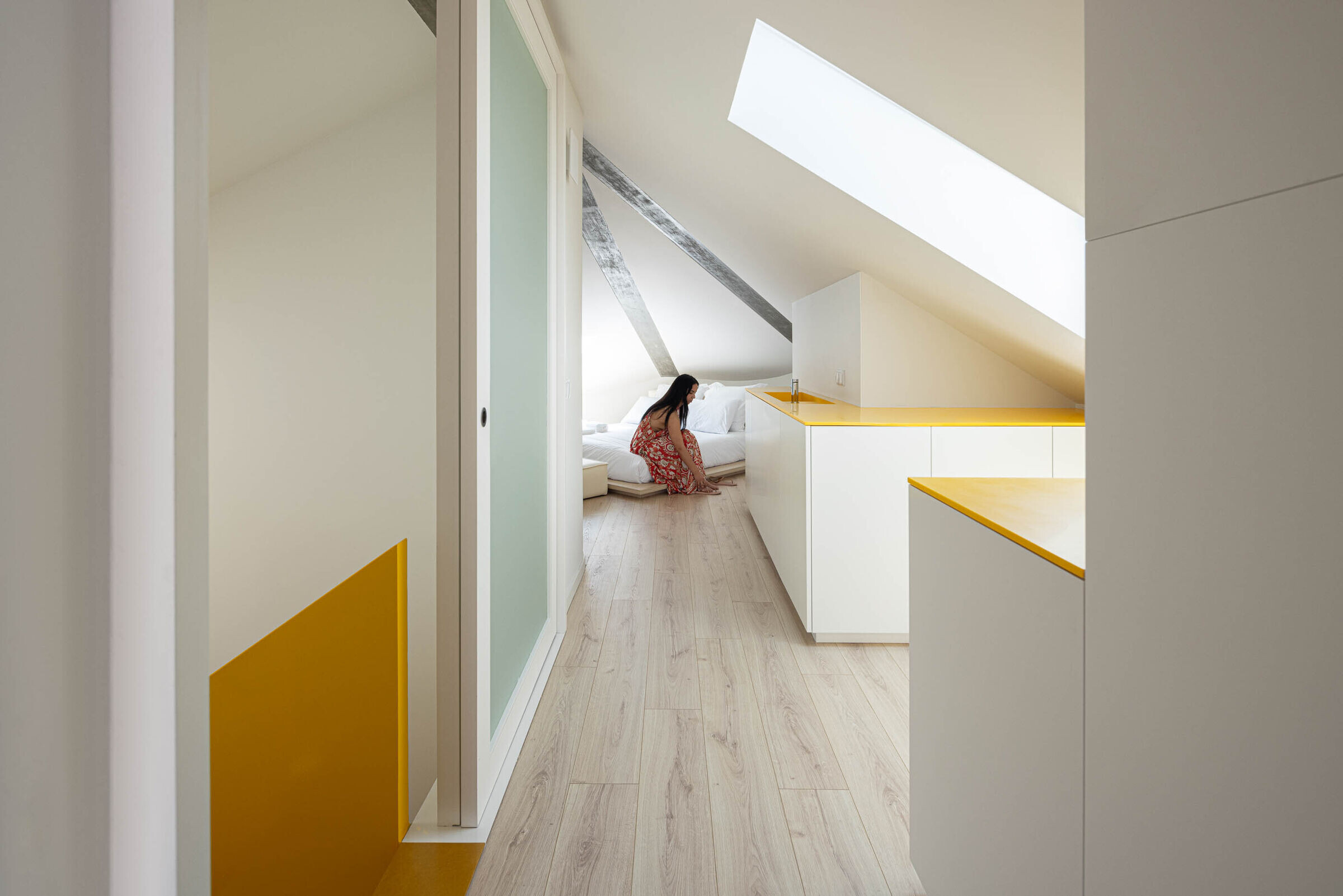
The functional organization of the intermediate level, with its irregular geometry, is facilitated by a longitudinal axis for distribution and a transverse axis for vertical movement. This transverse axis elegantly bridges the gap between the bedroom area and the communal space of the lodging while providing access to the attic suite.

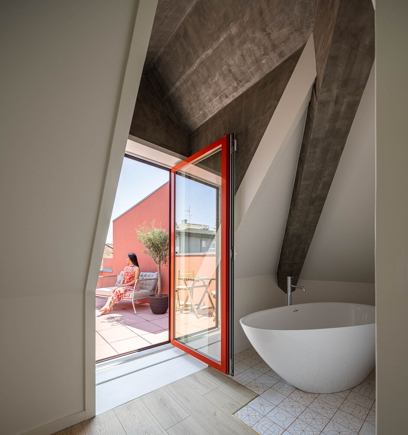
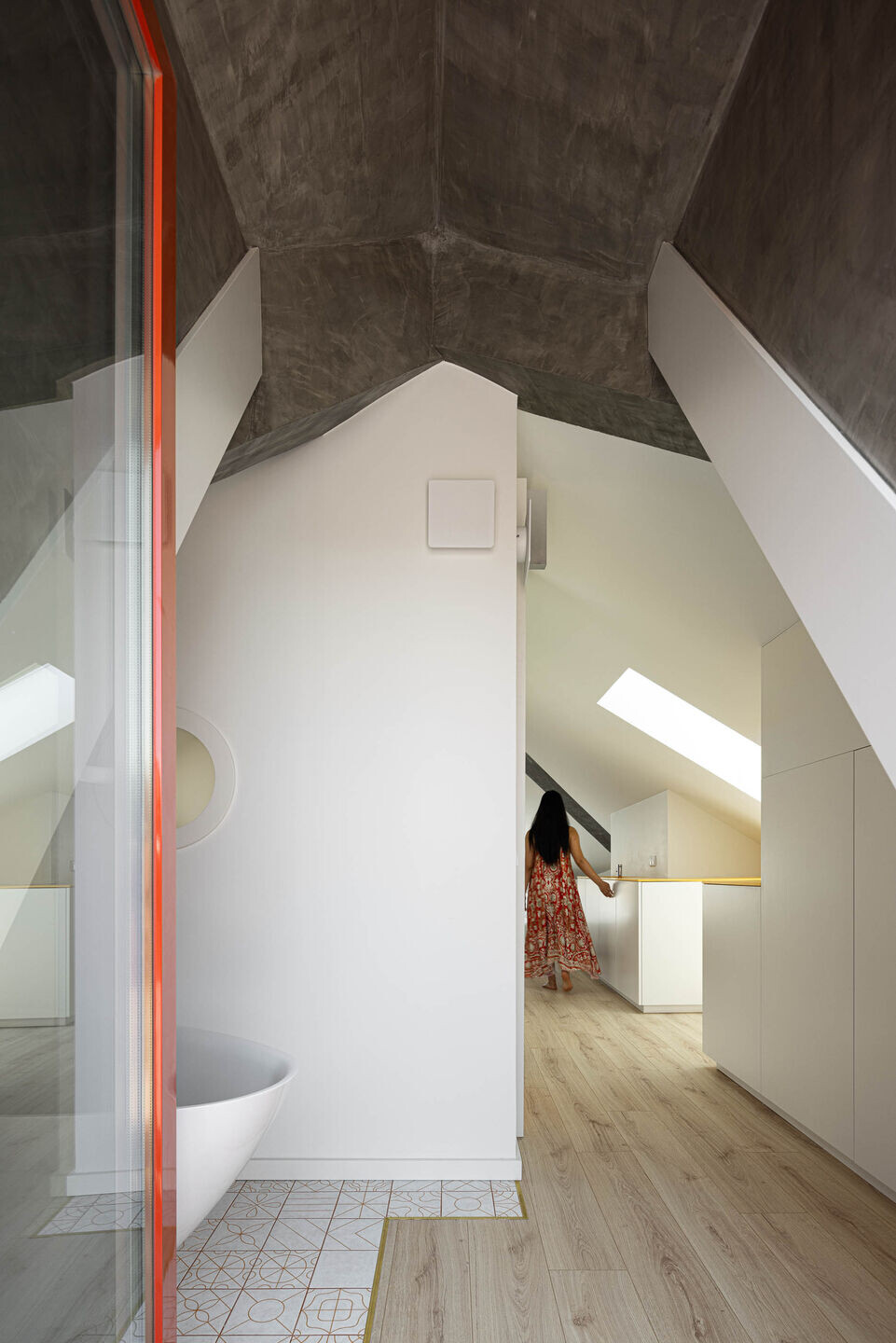
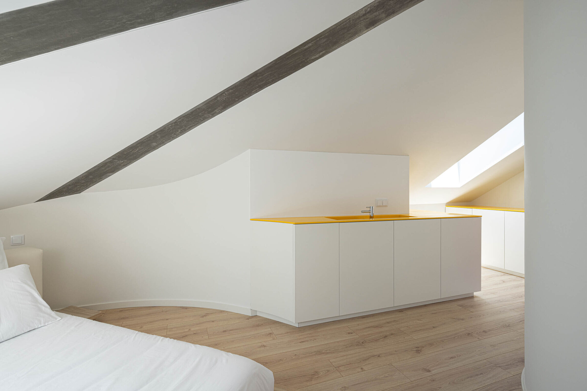
In contrast to the building's striking exterior, which boasts an intense chromatic palette, the interior design adopts a more nuanced approach. Spaces of transition, whether programmatic or on different levels, are highlighted with tasteful chromatic accents in a calming sea of white, allowing for a hierarchy of design element.
photo_credit Ivo Tavares Studio
Ivo Tavares Studio
photo_credit Ivo Tavares Studio
Ivo Tavares Studio

Team:
Architect: REM’A
Main Architect: Romeu Ribeiro & José Pedro Marques
Builder: Ondulavançar, Carpintaria Parente, Golacap
Engineering: Filipe Kellen
Interior Design: Day By Day
Architectural photographer: Ivo Tavares Studio
photo_credit Ivo Tavares Studio
Ivo Tavares Studio
photo_credit Ivo Tavares Studio
Ivo Tavares Studio

Material Used:
1. Accoya: Windows
2. FINSA: Floor
3. Valchromat: Stairs, ceiling and doors
4. JNF: Doors hardware 
5. CLEAF: Furniture
Caption
Caption
Caption

Project credits

Architects
Interior, Wall cladding, False ceiling, Doors, Flooring
Builder

Product spec sheet

Interior, Wall cladding, False ceiling, Doors, Flooring
Manufacturers
Valchromat MDF panel by Valchromat
Windows
Furniture
Floor

Project data

Project Year
2023
Stories By
REM'A
Investwood
Building Area
250 m2

A’Mar Building

Applied products
View all applied products

The building in question, a property of municipal interest in the city of Póvoa de Varzim, in addition to the restrictions arising from its classification, was a building much loved by the local population as a collective memory of the city.
After research, we were able to see that its previous owner was someone who travelled a lot and who poured many of his memories into designing this building, giving it an eclectic and revivalist character, in what we understand to be a kind of “reactive”, neo-Renaissance architecture.

Caption

This architectural exercise aimed to establish a game of subversions between what should be preserved and what is added or converted, not as an attempt to criticise the pre-existence, but rather as a reaction/exaltation of the two temporal spaces in which the building was constructed.

Caption


The intervention is characterised by the total preservation of the building’s façade with strict respect for its formal and aesthetic expression, preserving all ornamental and chromatic elements. A small extension was also defined to support the new programme established for the building (commercial space on the ground floor and local accommodation on the first floor and attic), the intention of which was to take on the less predominant colour of the original building (red), and also to subvert the rhythm of existing horizontal lines in low relief to vertical lines in the new building, creating a clear distinction between the two construction periods. In view of these two distinct activities, it was essential to create independent entrances, so the commercial space is entered at the main entrance (axis of the corner) and the accommodation is entered laterally on the street with the least traffic. On the ground floor, the commercial space also has car access for loading and unloading, via a concealed gate in the façade of the extension.

Caption

The functional organisation of the intermediate floor, taking into account that it is an irregular geometric figure, is carried out through a longitudinal axis for distribution and a transversal axis for vertical access, the latter allowing for the transition between the bedroom area and the social area of the accommodation, as well as providing access to the attic suite.

Caption

As opposed to the aggressive colouring of the building on the outside, we opted for an interior definition in which the transitional spaces, whether programmatic or level, were punctuated by chromatic notes (yellow) in a space in which white, although predominant, is prioritised.

Brand description

Investwood, SA is a Portuguese company that manages the production and sales of wood fibre boards and cement-wood boards.Valchromat and Viroc.

Products applied in Commercial , Cultural , Recreational , +1
Share or Add Edifício A’mar to your Collections