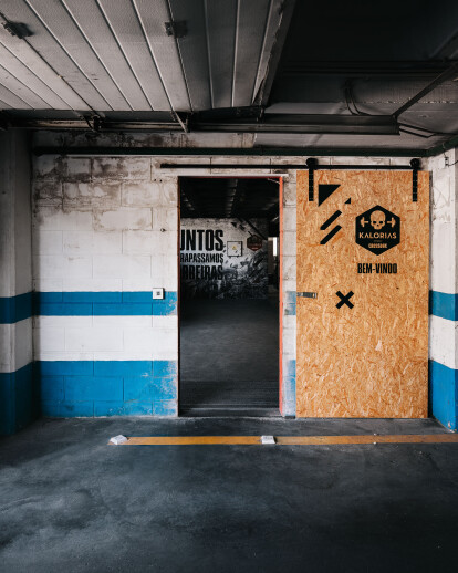
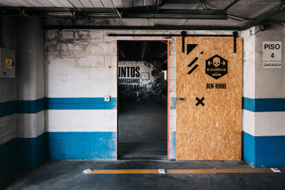
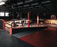
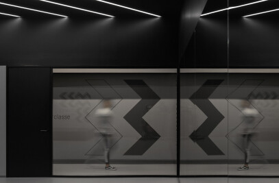
The main goal in this project was to transform an existing car service unit into a Crossbox, using quite limit resources. For that we tried to understand the space qualities and took advantage of them in benefit of the CrossFit training. Along side, a graphic image was developed for the brand in order to emphasize also the underground spirit of the space and to motivate the athletes.
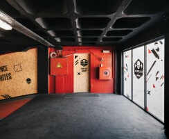
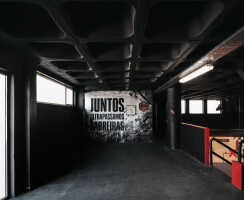
In terms of program, the existing dressing rooms were refurbished, and new cabinets were created in the back end of the Crossbox space. Our designed strategy was simple, take advantage of the existing architectural elements, such as the ramp, the existing stair case, the double high ceiling, the walls and pavement, and reshape them through the use of color and new applied materials in order to fit the training needs. Oriented strand boards were used to cover the walls and define the training area. Also giving a more natural feeling to such industrial space and add a layer of durability to the walls. The contrast between black and red help to identify important areas in the training routine, and visually play with the scale of the space. While by one side the black covering of the ceiling and walls intends to minimize the perception of the space scale, giving it a more human scale to the eye, the red elements intentionally break this relation and reveal the true architectural dimension.
