An initially much bigger apartment had in the past been divided into two smaller ones, one of which was then again separated into two units – one becoming this newly renovated studio apartment. The existing space was just a 27 m2 square-shaped empty room with no bathroom or kitchen connections.

The client lives abroad and wanted this to be a small city retreat for when they visit Ljubljana. It needed to be made fully functional for two, sometimes even three or four people. It had to be equipped with everything that bigger spaces can provide, but on a very limited area, while comfort should not be compromised. So we looked at the height as our main advantage to gain more space.

As the space is 3,60 m high, we calculated we could just about fit a bathroom and a bedroom one on top of another. So we inserted a cube in the middle of our bigger cube with stairs leading to the top around it. The space below the stairs is accessible from the bathroom and is used for wardrobe, storage and a washing machine. It is all covered by curtains, so no space is lost.

The rest of the space around the cube is open and consists of the kitchen, the dining area and a living space. If need be, the sofa can be used as a pull-out sofa bed and there are drawers below the bench for extra storage space. The small space between the two double front doors is used as a small entrance hall with hangers and shoe storage.

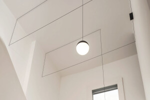
To balance out all the sharp edges, we inserted a mask wall which consisted of three arches, two framing the existing windows and the middle one framing a mirror. Although narrow, all the space below and between the arches is functional and is used for storage space. Flos string lights are playfully positioned at centers of the arches, but also with caution as the wall above the bench needed to be clear for projections.

Since the entire apartment is quite small, yet high, we also wanted to project a feeling of a bigger continuous space, which we achieved by positioning a mirror strip all around the top of the walls. The mirror multiplies the arches and reflects light. It makes it seem as if this space was just a part of a bigger space, partitioned with lower walls.

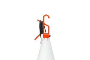
The client wished for a calm and neutral color palette, so we remained in more subdued tones, only wandering off in a few accents of red, orange and yellow.
Finally, we had some trouble deciding on the artwork, as the client was quite specific about things they didn’t like, that we in the end proposed that the client make a list of all the things they did like and we would have a local artist draw them.
The end result is a modern nod to renaissance still life paintings, done beautifully by a local illustrator and graphic designer Matic Flajs.


