SpaceInvader was commissioned by Aviva Investors to refurbish the central area of an existing mixed workspace at 201 Deansgate in central Manchester. Built on a former Quaker Burial site, the 6-storey modernist building at 201 Deansgate, which was constructed in 1997, sits on one of Manchester’s most vibrant and diverse thoroughfares in an important commercial location that can be easily accessed from surrounding prime retail, civic and legal community districts.

“Competition is high for landlords in this area and the refurbishment needed to be of a high standard to help retain the scheme’s existing tenants, moving forward into the future, as well as to attract new ones. It needed to match or preferably surpass the quality and types of offering in the surrounding area, giving the building a true competitive edge” John Williams, Founder of SpaceInvader commented.

Design Concept:
When it came to the concept for the unifying ground floor space, the design team was influenced by elements of Quakerism, inspired by the site’s historic origins and distilled into Quakerism’s core ethos of stillness, community and simplicity. This was paired with the concept of connection and networking, a key feature within the building’s original concept.

“201 Deansgate was built for people to connect and communicate at a pivotal digital time in history, when it became the first building to be marketed on the internet” John Williams explained. “This fed into the idea of waves, clusters and dispersion, embodying how digital sound recordings are transmitted.”
This idea is translated into the design through arrangements of clusters and elements of dispersion and weaving, set against a calming natural palette with a modernist edge. Within the palette, tonal changes drive the scheme with hints of rust, sand and soft greens depicting nature’s life cycle, changes in the seasons and new growth.

Design Walk-through:
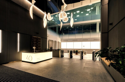
The space was previously dominated by a large reception desk and a space-hungry ramp, offering no additional facilities for tenants to use. An accessible lift was added to the redesigned space to free up space, whilst an updated desk was designed to be as uncluttered as possible, with a facilities management room nearby acting as an extension of the reception area. These decisions opened up ‘new’ space for 20 seats across individual and collaborative settings, as well as a self-service tea point.
Approaching the space, warm-toned signage and a weaving window manifestation graphic greet tenants and visitors from the exterior and hint at the scheme to come. All branding and wayfinding were also designed by SpaceInvader, with the agency’s interior and graphic designers working closely together to ensure the branding and its applications responded to the interior scheme. The simplicity of the typography, the materiality of the signage and the weaving on the graphic all nod to and correspond with the interior concept.

Within the reception area, upholstered booth seating provides snug areas to retreat within, featuring intimate, low-level task lighting to aid focus. A further seating area in the centre offers a more relaxed space to lounge in with a soft, rounded aesthetic. Facing onto the lounge seating, bespoke joinery houses a selection of books curated for their relevance to the concept. The same design language is used across the lounge joinery as on the booths and timber feature wall, inspired by the concept’s weaving feature. Tiled planters frame the staircase, whilst feature wallpaper on the back wall imitates cut stone to reference organic influences.
The star of the space is a feature installation suspended across the atrium in clusters that disperse and weave together. The concept was inspired by the flocking and murmuration of birds, part of the scheme’s core ‘connections’ concept, with SpaceInvader’s concept further developed and then manufactured by Paul Shoosmith of Light Forms. The idea of murmuration and flocking behaviour influenced how the form and movement developed – once clustered together birds just as quickly disperse apart, creating a delicate movement. Upon entering or departing the space therefore, the outside air brings the piece to life, with each section moving gently in the breeze. This concept also translates through to the wayfinding, with arrows on the staircases placed in flocking formations, whilst the height of the piece also serves to connect the floors above.

Moving from reception to the lift lobby, the ceiling drops to a more typical height, allowing the space to feel calmer as the user transitions through the building. Neutral colours and applied moulding to walls create a grounding across the space, whilst timber-effect flooring draws references back to a more natural materiality and provides a hardwearing, easy clean solution for a high traffic area. The existing dropped ceiling section is retained but darkened with charcoal grey and a concealed LED light to backlight the space. Sculptural forms dress the back wall with an occasional bench as a focal point.
The flooring acts as a framework and background to house and display the different areas of seating and circulation within the ground floor central space. At detail level, the set dressing in the form of books and objects also relate to the interiors concept, including books on birds and walking for a sense of natural wellbeing. Textures were also key, with thick, cosy and woven elements selected for the furniture and rugs here, as well as for textured vases - and even textured planting!
The clean, modern colourways and variety of installations of tiles also add close-up interest. Tiling includes the Solus Motown small dark tile in the ‘Miracles’ colourway around the seating areas, with the fine lines of pale grout and a staggered brick bond installation tying in perfectly with the geometry of the bespoke lounge joinery. A larger dark grey tile – the Domus Glitch in colourway DPGL 08, also in a staggered brick bond installation pattern – is used for circulation spaces around the seating zones and the steps up to the raised level. Tiling is used again for the toilet areas; in this instance the Domus Narvik tile in colourway 134 Silk from the Ultracolour Plus range – with the same tile also used for the lower part of the bathroom walls.

Sustainability and Wellbeing:
Sustainability was also considered as a goal for the project. There needed to be a balance between modernising the space to achieve aspirations whilst also being cost-effective and sustainably conscious. Sustainability here also included considering tenant wellbeing and the importance of ensuring a connection to nature, as well as the use of planting to help improve air quality. The inclusion of a range of different spaces gives users flexibility and choice, providing an escape from their own office spaces if needed, with tactile, soft and cosy finishes used to stimulate the senses.
“At the beginning of the process, we undertook a full analysis of the space, noting which materials were in good condition and fit for potential reuse” John Williams commented. “When translating the design concept into finishes we revisited this analysis, considering which materials would still work from a design point of view and where new materials could add value, ensuring the scheme still felt conceptually driven. For example, the existing beige tile in the reception previously covered most of the walls and floor, dominating the space. As the colour is neutral, we were able to retain parts of it, whilst selecting complementary finishes around it.”
When specifying products and materials, the SpaceInvader team considered the environmental credentials of each, with the most environmentally friendly material or product selected. For example, tiles were favoured for a number of reasons. As well as being made from natural raw materials, they are durable, low maintenance, can assist with interior temperatures and due to the high temperatures they are fired at in kilns contain no organic compounds - often a contributor to health issues.
Wayfinding for the cycle store aimed for minimal material usage whilst still providing directions that are easily identifiable. Directional signage was bold and decorative meanwhile, using the same weaving graphic placed on the reception glazing, with the introduction of colour and a cycle graphic, following the same linear style for all icons throughout the space.
“Overall, we believe the refurbishment of 201 Deansgate to be a huge success” John Williams concluded, “uplifting the offering to include greater value to tenants and providing a beautifully updated look and feel rooted in a rich concept. Tenants and staff alike appreciate the updated functionality, and the scheme brings the building back up to date to stand in line with competitor spaces. Stepping from the hustle and bustle of Deansgate, we have successfully created a space of connection, communication and reflection.”


