A.MANO is a home décor shop featuring work by local artists, vintage finds, and up-cycled fine furniture. It is owned by Katherine Wells and designed by Sergio Mannino Studio.
KEY FEATURES
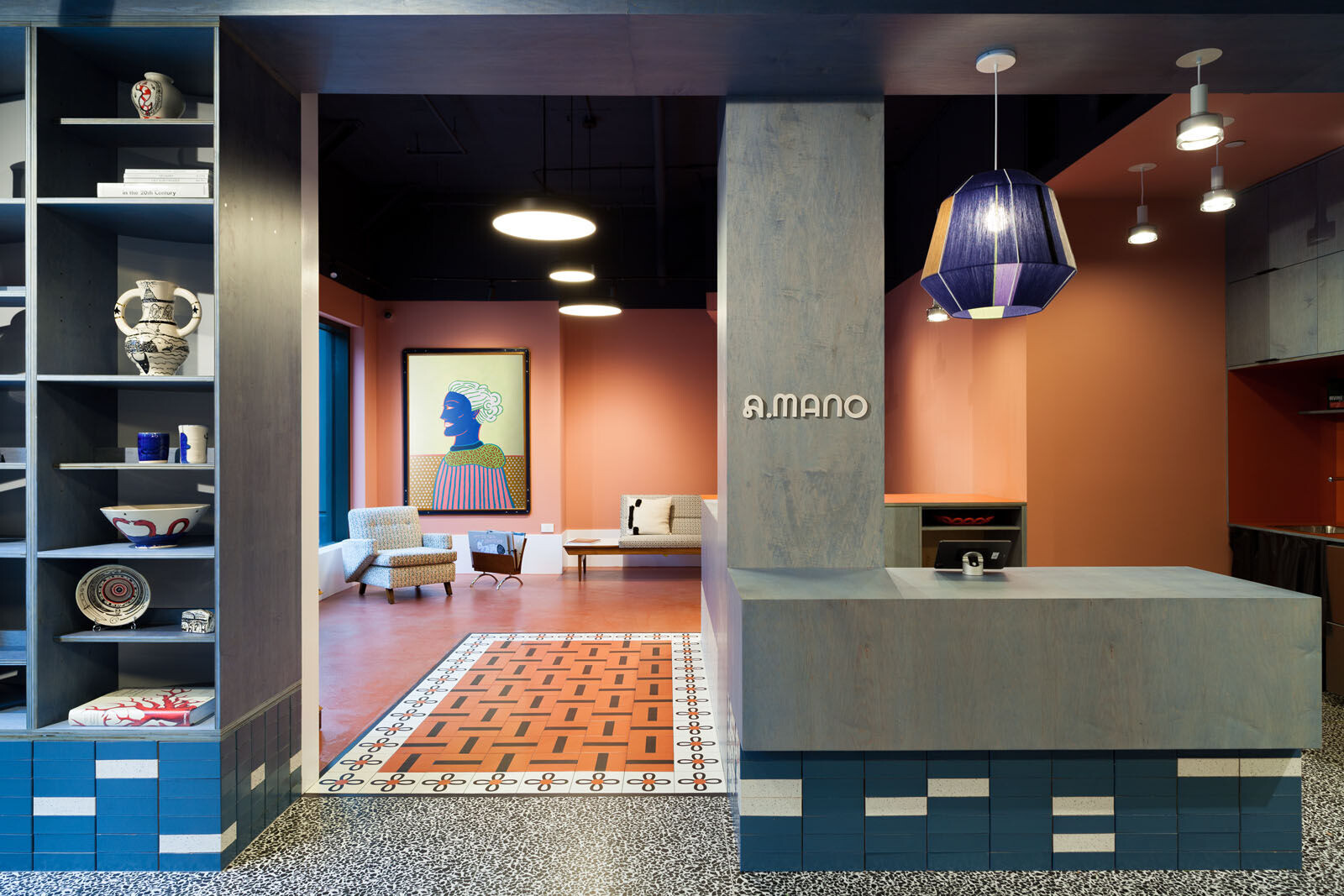
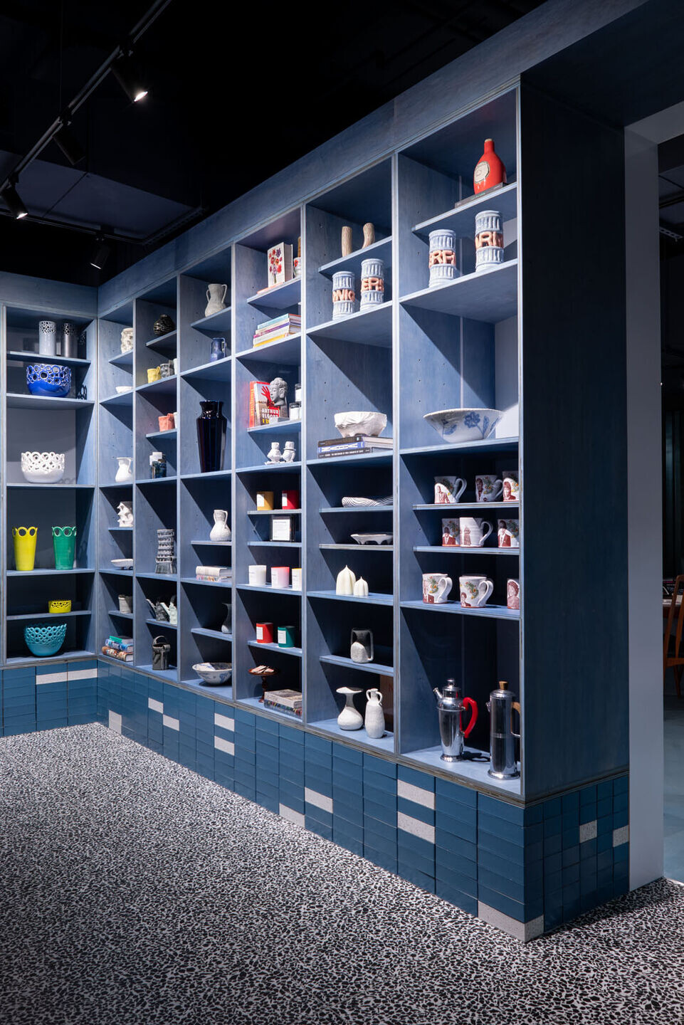
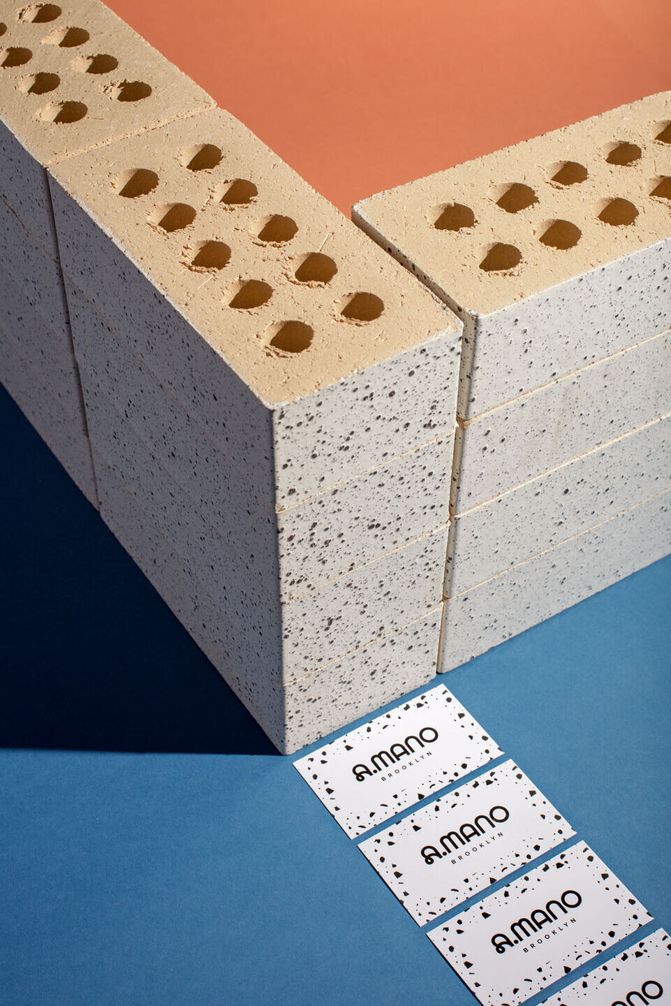
● The store is sustainably designed, allowing for all the fixtures to be disassembled without destroying the materials. No glue has been used to connect all the parts, even the glazed bricks, only screws.
● It features minimal as well as bold, funky design, while also incorporating a raw feel to the space.
● The logo and branding are carefully designed to reflect tidiness while also maintaining a delicate and uniquelook. This is representative of the handmade, one-of-a-kind ceramics being sold. In fact,"AMano" itself translates to "handmade".
● There are three main rooms: a main gallery, a coffee shop, and a back gallery that can be used for various purposes.
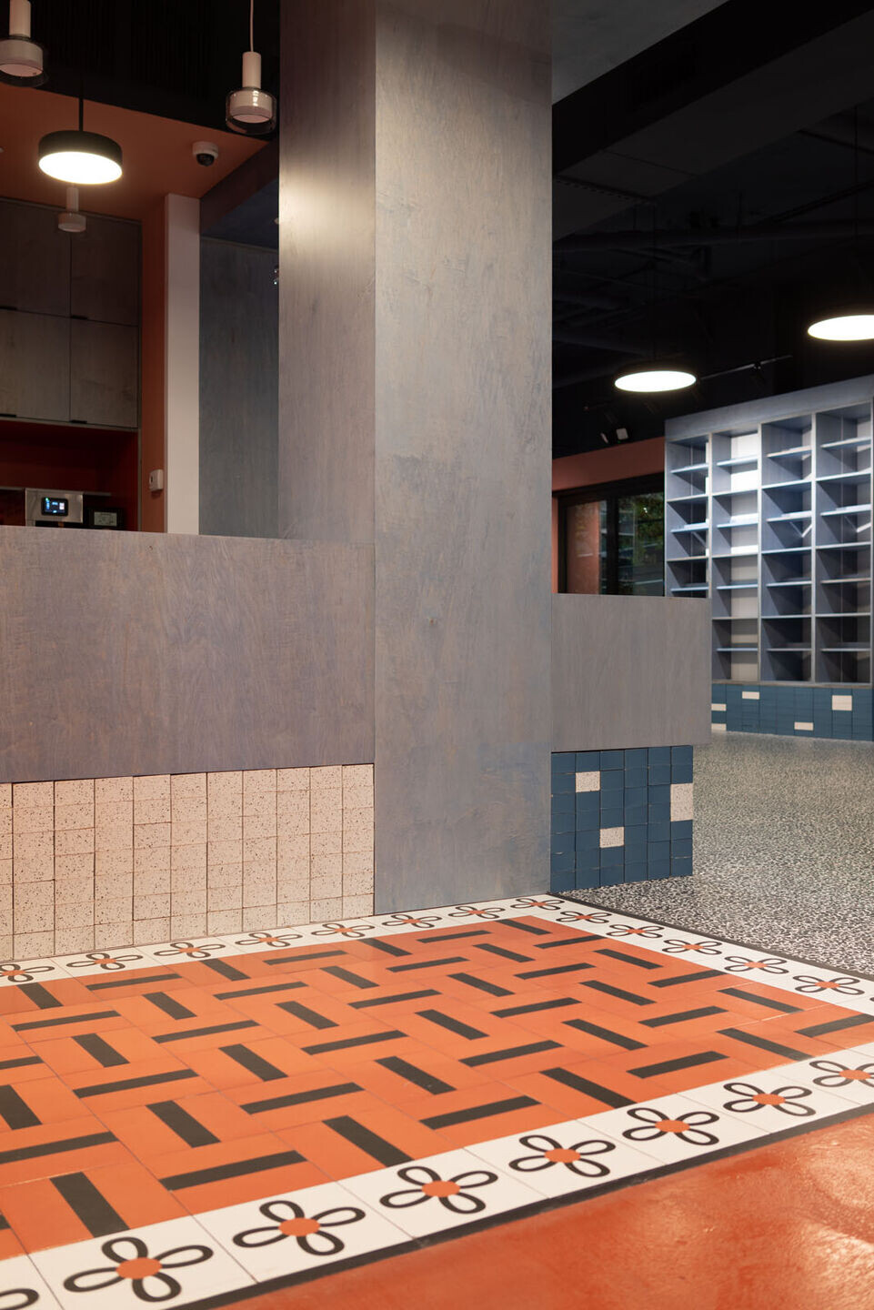
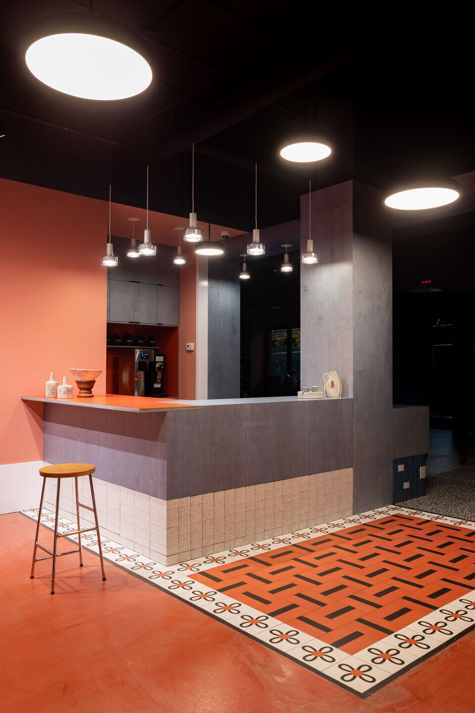
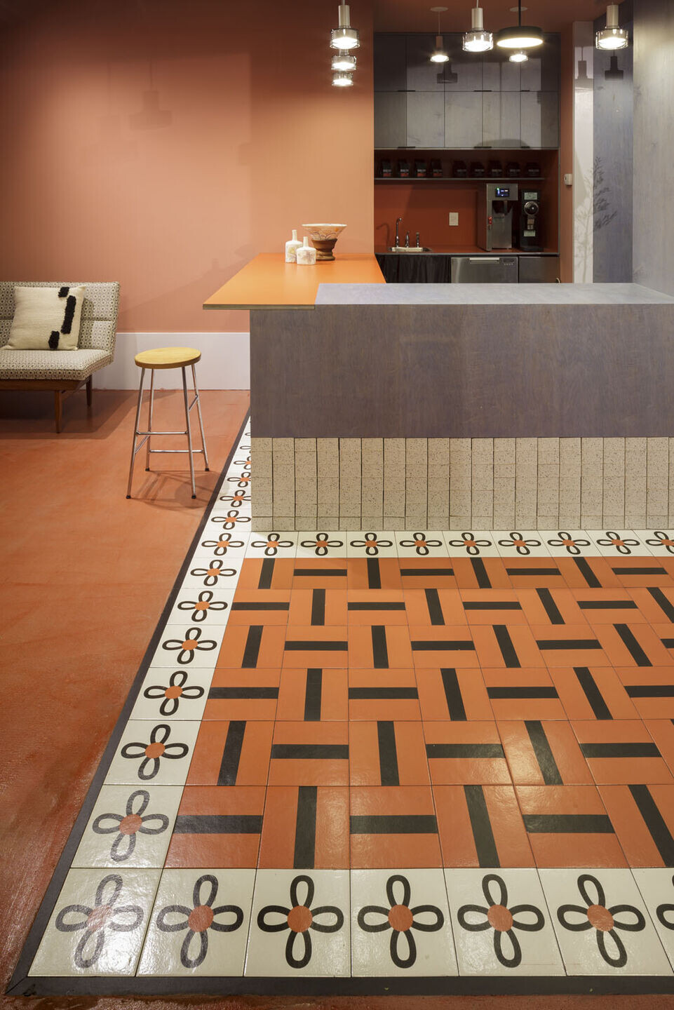
● The coffee area features a series of Margherita Tiles by Mutina, designed by Nathalie Du Pasquier (a Milan-based designer known for her iconic MEMPHIS design and art).
● The raw and minimalist look and the use of plywood in the design is inspired by Donald Judd, but positioned on top of a base made of colored glazed bricks.
● The main floor features a digitally printed porcelain terrazzo floor by FLORIM, while the other rooms are characterized bystained concrete in two different colors:blue and terracotta.
● The main colors are smoky blue and terracotta, the latter evocative of the ceramic pieces sold by A.MANO.
● Both store design and identity are envisioned and developed by Sergio Mannino Studio.
Sergio Mannino Studio, an Architectural Branding Agency based in New York, designs a new brand identity and a store interior for A.MANO Brooklyn.
A.MANO Brooklynis a Brooklyn-based home decor shop owned by Katherine Wells, merging the retail of locally-made ceramics, art, and up-cycled fine furniture.
The shop creates a hub for artists, Brooklyn residents, and retailers to collaborate and allow local art to be accessible on a larger scale. In addition, A.MANO is partnering with BKLYN CLAY, a ceramic school/workshop located right next door.This collaboration fosters the promotion of local art,andthe sales of the pieces will benefit both entities.
Katherine Wells has inspired the Studio to create a vibrant, welcomingspace full of artistic references that she cherishes dearly.
Brooklyn has a new booming spot to keep the community active and inspired.
Store Design
The unique and modern storecombines various design aesthetics from 80sItalian Design to minimalist to industrial, drawing inspiration from iconic artists and designers such as Donald Judd and the Milanese Memphis group.
This project incorporates Mannino Studio's dual heritage: the Italian Radical Design on one side and the American minimalism on the other. Sergio Manninotrained with Ettore Sottsass at the beginning of his careerbefore moving to New York in 2001 to open his own design studio.In 2002, he presented a series of furniture at the Memphis-Postdesign Gallery in Milan, once again under Sottsass'mentorship.
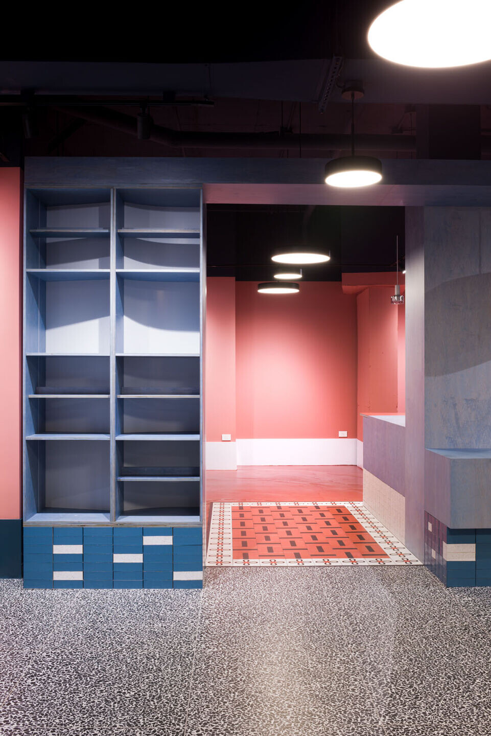
The interior is distinctlydivided into three different spaces, each with its unique feel. The main goal of the design was to create a progressive flowand allow for different experiences for each of the clients.
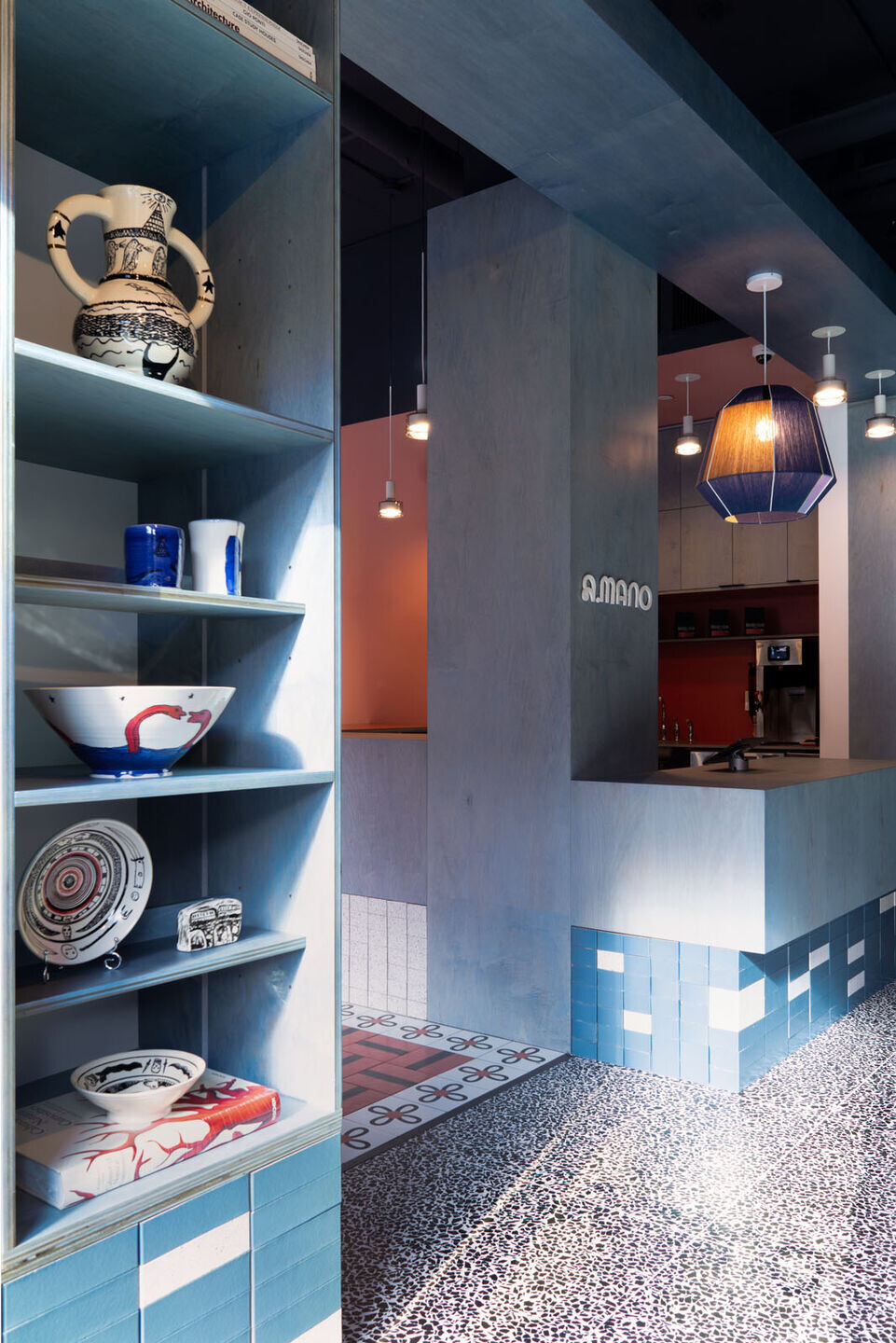
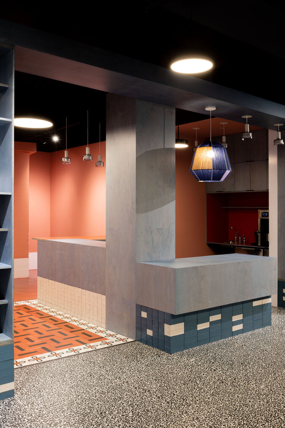
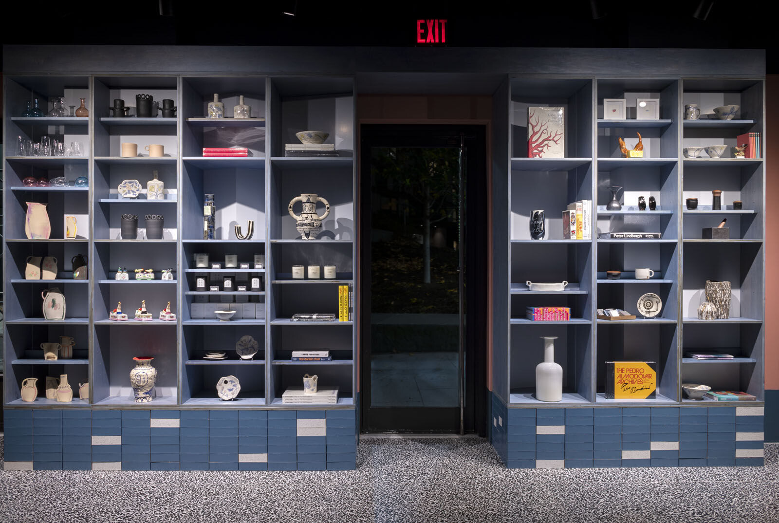
The main gallery is an eye-catching place featuringblue-stained plywood shelving sitting on a base of blue and white glazed bricks, together with a black and white terrazzo floor. The coffee area on the left has a more intimate and homey feeling,displaying abolder terracotta/orange tone on the floor and the walls. Here, the counter space is emphasized by the Mutina tiles, designed by Nathalie Du Pasquier, which the Studio used to create what seems to remind us ofa ceramic rug on the floor.
Lastly, the back room is a relatively more neutral area where the store will periodically show rare and valuable vintage furniture from different eras. It has a blue concrete floor and two large windows overlooking a garden.
The whole space is characterized by a 16" baseboard aligned with the top of the glazed bricks. The "baseboard issue" is recurring for many architects, with some trying to remove it entirely using just a reveal. The Studio opted for a bolder solution to make it a strong presence in the space, painting it in contrast with the wall behind.
Brand Identity
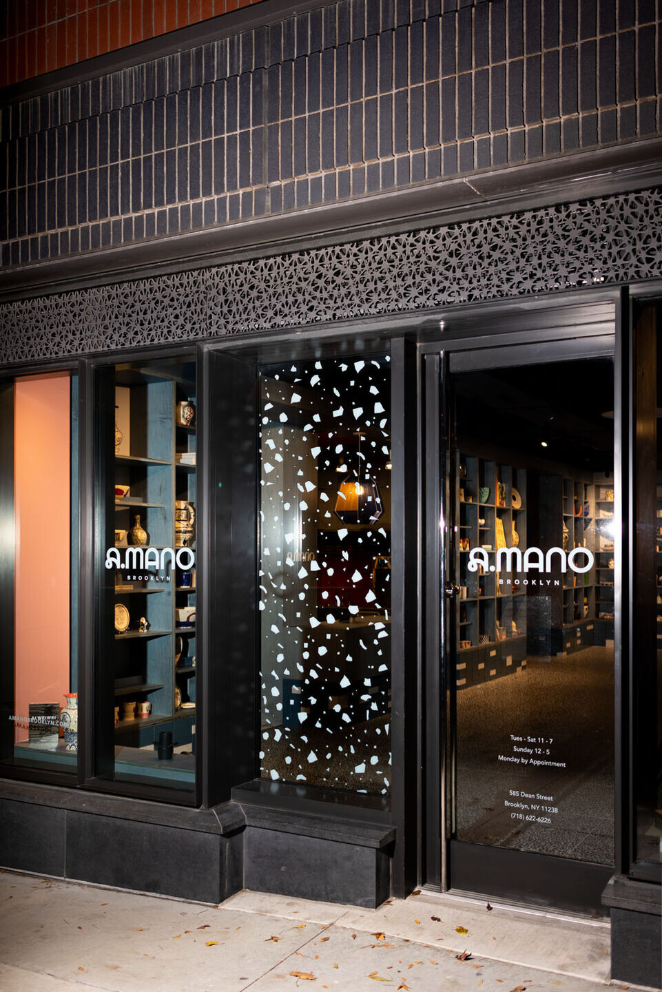
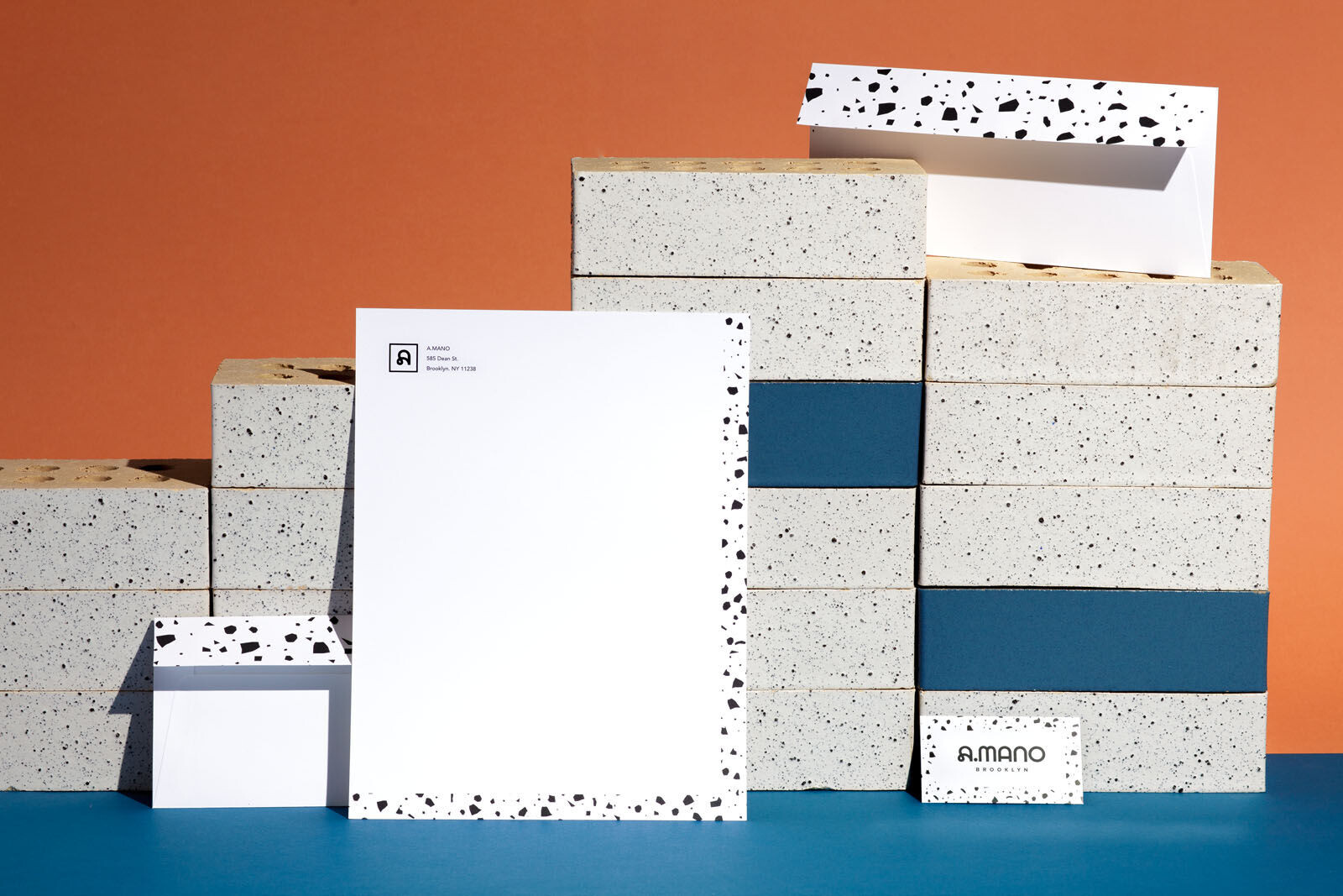
The brand identity has been conceived as a natural extension of the store design. The Studio created a logo characterized by two very different letter A’s: the first one being bold and playful, representative of the brand's characteristics, while the second one aligned with the rest of the typeface.
The main A becomes a Logo Mark that can be used independently, with or without the Brooklyn tag, in a framed square or a solid background. The A is from the typeface Lyno by RadimPesko.
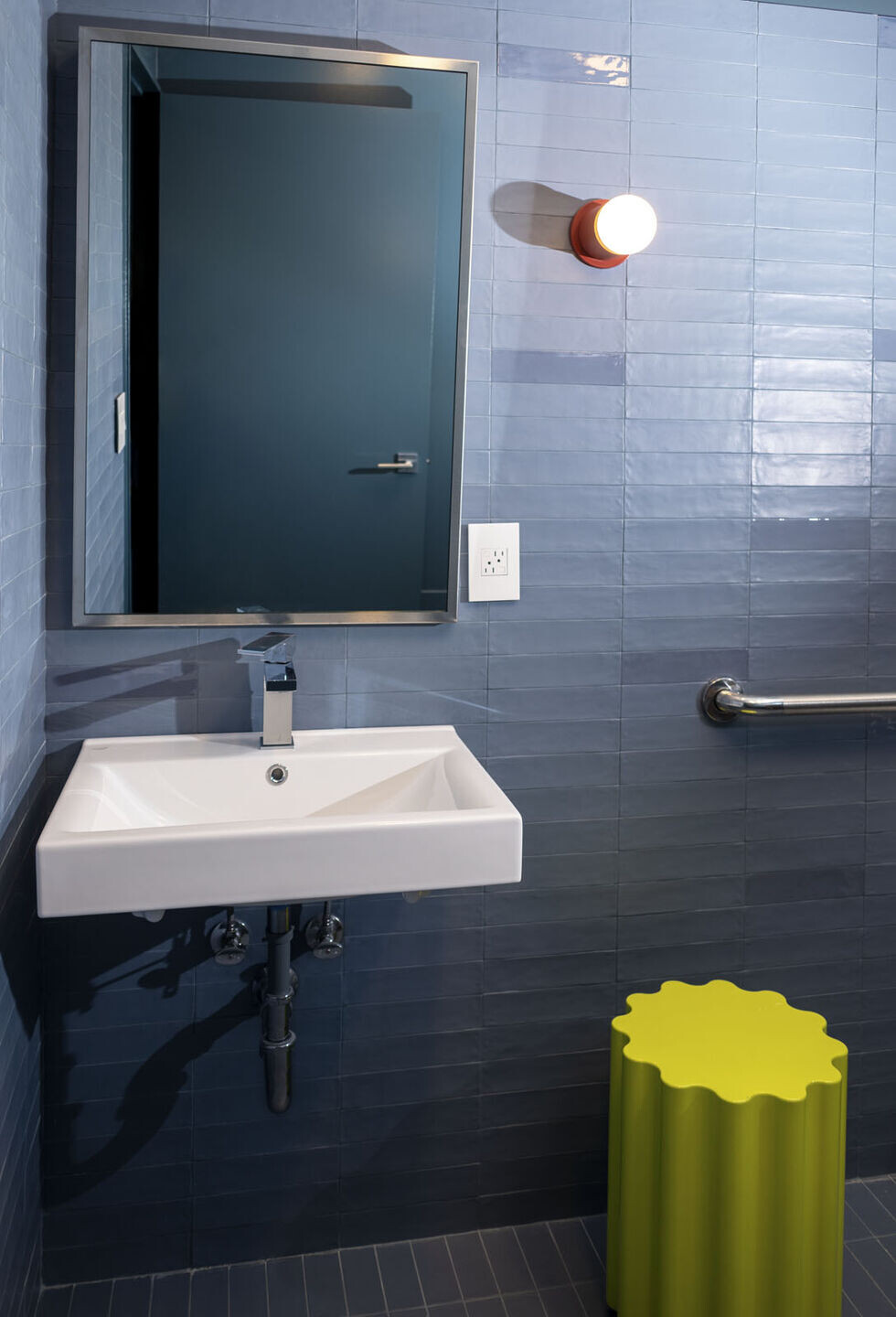
The brand's primary colors are Black, White, and Smoky Blue, all three reflected in the floor and glazed bricks materials. They have strong character, with contrasting tones and a bold presence.
The brand's secondary colors are a lighter version of the shades used for the interior space, with the addition of a light green shade. These colors evoke feelings of warmth, comfort, and nature. They evoke naturally painted surfaces, and feel contemporary without breaking with tradition.
The main logotype for the brand is Avenir, a sans-serif typeface designed in the 80s by Swiss designer Adrian Frutiger. It is a harmonious and sensual font that perfectly fits A.MANO, giving the brand a delicate feeling without being overly present. In the words of its designer, "The whole point with type is for you not to be aware it is there. If you remember the shape of a spoon with which you just ate some soup, then the spoon had a poor shape."
DESIGNER'S QUOTES
DESIGN:
"Design is a form of communication, and, just like language, is a characteristic that defines the human nature. We share ideas and feelings through a complex system of signs and symbols such as colors, materials, finishes, forms, lights, and shadows.” SM
THE COLOR BLACK:
"In graphics, black goes back to the earliest tradition of print, as far back as Gutenberg.But even with such a strong tradition on its back, its simplicity gives it a contemporary look and feel that transcends history." SM
BLACK AND WHITE PHOTOGRAPHY:
"For as much as our work is rooted in colors, I have always been fond of dark and contrasty black and white photography; I believe this feeling is transferred into this identity project. Black-and-white reduces the world to its pure essence.Without strong content, there is no real message, and the absence of color forces you to work harder." SM
MULTIDISCIPLINARITY:
"At the Studio, we work on each project by simultaneously looking at all the different angles. We believe in the traditional Italian creative process involving various disciplines and facetsin the same bottega. We don't think that a line separates architecture from interiors from graphics from décor. All of these different disciplines are part of the same whole.
When we designed A.MANO, we looked at each material and element of the space from an architectural perspective and a graphic one. The terrazzo floor we selected for the main room quickly became a pattern for the business cards and the window graphics. Even the logo, in its various iterations from initial sketches to the ultimate version, came from the design of the shelving system." SM
Team:
Client: A.MANO Brooklyn
Designer: Sergio Mannino Studio
Local Architect: Hany Rizkalla
Lighting consultant: Lido Lighting
Flooring consultant: Stone Source
Builder: Minas Construction
Material Used:
1. Margherita by Natalie DuPasquier: Mutina
2. Terrazzo Floor Art Basic 02 matte: Florim
3. Glazed Bricks Bermuda & White with speck: Glen-Gery
4. T99 Track Light Heads: Lumenture
5. Bonbon pendant lightby Ana Kraš: Hay
6. Bobber Pendant lights in black: Blu Dot
7. Trace 2 Pendant lights in white: Blu Dot


