Leading British design studio Kinnersley Kent Design has created a new store concept for heidiklein – the luxury swimwear brand and holidaywear retailer–to serve as a launchpadfor the business’s next phase of international expansion. Formed in 2002 by Heidi Gosman and Penny Klein, heidiklein first launched its ‘one-stop holiday shop’ concept in its Notting Hill store in 2002, before openinga second boutique in Chelsea in 2004. The retailer currently hasfour stores, including St Lucia and Montenegro, whilst thewholesale arm of its business, via its own-brand ‘heidiklein collection’, is stocked in over 150 stores in 39 countries.
The new store concept is now triallingat heidiklein’s Pavilion Road store, in Chelsea. ‘Our main design evolution’, explained Jill Higgins, Partner atKinnersley Kent Design and director of the project, ‘has been to move the interiors iconography away from a beach-inspired dressing towards a more refined, internationally-applicable glamour, with inspiration from the domestic interiors vernacular of a ‘Hamptons House’. The store layout is therefore inspired by domestic zones:living room, bedroom, veranda and so on, which creates a more lifestyle-oriented environment and encompasses the growing breadth of the offer, including après-beachwear, menswear, childrenswear and a thriving accessories range.’
The new store design is very much a key stage in the expansion of the brand. ‘We set out to reinvent swimwear shopping into an exciting and enjoyable experience, while providing everything our clients desired in order to look and feel gorgeous on holiday; all under one roof,” explains Heidi.
The new, overall environment at the Chelsea store is very clean, with the product very much the star. The store needed to transport customers instantly into an oasis of calm, which it does via a space that is light and warm - and smells beautiful too. The walls, flooring and ceiling are all in white, with an accent colour of soft gold taken from the branding, plus sparing use of green palms to add freshness and vibrancy. The strong new merchandising system contains elements that can be easily applied to smaller, concession opportunities, whilst merchandising densities reflect the premium positioning and are light in colour, underlining the transparent and bright holiday feel. ‘The product is vibrant and pattern-rich’Jill Higgins explained, ‘and we sought therefore to design a space that very much creates a canvas for the product, using neutral tones with texture for visual interest.’
Store Design Walk-through: For the 1,100sqft Chelsea store, located just off Sloane Square, the store footprint remains as existing. The front entrance has been opened up and the storefront itself refurbished and cleaned with new fascia boards and branding.
Three full-height store windows were treated as the ‘veranda’ areas of the ‘Hampton House’ concept and feature full-height screens, resembling grand-scale,domestic window shutters, which can be set at angles, creating a strong visual identity within the glazed elevation andalso offering flexibility bydoubling as a merchandising system on the interior side.
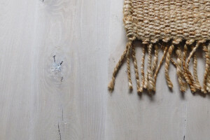
Flooring throughout is in white oak, whilst the ceiling is made up of a raft installation of horizontal boarding, underlining that the domestic vernacular is inspirational, but not literally applied.
For the merchandising system, a balance was struck between maximum flexibility and creating the bespoke and refined look of a luxury brand. The ‘non-system system’around the perimeter, therefore,has brass rod detailing, echoing the ‘soft gold glamour’ highlight used throughout the scheme and offers the benefits of flexible shelving. Each item of the core swimwear offeris displayed in one size only, maintaining the brand’s spare, luxe aesthetic, whilst integrated drawer units throughout hold stock in other sizes.heidiklein’sown-brand collection allows the retailer much greater control over colour stories in the display. The wooden elements of the merchandising system are all white, but in different opacities, with subtle differences only in order to harmonise with the overall material simplicity of the scheme.
Accessories are integrated throughout, with cross-merchandising layouts designed to highlight shoes, bags, hats, toiletries and jewellery and tell full, lifestyle-driven product stories. Domestic-scale mid-floor merchandising units are multi-level and includea stand-out, bespoke oval ellipse table with soft gold geometrically-angular legs and inset seating beneath, as well as a perimeter table inspired by a hall console. A relaxed lounge zone just outside the changing rooms again strikes a domestic furniture note and features bespoke-designed armchairsby Kinnersley Kent Designwith a satin brass frame, along withside tables by Louise Bradleyfeaturing antique gold frames and mirror tops. An artwork wall behind the seating arrangement features images from current heidiklein campaigns, used once again in the changing room vestibule area and in smaller form in and amongst table top merchandising.
Lighting is a mix of flexible, dimmable track lighting, flush lighting within the ceiling raft and three large, bespoke feature pendant lights in powder-coated white metal with gold-lined interiors, which hang directly over the cash-desk. The cash desk, relocated from its previous front-of-store setting to a more discreet back wall location, also features a handbag shelf; exactly the kind of detail that makes the shopping experience in the store such a pleasure.
There are small mirrors integrated into the display areas, as well as full-length mirrors, mostly located on doors as a good use of spaceand to help conceal the doors that link to back-of-house. Vertical wood panel detailing, directly referencing Hampton House architectural detailing, is used wherever there is a gap between a merchandising unit and a corner, for example.
Over-sized brushed brass door handles announce the beginning of the fitting room area. Customers pass more accessory merchandising en route to maximise cross-selling opportunities. The fittings rooms are more luxurious than in the store’s previous incarnation, with lots of hooks to help when trying things on and for hanging for existing bags and clothes. Seating is also included in the form of a hessian pouffe, especially useful for mums keeping an eye on small children. White, framed wall-panellingin the fitting rooms strikes a further domestic ‘wardrobe’ note.


