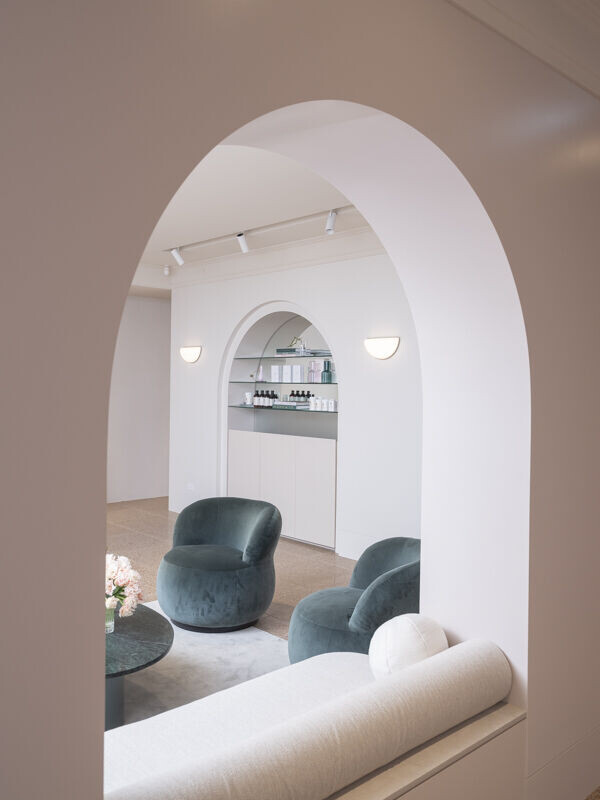
Pink arches; a client’s insistence; a non-negotiable that became the core element to define an emerging Australian beauty brand and salon.
A romantic pastiche of genres are united with colour and texture. The primary space, a waiting area for beauty appointments, is conceived as a feminine hotel reception, a ‘holiday in the middle of the day’, a serene and comfortable space with a hint of old-world glamour.
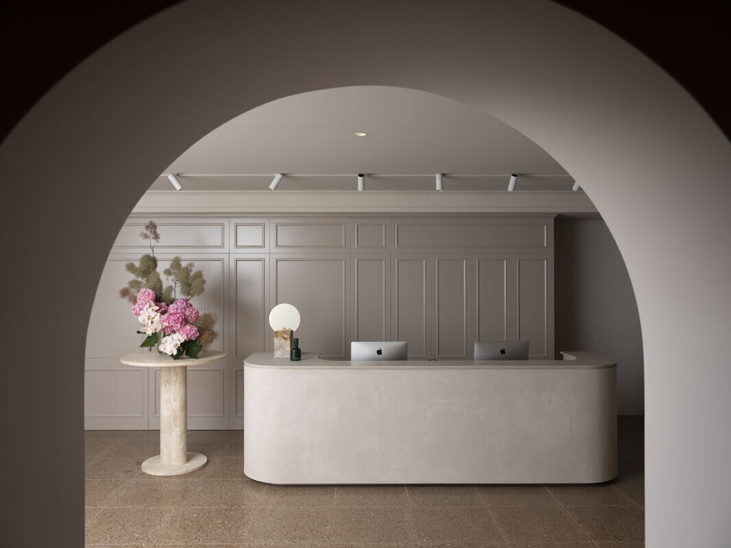
Although there is an overwhelming sense of ‘pinkness’, no actual pink has been used in this space, only tonal variations of colours that relate to pink; pinky-hues rather. An exploration of texture and material further enhances the warmth of those tones and soft curves throughout draw parallels to the female form.
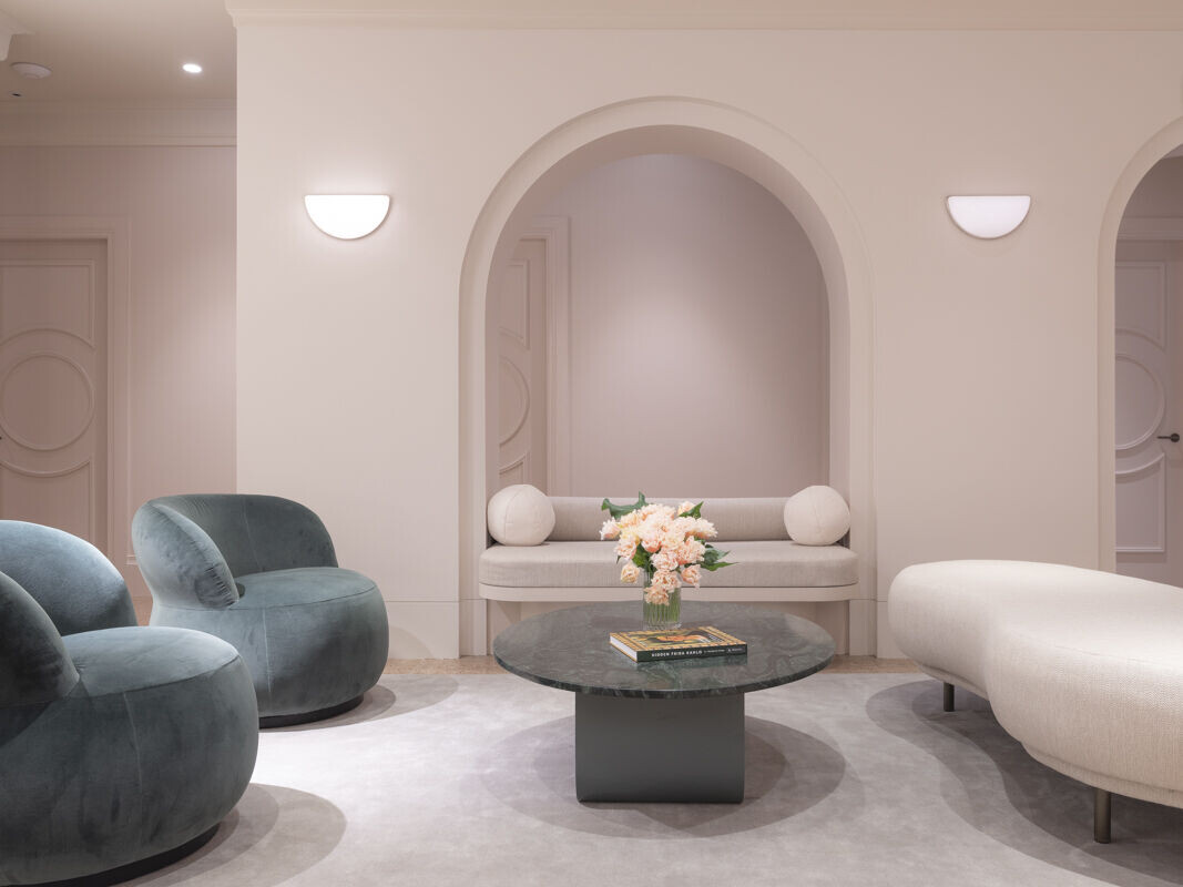
The Dulux colours were carefully selected from a wide selection, patiently sampled by the painter, so that they could be fullly reviewed and refined and checked with natural and artificial lighting. We particularally like to review the intensity of the colour- sampling ull, halff and quarter strengths.
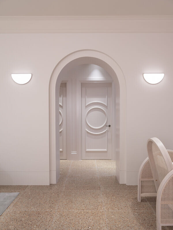
The tones needed to read as pink, but NOT too pink. We were wary that the colour shouldnt be too open to date or to reflect that particualr era of 'millenial pink', it should be classic and timeless, feel warm yet reflect a certain 'fleshiness' that became key to defining this new brand.
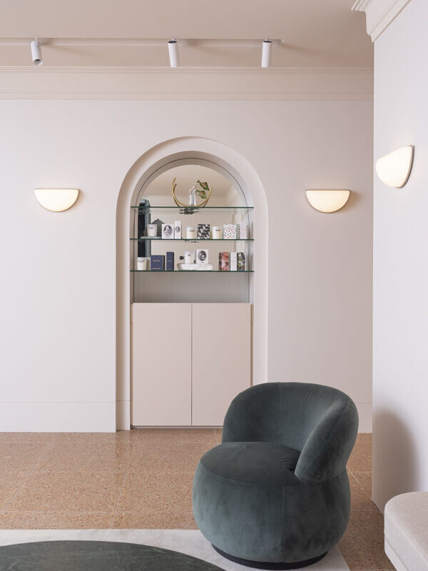
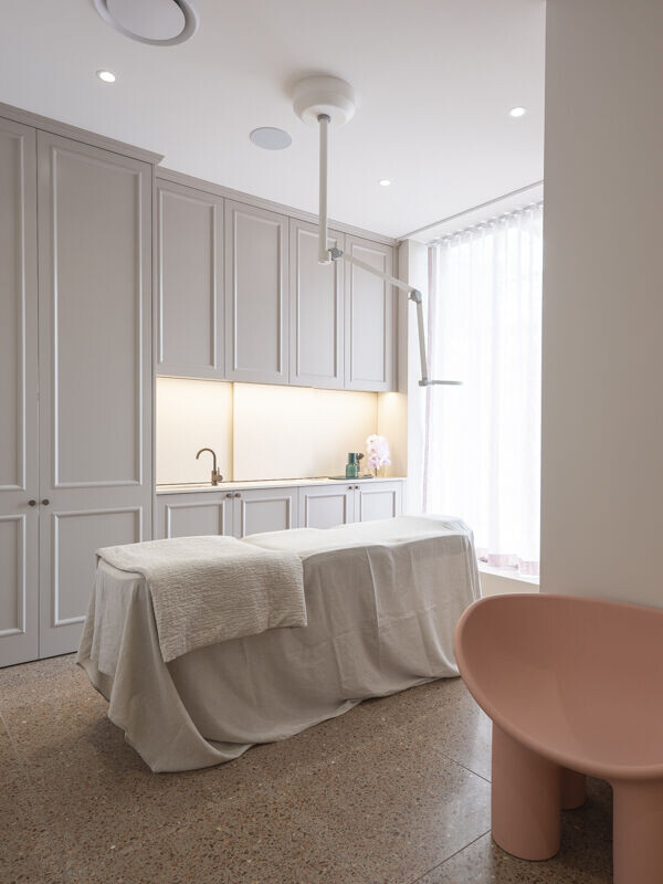
Tonal variations were key to subtely define different spaces and create certain moods. A glamorous open reception and waiting area in shades of Dulux 'Male' (and yes the paint colour name was most appreciated for this overtly femme space) leads into a more dramatic and dimmly lit hallway of 'Christobel, a moment of 'pink' reflection prior to entering the clinical spaces which need to be clear and crisp with just enough warmth- painted in Dulux 'Limed White half'.
