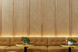
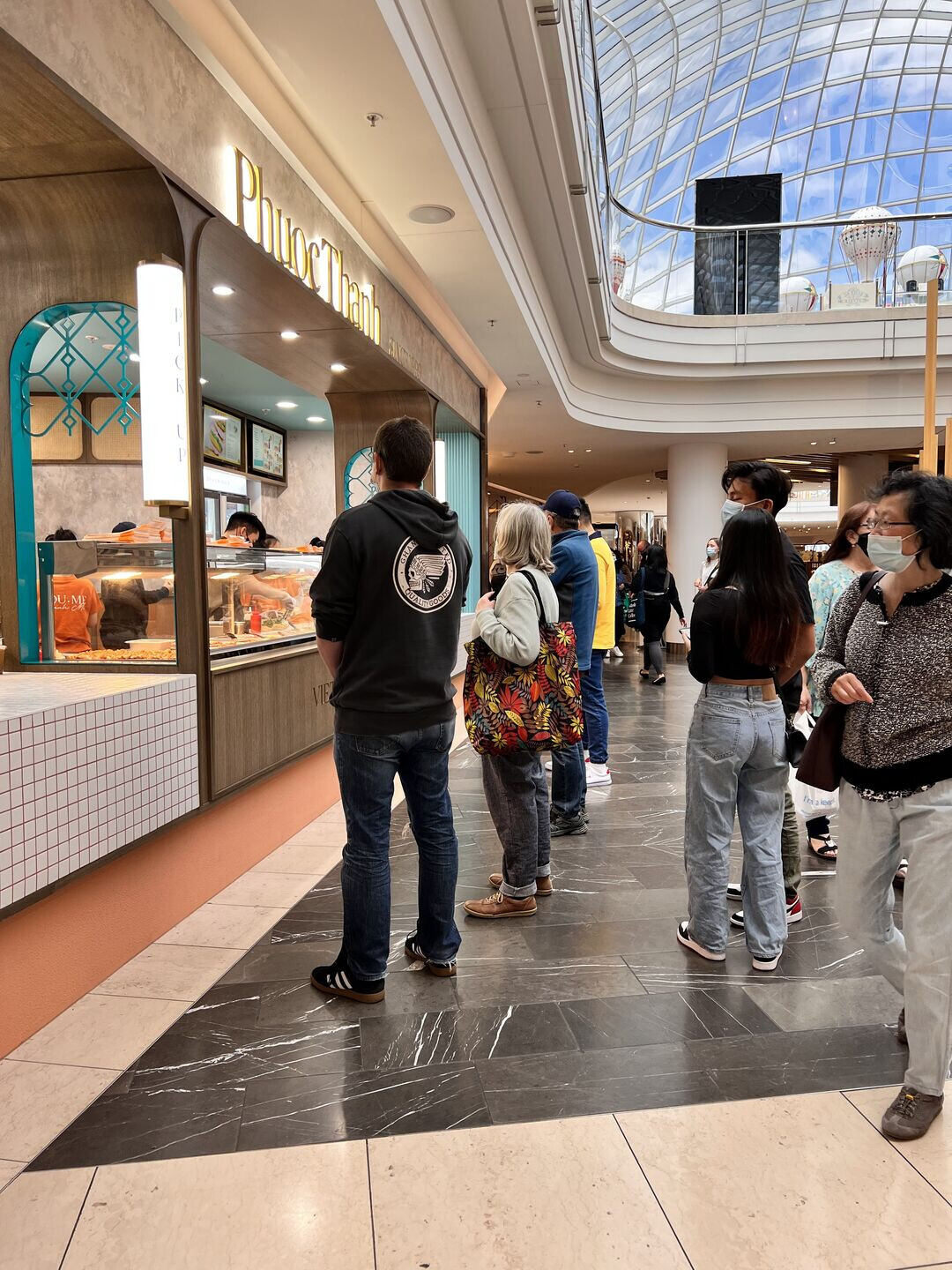
BrandWorks were engaged by Phuoc Thanh to reimagine the brand and FFE design for their new Chadstone concept store. Working in collaboration with T-A Square Architects, the studio rationalised a new store concept, signage and finishes palette that was a contemporary take on hues and motifs that can be found in traditional bakeries throughout Vietnam.
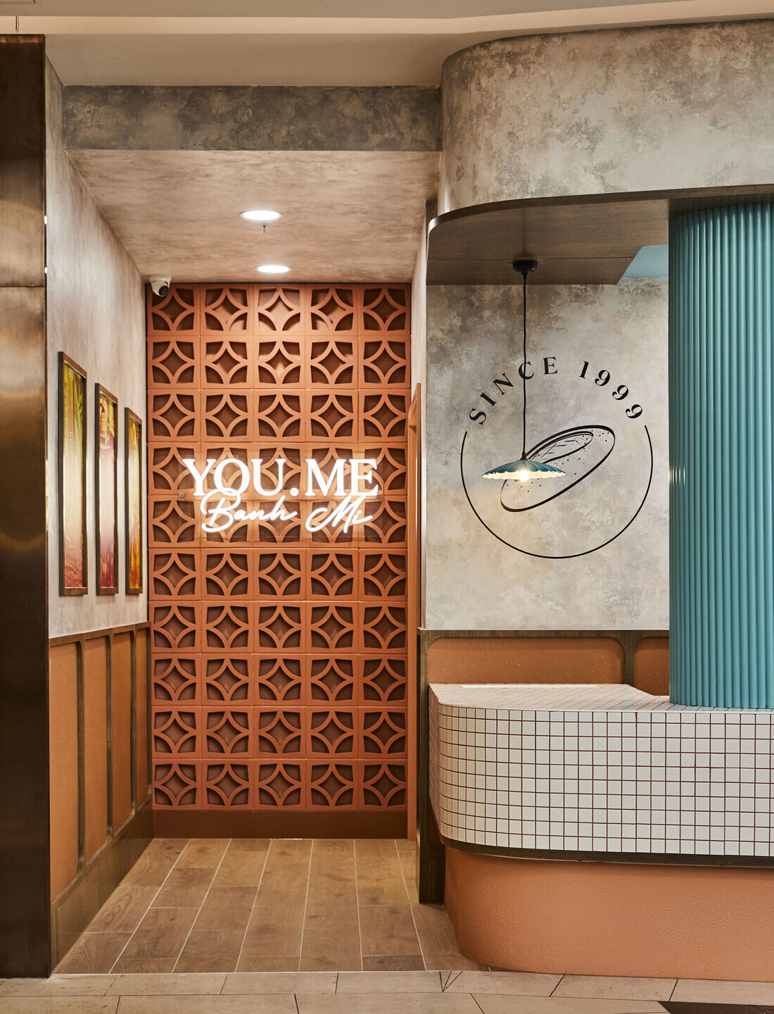
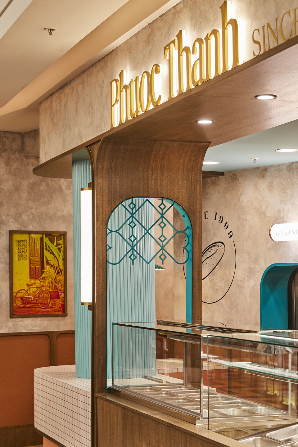
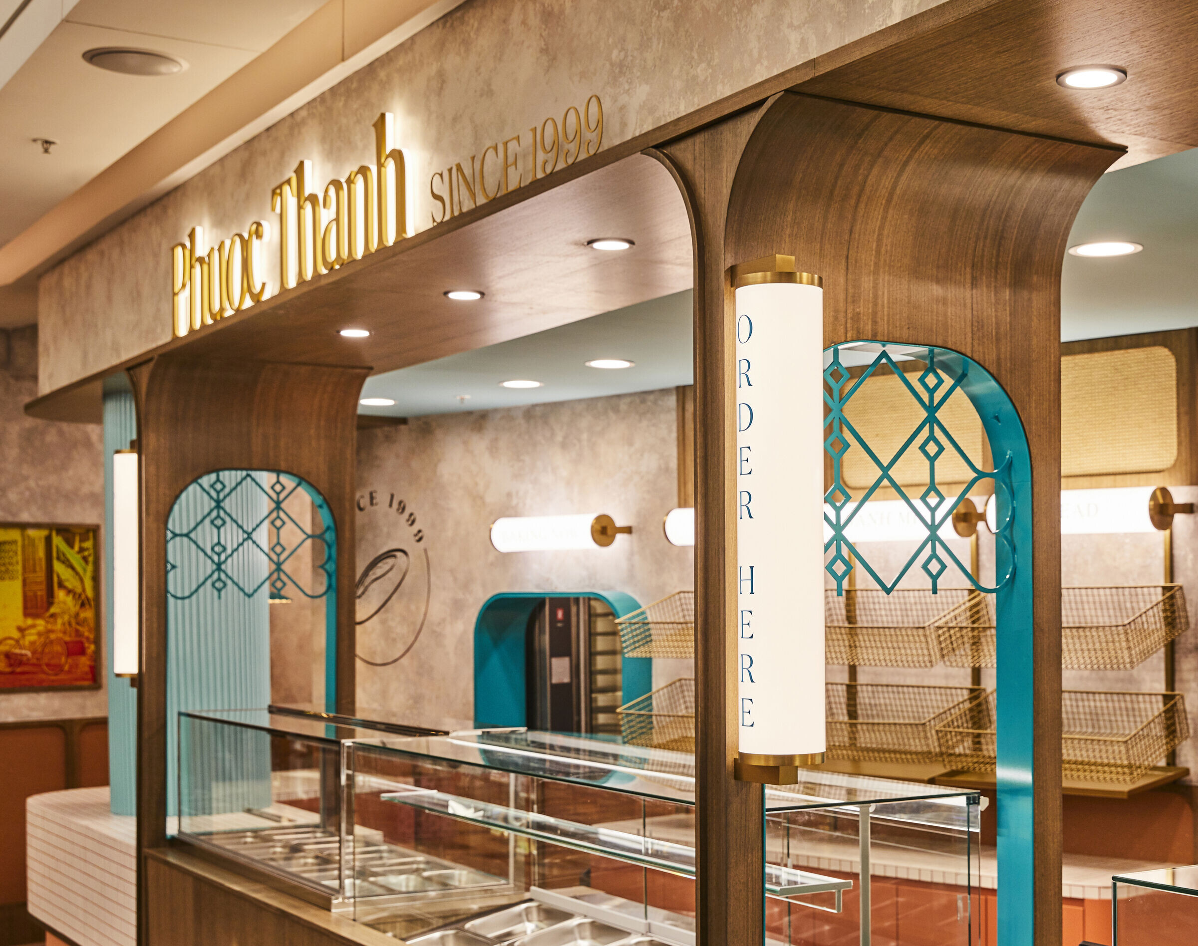
Citing inspiration from Vietnamese colonial architecture, Phuoc Thanh draws from silhouettes seen in Old Saigon. Two large timber pillars frame the centre of the tenancy, breaking up the long counter and focusing your eye to the bread display in the back. Warm terracotta hues are contrasted by the vibrant teal that is also reflected in the new branding, also reminiscent of the vibrancy seen on the streets of Vietnam's most famous cities.
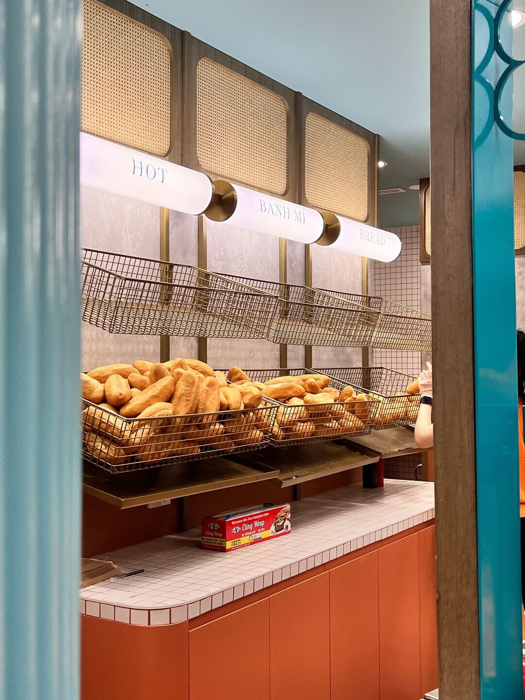
An essential part of the brief was to ensure the design was as honest and authentic as possible. A decision to make the window right where the bread oven allowed the back wall to become open and eye-catching. Customers are able to see fresh bread baked on site strengthening the authentic and artisanal feel. Custom canister style signage anchors the focal points of wayfinding, imperative to tenancies such as these, with one above the window that simply states 'baking now'.
Project materials
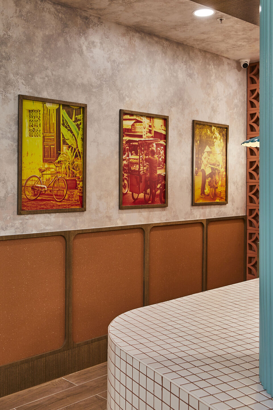
BrandWorks engaged specialty renderers Scanlan & Makers to assist with bringing in some grit to the overall palette. Their skill in rendering the surfaces of the tenancy brings authenticity and honesty to the overall palette. Terracotta breezeblocks also frame the back of the tenancy, drawing you in and creating an eye-catching, insta-worthy focal point for passers-by. The timber used is a mid tone smoked oak hue that juxtaposes the vibrancy of the teal, balancing the bold tones with natural hues. Rattan was used as a nod to natural finishes in an otherwise modern environment. It was specifically placed as cladding near the ceiling to protect it from high traffic areas and to ensure it's longevity.
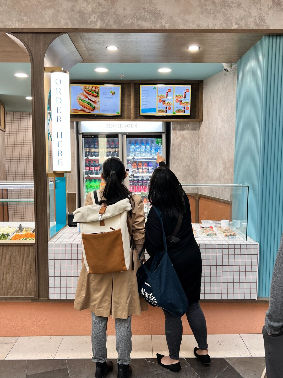
The main design constraint that was examined was to create a visual break from the long counter. This was resolved by adopting colonial-style pillars that framed the hero bread display behind. The pillars also worked as a wayfinding mechanism to anchor signage for ordering and picking up, allowing a clear workflow in a busy setting.
The colours and silhouettes of traditional bakeries throughout Vietnam, as well as referencing all finishes and colours with that of the new brand refresh.
A custom lattice feature was designed to mimic wrought iron motifs often found in colonial Vietnamese architecture. The lattice was CNC cut from a pattern designed by the branding team. The benefit of having an end to end design offer is that we're able to control a lot of bespoke elements to ensure the interior design not only represents the client vision, but reflects the brand story as a whole as well.
Our clients Alex and Jo stressed that getting the balance right between traditional inspiration and contemporary execution was paramount. By work-shopping directly with them we were able to carefully create a balance that ensured the outcome was refreshing and not too embedded in the past.
Team:
Architects: BrandWorks Studio & T-A Square
Builder: Trust Projects
Photographer: Tania Lee Photography
Materials Used:
General wall: Paint, dulux wash and wear, colour: Gold Pheasant
Wall render: Specialty render, Scanlan and Makers
Flooring: Vinyl floor, Forbo Sure-Step Vinyl colour Terra
Doors: Paint, dulux wash and wear, colour: Nirvana Jewel
Bar cladding: Terracotta micro concrete, Mauris Aurenti Micro Concrete
Tabletop: Square white tiles (National Tiles), with terra di siena grouts (Mapei)
Bulkhead: Rattan, House of Bamboo
Interior lighting: Vintage Style Scalloped Shade Pendant, Lakiq
