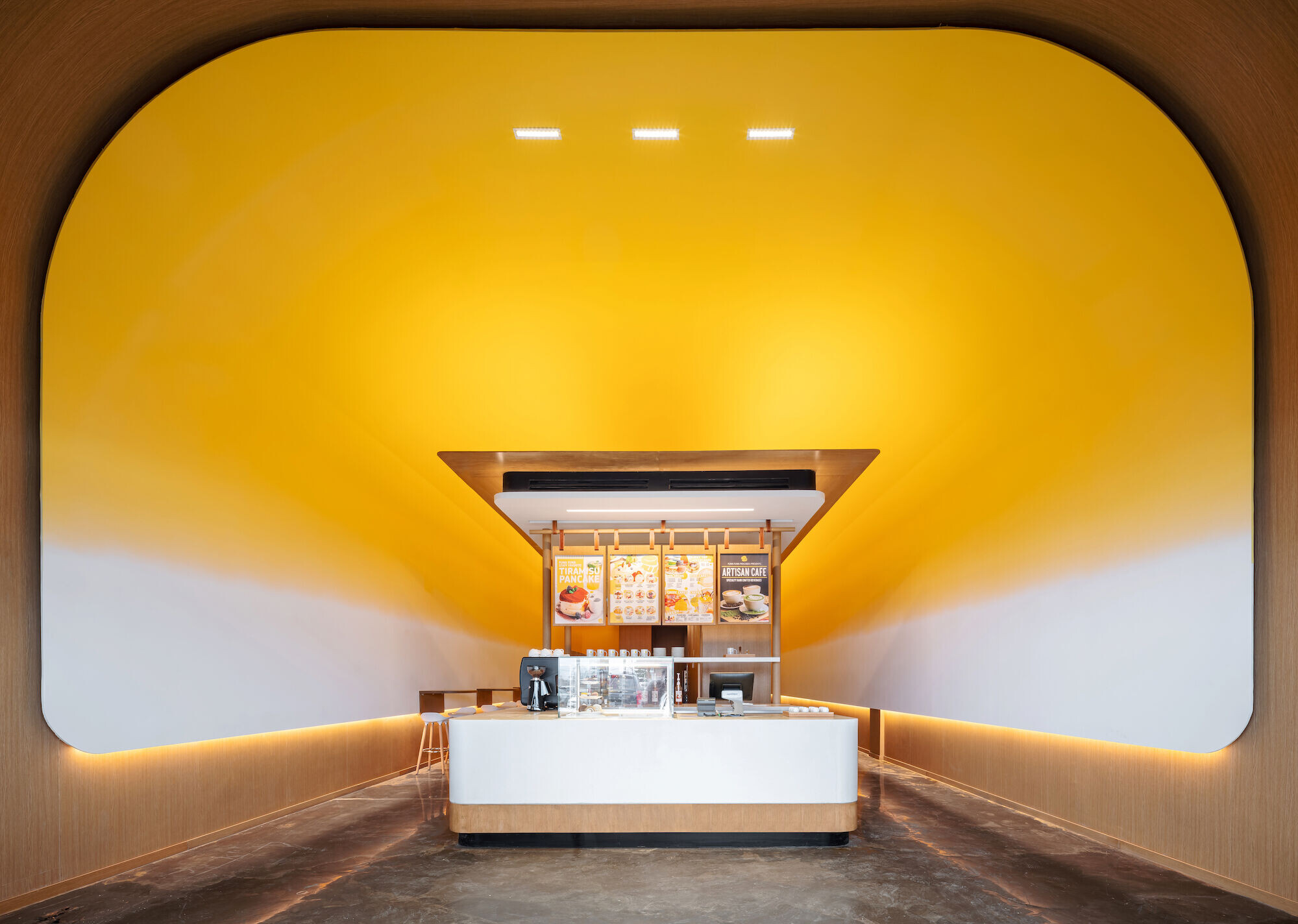
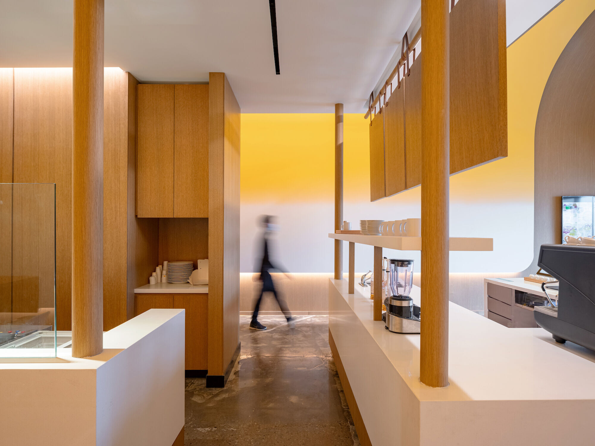
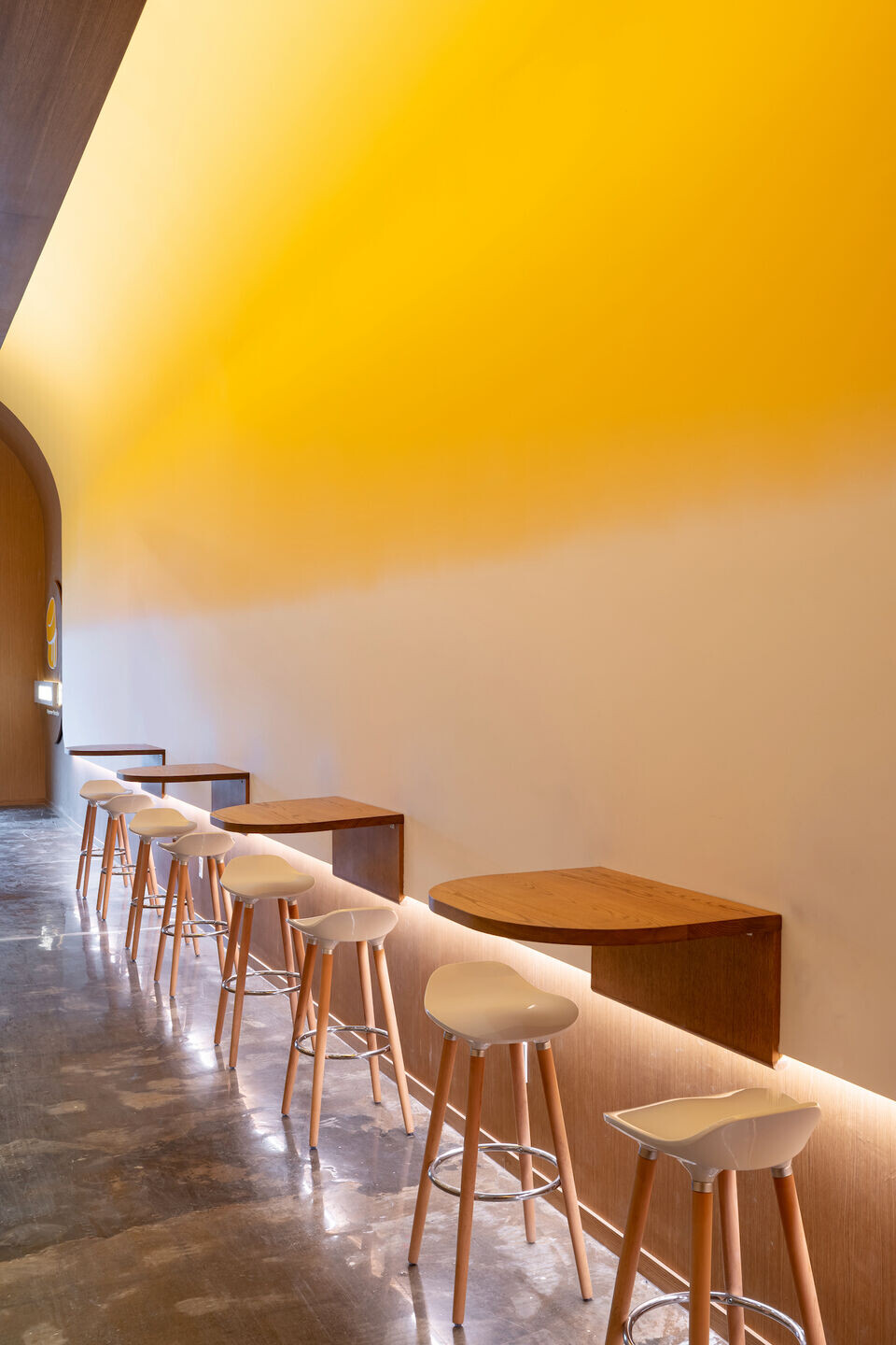
This modern café brings in youthful energy and fresh elements imbued with the steadfast qualities of traditional materiality. The spatial organization is a tribute to traditional alley streets of Kyoto, offering glimpses of what is yet to be explored under the playful yellow and white canopy.
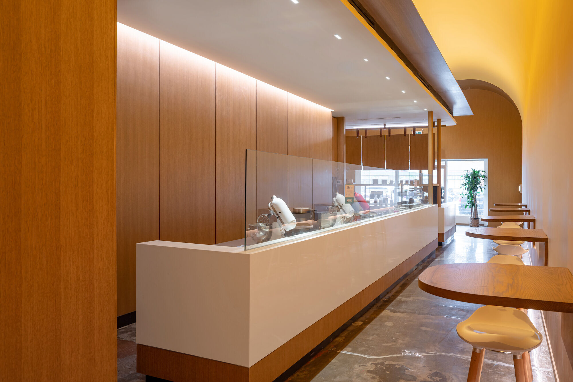

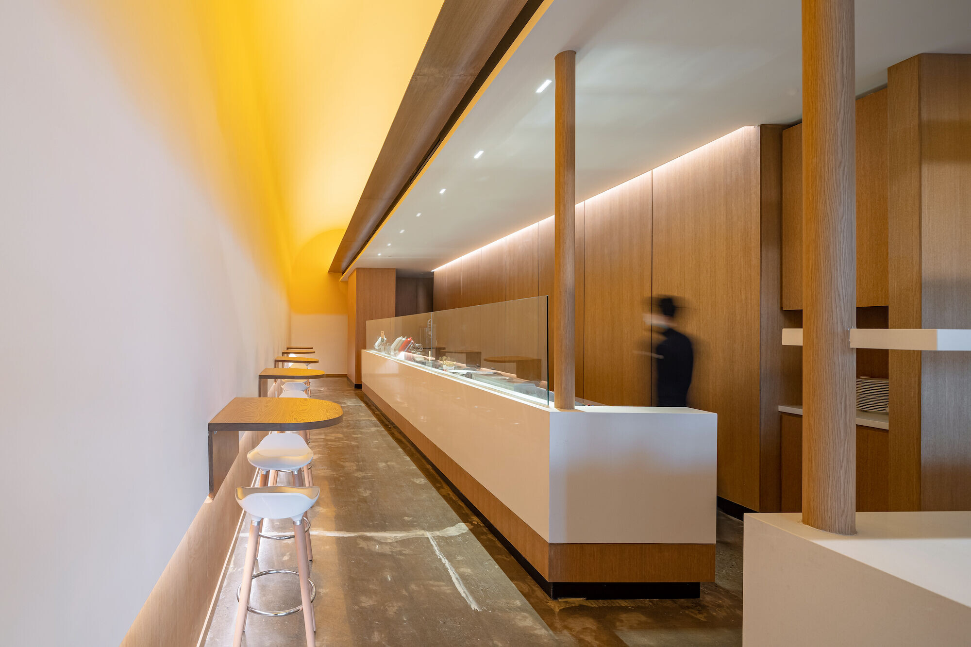
Located in an outdoor plaza, the goal is to introduce the cafe's modern and forward presence to an otherwise traditional and subdued area. It is neither a grab-and-go cafe place nor a sit-down restaurant. It exists in the intersection of the two, and thus aims to combine the visual aesthetics of both; the brightness of the youth-led culture and the solid steadfast quality of a classic eatery. All the while, the design infuses visual traits of Japanese design to reflect the Japanese style dessert that it serves. Visitors are greeted by the soft curve and bright yellow of the high canopy as it frames a modern temple-like structure. Light emanates from it, softly brightening all corners of the space. It is flanked by corridors on either side. By entering the side valleys, two experiences become available; the hustle and bustle of pancake flipping and the cozy feeling of being tucked away in a small pocket of space. The narrow and long 168 square meter space needed to fulfill three key requirements: a space for delivery/pickup orders, privacy for in-store customers where they can converse and dine undisturbed, and an accessible and highly visible front of house. The pandemic has made take-out and delivery more prevalent and it became essential to consider the distribution of space in relation to the flow of traffic. How can the travel of customers be minimized? How can this narrow space host distinct zones for different customers in an organic and passive fashion? The solution came in the form of highlighting the length of the space and creating a feeling of walking down a side alley street. By placing the sales counter in the front of the curved element, it effectively becomes the entrance, creating a simple dialogue of “inside & outside” between two contrasting zones.
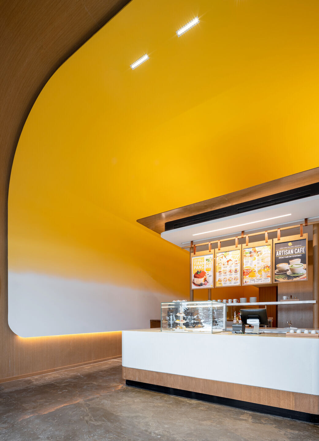
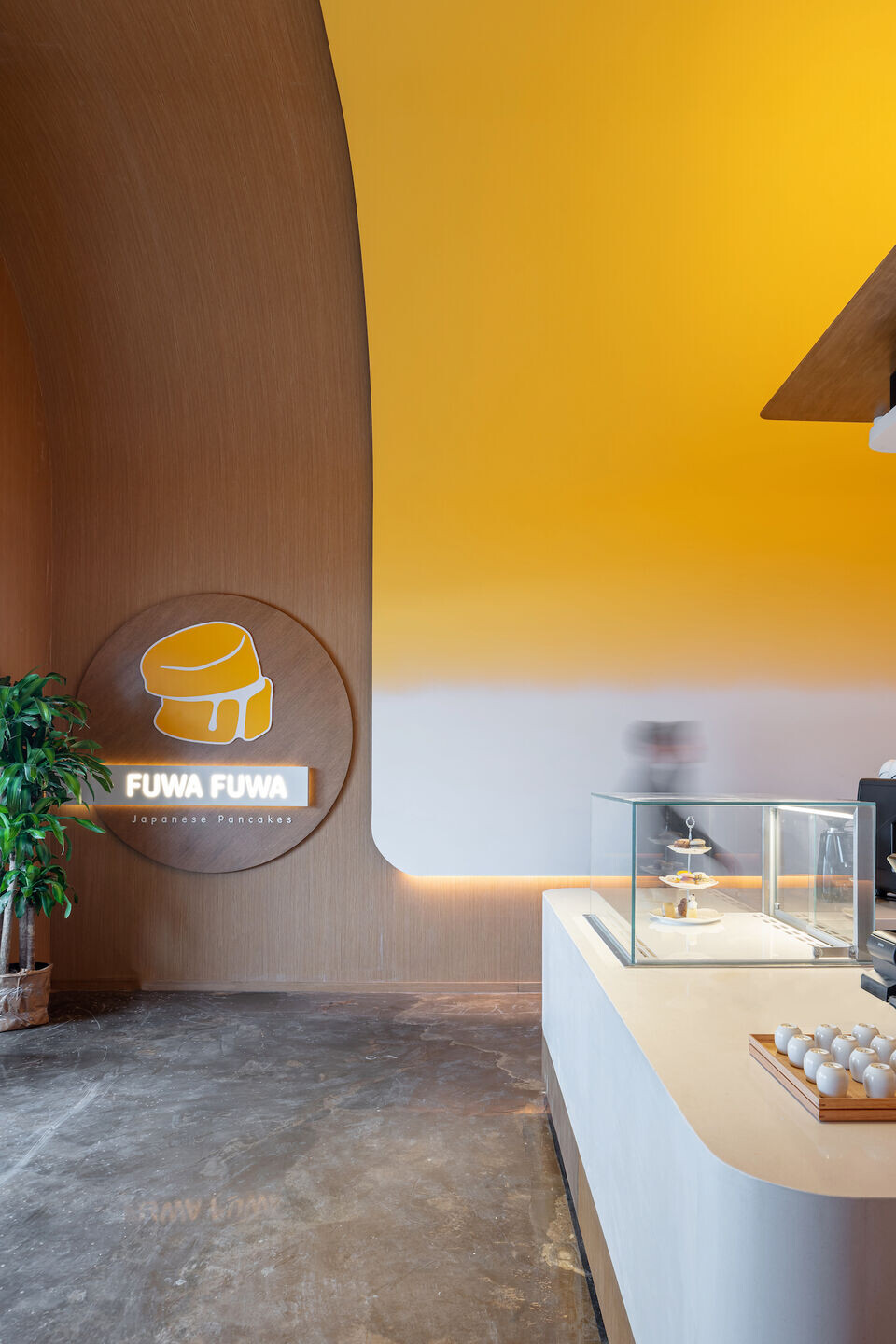
This café is one of the newest additions to a growing franchise with an existing brand identity. The challenge is maintaining their core identity while still creating a one-of-one space. We believe design is always built in context and therefore, should never be copy and pasted. We must look at the nuances of the space, recognize its unique abilities and limitations and tailor the design. The space is very long and narrow and the natural configurations options afforded to more rectangular spaces could be used here. This posed an interesting design challenge. The team drew inspiration from the history of the business. The food techniques came to Toronto from the streets of Japan and we built the concept around the imagined idea of Fuwa Fuwa being a modern Japanese street valley juxtaposing the old and modern craft. We used simple design principles of emphasis, proportion, and placement to create focal point and distinct zones that still feel visually cohesive. Its beauty is not only in its visual appearance but also in the space's ability to provide comfort.
Team:
Client: Fuwa Fuwa
Design Firm: Studio Yimu
Creative Director: Ryan Chung
Designer team: Long Wu, Chelsea Chen
Photographer: Scott Norsworthy
Materials Used:
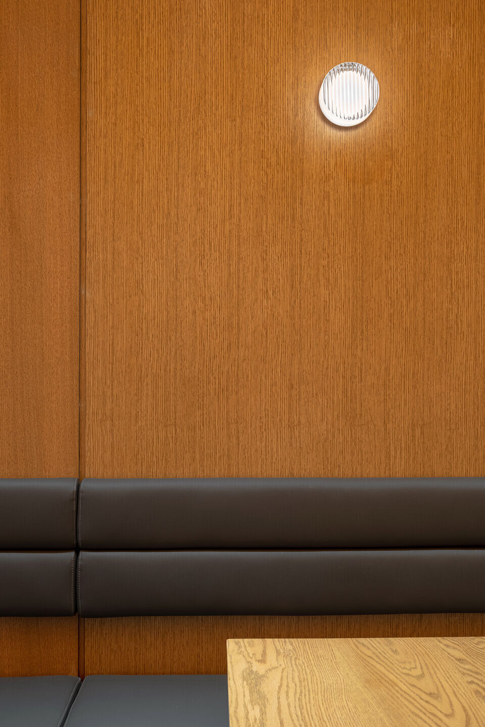
Wall scones: RBW Crisp
Architectural Light: Vyvyd lighting
Wall cover: Crown surface solutions SWS06 wood veneer wallcover

