Kaiko Design were engaged by a professional couple and their growing family, to breathe life into this timeworn 90’s brick bungalow in Sydney, Australia. Central to the redesign was a thorough review of the home’s existing, restrictive floor plan.
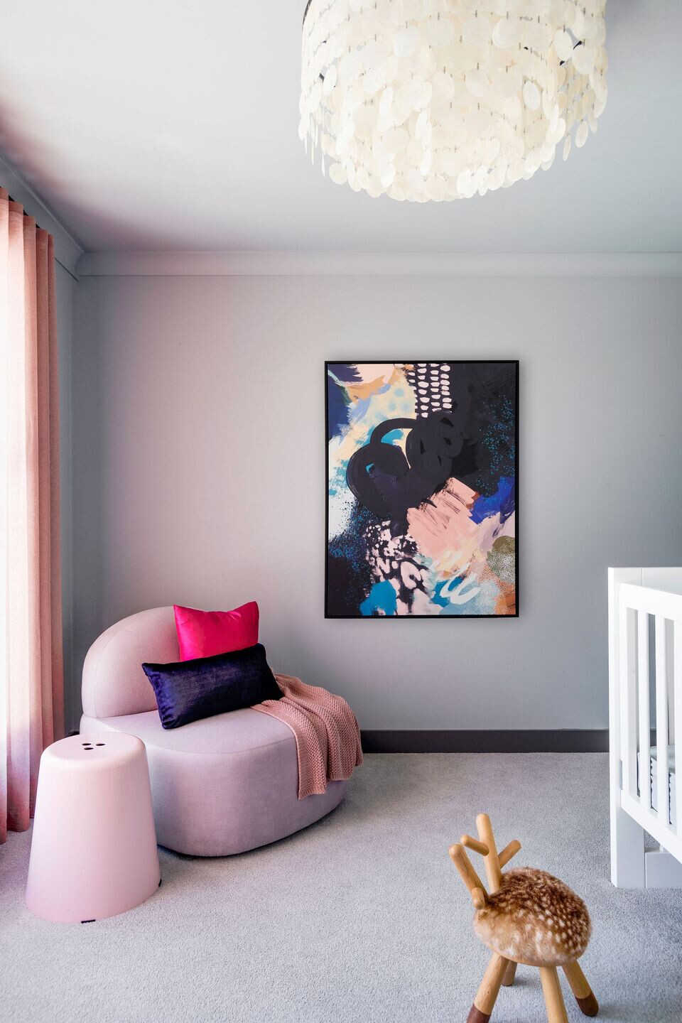
To invest the home with a more practical arrangement of spaces, befitting the clients’ needs, we reimagined the home’s layout prior to any aesthetic considerations.
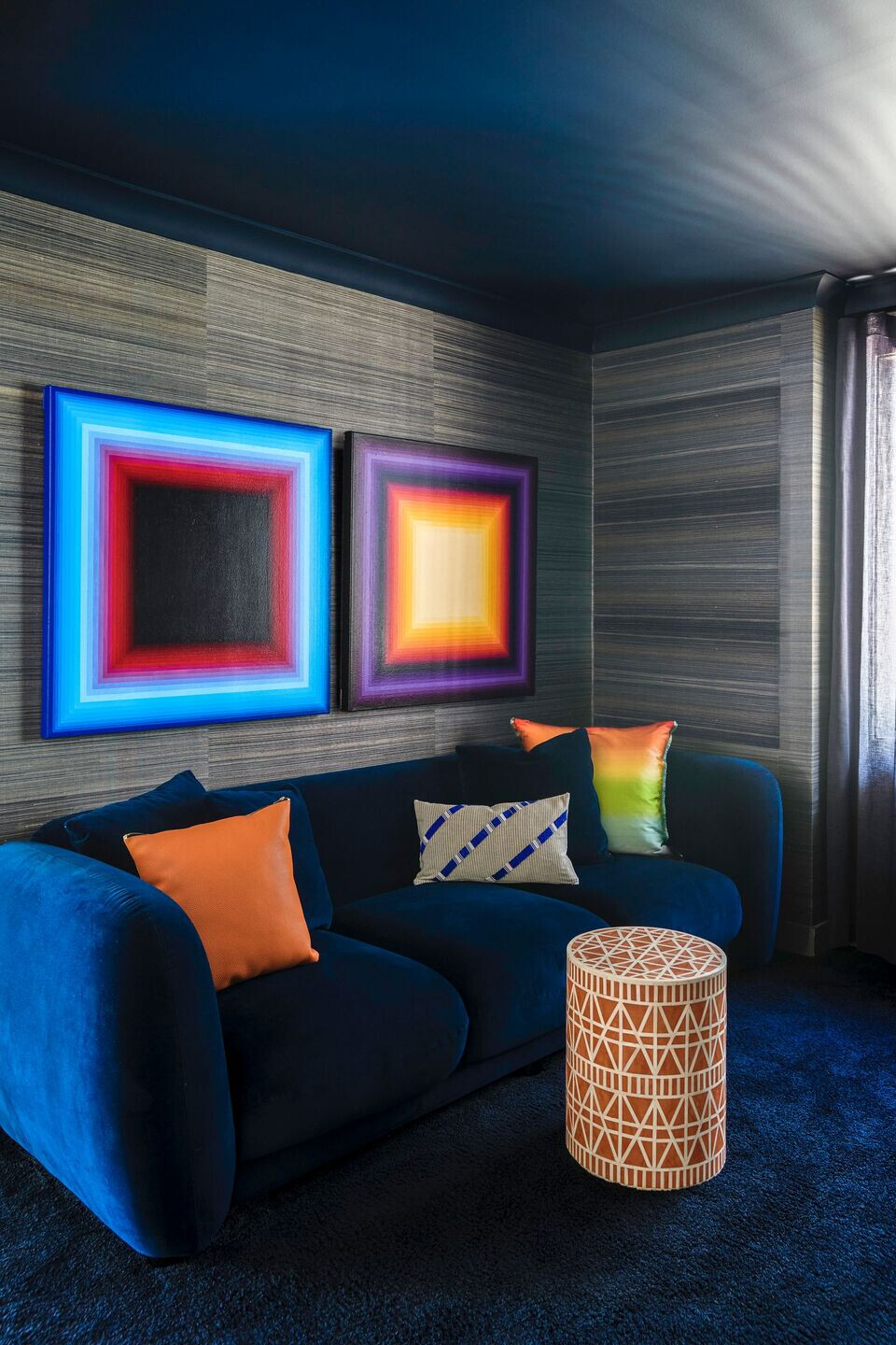
By addressing the location of all the access ways and room boundaries, many key zones in the property have now been enhanced and offer greater functionality. Through smart replanning we were able to add a brand-new powder room, an en-suite for the master bedroom - with makeup station and adjacent dressing area - as well as a media snug, a new sizable butler’s pantry and a more appropriately appointed laundry.
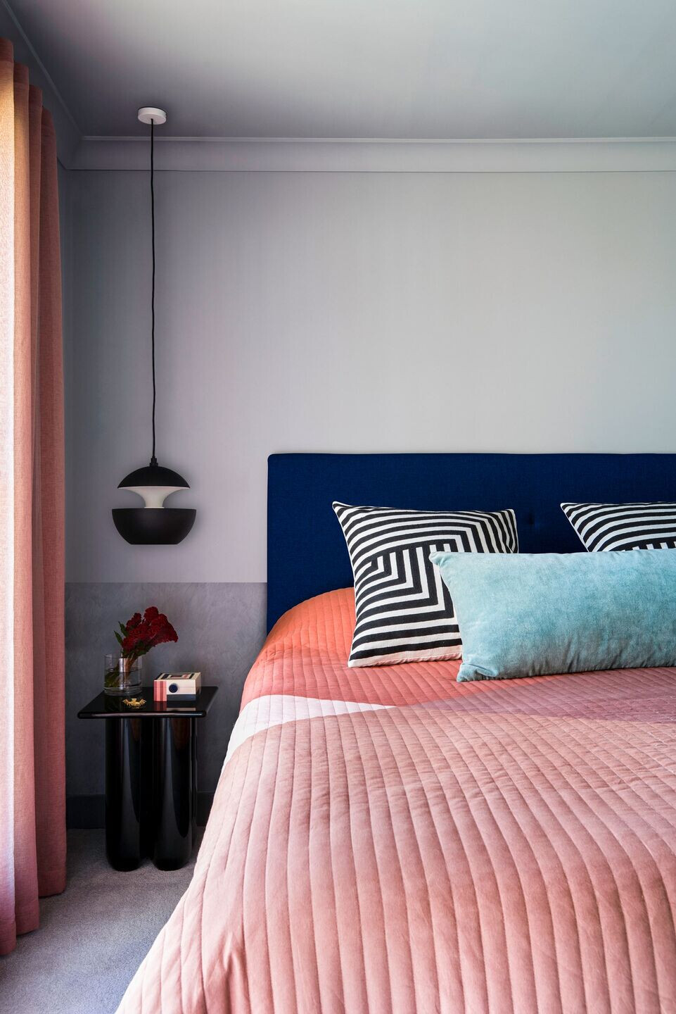
Looking to the character of the home’s existing architecture - where arched apertures and thresholds featured often – Kaiko Design has incorporated the arch form, introducing and repeating it throughout the building’s interior.
Similarly, in the careful selection of decorative items, decor and furniture we have sympathetically married these new tangible, aesthetic elements within the home, to the architecture.
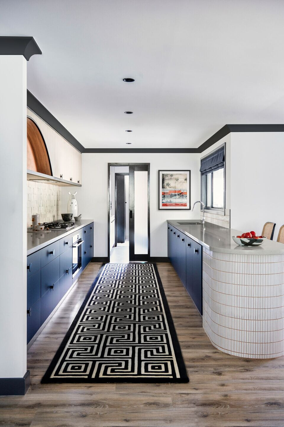
Building on Kaiko Design’s commitment to deliver made-to-measure, distinctive design solutions, we custom designed most of the decorative lighting for the project. Drawing inspiration from the original building as well as some 1960’s influences, we have imbued these functional, integrated elements with an individuality and flair, unique to this home.
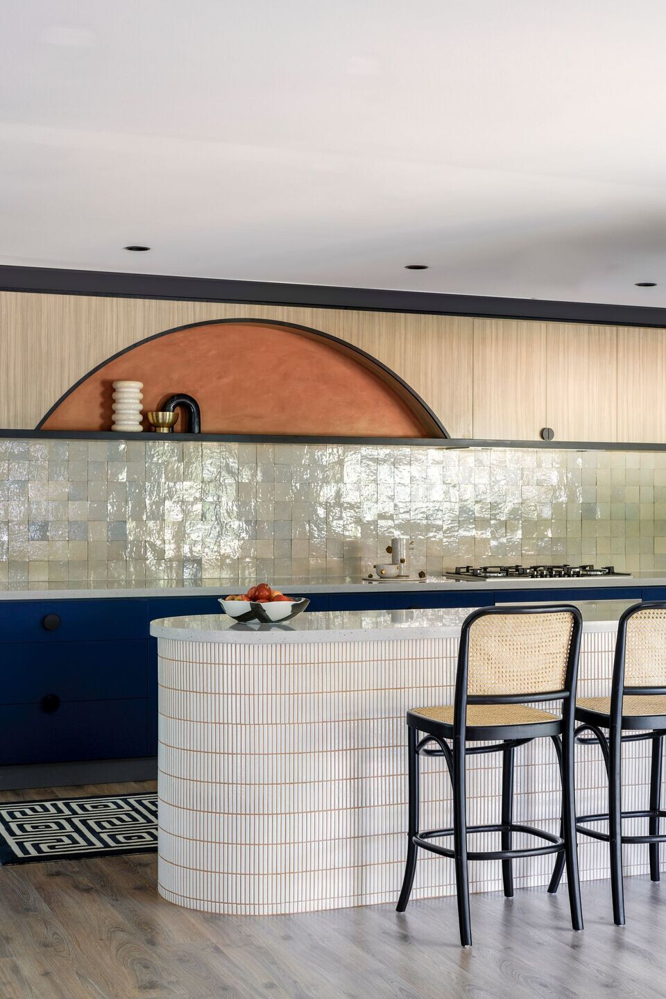
Similarly, the saturated almost unconventional layering of colour in this residence, across painted and applied finishes, offers our clients and their guests’ moments of vibrance and graphicness. The colours, textures and the configuration of each room, whether in paint, tiles or stone - contribute a strong sense of personality and luxury at every turn.
Our Hill House project characterises Kaiko Design’s affection for a 1960’s aesthetic, overlayed with a comfortable, contemporary character. Regarding the inspiration – We started the conversation with their wish list of what they wanted to add to the home and then arranged this list in order of importance. Adding a powder room, larger main bedroom ensuite and adding a bedroom to the front of the house (closer to their own) for their young daughter were the main items.
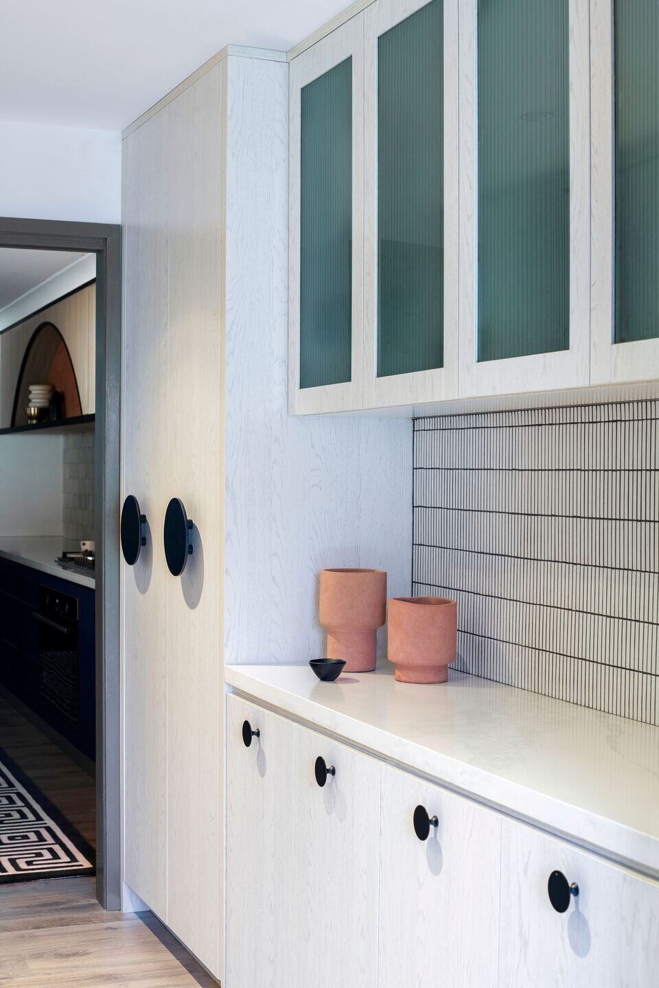
They love to host extended family so having a butler’s pantry was also essential and a laundry which was more family sized topped off the list. Prior to Covid, the clients travelled quite extensively, for work and for pleasure, and wanted some of that “hotel” feel in the private bedroom space – there wasn’t a specific “look” they were going for, it was more about function initially, we layered the decorative elements as the project progressed and material selections were finalised.
The overarching concept for me was a contemporary nod to 1960’s interiors. We have achieved this through the selection of materials and repeating elements in art, furniture, and accessories. Ultimately my “vision” is always to answer the specific design problems presented by the client, rationalising the plan, and making it work for how they want to live in their home. once we had solved that, then we started to look at the next layer - which is fixtures and material selections.
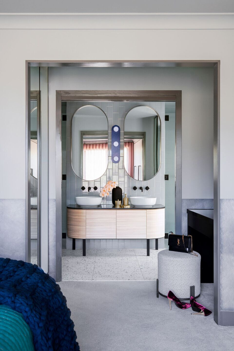
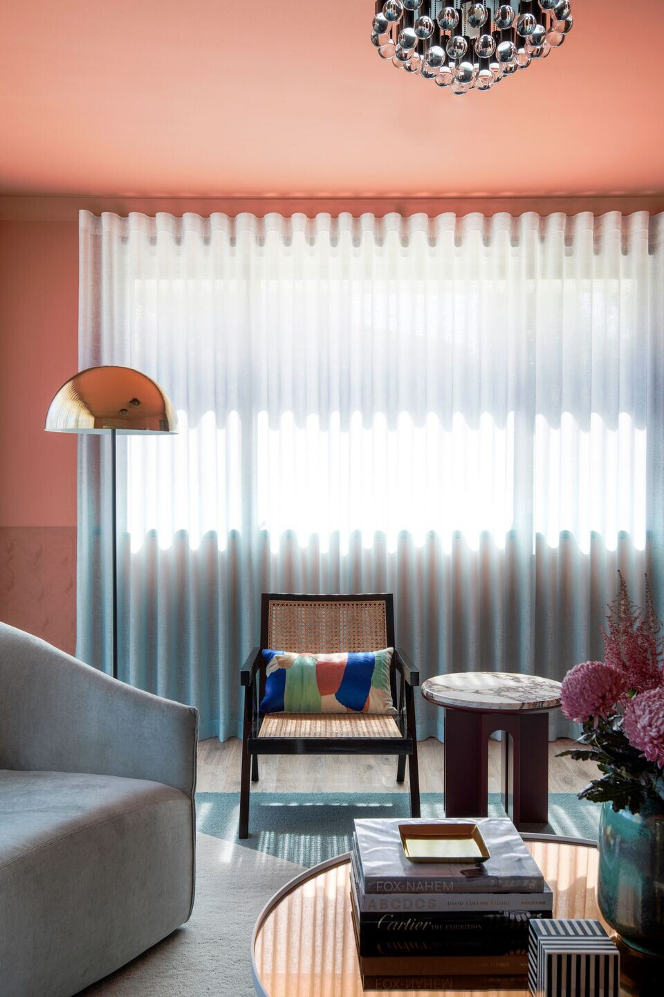
In terms of the materials palette – it was the clients love of red travertine (seen in the new powder room benchtop) which was really the starting point. It’s a such bold material – so the resulting palette complements this offering points of lightness and also deep saturation, it’s a balancing act. Variations of this brave material are used throughout ie at the entry a piece of terracotta coloured glass, the powder room and red travertine, the kitchen and terracotta coloured polished plaster in the arch above the benchtop and coloured grout to the island, accessories in the media snug, rich tan leather of the dining chairs and finally the living room which used textured and flat paint in terracotta colourway(s).
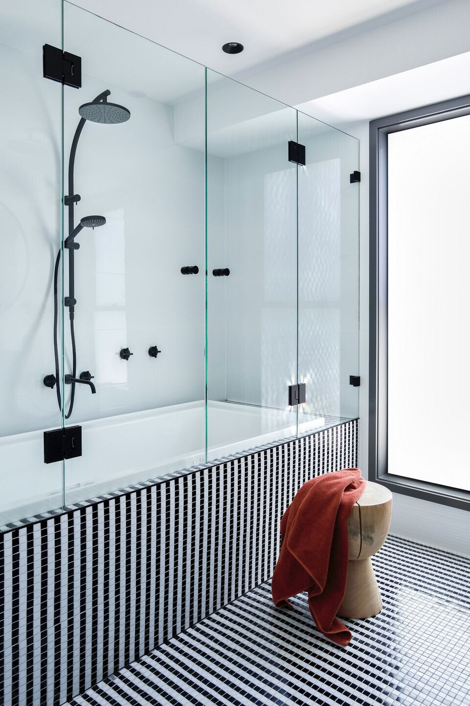
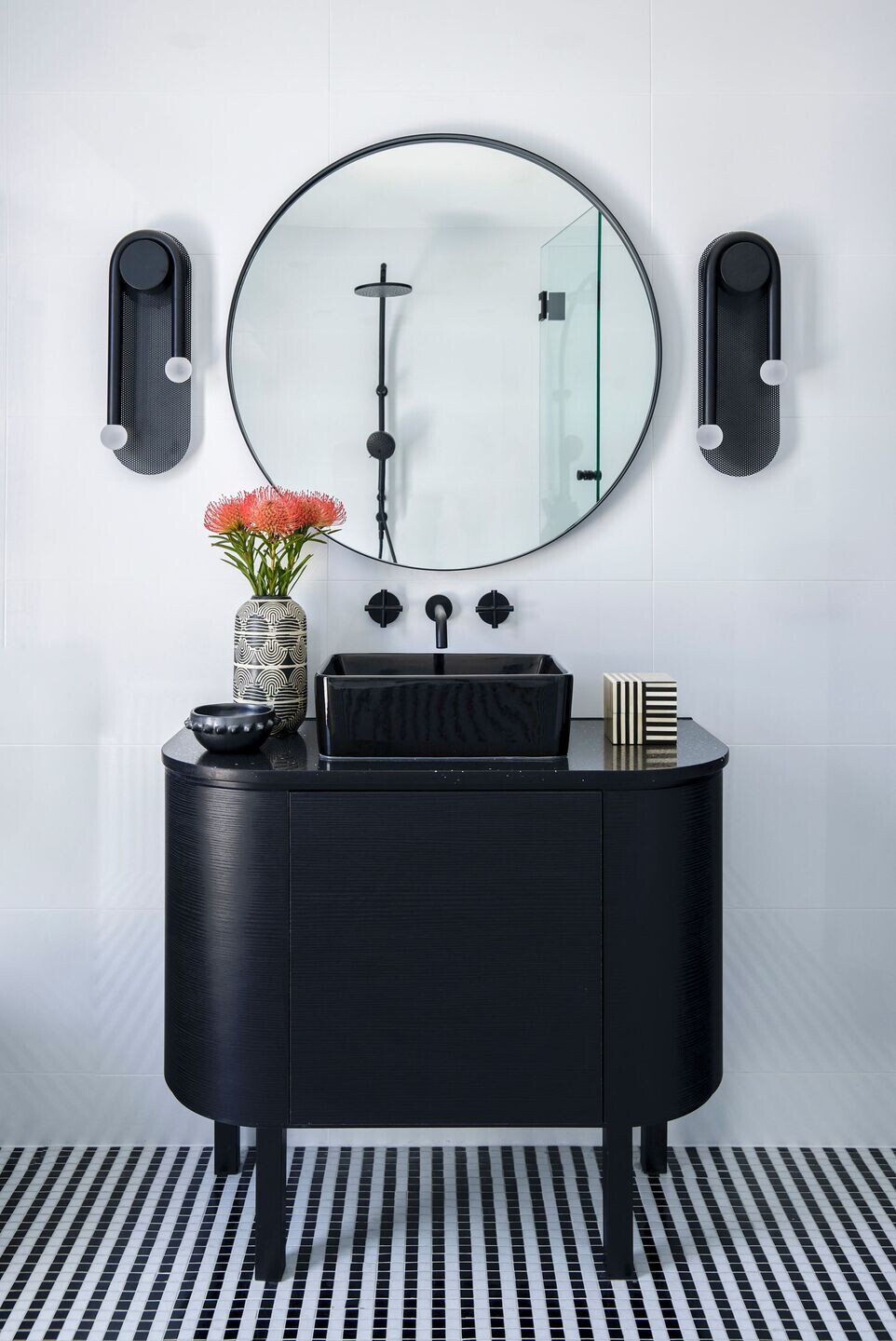
I was inspired by 1960’s interior and graphic design for this home – colour blocking, graphic linework etc. the repeated black and white linework in both hard finishes (main bathroom) and soft accessories (rugs, cushions) references this. the work of both Kate Banazi and Andy Harwood I find endlessly inspirational, and I think the pieces chosen here are magnificent.
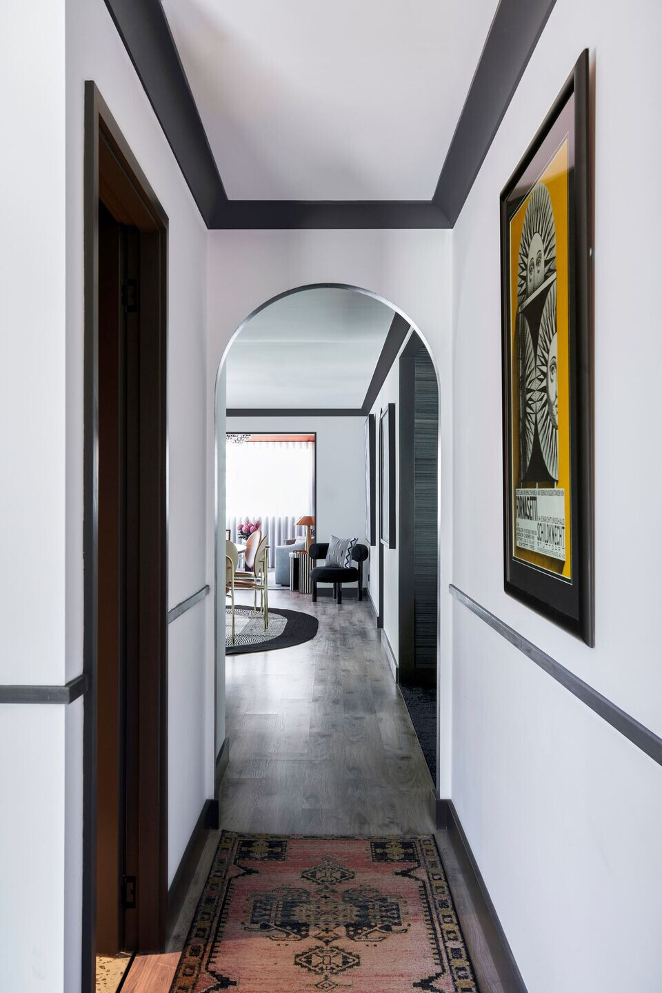
Architecturally the home featured several archways, both externally and throughout the internals – rather than trying shoehorn the house into something it’s not, we have highlighted these details and made them work – using them as inspiration for custom decorative lighting as well as the furniture and accessories selections.
Material Used:
1. Facade cladding: Painted Brick, Dulux: colour Raku
2. Flooring: Pacific Flooring, Engineered board
3. Doors: Corinthian Doors, Painted, Dulux Raku
4. Interior lighting: Custom designed and manufactured by Kaiko Design Interiors
5. Interior furniture: Various supplier, sourced and procured by Kaiko Design


