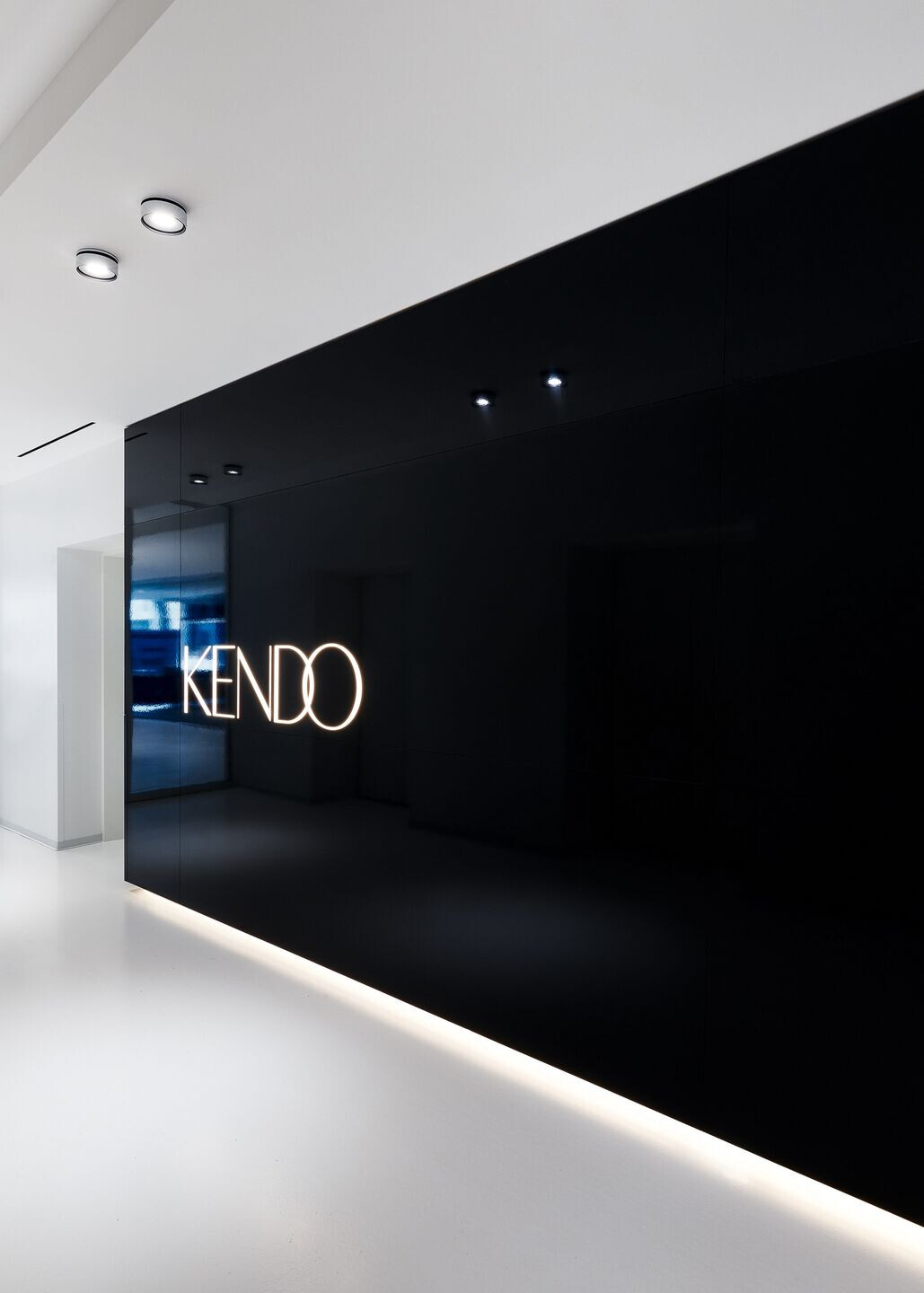
When Kendo, an LVMH beauty brand incubator based in San Francisco, needed to majorly expand into a new space, the company turned to local firm Garcia Tamjidi Architecture Design, known for its ethereally modernist work on projects as varied as the Parker Institute for Cancer Immunotherapy, residential jewel boxes dotted across the bay area and multiple tech offices for both startups and established firms. The people of Kendo, which is currently focused on six pillar companies – Marc Jacobs Beauty, Kat Von D Beauty, Ole Henriksen, Bite Beauty, Formula X and Fenty Beauty by Rihanna – hadn’t ever worked in a space dedicated to and designed explicitly for them. That’s where Garcia Tamjidi came in.

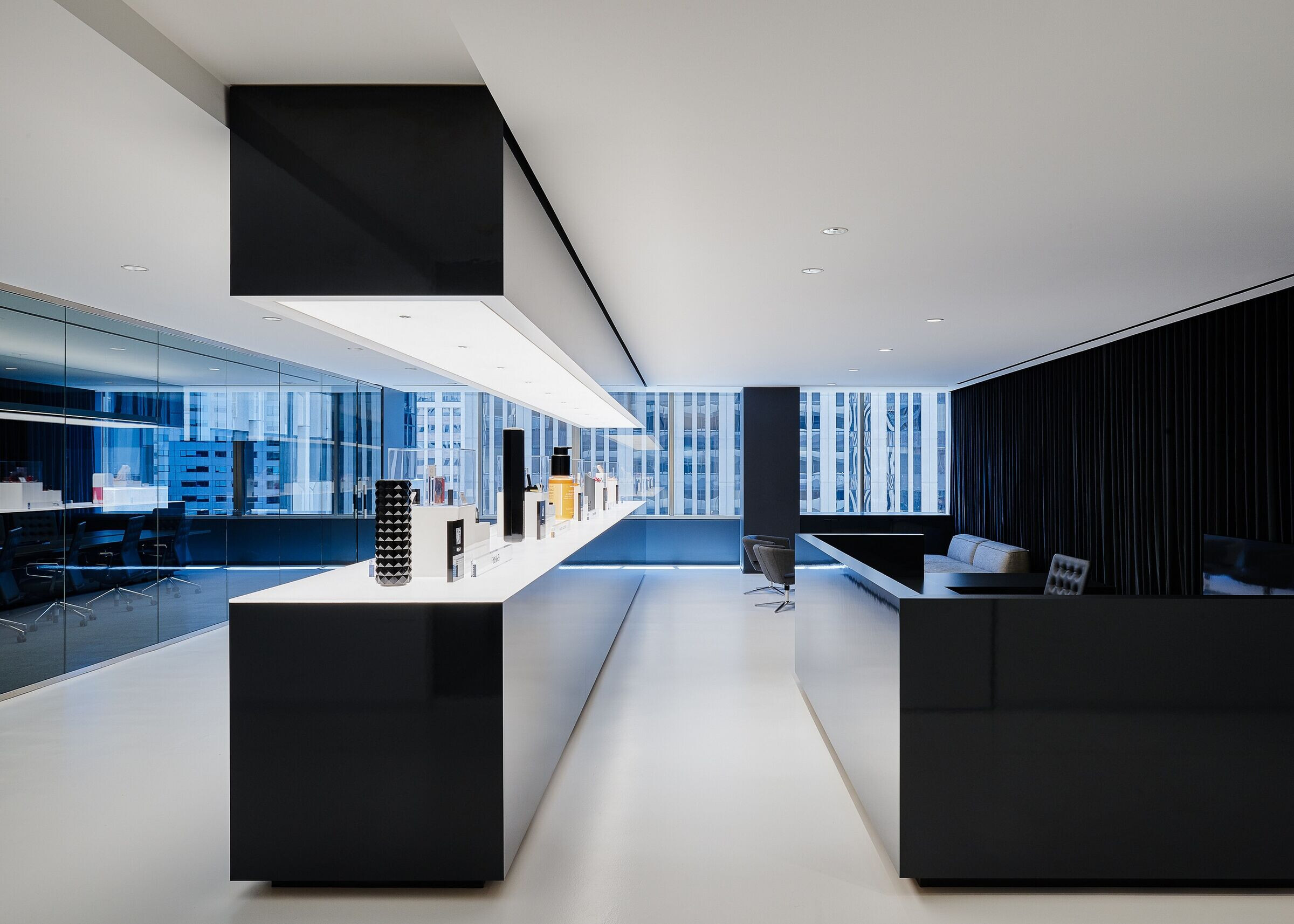
'They’re not retail, but we imported that retail look to energize the internal team,' says Farid Tamjidi. That retail look is centered on a massive, shiny black centerpiece of a long glowing table that appears in the reception area and is repeated in the cafe area directly opposite (a hallmark of the project is long views and repeated motifs). Before moving into their own full-floor office space, Kendo product managers were squeezed together, displaying products wherever they could – on conference tables, in spare hallways, on desks. Now, with the combination of this endlessly long table and the spotlit illumination that elevates products like the Kat Von D Beauty lipstick tubes and the Marc Jacobs Beauty limited edition nail lacquer, it feels like there’s something to really look at.

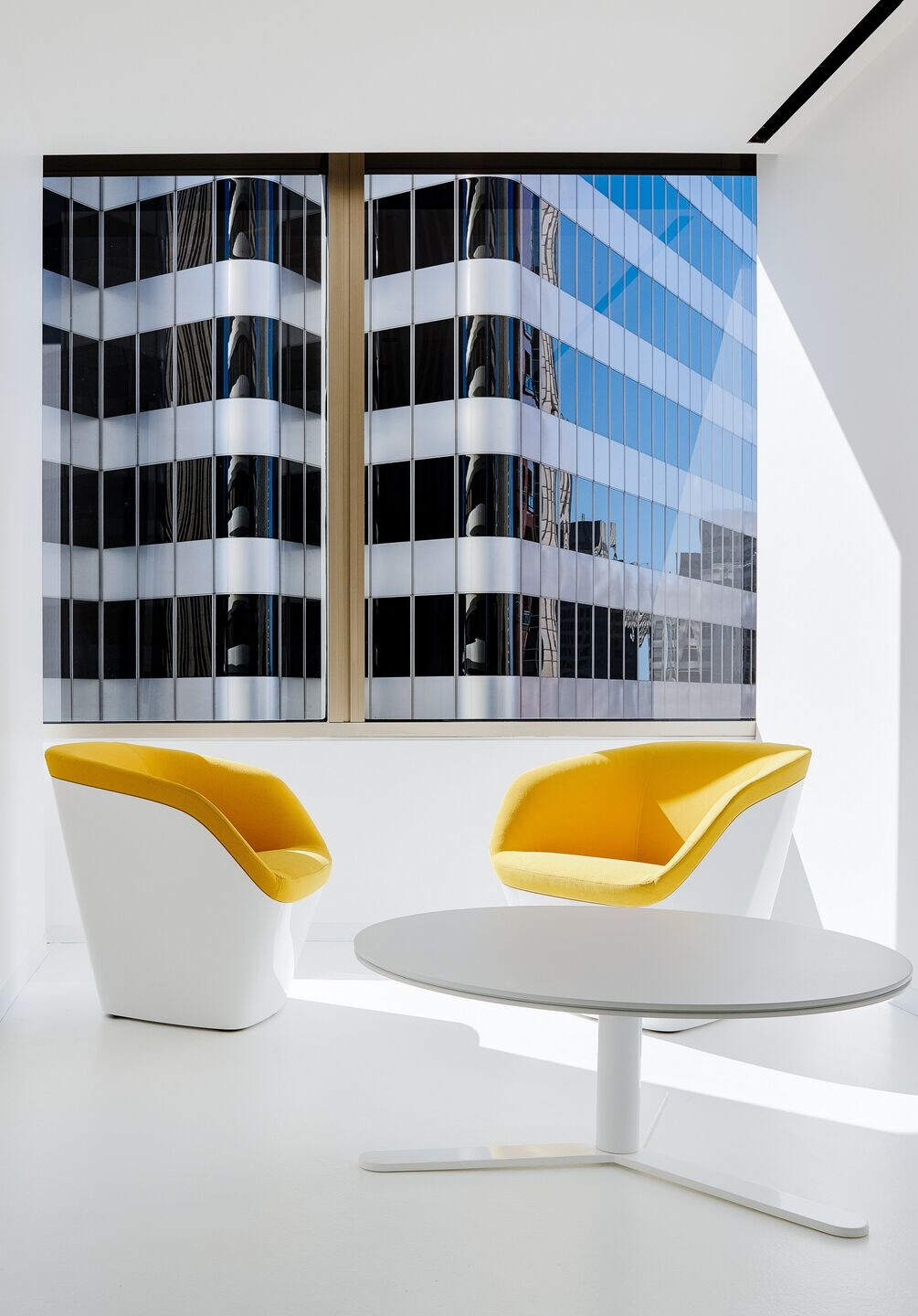
'We also brought in graphics that reconfirm their cultural identity,' says Michael Garcia. Those graphic, massive print-outs glued to the wall (so they’re changeable along with the trends) help to give a sense of narrative momentum to the otherwise color-neutral – black, beige, and white dominate – open office desking. Further pops are provided by bright flashes of colored furniture in the lounge areas and small meeting spaces. 'You’re looking at patterns of windows and colors of glass on all four sides,' Tamjidi says of the views of downtown San Francisco that are visible from the clear floor-length spans. 'A lot of it was hard architecture. Silver, smoke grey glass panelling, a very color-neutral field of view. We thought it’d be a good juxtaposition to have a pop of color in the foreground.'

That connection of inside and outside, and bright colors and soft neutrals, is perfect for a company devoted to incubating beauty brands that deal with, essentially, exactly all of that.


