Lovely customers whose children have grown up and left home, decided to renovate the existing apartment and completely renovate it.

The renovation included dismantling the infrastructure of the entire apartment, due to an existing plumbing problem that was known before the renovation and was another trigger for the start.
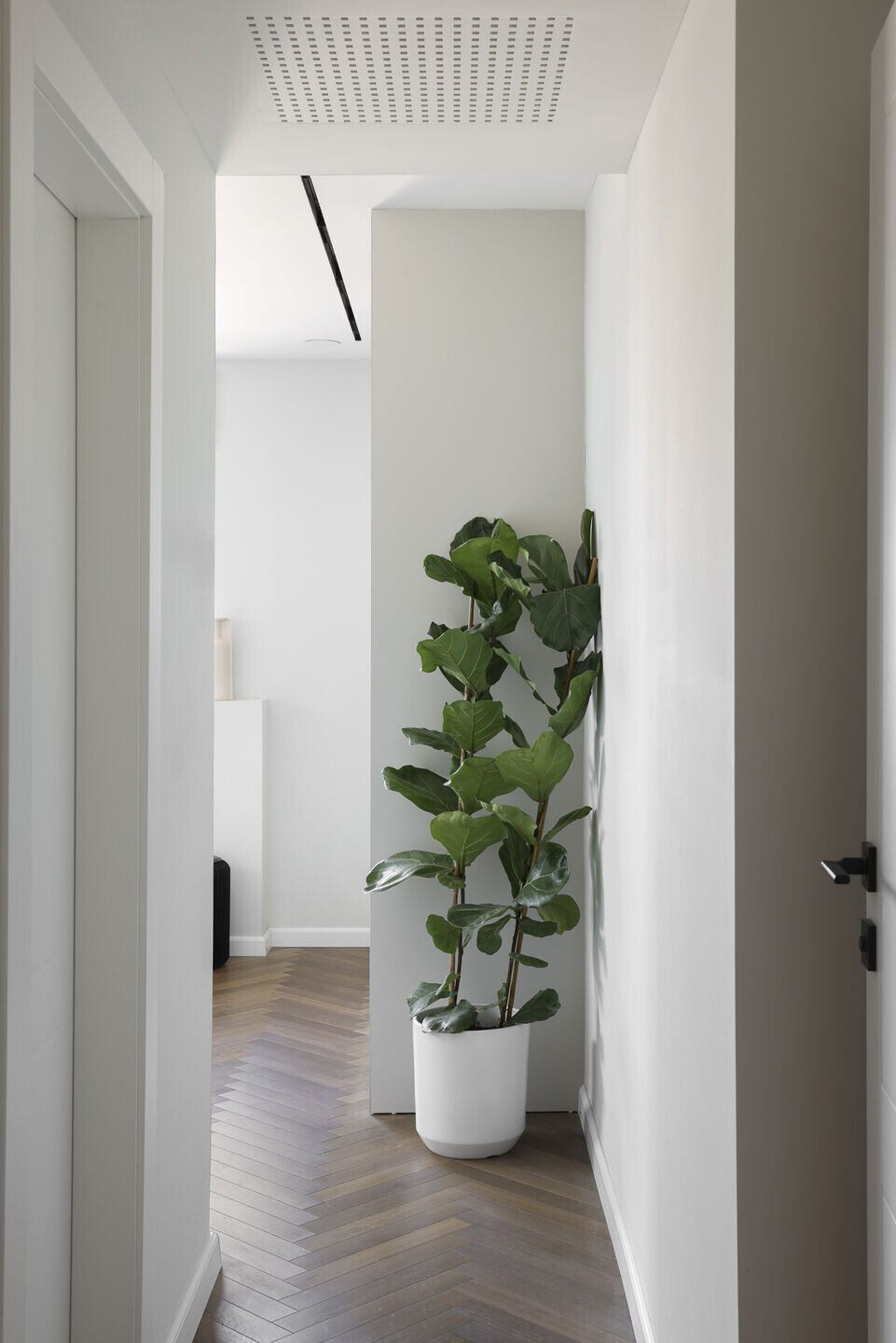
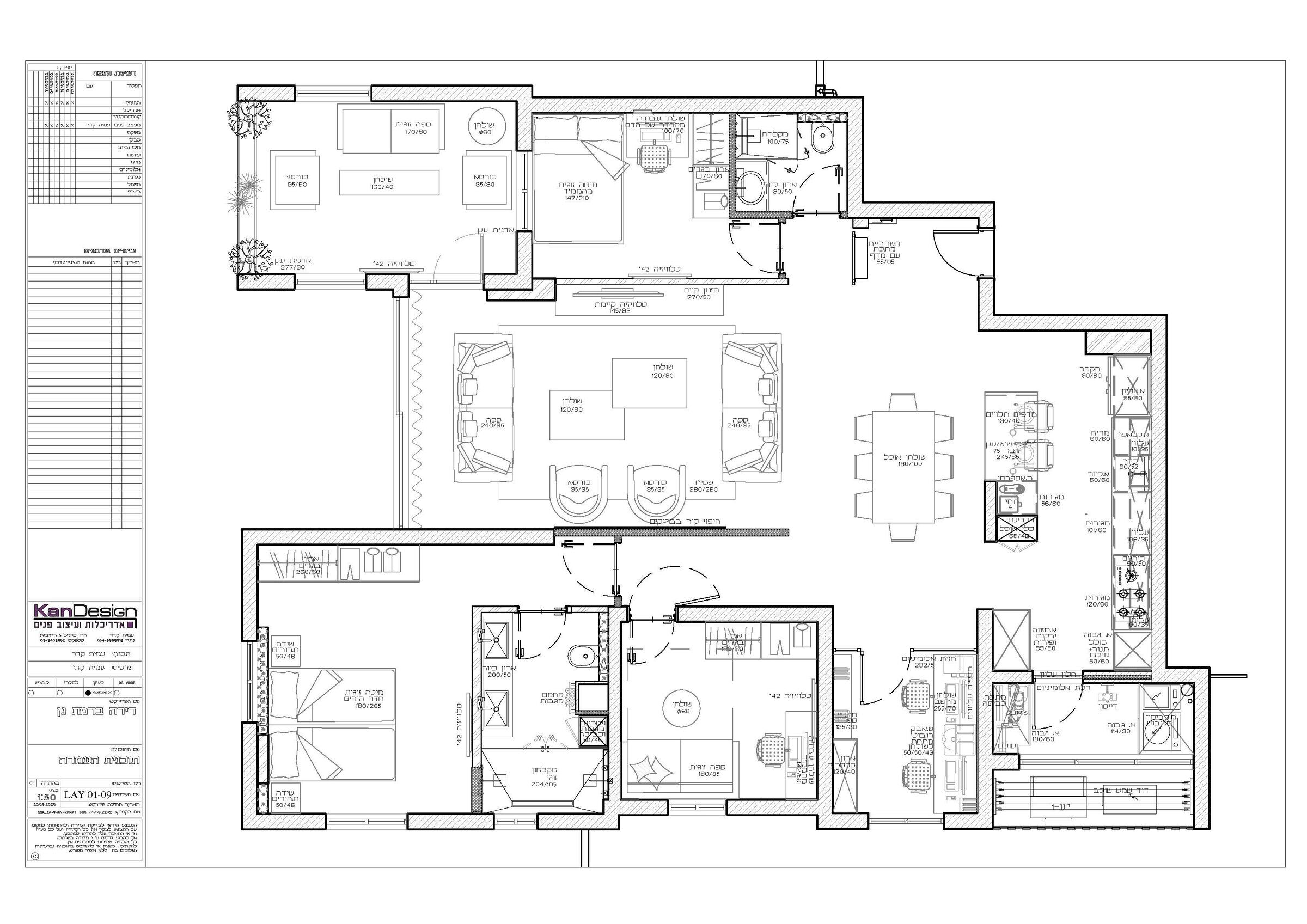
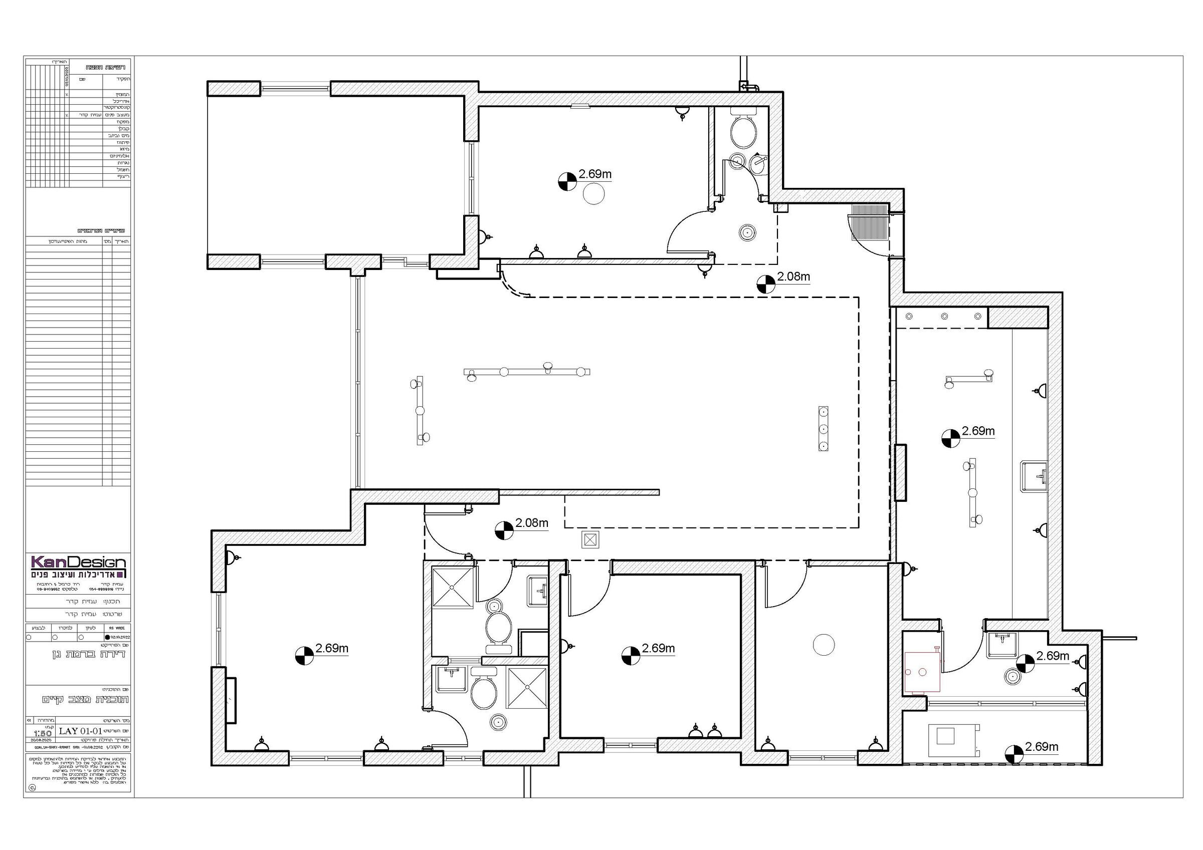
The house was dismantled and reassembled in a different design, more open and bright. Walls came down and large and significant plaster depressions that were made in the past due to different sizes of air conditioners were destroyed, thus also achieving a new sense of height for the apartment
The apartment was initially enclosed in walls, including the kitchen and the office, which were behind closed walls with doors.

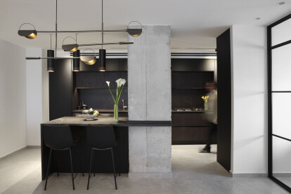
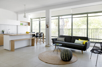
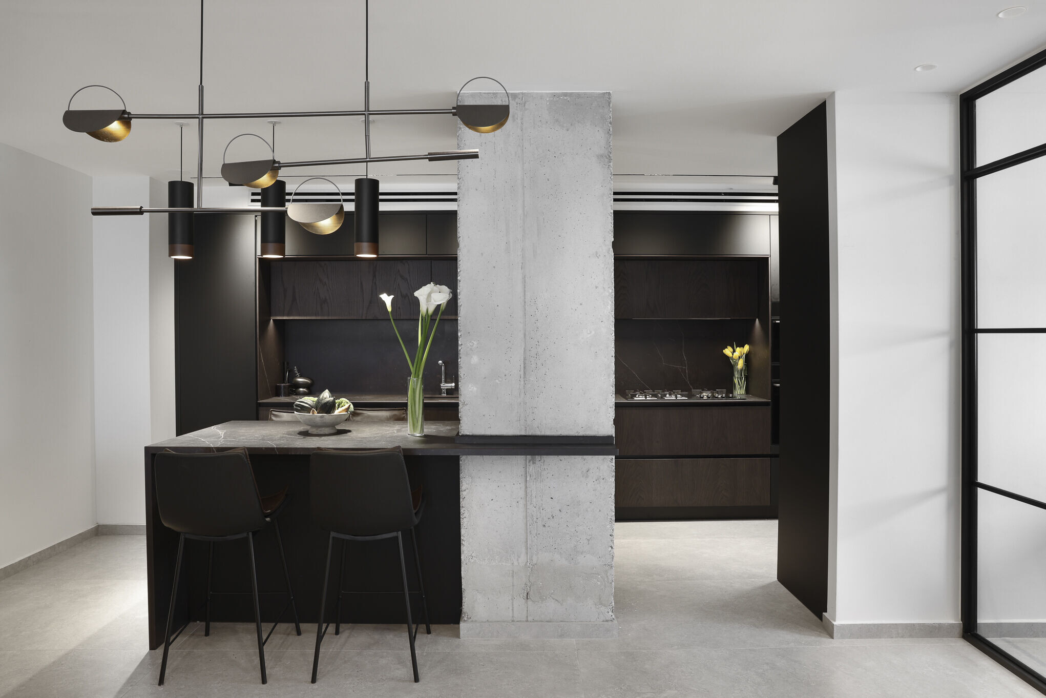
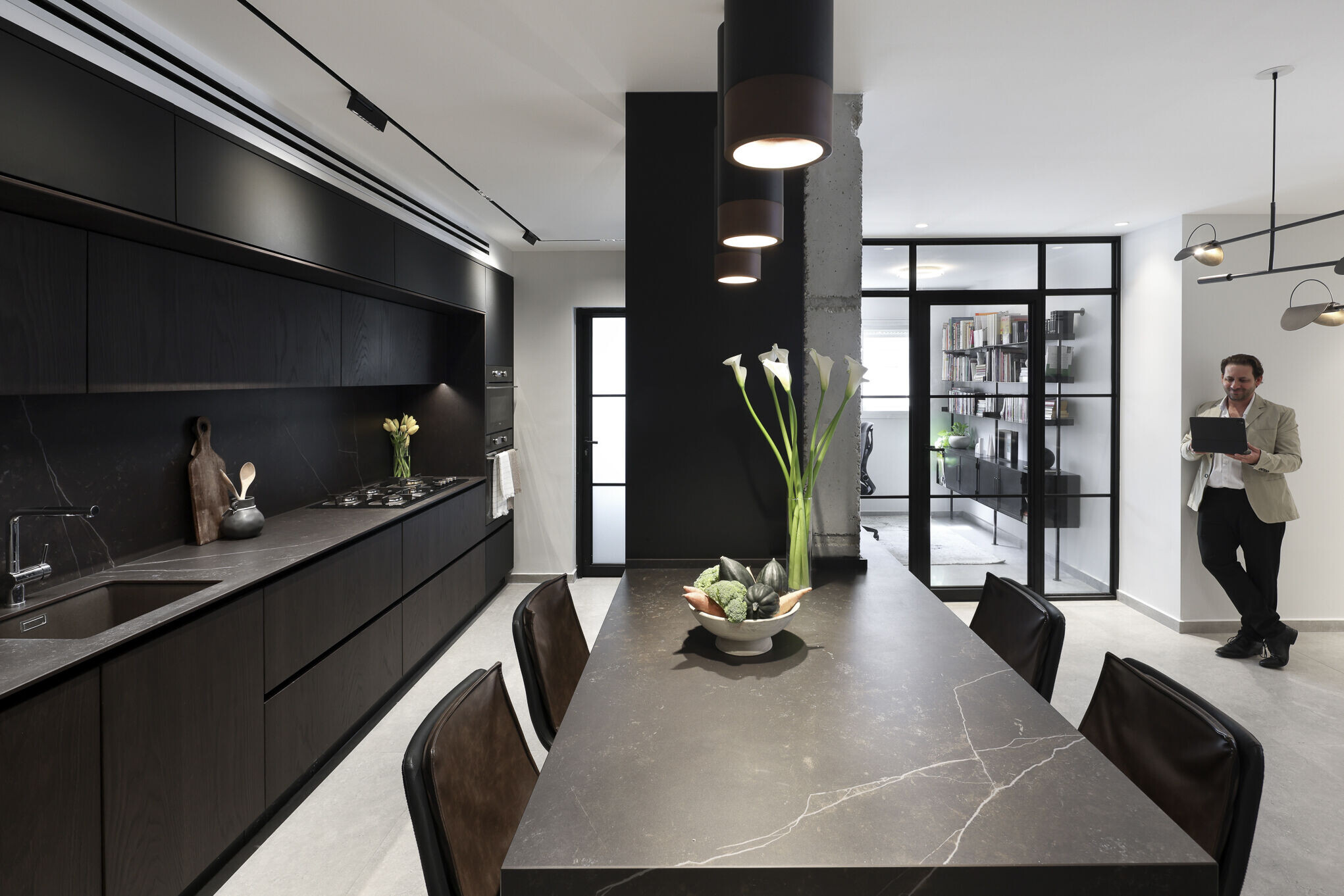
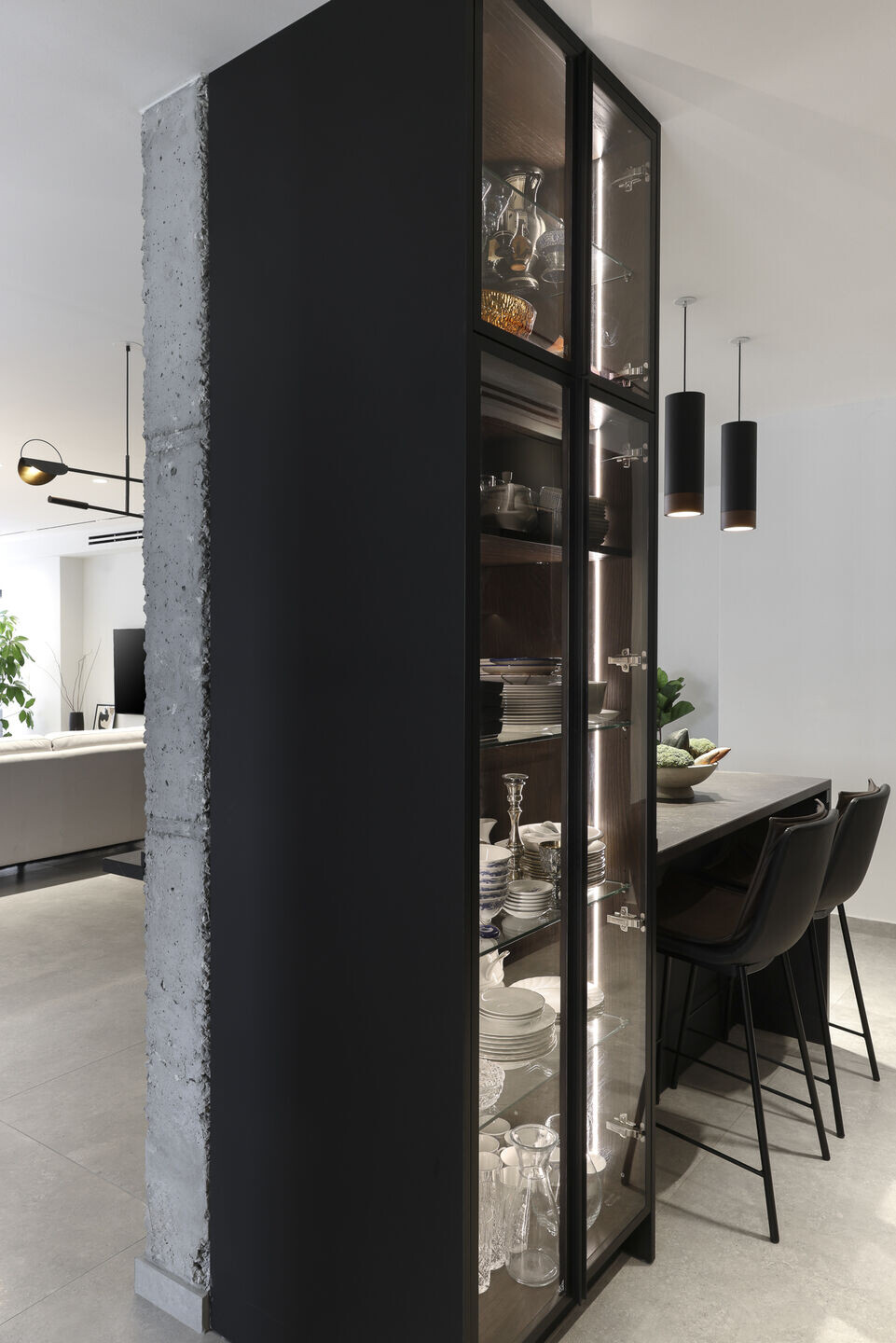
Something that was completely opened during the renovation. The walls of the kitchen were taken down and only an exposed concrete pillar remained that was known about but hidden within the walls. It was decided to leave it in its clean form, as a bare and visible concrete pillar and not to hide it again with a plaster wall. Next to the kitchen was the office which was enclosed by walls and loaded with shelves of various types.
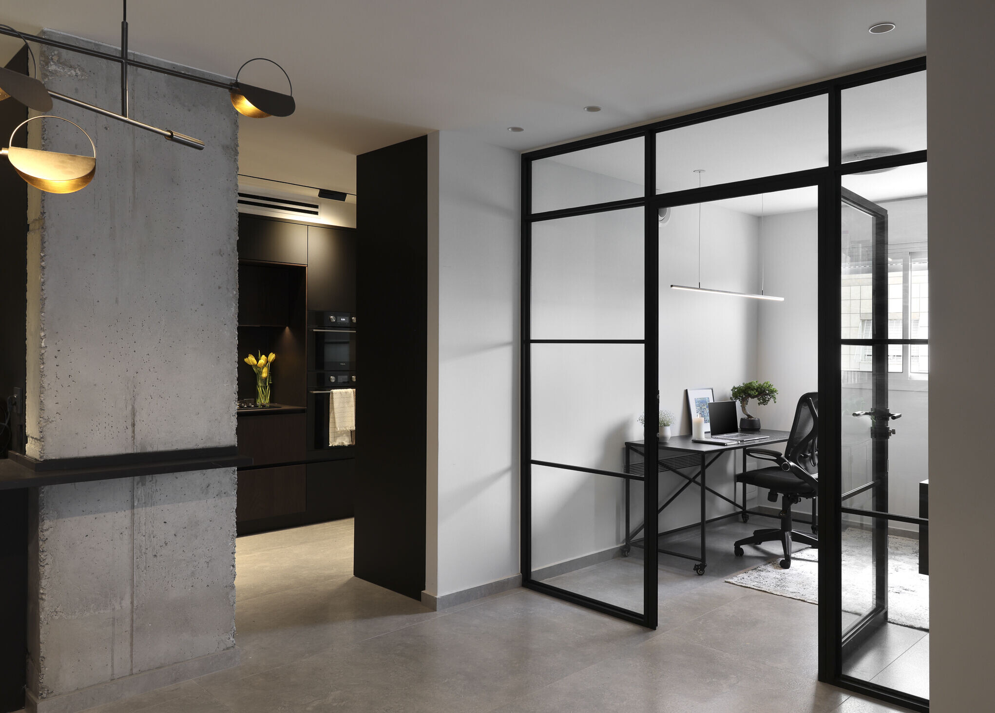
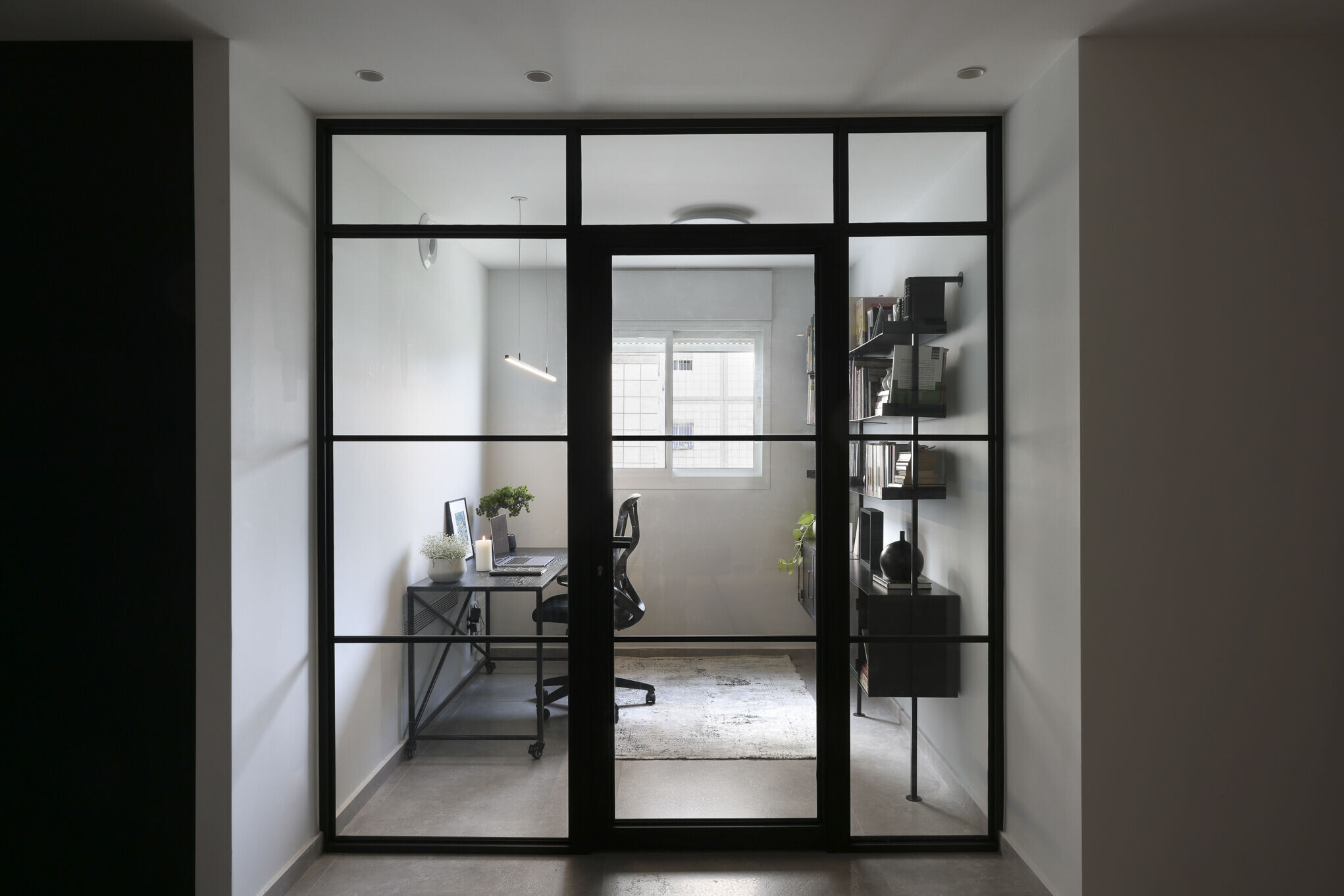
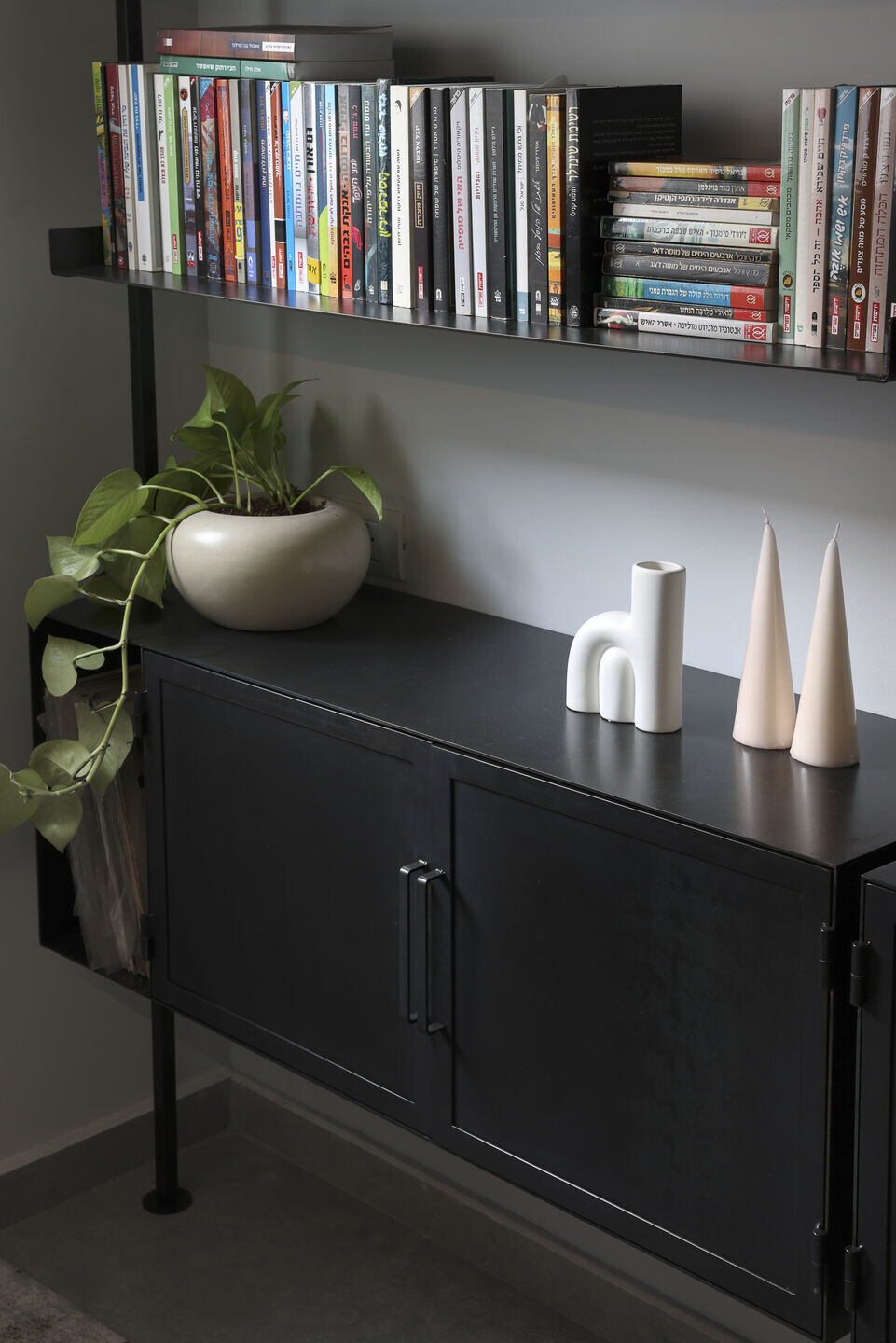
The office used by the apartment owner who works in high-tech and many days works from home. Redone, including new communication and electricity infrastructures. The positions of the furniture were changed and an aluminum profile wall with transparent glass was built in place of the existing wall. The space is brighter and open to connection with the house. But you can still close the door and create silence during work
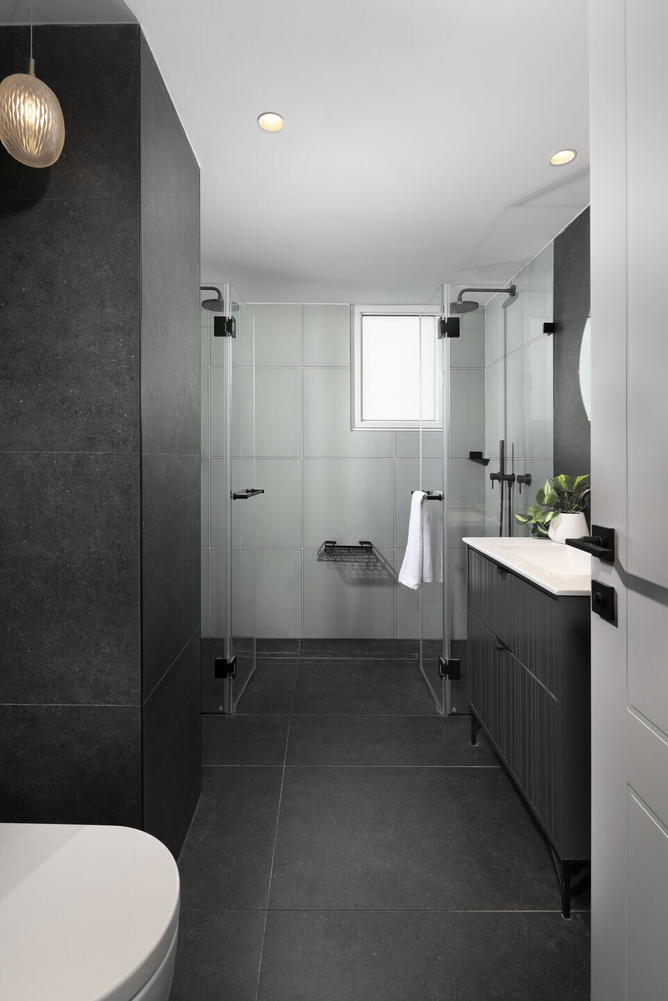
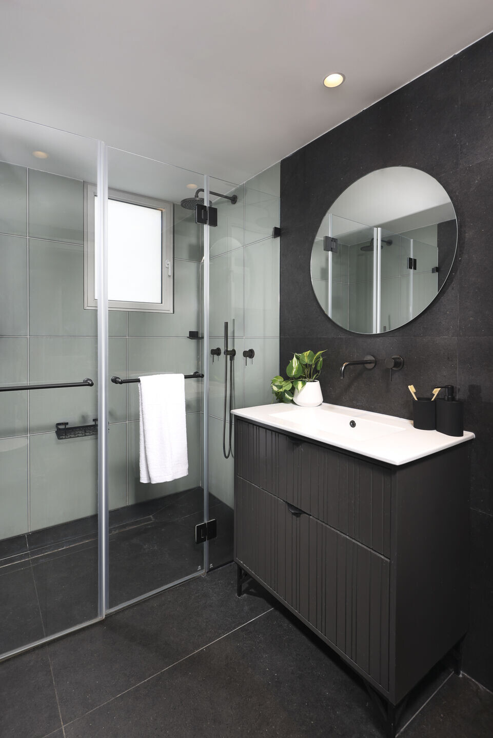
Master's closet and master's shower were completely disassembled and two small, narrow rooms, the space was rebuilt as a longer and wider rectangular room as a double bathroom for the parents. Two bathroom units were placed inside the shower, two bathroom cabinets with separate faucets and separate mirrors were also placed.

The bathroom is partially covered with a black tile like the floor, and the shower area is covered with greenish glass tiles that adds a different tone to the room. The carpentry of the bathroom cabinets was designed from wood in a black shade in the form of slats with slots.

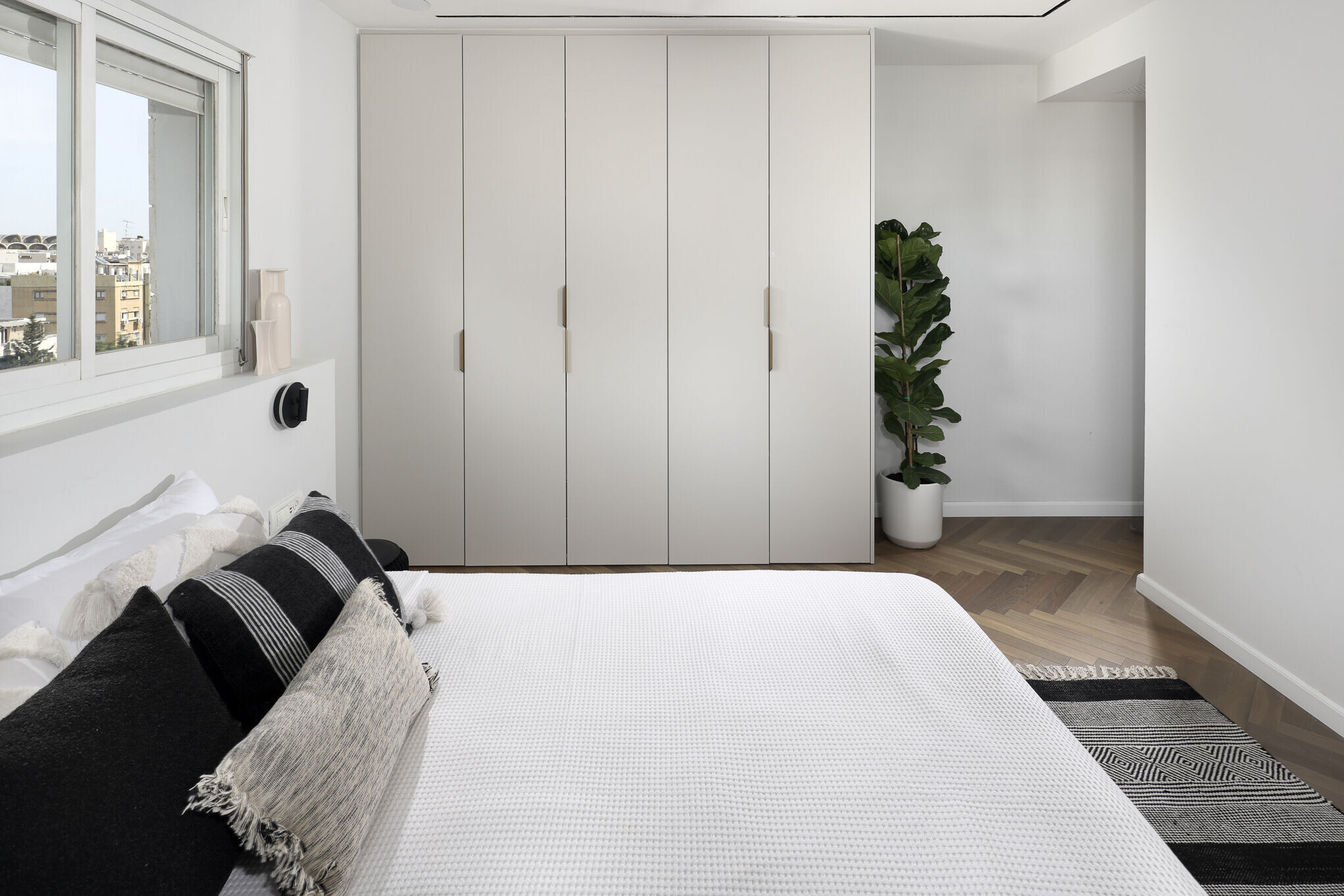
The closet that was destroyed and connected with the shower, turned into a larger wardrobe inside the room itself.

The bedroom is paved with fishbone parquet in a brown oak shade. The entire bed position rotated ninety degrees. New light fixtures and lighting with a fan installed in the ceiling were installed, in addition to the air conditioning shutter in the room, and air is thrown from the air conditioner located in the plasterboard in the master shower.
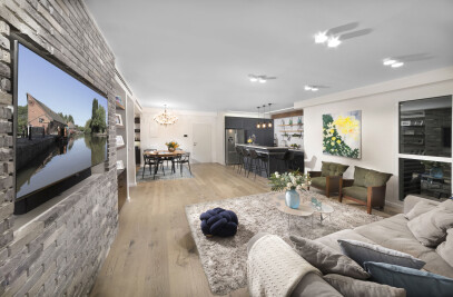
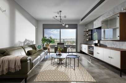
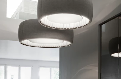
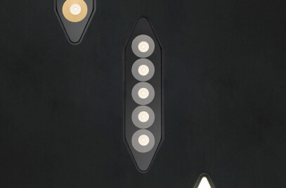
In the living room and the rest of the house, a new large gray floor was laid, which opened up the house and introduced a more modern atmosphere. All the large plaster casts were dismantled, and one smooth and straight ceiling was planned for most of the living room and the entrance, except for one corner for the air conditioner near the wall. Modern lighting fixtures in the form of sunken accumulation stripes were placed inside the ceiling, black stripes were chosen with sunken and semi-prominent light fixtures. The rest of the lighting fixtures were chosen in a round shape in white and they disappear in the eye when they are sunk into the ceiling.
The living room window and the exit door to the balcony were replaced with new ones, also in black with transparent glass that lets in light, and fewer partitions than they were. Thus the view and the light from the outside that was hidden until now comes in and expands the view, from the entrance you can see outside when the curtain is moved to the side

A large, beautiful carpet and new furniture were bought for the house in light colors as well, except for the living room tables and bookshelves which were chosen in black. Like the lamps and the aluminum.
Two armchairs were reupholstered and taken from the grandmother's house who passed away during the renovation.
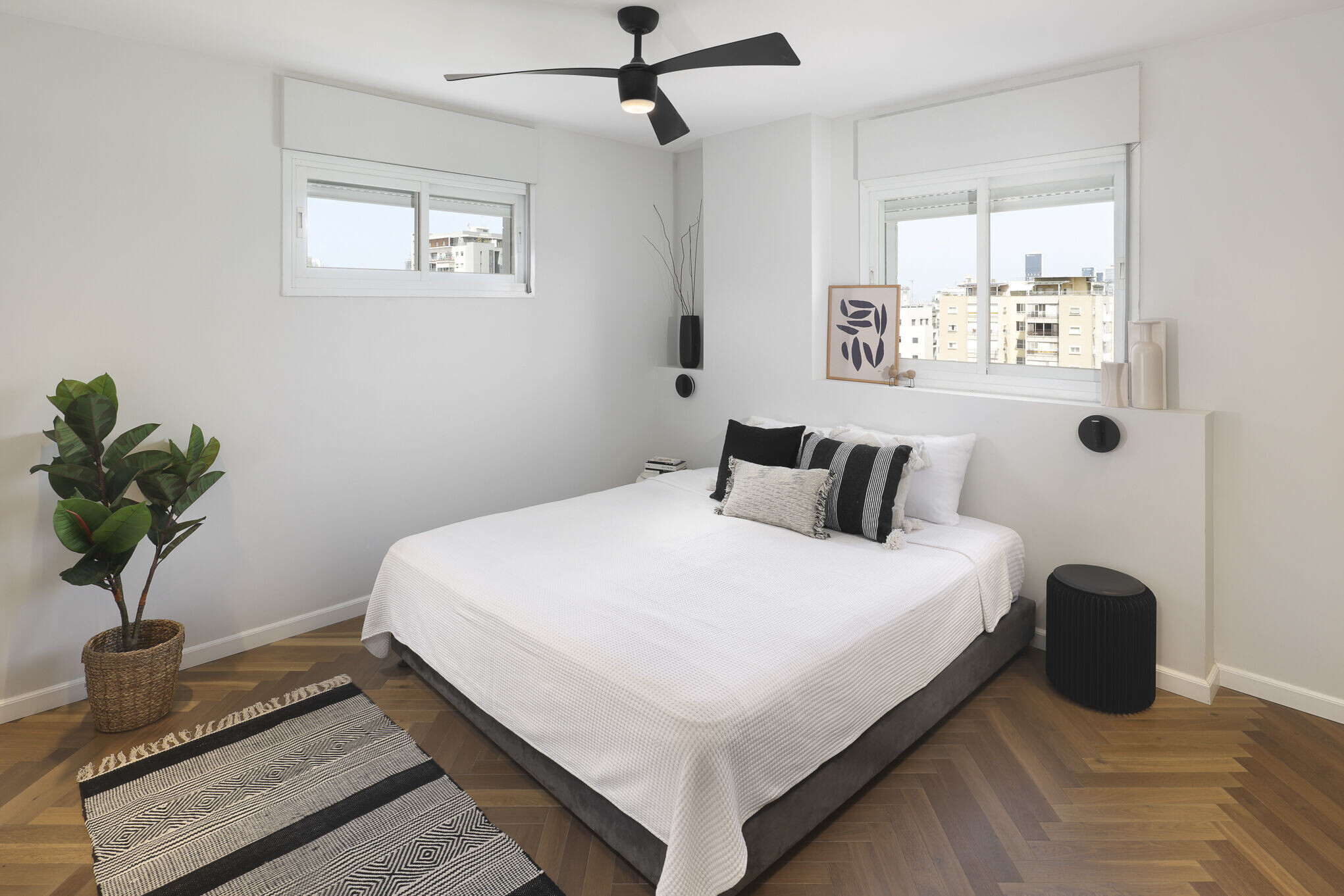
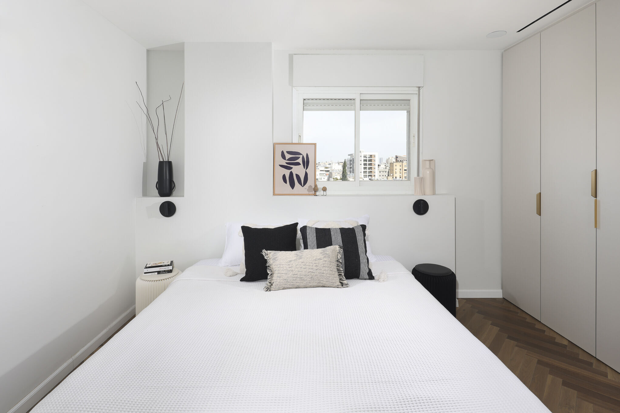
The bedroom adjacent to the living room was redesigned, and converted into a guest room\ a room for one of the girls who is a student today and comes to the house to sleep on the weekend once in... The bedroom is also paved with fishbone parquet and was designed to lower an air conditioner with lighting above the low wardrobe, where there is no wardrobe because There is no need.
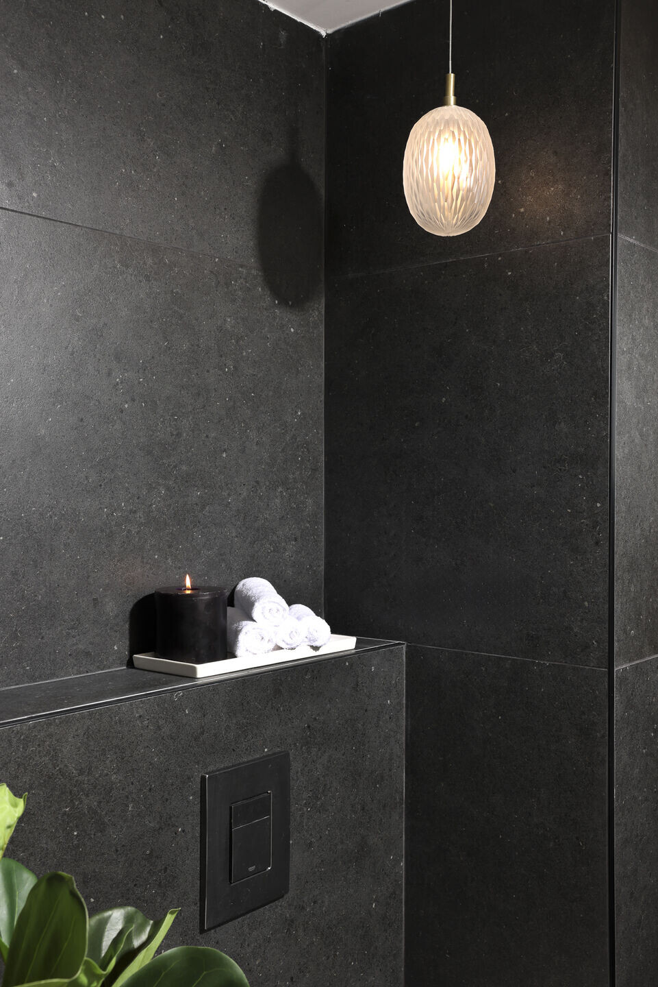
The guest services adjacent to it were destroyed and enlarged at the expense of the existing room. From a small guest toilet it became a bathroom that includes a shower, toilet and a wider sink. The floor is covered with a black floor like a master bathroom, and the shower walls are also covered with the same tile, except for the wall in front of the entrance which is covered with green fishbone tiles in a dark green shade. Carpentry The bathroom cabinet was designed from wood in the form of slats with slots.
The kitchen, which was inside a closed room, was reopened, with a new glass door with black aluminum at the end and a laundry room behind it

The kitchen was completely redesigned in the form of two parallel straight bars.
One wall is the kitchen itself, which contains a full and tall carpentry wall, tall cabinets on both sides and above as well, and in the middle space the marble with the sink and work surface. All in shades of black and dark oak.
Opposite this lane, a parallel lane was planned, divided into three parts. One is the large double fridge area in a black shade.
The concrete column and on its inner side a lighted cabinet with glass doors and glass shelves. Used to store decorative kitchen utensils. And in the continuation of the bar counter with the seating chairs, while on the outside of the kitchen there are two more bar stools and in the continuation the marble continues and wraps the concrete column and serves as a narrow shelf for placing accessories
The apartment underwent a fundamental change, walls came down, some of the walls were moved and rebuilt. The bathrooms underwent a makeover, the electrical and plumbing infrastructures were all replaced, the air conditioning system was completely replaced and with it the old-fashioned plaster walls and blinds were dismantled, everything was redone with the most minimal walls. The kitchen, the entire furniture was bought anew and in general the feeling received is that of a new, bright, white and cleaner apartment.
The tenants who love their neighborhood and the building itself left satisfied and feel that they are living in the same settlement and neighborhood that is convenient and good for them, but in a brand new house
