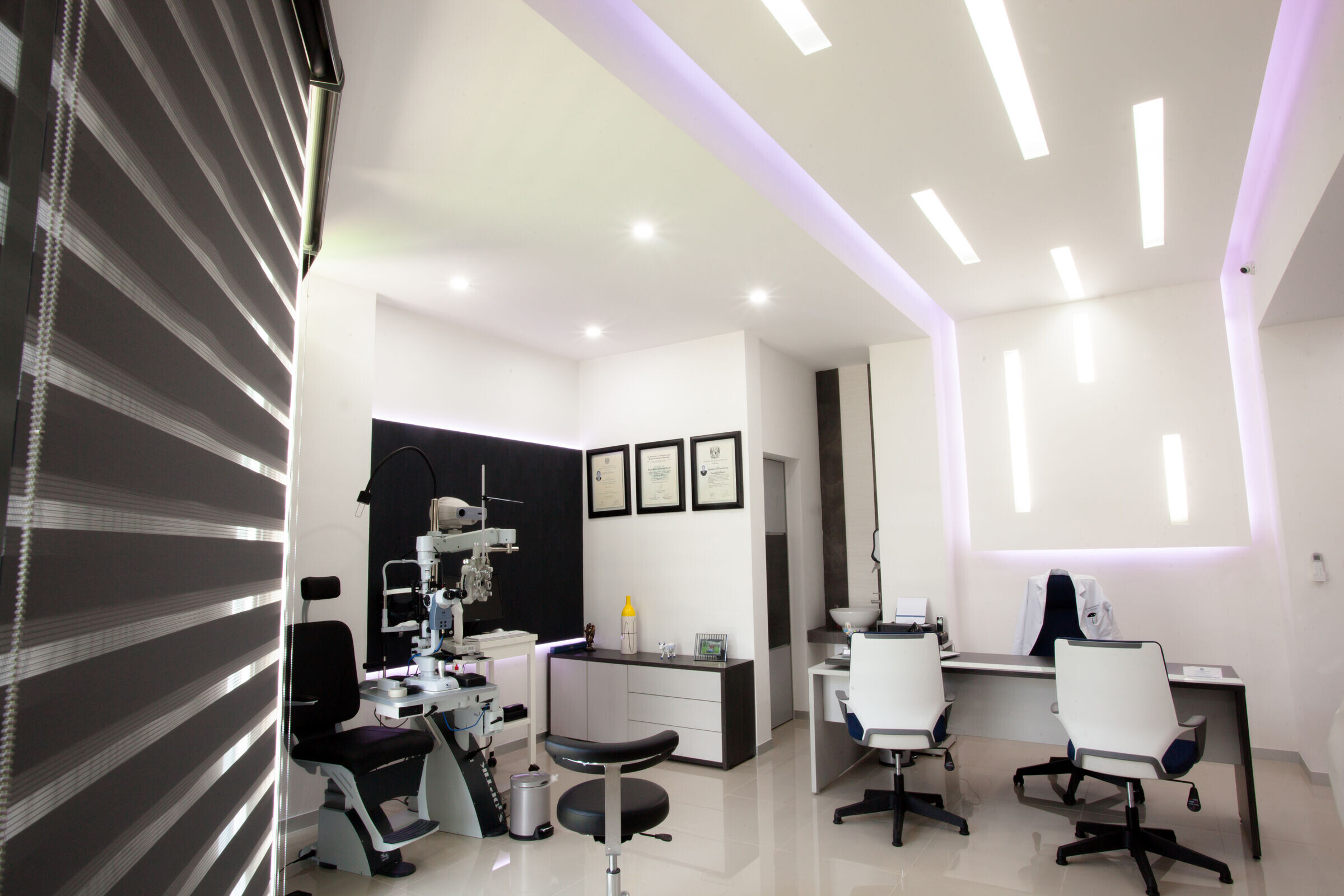
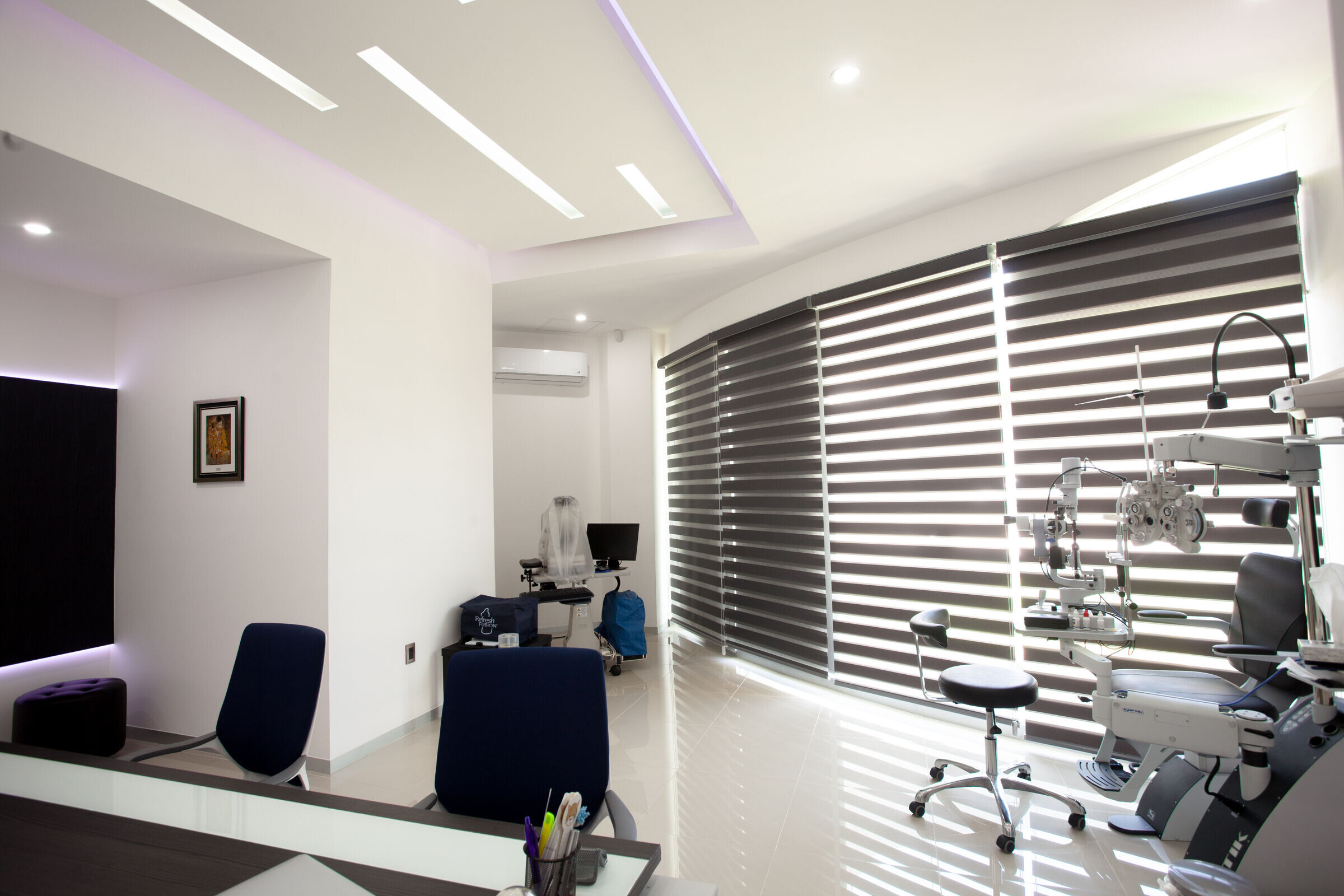
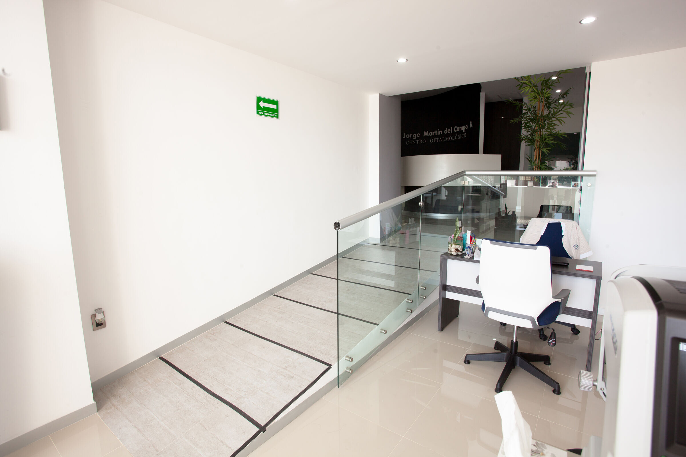
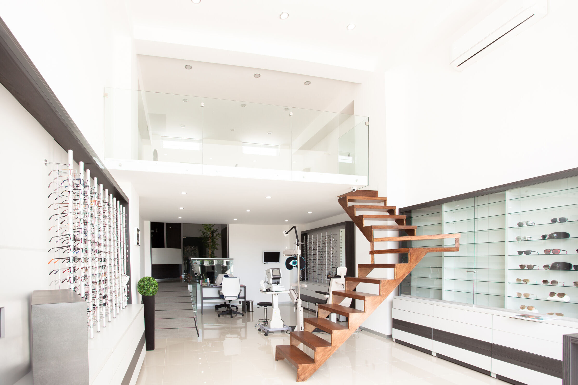
The building, located on a corner lot with a unique view in the city of Colima, México, has been designed with a commercial focus that combines several independent areas to form a unified whole. The centerpiece of this design is an ophthalmic unit with unique characteristics, with the primary requirement of being inclusive and accessible to all.
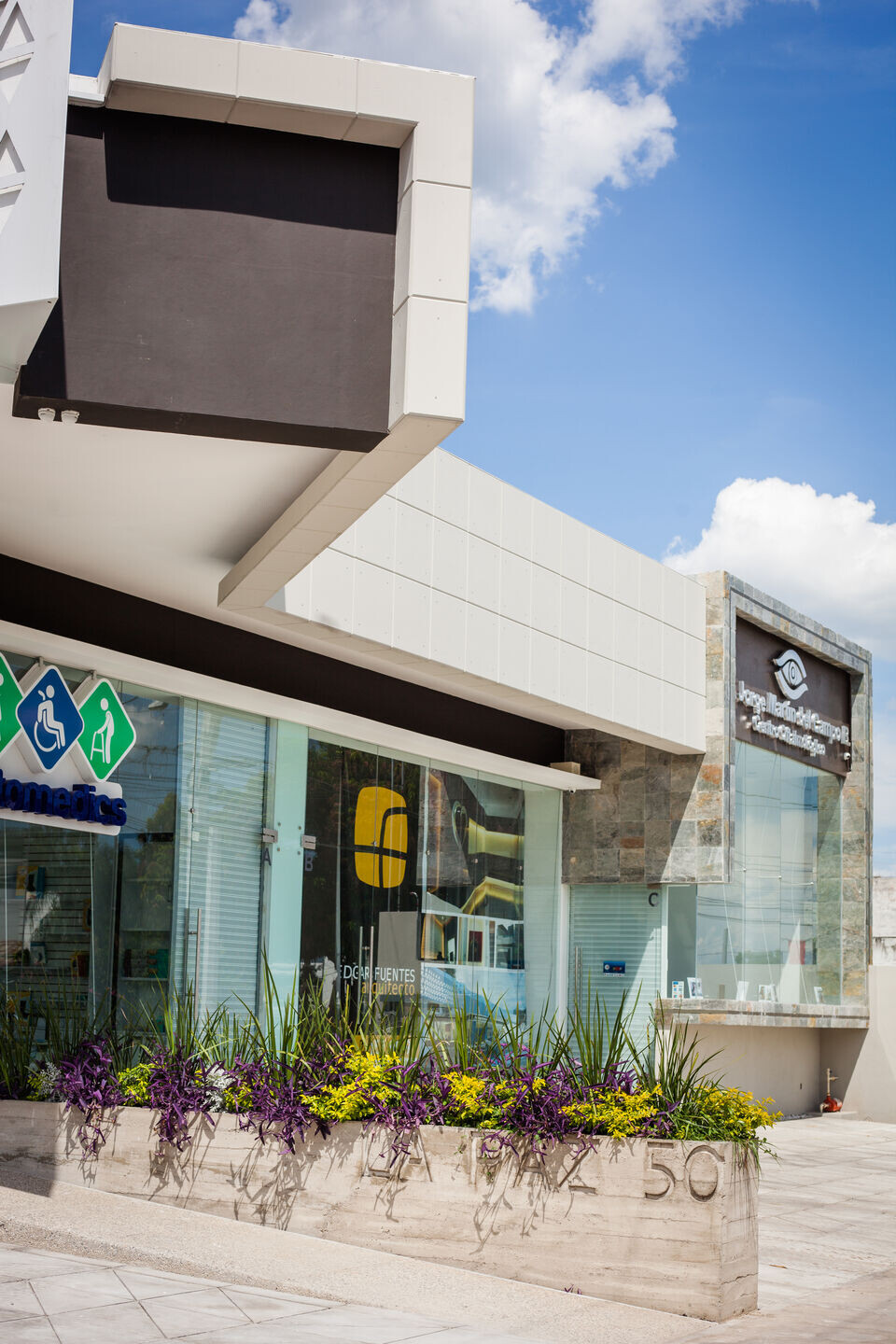
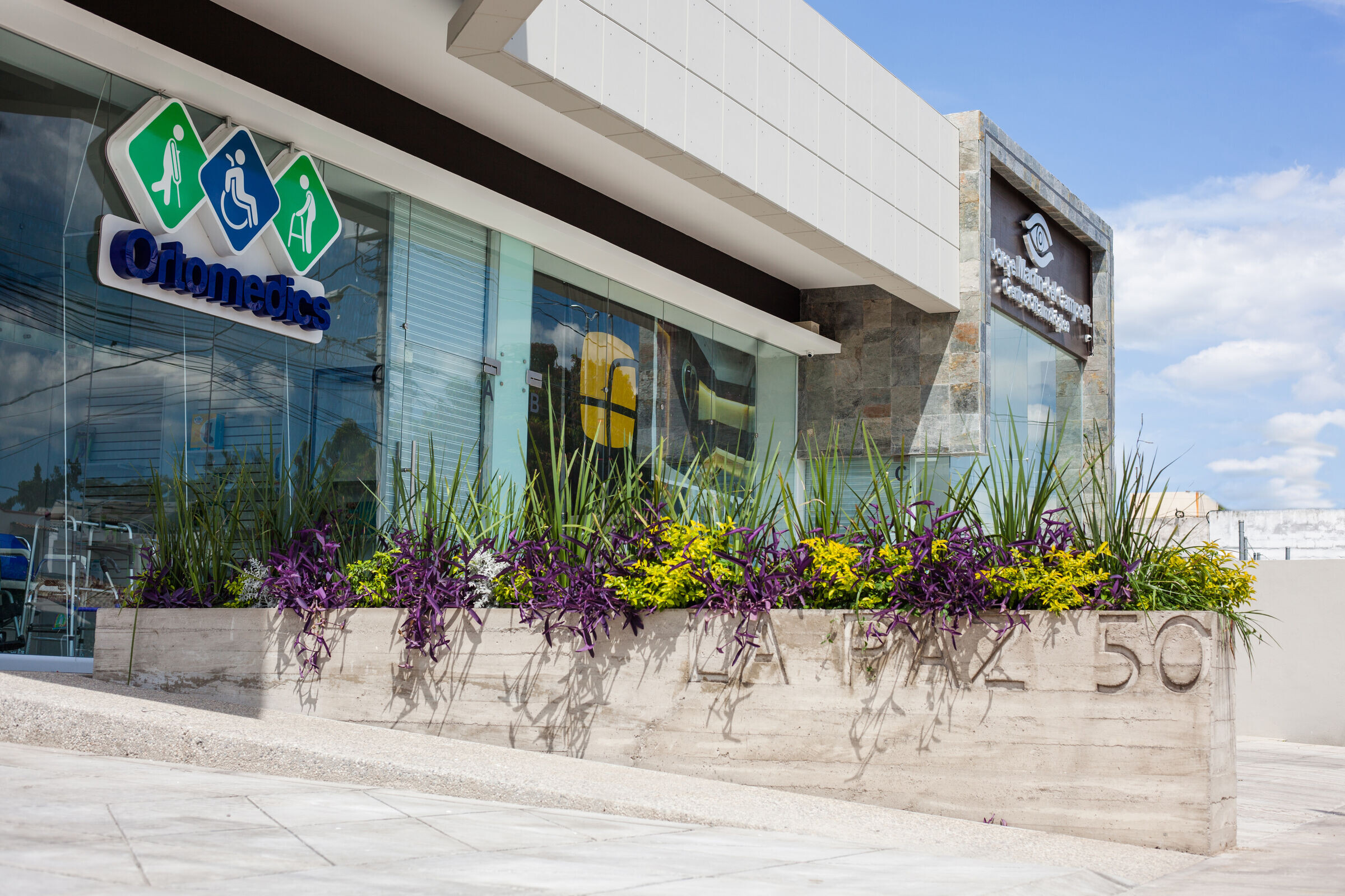
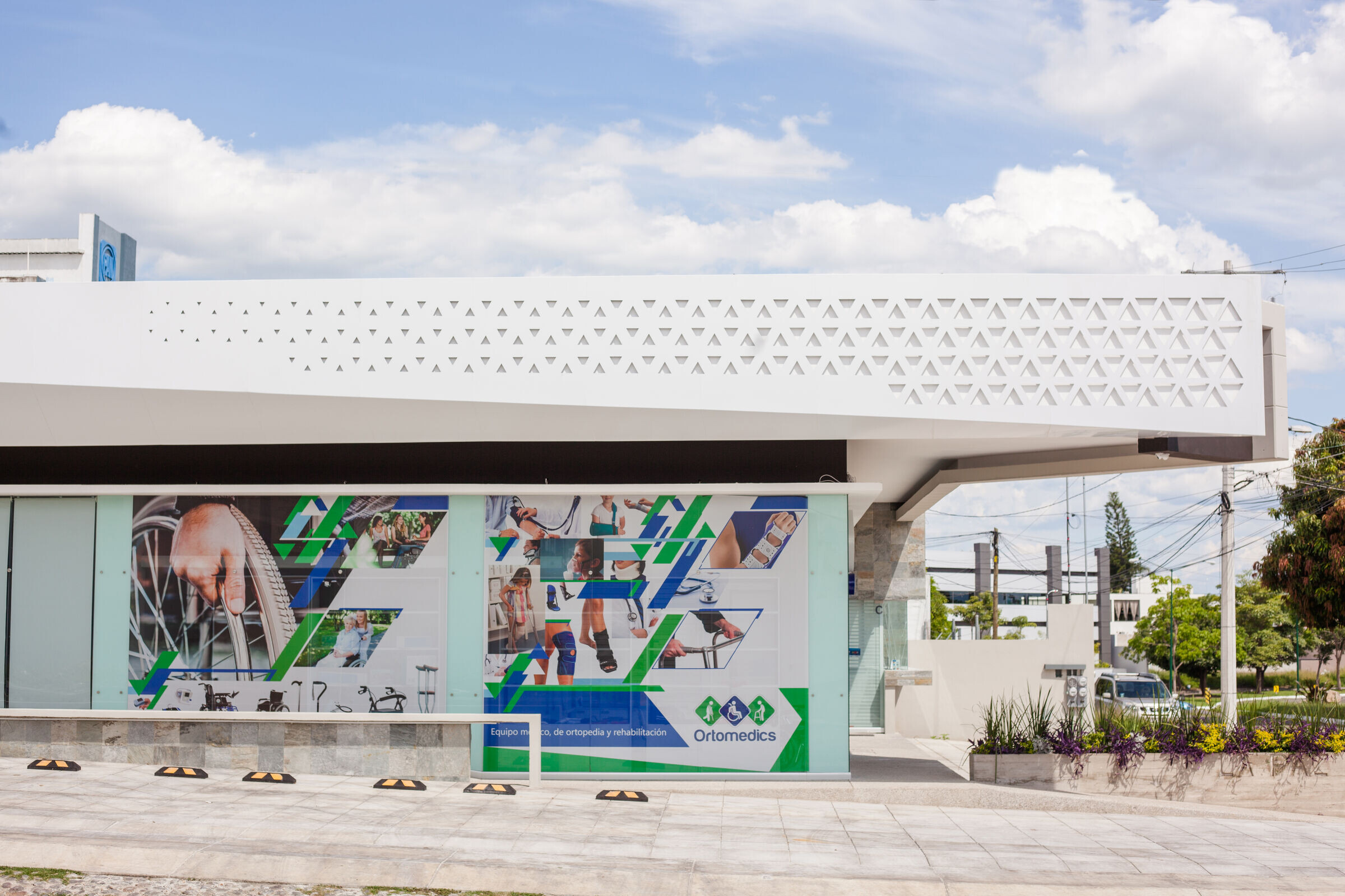
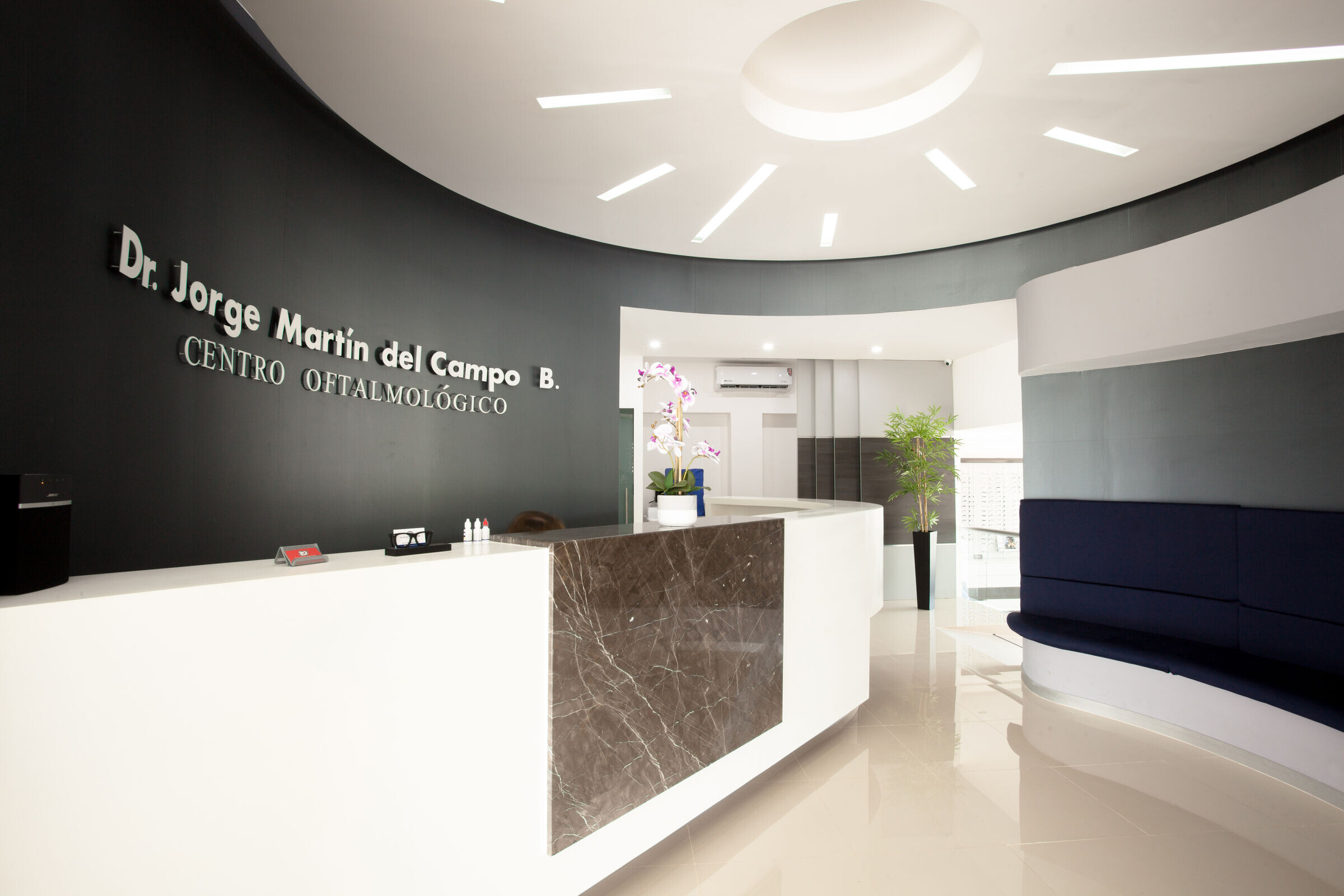
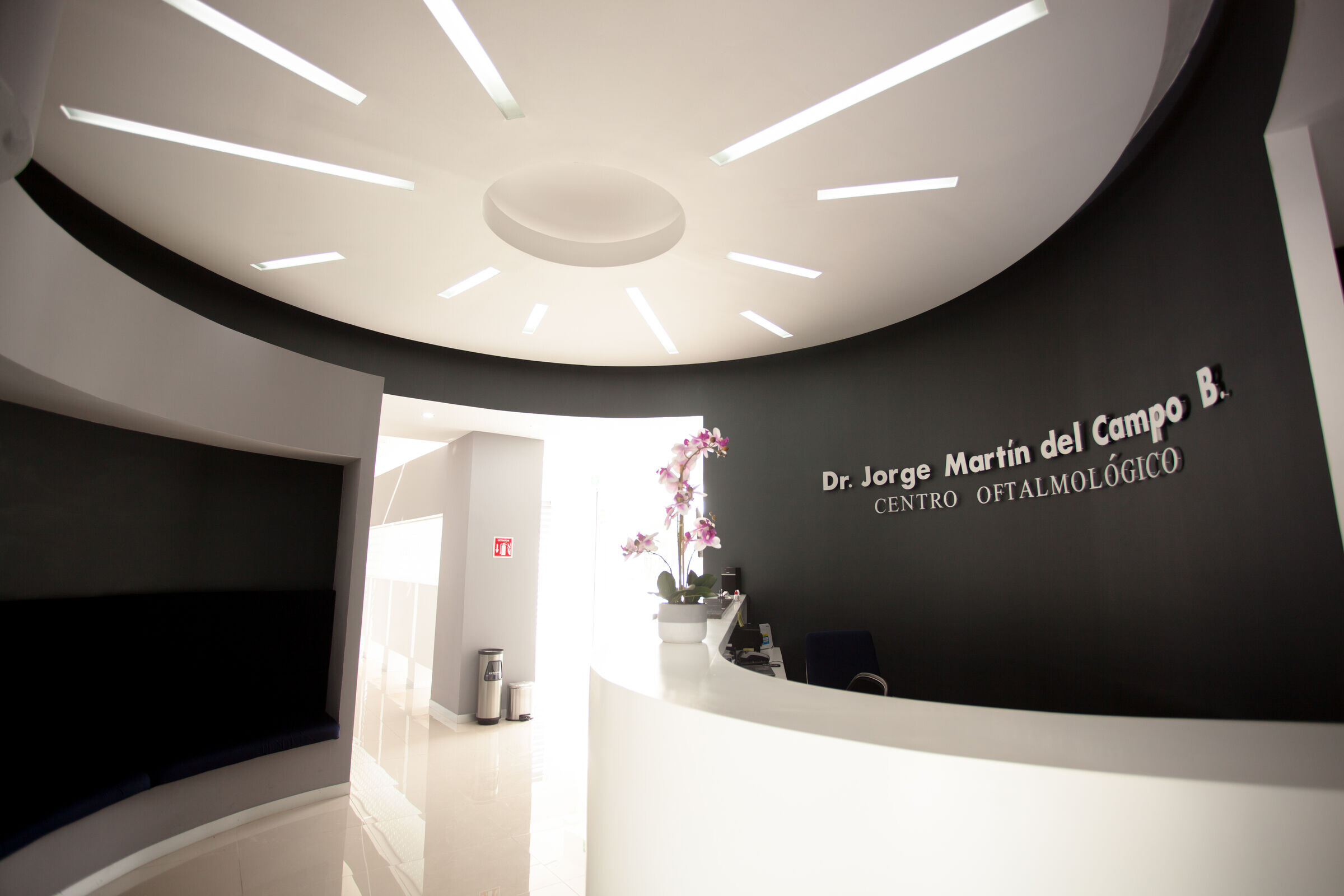
In its exterior design, materials have been used to create lightweight elements with bold yet balanced shapes. These materials define and frame a series of visual elements that turn this construction into an icon in its environment. The main facade, of considerable length, is crowned by a lightweight eave that, while visually imposing, maintains the necessary solidity. It is clad in white aluminum composite paneling, allowing for play with parametric geometry that gradually transforms the horizontal plane into an orthogonal one, subtly guiding the gaze from one end to the other.
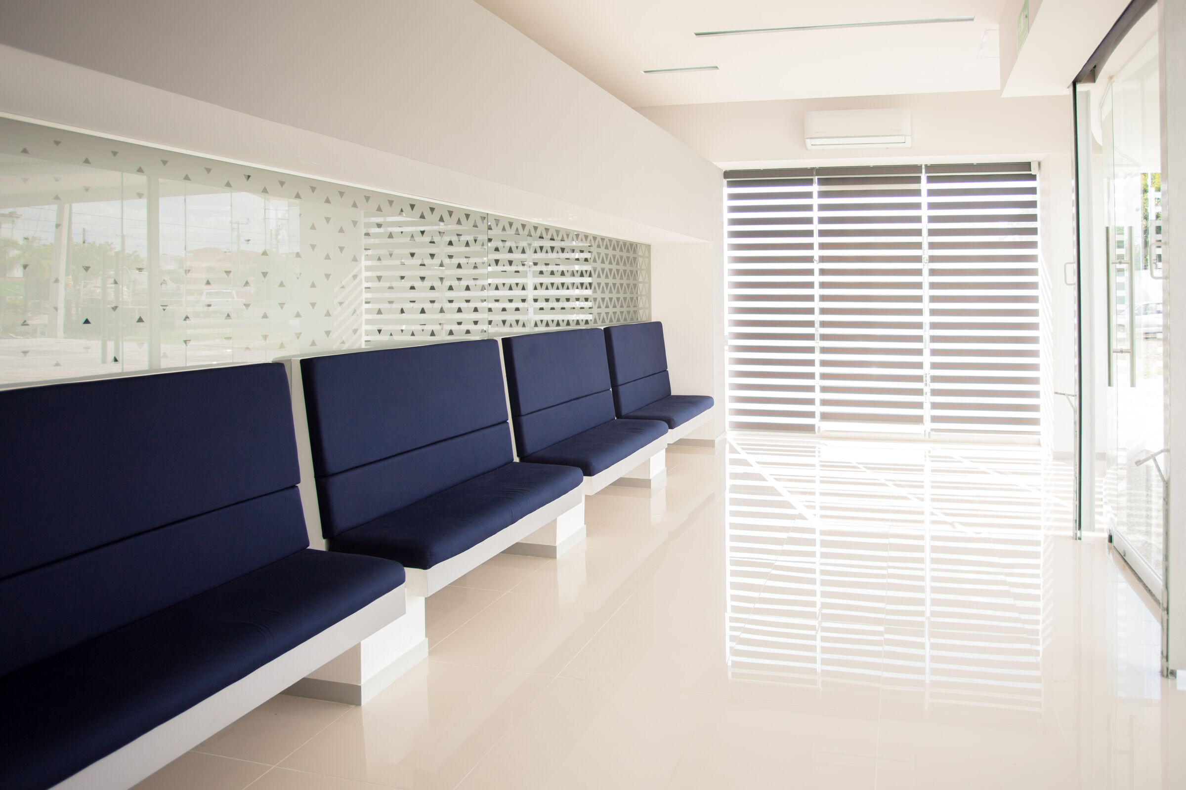
To add texture to the smooth surface of the aluminum, a perfectly geometrized triangular lattice with a dynamic pattern in terms of size has been integrated, from the ends towards the center. This triangular lattice creates depth effects with sunlight and shadows, generating a pleasant texture both day and night when illuminated from the inside, adding dynamism to the design.
A straight and high-contrast skirt in its color frames the covered part of the glass facade, which connects to all the different commercial spaces on the perimeter. Additionally, a circular open space has been inserted, serving as a vestibule, benefiting the overall functioning of the building by increasing the linear meters of the internal facade and providing an outdoor waiting space with pleasant views of the garden area, protecting from the afternoon sun.
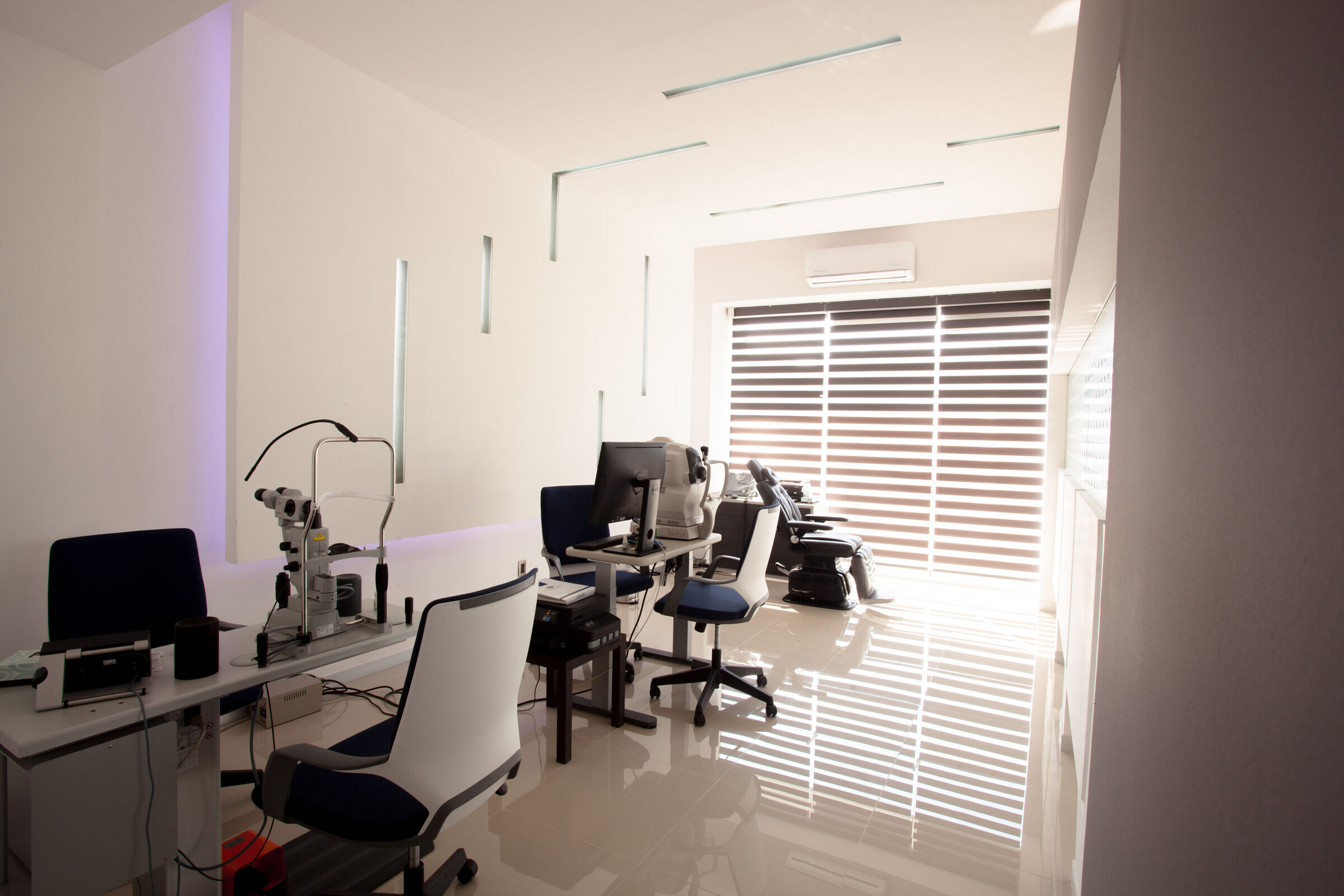
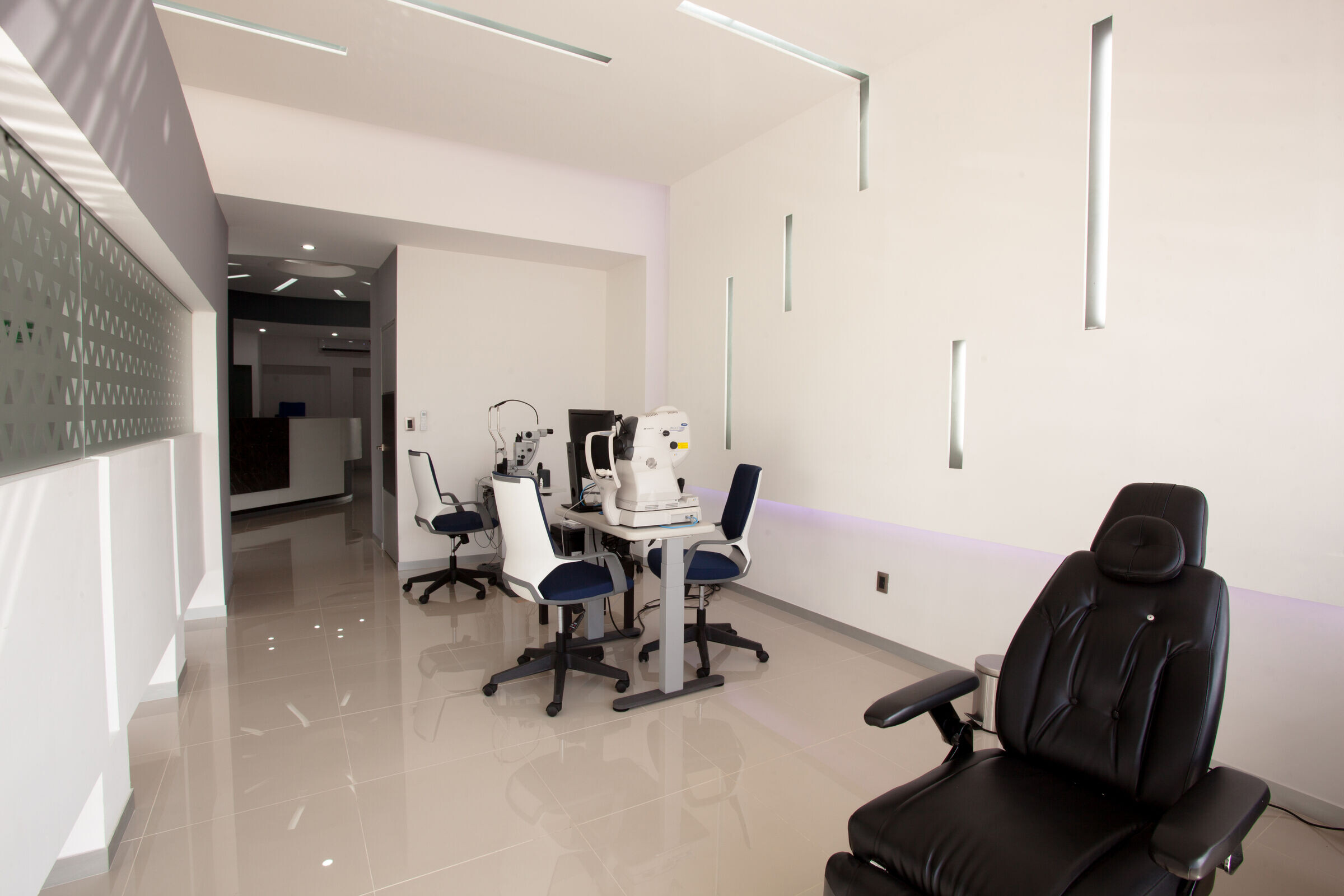
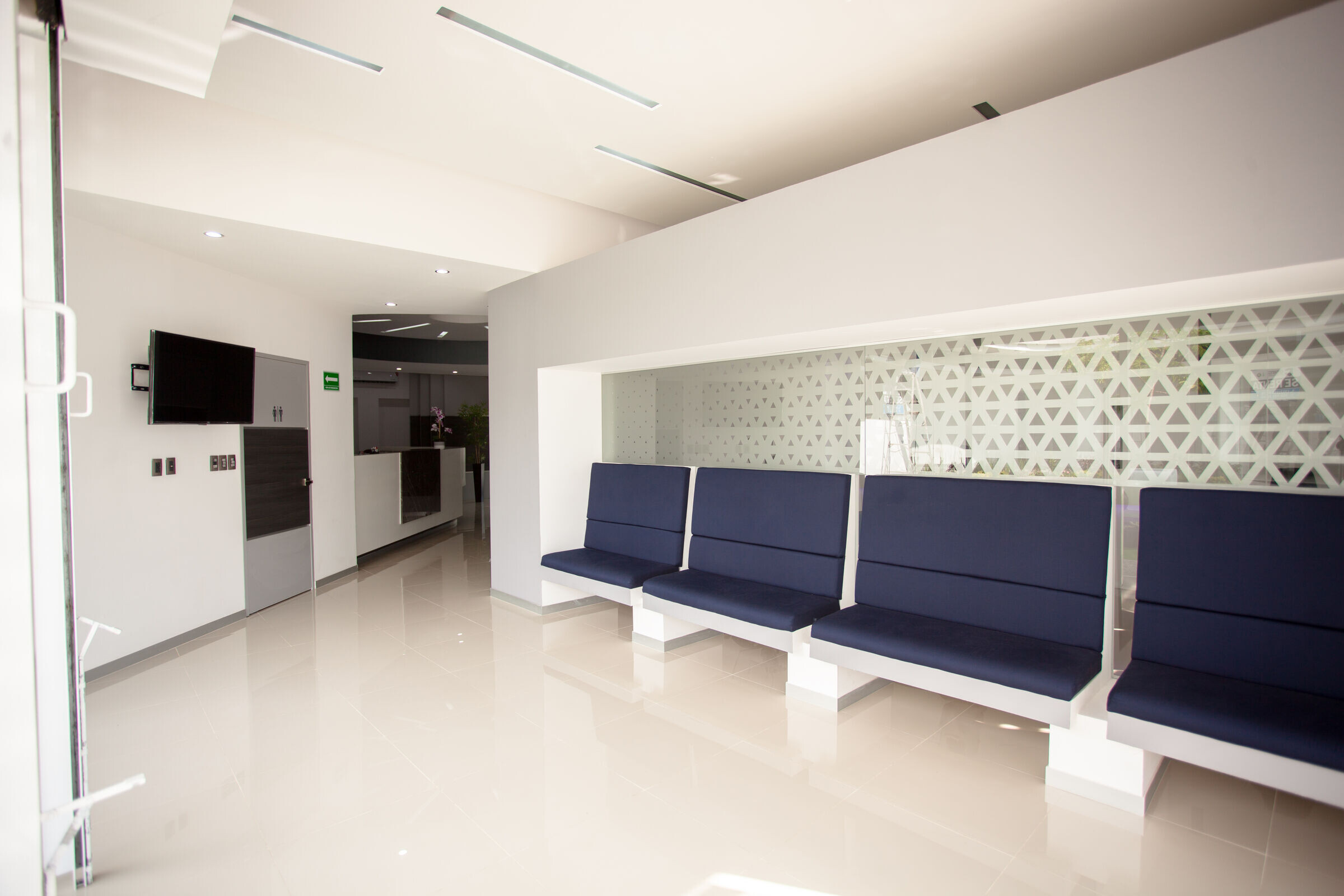
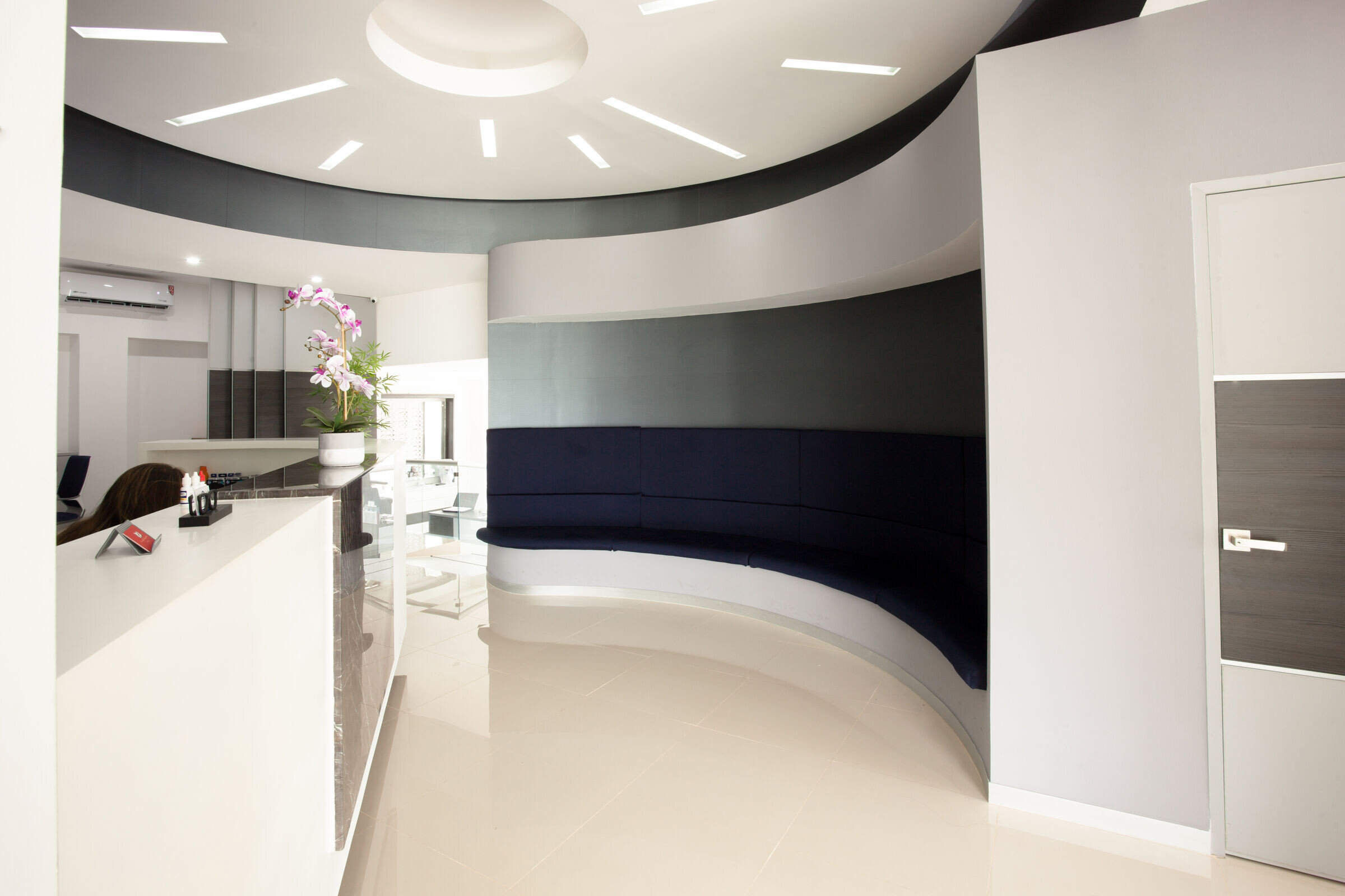
Despite having clear glass facades, the ophthalmic unit is perfectly isolated both visually and acoustically from the exterior, guaranteeing comfortable facilities for the patients. Its interiors feature a range of neutral and balanced colors that reflect professionalism and seriousness, with accent colors to emphasize certain details and spaces. Natural light is integrated subtly but constantly, creating welcoming environments without affecting the visual comfort of the patients.
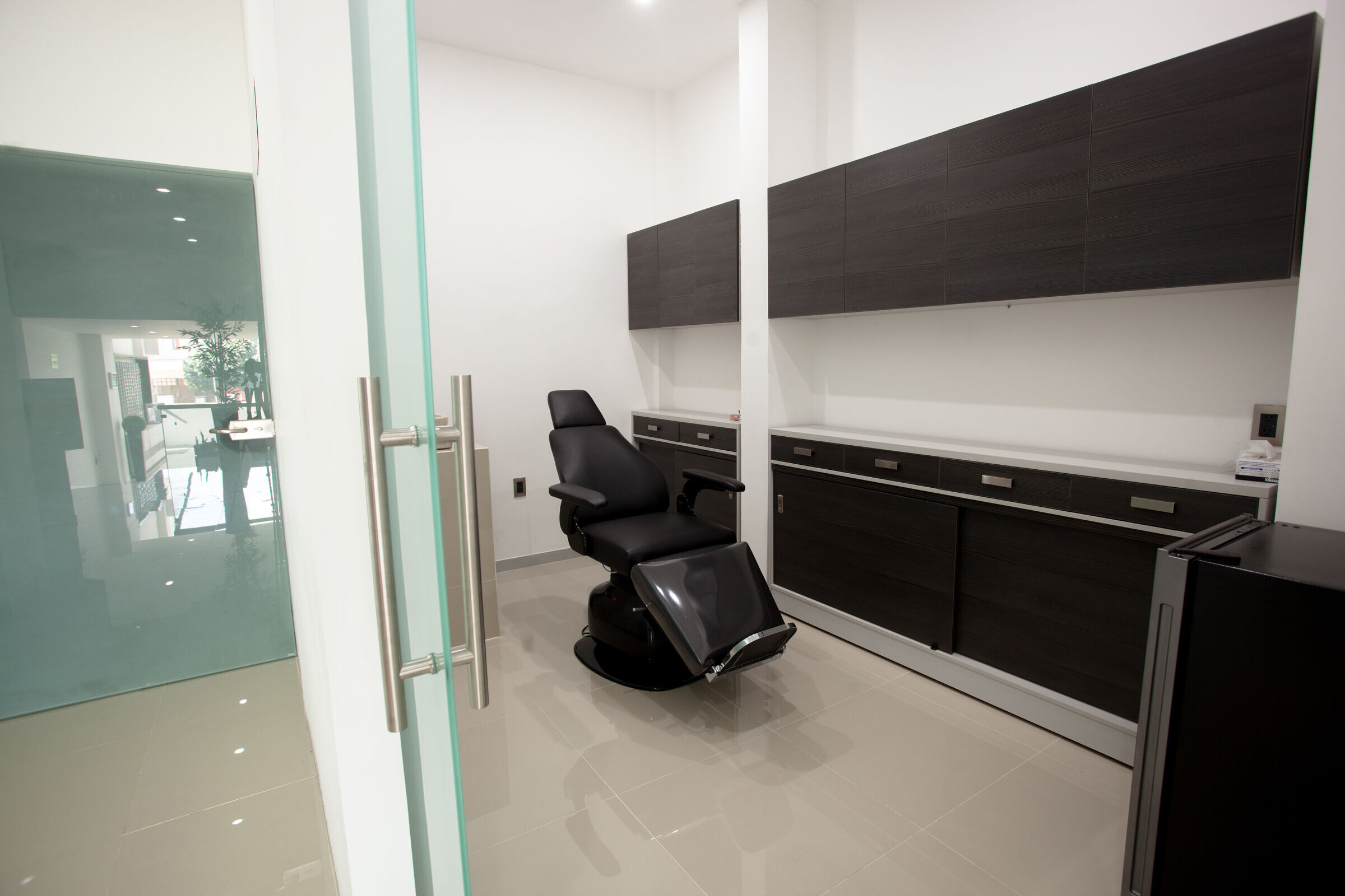
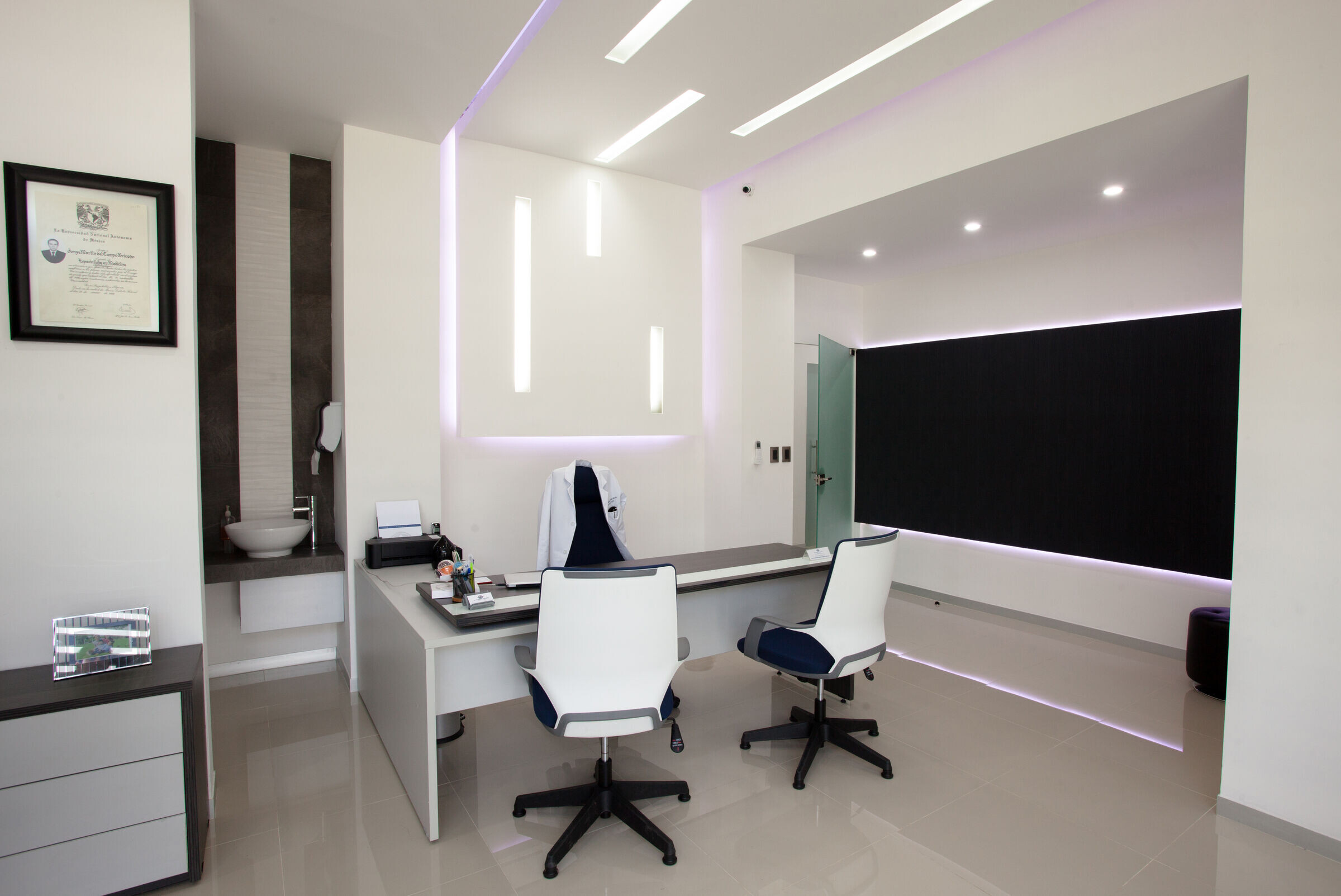
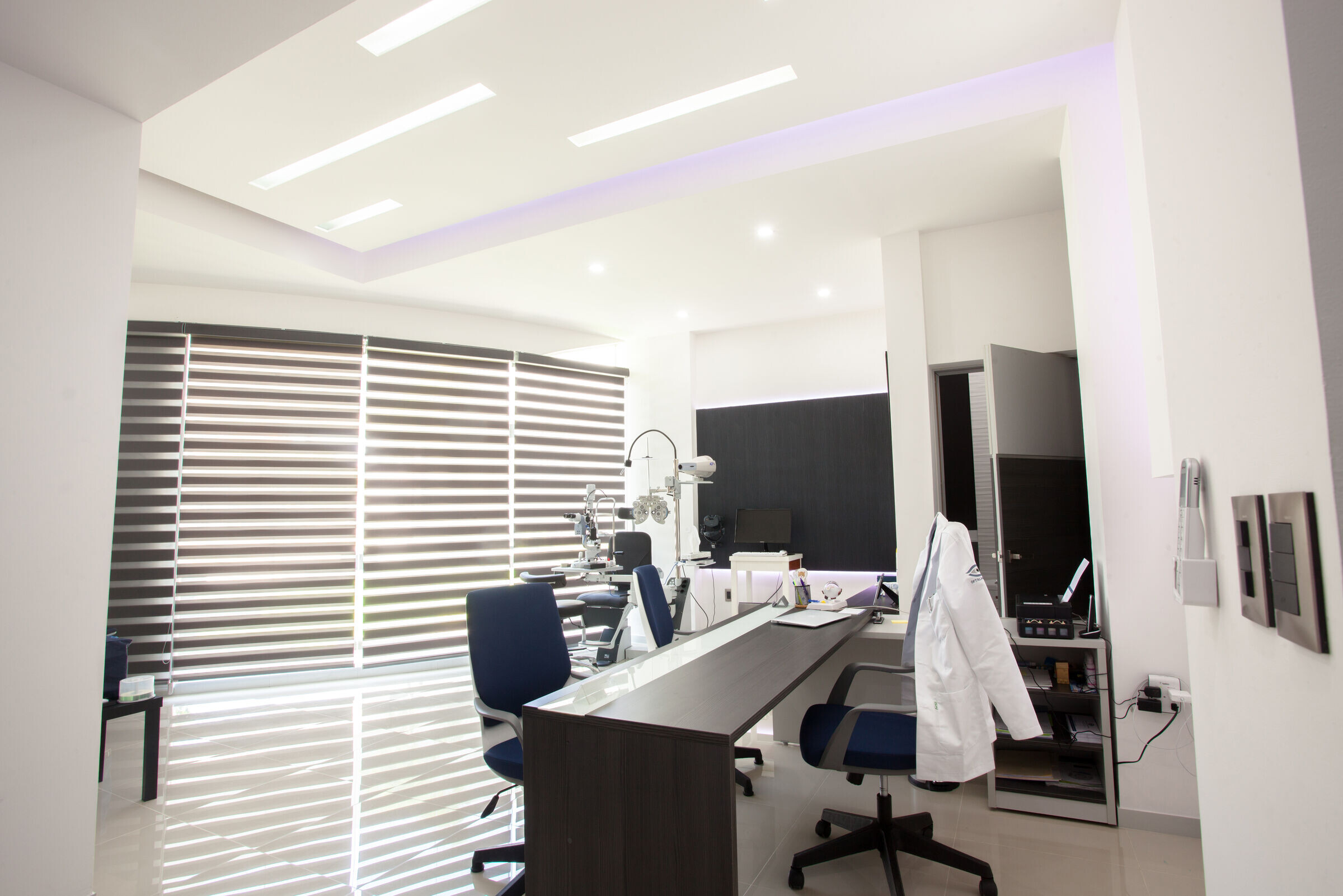
The waiting room, with custom furniture, functions as an architectural element that divides the study and waiting areas, allowing glimpses of the work being done without compromising patient privacy. At the reception, a second waiting room has been integrated, all framed in a circular perimeter with subtle symbolic details indicating the purpose of the space. Continuity in the ceiling removes visual boundaries, expanding the perception of the interior spaces.
