OVERVIEW
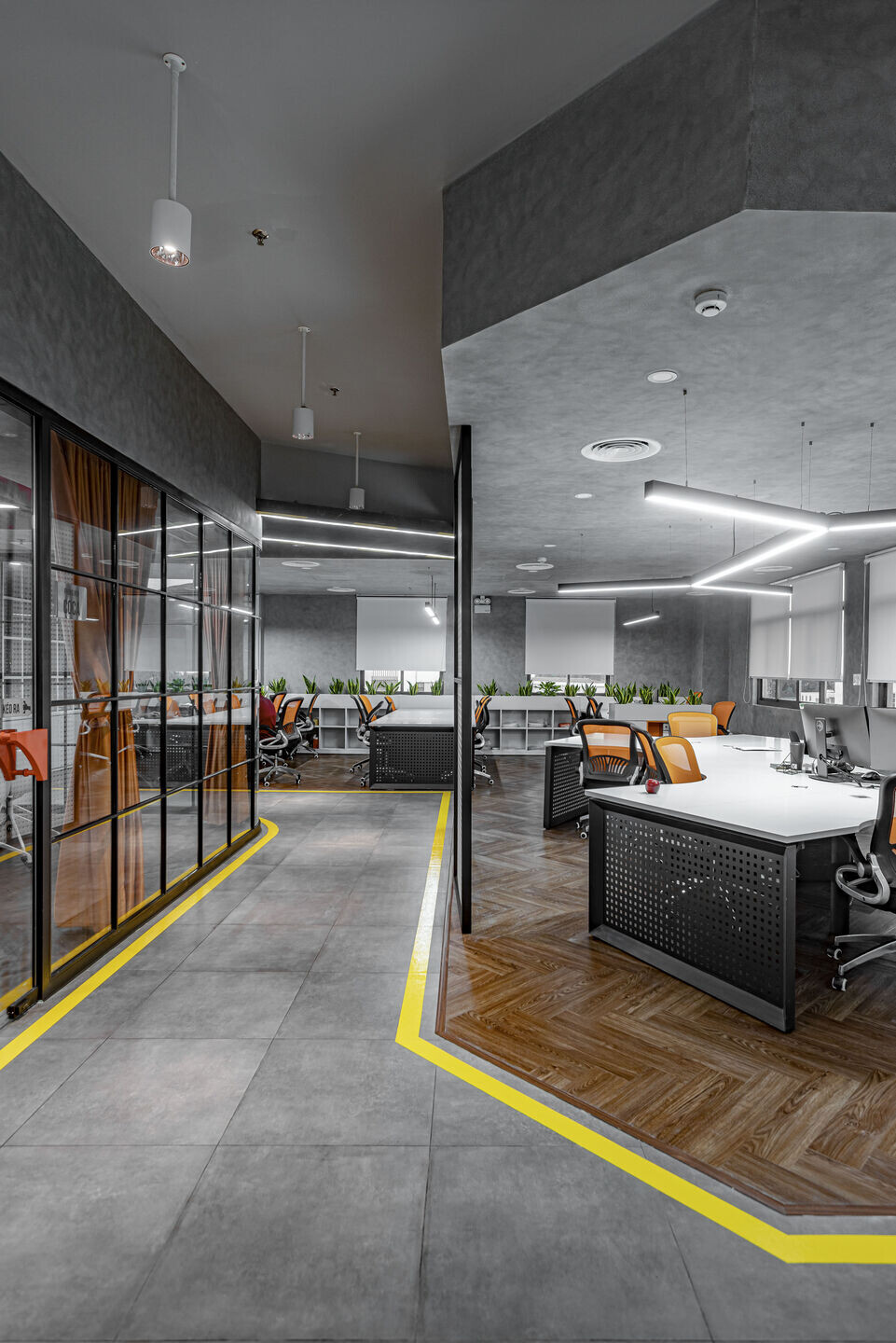
The workspace is designed in a modern style to express the spirit of "passion in action" - dynamic, strong and fierce.
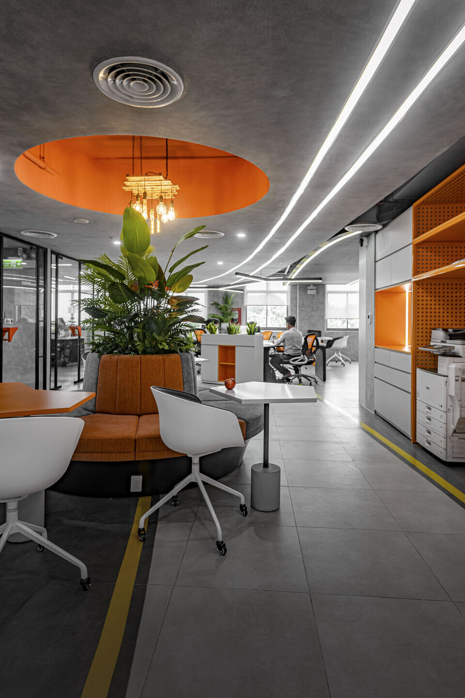
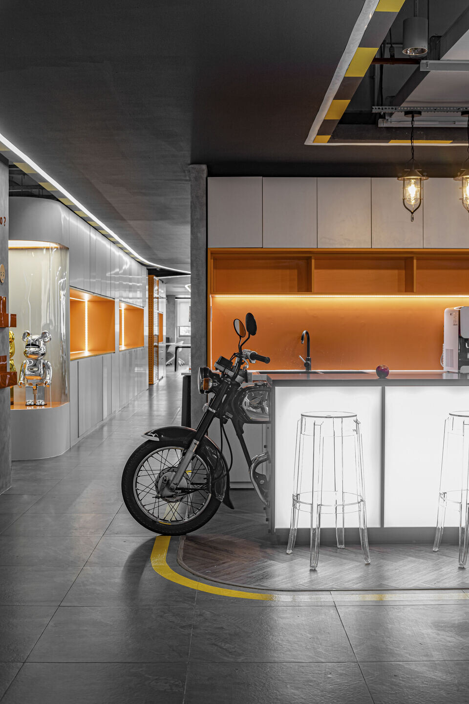
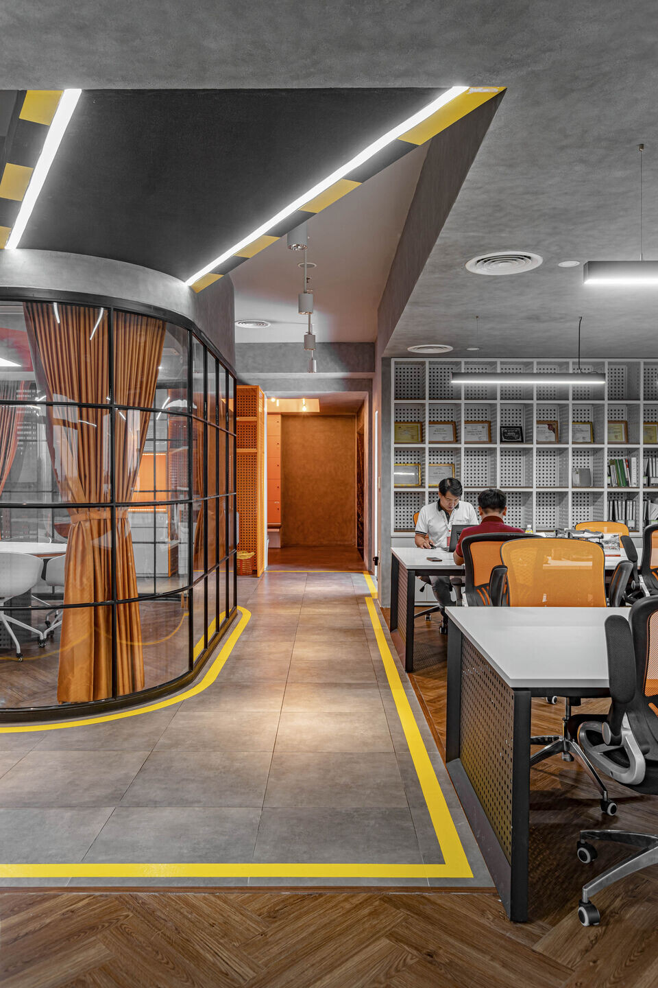
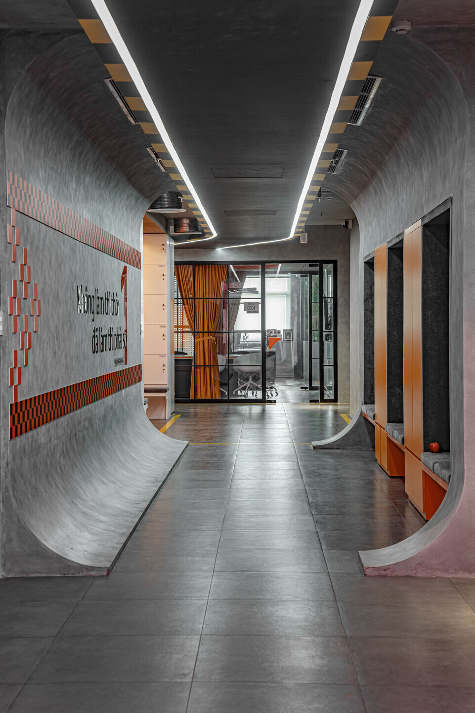
The corridor is designed as a road, navigating to the space sections of the office. Looking at the ground design, Hoa Binh Minh office space is like a miniature urban area.
DETAIL
Color
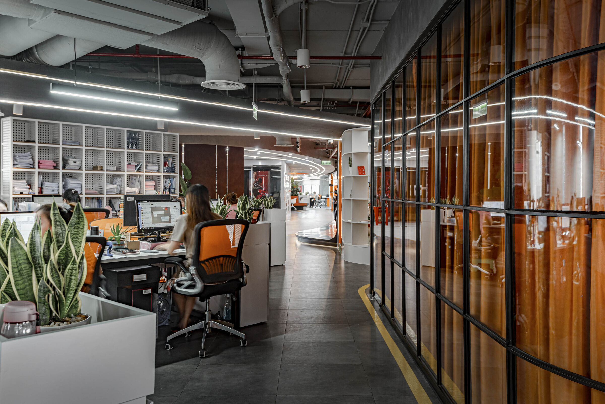
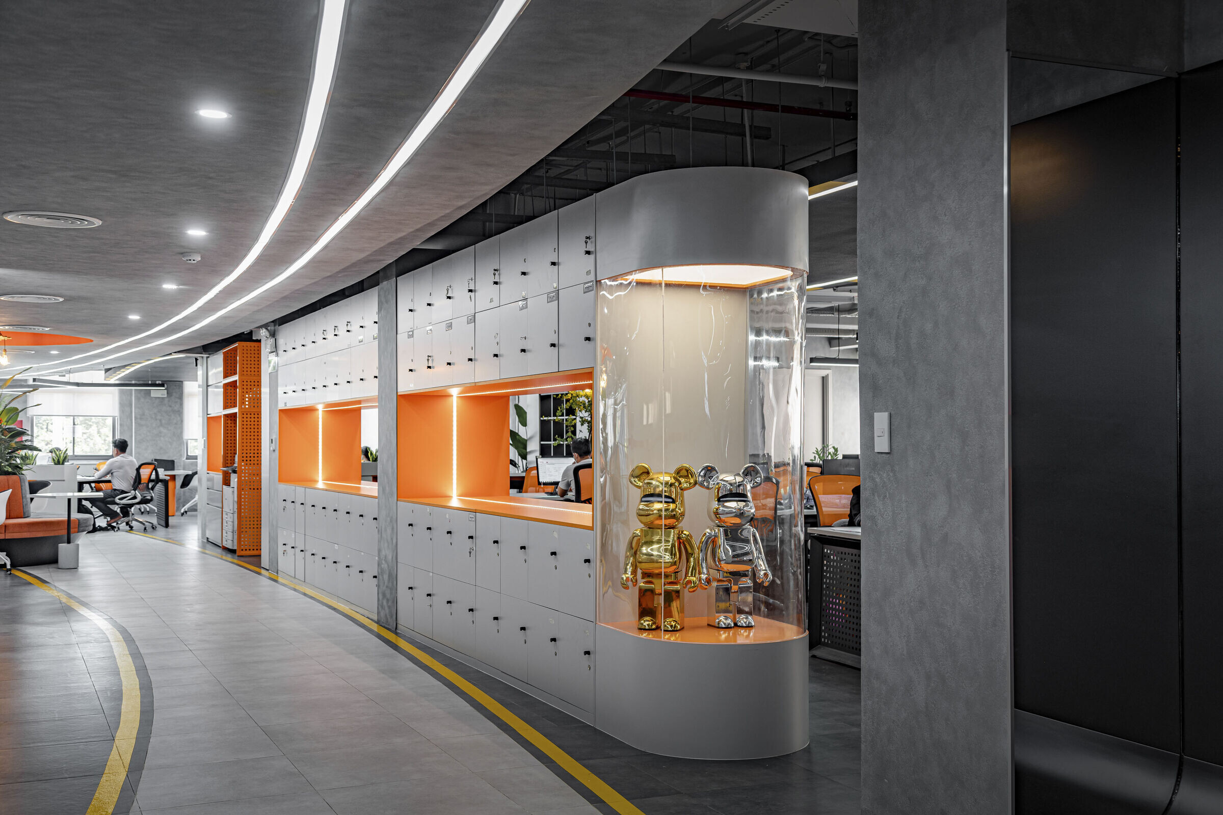
The contrast method is used thoroughly in the coordination between the brand's identity color pair (black-orange) and other tones.
The characteristic colors of modern style such as white, grey, and black (neutral color gamut) are used as the background color, combined with orange, red, and yellow - (brand identity color) to create a clear contrast and layering.
Black represents regularity, sustainability and permanence over time
Red and orange show enthusiasm, fierceness, and passion.
Environmental Graphic
Environmental Graphic Design is a unique highlight applied by DPLUS in this project.
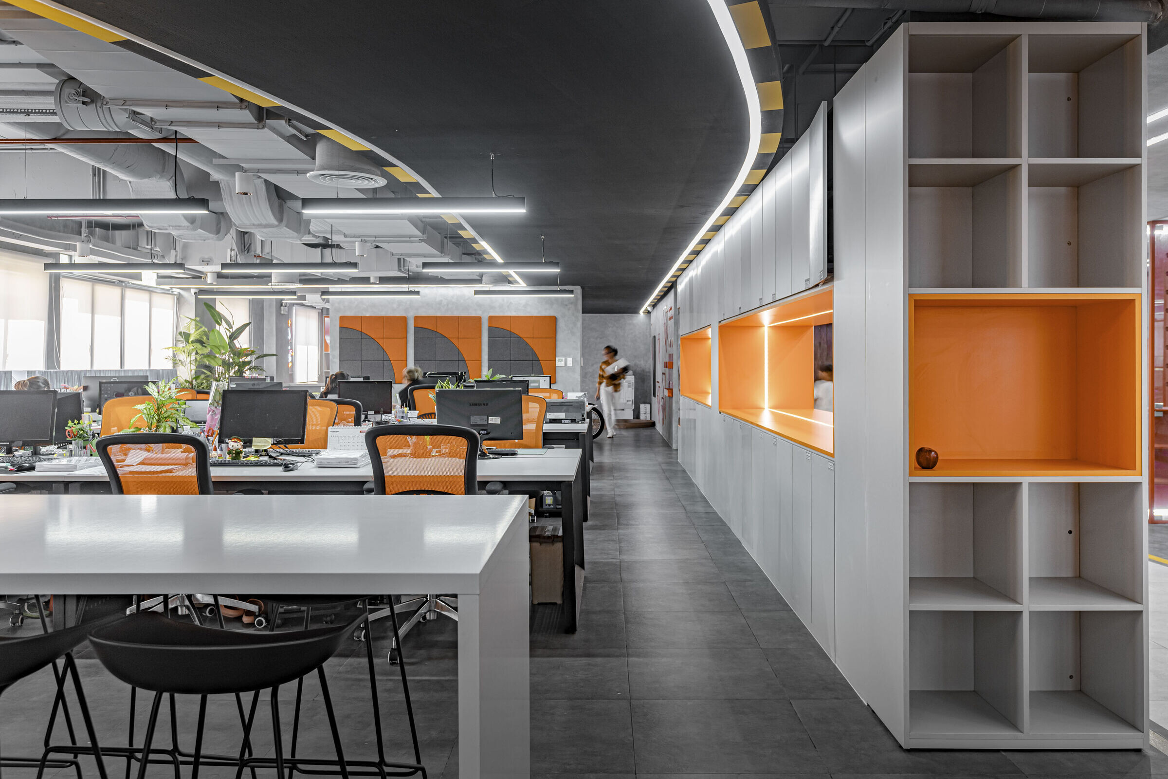
The upsidedown road
Right in the middle of the space combined with the ceiling system creates soft bends, leading users through each different area of the office.
Hanging ceiling panels
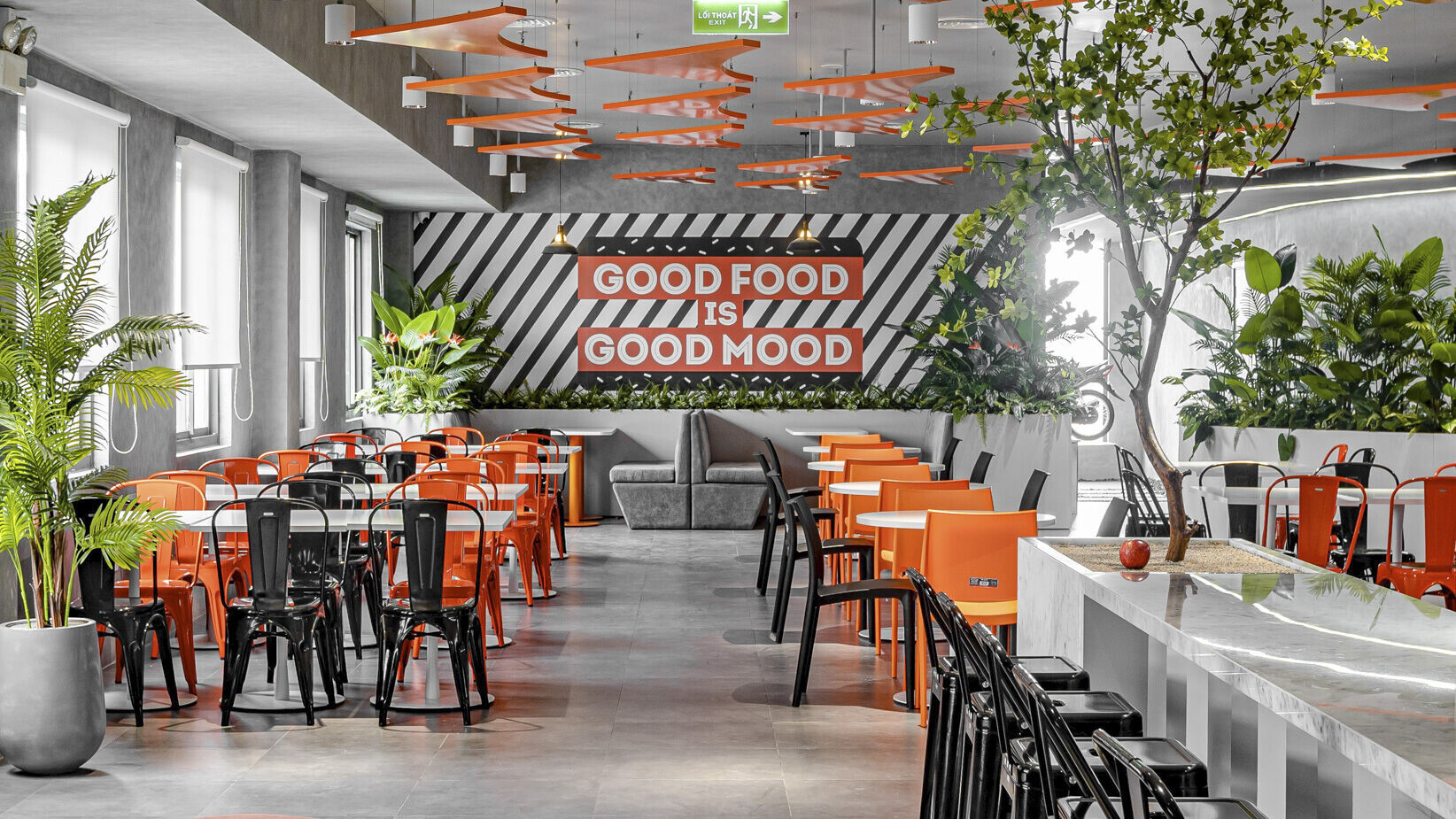
The ceiling rug in the pantry was inspired by the brand's logo. A stylized right triangle represents a combination of a straight line (Honesty) and a curve (Action Energy Richness).
Exhibition
Exhibition is a form of environmental graphic design) that is traditionally applied to communicate about the development and culture of the business, creating an interesting way of receiving information for users.
Interactive experience
Interactive experiences are graphic designs that increase the interaction between the user and the space. Recycling corners, maps on the floor, and typos on the walls are typical applications of interactive experience in the project, aiming to experience and bring new emotions to users. From there, between people and space, there is a multi-sensory interaction (visual, tactile).
